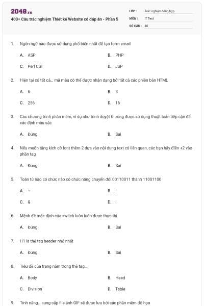
400+ Câu trắc nghiệm Thiết kế Website có đáp án - Phần 5
40 câu hỏi
ASP
PHP
Perl CGI
JSP
Chọn B
6
8
256
16
Chọn D
Đúng
Sai
Chọn A
Đúng
Sai
Chọn A
~
!
&
|
Chọn A
Đúng
Sai
Chọn B
Đúng
Sai
Chọn B
Body
Head
Division
Table
Chọn B
Dithering
Interlacing
Balancing
Chọn B
ht
htl
html
Tất cả đều sai
Chọn C
<style src=”mystyle.css”>
<stylesheet>mystyle.css</stylesheet>
<link rel=”stylesheet” type=”text/css” href=”mystyle.css”>
Tất cả đều đúng
Chọn C
Trong thẻ <body>
Trong thẻ <head>
Ở cuối file HTML
Ở đầu file HTML
Chọn B
border[round]: 30px;
corner-effect: round;
border-radius: 30px;
alpha-effect: round-corner;
Chọn C
box-shadow: 10px 10px 5px grey;
shadow-right: 10px shadow-bottom: 10px;
shadow-color: grey;
alpha-effect[shadow]: 10px 10px 5px grey;
Chọn A
border: url(image.png);
border-variable: image url(image.png);
border-image: url(border.png) 30 30 round;
Không thêm được hình ảnh xuất hiện trên đường viền
Chọn C
background-size: 80px 60px;
bg-dimensions: 80px 60px;
background-proportion: 80px 60px;
alpha-effect: bg-resize 80px 60px;
Chọn A
font: shadowed 5px 5px 5px grey;
font-shadow: 5px 5px 5px grey;
text-shadow: 5px 5px 5px grey;
shadow: text 5px 5px 5px grey;
Chọn C
word-wrap: break-word;
text-wrap: break-word;
text-wrap: force;
text-width: set;
Chọn A
matrix()
modify()
skip()
simulate()
Chọn A
object-rotation: 30deg;
transform: rotate(30deg);
rotate-object: 30deg;
transform: rotate-30deg-clockwise;
Chọn B
transform: scale(2,4);
scale-object: 2,4;
scale: (2,4);
None
Chọn A
transition: width 2s;
transition-duration: 2s; transition-effect: width;
alpha-effect: transition (width,2s);
None
Chọn A
Đúng
Sai
Chọn A
-webkit-
-moz-
-o-
-gecko
Chọn B
vertical, blur, horizontal
blur, vertical, horizontal
vertical, horizontal, blur
horizontal, vertical, blur
Chọn D
top, bottom, left, right
up, down, front, behind
top-left, top-right, bottom-right, bottom-left
bottom-left, bottom-right, top-right, top-left
Chọn C
Red Gold Black alpha
Red Green Blue alpha
Red Gray Brown alpha
Chọn B
Định vị tương đối cho một thành phần
Quy định kiểu viền của một đối tượng web
Tạo hiệu ứng màu sắc cho liên lết
Đặt các thành phần web ở các lớp khác nhau
Chọn D
In hoa
In hoa kí tự đầu tiên ở mỗi từ
In thường
Không áp dụng hiệu ứng nào cả
Chọn A
class
id
Cả A và B đều đúng
Cả A và B đều sai
Chọn A
Đen
Trắng
Đỏ
Xanh
Chọn B
External CSS < Internal CSS < Inline CSS
Inline CSS < Internal CSS < External CSS
Internal CSS < External CSS < Inline CSS
Inline CSS < External CSS < Internal CSS
Chọn A
External Style Sheet, Internal Style Sheet, Browser default, Inline Style
Inline Style, Browser default, External Style Sheet, Internal Style Sheet
Browser default, Internal Style Sheet, Inline Style, External Style Sheet
Browser default, External Style Sheet, Internal Style Sheet, Inline Style
Chọn D
class selector
id selector
name selector
type selector
Chọn A
<STYLE>
<A>
<LINK>
<CSS>
Chọn C
2
3
4
5
Chọn B
font-style
font-size
text-style
text-size
Chọn B
a {decoration:no underline}
a {text-decoration:no underline}
a {underline:none}
a {text-decoration:none}
Chọn B
text-transform:capitalize
text-transform:uppercase
Bạn không thể làm điều này trong CSS
Không có đáp án nào đúng
Chọn B
margin-left:
text-indent:
margin:
indent:
Chọn A, D