2000 câu trắc nghiệm tổng hợp Tiếng Anh 2025 có đáp án (Phần 18)
100 câu hỏi
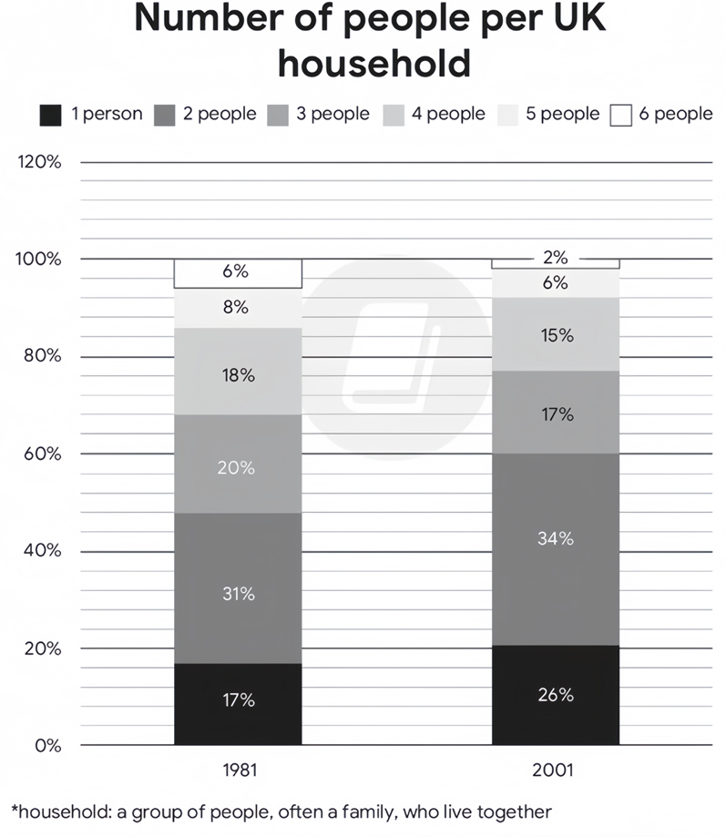
The chart below compares the number of people per household* by percentage in the UK in 1981 and 2001.
Summarise the information by selecting and reporting the main features, and make comparisons where relevant. Write at least 150 words.
Sample 1:
The stacked bar charts give a breakdown of the UK’s household composition in two separate years, namely 1981 and 2001.
Overall, there were decreases in the shares of households having from 3 to 6 people, whereas the converse was true in the case of those having 1 or 2 members, with 2-person and 6-person households being the most and least common in both given years, respectively.
Regarding households with an upward trend, the percentage of 2-member households was consistently the highest, starting at 31% before rising minimally by 3% in the final year. A similar change, but to a greater extent, was observed in the proportion of the smallest-sized households, growing from 17% initially to just over a quarter at the end of the period.
Turning to categories with a downward trend, households with 3 and 4 occupants witnessed the same level of decrease, with their figures dropping from 20% and 18% in 1981 to 17% and 15% two decades later, in that order. 5-person and 6-person households followed similar falling trends, albeit at lower rates. While the figure for the former had declined from 8% to 6% by 2001, that of the latter remained the lowest throughout, dipping from 6% to 2%.
Sample 2:
The two stacked bar charts detail the UK’s household demographics in 1981 and 2001. The initial impression from the chart is that 1-person and 2-person households were the second most and the most common family classifications in both given years, and they also experienced rises in percentages. The remaining groups made up smaller proportions and underwent corresponding drops, with the 6-person household being the least popular one.
In 1981, 2-person household made up 31%, ranking first among the given household type, after which the rate underwent a mild rise to 34% in 2001. A similar picture is evident in 1-person household, with its figure accounting for 17% and thereafter rising to 26% in 2001.
Opposite patterns could be observed with regard to the remaining groups. In 1981 the shares of 3-person, 4-person, 5-person and 6-person were 20%, 18%, 8% and 6% respectively. Over the next 20 years, they all decreased by similar margins (of around 2-3%) to 17%, 15%, 6% and 2%.
Sample 3:
The charts illustrate the percentage of different sized households in the UK, in 1981 and 2001.
Overall, the most common sized household in both measured years was that of 2-person households, while 6-person households were the least common. Additionally, while the percentage of 1-person and 2-person households increased, the percentage of all other sized households decreased.
In 1981, 31% of all households contained 2 people, while 20% of households contained 3 people. 1-person and 4-person households made up similar percentages, at 17% and 18% respectively, whereas 5-person and 6-person households only made up 8% and 6% of the total.
By 2001, the proportion of 1-person and 2-person households had risen to 26% and 34% respectively. Meanwhile, the proportion of all other sized households had decreased, with 3 and 4-person households dropping to similar levels, at 17% and 15% respectively, and 5 and 6-person households dropping to 6% and 2% respectively.
Sample 4:
The stacked bar charts delineate the household compositions with respect to the number of occupants in the UK in 1981 and 2001.
As is shown in the graph, most households in the UK had 2 occupants. Over the surveyed period, single and 2-person households enjoyed upswings whilst other demographics experienced a corresponding downturn.
Regarding the first stacked bar, 31% of households consisted of 2 occupants, heading the list of total demographics. Next came 3-person households with 20%, as opposed to single and 4-member households, accounting for 17% and 18% in turn. Large household sizes ranked in bottom place with 8% for 5-occupant and 6% for 6-occupant units.
20 years later, households with a single person living alone or two persons became dominant, with the figure for the former rising up by 9%, amounting to over one-quarter of total surveyed households. Meanwhile, households with 3 or 4 occupants recorded a fall of 3%, finishing at 17% and 15% respectively. Remaining in the last place were household units of 5 or 6 members, with their figures decreasing to 6% and 2%.
Sample 5:
The stacked bar charts delineate the composition of households in the UK during two distinct years: 1981 and 2001.
Overall, the UK preferred a smaller family size. Throughout both years, households comprising 2 individuals were the most prevalent, while those with 6 members were the least common.
Regarding the escalating trend, 2-person households consistently held the highest percentage, commencing at 31% and experiencing a marginal rise of 3% by the conclusion of the period. A comparable albeit more pronounced upward shift was noticeable in the proportion of the smallest-sized households (1 person), advancing from 17% initially to slightly over 25% by the terminal year.
Conversely, a declining trajectory was evident in households with 3 and 4 inhabitants, both experiencing a reduction from 20% and 18% in 1981 to 17% and 15% respectively by 2001. Similarly, households with 5 and 6 occupants also followed decreasing trends, albeit at slower rates. While the former decreased from 8% to 6% by 2001, the latter consistently demonstrated the lowest representation, plummeting from 6% to a mere 2% over the same period.
Sample 6:
The provided bar graphs compare the number of people per household in the UK in 1981 and 2001, elucidating the dynamic changes of household sizes. Notably, the trend indicates a pivot towards smaller household units over the two decades in question.
Overall, the data presents a clear downsizing trend in UK households, with a notable rise in one and two-person homes and a general decrease in larger family units.
In 1981, two-person households dominated, accounting for 31% of the total, and witnessed a slight increment to 34% by 2001, solidifying their prevalence. Conversely, the smallest household category, one-person units, experienced a significant upsurge from 17% to 26%, marking a move towards more individualised living spaces.
Meanwhile, the more populous household categories all contracted. Four-person homes, which constituted 18% in 1981, retracted to 15% by 2001. Three-person households mirrored this decrease, diminishing from 20% to 17%. Five-person households also saw a reduction, albeit less dramatically, from 8% to 6%. The most pronounced decline was observed in six-person households, which halved from 6% to a mere 2%, marking the most substantial demographic shift.
Sample 7:
The chart elucidates the changes in household composition in the UK, as measured by the number of occupants, between 1981 and 2001.
Overall, there was a noticeable shift towards smaller households in the UK over the 20-year period, with an increase in one and two-person households and a decrease in larger households.
In 1981, two-member households constituted the largest segment, accounting for 31% of the total, and this figure saw a modest rise to 34% in 2001. Single-person households also increased notably, jumping from 17% to 26% over the two decades. Households of three persons experienced a slight decline, from one fifth in 1981 to 17% in 2001.
Contrastingly, larger households displayed a downward trend. In 1981, four-member families accounted for 18% of households, but this fell marginally to 15% in 2001. A similar pattern was observed for five-member households, whose share dropped from 8% to 6% during the same period. Notably, households containing six members were the least common in both years, representing less than 6% of the total.
Sample 8:
The presented chart delineates the evolution of the number of people per household in the UK, by enumerating the number of inhabitants, from 1981 to 2001. It is compelling to note a significant transition towards smaller household units and a concurrent decline in more substantial familial arrangements.
In 1981, the dominant household structure comprised two occupants, accounting for 31% of the total. This segment saw a subtle uptick, reaching 34% by 2001. Singular dwellers also experienced a considerable surge, escalating from 17% to 26% over the two-decade span. The fraction of tri-member households diminished marginally, receding from one fifth in 1981 to 17% by 2001.
In stark contrast, households with larger numbers exhibited a waning trend. Four-member familial units, which represented 18% of total households in 1981, underwent a slight contraction to 15% in 2001. A congruent trajectory was observed amongst five-member households, dwindling from 8% to 6% over the same timeframe. Significantly, households embracing six inhabitants remained the least prevalent category, commanding less than 6% in both surveyed years.
Sample 9:
The given chart depicts the percentages for the number of people living in households over a period of twenty years from 1981 to 2001 in the UK.
Overall, the percentage of families with 1 to two members increased, while the proportion of families with 3 or more people decreased slightly. In addition, two person households account for the largest percentage of households, whereas six person households have the lowest percentage.
In 1981, the number of households with 2-person accounted for 31% and ranked first among the households, after which it witnessed a slight increase to 34% in 2001. Furthermore, the number of single-person households was responsible for 17%, which was followed by a significant increase of 26% in the next two decades.
Turning to households with a downward trend, the number of households with 3-person decreased slightly by 3% from 20% to 17% and households with 4-person witnessed the same level of decrease with their figures dropping from 18% to 15% over the following two decades. Remain in the last place are households of 5 and 6-person who also have a similar decrease with the rate falling to 6% and 2% respectively.
Sample 10:
The bar chart depicts the distribution of households in the UK based on their size in the years 1981 and 2001.
Overall, households consisting of two individuals were the most prevalent category in both years, whereas households with six members were the least common. Furthermore, while the percentage of one-person and two-person households witnessed an upward shift, the proportion of households of other sizes took the opposite trend.
In 1981, approximately 31% of all households comprised two people, while 20% were composed of three individuals. One-person and four-person households accounted for similar proportions, at 17% and 18% respectively, whereas five-person and six-person households constituted only 8% and 6% of the total in that order.
After 20 years, the percentage of one-person households rose considerably to 26%, representing a significant increase of 9%. The proportion of those with two people followed a similar pattern, although the increase was less pronounced, with a 3% rise. Meanwhile, the trend for the remaining categories was downward, as their figures decreased by around 2 to 4%.
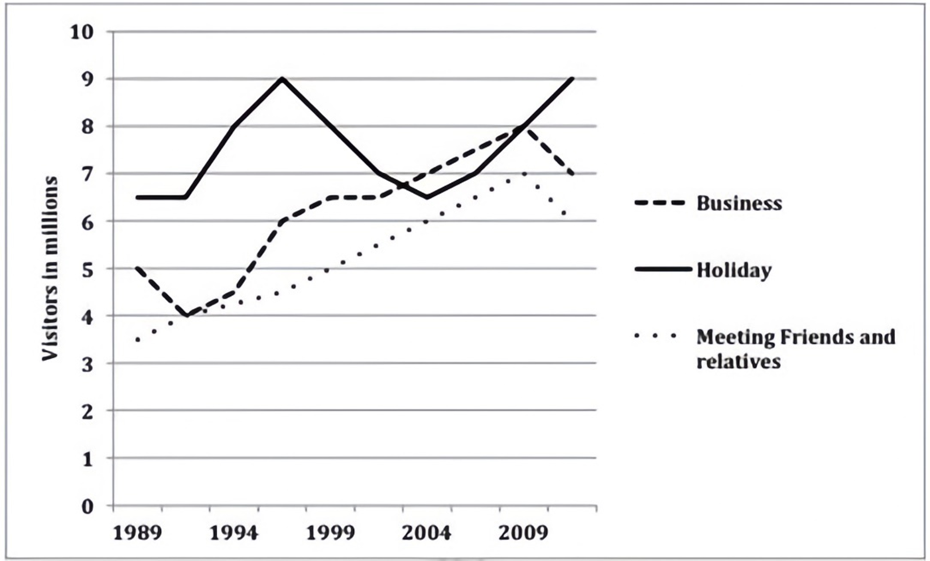
The graph below shows the number of overseas visitors who came to the UK for different purposes between 1989 and 2009.
Summarise the information by selecting and reporting the main features, and make comparisons where relevant. Write at least 150 words.
Sample 1:
The given line graph illustrates the number of foreign visitors who came to the United Kingdom for business, holiday and for meeting kith and kin, from 1989 to 2009. It can be seen that tourists who came for holiday were more than those for the other given purposes for a major part of the given two decades.
About 6.5 million people travelled to the UK for holidays in 1989. This number rose rapidly and peaked at 9 million by 1997, but after that fell dramatically and reached 6.5 million in 2004. After that the number of visitors picked up again and again reached a high of 9 million in 2009.
Meanwhile, business and socializing trips to the UK showed almost similar trends, starting from 3.5 million and 5 million respectively in 1989 and then rising moderately to reach 6 – 7 million in 2009. After that a fall in the number of visitors can be seen in both these cases. Throughout the given period, more people did business than those who visited their family and friends.
Overall, an upward trend can be seen in all three reasons for visiting abroad.
Sample 2:
The provided line graph illustrates the reasons why international visitors traveled to Britain during a two-decade period starting from 1989.
In general, this nation attracted an increasing number of foreign travelers for all documented motives. Moreover, vacation trips, despite their fluctuation, consistently ranked highest.
6.5 million holidaymakers came to Britain at the start of the period, followed by a surge to 9 million in 1998 but later a six-year plunge to its starting point. After a passing plummet from the initial 5 million, the figure for work-related visits soared to 7 million in 2004 and outdid that for the previously mentioned group. Despite a consistent 3.5-million increase, the number of visitors who arrived in the UK for family and friend reunions still ranked last at 6 million at the same time.
The UK subsequently welcomed a wave of tourists, which climbed to the formerly recorded peak of 9 million, in 2009. The figures for the other categories showed clear similarities in the remaining years. They witnessed proportional rises before declines and ended at 7 million for those going on business trips and 6 million for those visiting friends and relatives.
Sample 3:
The line graph illustrates the trends in activities performed by foreign visitors for three main purposes in the UK from 1989 to 2009. Overall, there was a remarkable increase in the number of foreign travelers visiting the UK for all three purposes. It is also clear that while business remained the most popular reason for visiting, with the exception of the period between 2000 and 2007, meeting friends and relatives was the least common purpose for visitors to visit the UK.
Regarding the leading business category, in 1989, approximately 6.5 million foreigners visited the UK for business purposes, and this number increased to just under 9 million by the mid-1990s. However, the number then dropped sharply to around 6.5 million in 2003 before picking up again in subsequent years. By 2009, the number of visitors for business purposes had surged to around 8.3 million, surpassing holiday to once again become the leading purpose for foreign visitors to the UK.
Regarding the two remaining categories, in 1989 the number of foreigners who came to the UK to enjoy holidays was 5 million. After a sudden drop to 4 million people in 1992, the figure then considerably increased to around 8 million visitors in 2007 before an unexpected decline to around 7 million people after 2009. By contrast, there was a constant growth in the number of visitors who traveled to the UK to meet their friends and relatives from 3.5 million in 1989 to around 7 million travelers in 2007, before declining slightly to around 6.5 million in 2009.
Sample 4:
The given line graph provides information about why international visitors travelled to Britain over a two-decade period starting from 1989.
Overall, this country attracted a growing number of overseas travellers for all reported reasons. In addition, the data on holiday trips, though erratic, nearly always topped the chart.
6.5 million holidaymakers came to Britain at the start of the period, followed by a surge to 9 million in 1998 but later a six-year plunge to its starting point. After a passing plummet from the initial 5 million, the figure for work-related visits soared to 7 million in 2004 and outdid that for the previously mentioned group. Despite a consistent 3.5-million increase, the number of visitors who arrived in the UK for family and friend reunions still ranked last at 6 million at the same time.
The UK subsequently welcomed a wave of tourists, which climbed to the formerly recorded peak of 9 million, in 2009. The figures for the other categories showed clear similarities in the remaining years. They witnessed proportional rises before declines and ended at 7 million for those going on business trips and 6 million for those visiting friends and relatives.
Sample 5:
The line graph illustrates how many foreigners visited the UK for business, holiday and socializing purposes in a period of two decades from 1989 to 2009. Units are measured in millions.
Overall, the number of overseas people who came to the UK for all three reasons soared over the period shown although figures for business travelers were more erratic. Interestingly, this group of tourists generally dominated the chart while those visiting this country for friends and family gathering remained the least.
Business visits to the UK, the largest category of foreign visitors, were impacted by a wild fluctuation in number. In 1989, this figure was far higher than those of the others (around 6.5) despite remaining flat during the first two years. It then fluctuated wildly between this initial level and the highest point of exactly 9 for the next 18 years, running to end at its peak in 2009.
In contrast, the proportion of tourists who paid a visit to the UK for holidays and socialization underwent a surge. As for the former, even after an initial dip, in 2002 and mid 2008 it spiked to overtake business goers before declining to just over 7. Finally, the latter doubled, rising from roughly 3.5 to a peak of 7 in 2008. This figure then experienced a similar trend as the former, downing slightly to finish at well over 6.
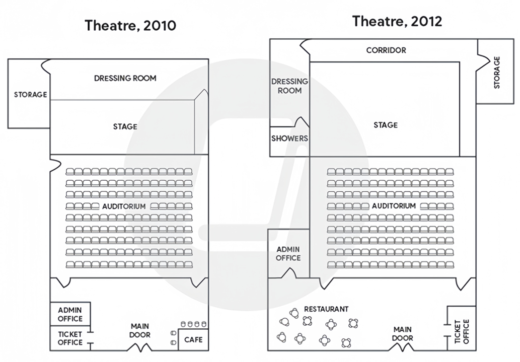
The plans below show a small theatre in 2010, and the same theatre in 2012.
Summarise the information by selecting and reporting the main features, and make comparisons where relevant. Write at least 150 words.
Sample 1:
The two maps illustrate the degree to which a small theatre changed from 2010 to 2012.
Overall, after two years, the theater became noticeably larger with the expansion of its upper and lower sections, and all of its facilities were either repurposed or relocated, except for the auditorium and the stage.
Regarding the top of the plan, the stage was enlarged in a northerly direction, overtaking half of the space previously occupied by the dressing room in 2010, which was turned into a corridor two years later. Meanwhile, there used to be a storage space flanking the stage and the corridor on the left in 2010, but it was then repositioned to their right flank in order to make way for two new rooms where performers or actors could get changed and take a shower.
Turning to the remaining areas of the theater, although the auditorium in the middle remained intact, the foyer below it had been extended towards the left by 2012, allowing for the establishment of a restaurant at the expense of the administration and ticket offices on the left-hand side of the main entrance. This in turn led to the relocation of the former to the left side of the auditorium and the latter to the bottom right corner of the plan, replacing the cafe that was present in 2010.
Sample 2:
The maps illustrate the layout of a small theater between 2010 and 2012 show significant changes during that time period.
It can be seen that the theater received renovation efforts in the two-year time frame, with the building itself expanded sideways as existing features were moved and reconfigured. The only part that did not undergo significant changes was the central seating area.
Regarding the southern part of the theater, in 2010, there was a cafe situated in the corner to the right of the theater's main entrance, whereas the left corner was occupied by a ticket office and an administrative office. However, within the next two years, the ticket office was relocated to the bottom right corner where the cafe had been, while the administrative office was moved further back, to the left side of the seating area. This made way for a new restaurant area in the left rear corner.
In the upper section of the maps, one notable change was that the stage in front of the auditorium almost doubled in size with the addition of a side hall behind it, even as the auditorium itself remained unchanged. To the left of the stage was a storage room which, after 2010, was moved to the opposite end of the stage to make way for the construction of a showers area as well as the relocation of the dressing room. The old dressing room was located behind the stage in 2010, but this space, together with the right side of the stage, was redesigned to serve as a corridor which connected the dressing room and the storage room.
Sample 3:
The diagrams show the layouts of a theatre in 2010 and 2012. Overall, by 2012, it had been made significantly larger by adding new facilities and relocating some existing ones, while the main auditorium remained intact.
In 2010, the structure had two adjacent offices for admin and ticket sales and a cafe all located on either side of the main door at the centre of the lower wall. Inside the auditorium, there were two doors for entry, and one door for exit on the left next to the front-row seats. The main stage was about the same size as the dressing room behind it and a storage room was at the left rear of the theatre.
Over the next two years, the main door and auditorium with its entry doors remained untouched, while the exit one was lost. However, the lobby was widened, making room for a new restaurant. This means the admin office was moved a little up to the left in an addition, and the ticket counter replaced the old cafe on the right of the main door. Notably, although the stage was enlarged by almost double, the dressing room and storage were downsized and moved around slightly. The dressing room and new showers were located on the left in an extension, while the storage was on the right, all connected by a new long corridor at the back.
Sample 4:
The maps demonstrate how the layout of the small auditorium has changed over a span of 2 years.
Overall, with the core structure for the main operations remains largely the same, there are horizontal expansion of the theatre and significant alterations in amenities aiming to enhance the experiennce for customers and performers.
In 2010, the storage was occupied by a moderately sized on the left-hand side in the first half, while the rest area was utilized for the dressing room and the stage. Nevertheless, by 2012, the relocation of the storage to the opposite corner of the stage facilitated the establishment of a showers region as well as the refurbishment of a dressing room. Moreover, the old dressing room was combined with the right-hand side of the stage to construct a backstage corridor connecting the storage and dressing room, allowing for smoother movement. Additionally, the stage in front of the auditorium was nearly doubled in its origin, whereas the centered auditorium remained unchanged.
The period from 2010 to 2012 experienced a complete change in the lower section of the theatre. A restaurant was introduced in the left corner, where the admin office and the ticket office had been simultaneously removed. Furthermore, the cafe area was dismantled to accommodate a new ticket office, and the administrative office was shifted to the left-hand side of the seating room.
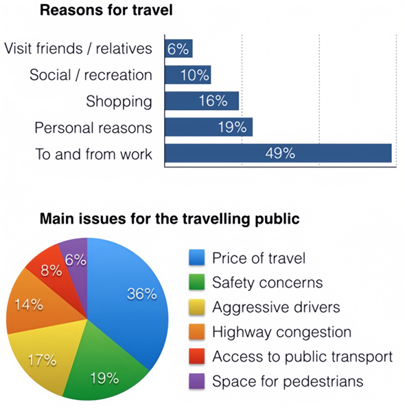
The charts below show reasons for travel and the main issues for the travelling public in the US in 2009.
Summarise the information by selecting and reporting the main features, and make comparisons where relevant. Write at least 150 words.
Sample 1:
The bar chart and pie chart give information about why US residents travelled and what travel problems they experienced in the year 2009.
It is clear that the principal reason why Americans travelled in 2009 was to commute to and from work. In the same year, the primary concern of Americans, with regard to the trips they made, was the cost of travelling.
Looking more closely at the bar chart, we can see that 49% of the trips made by Americans in 2009 were for the purpose of commuting. By contrast, only 6% of trips were visits to friends or relatives, and one in ten trips were for social or recreation reasons. Shopping was cited as the reason for 16% of all travel, while unspecific ‘personal reasons’ accounted for the remaining 19%.
According to the pie chart, price was the key consideration for 36% of American travellers. Almost one in five people cited safety as their foremost travel concern, while aggressive driving and highway congestion were the main issues for 17% and 14% of the travelling public. Finally, a total of 14% of those surveyed thought that access to public transport or space for pedestrians were the most important travel issues.
Sample 2:
The bar chart compares the figures for Americans going out for five reasons and the pie chart illustrates the percentage of six problems that concerned them when travelling in 2009. Overall, it is clear that the main reason why people in the US went out in 2009 is to commute to work, and the cost of travelling is the problem concerning them the most.
Looking first at the bar graph, the proportion of Americans going out for commuting to work stood at 49%, while the figure for those leaving their house for personal reasons accounted for 19%. In addition, the rate of people in the US going out for shopping and recreation made up 16% and 10%, respectively, while visiting friends or relatives accounted for the lowest percentage, at only 6%.
Turning to the pie chart, the cost of travelling was the most concerning problem of Americans when going out, with the figure making up 36%, while the proportion of safety concerns is half of that, at 19%. In addition, 17% of US citizens were concerned about aggressive drivers, while highway congestion made 14% of them worried when leaving their house. Access to public transportation and places for people to walk accounted for the lowest percentages, at only 8% and 6%, respectively.
Sample 3:
The provided charts offer insights into the reasons for travel and the primary concerns faced by the traveling public in the United States during the year 2009. The data is presented through a bar chart illustrating travel purposes and a pie chart highlighting key issues.
Notably, the primary motivation for travel among Americans in 2009 was commuting to and from work. Simultaneously, the major concern for the traveling public during their trips revolved around the cost associated with travel.
Examining the bar chart in detail reveals that almost half of the trips made by Americans in 2009, precisely 49%, were attributed to commuting. Conversely, visits to friends or relatives accounted for a mere 6%, while social or recreational trips constituted one in ten journeys. Shopping emerged as the purpose for 16% of all travel, leaving the remaining 19% for unspecific ‘personal reasons.’
Turning attention to the pie chart, it becomes evident that cost was the primary consideration for 36% of American travelers. Safety closely followed, with nearly one in five people, or 19%, expressing it as their foremost travel concern. Aggressive driving and highway congestion were significant issues for 17% and 14% of the traveling public, respectively. Additionally, 14% of respondents identified access to public transport or space for pedestrians as the most crucial travel issues.
Sample 4:
The bar chart shows why American people chose to travel, and the pie chart shows the main issues for the travelling public in the USA, both for 2009. The trend suggests that the reason and price were the main issues for travel in the United States. It is clear that commuting from work was reported as the biggest contribution to travel, at 49%. People who went travelling for personal reasons and shopping accounted for 35% when these two groups are combined. However, interaction with friends and relatives only accounted for 25% less than the above categories. And social and recreational activities took up only 6%, which was the lowest figure by more than 43%. The travelling public’s main issues were related to price and safety, with 55% of respondents reporting these two issues. While other issues accounted for a relatively small part. Only 17% of the respondents reported issues with aggressive drivers, while highway congestion accounted for even less at 14% of the issues reported. The percentage of access to public transport and space for pedestrians was much lower than the other categories at less than 10% for both. To conclude, price and commuting time were the dominant factors relating to travel in the US in 2009.
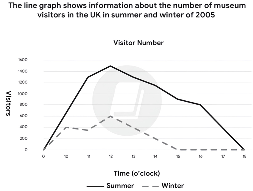
The graph shows information about the average number of visitors entering a museum in summer and winter in 2003.
Summarise the information by selecting and reporting the main features, and make comparisons where relevant. Write at least 150 words.
Sample 1:
The line graph illustrates how many people, on average, visited a particular UK museum during two seasons in 2005.
Overall, the attendance rate in the summer was generally much higher than that in the winter, with their peak time being at midday. It also appears that the museum had the same opening hours for both seasons, but it closed earlier towards the end of the year.
In the summer, the number of visitors soared/surged from 9 to 12 o’clock in the morning, peaking at approximately 1500 at noon. Subsequently, the museum saw a gradual drop of 700 visitors by 4 p.m., followed by another sharp fall towards 6 p.m. This seemed to be the closing time of the museum, as no visitors were recorded after that time.
The winter season followed a similar pattern, albeit at a lower rate. Despite a slight fall at 11 a.m, there was a considerable rise in visitor numbers between 9 and 12 o’clock, with a high of 600 in the middle of the day. Thereafter, a continual decrease was observed in this attendance figure, and the museum closed its door at 3 o’clock in the afternoon.
Sample 2:
The line chart illustrates how many people went to a British museum in the summer and winter of 2005.
Overall, fewer people went to this museum in the winter than they did in the warmer season. However, during both times of the year, the daily peak time was at midday, although it seems like the building closed earlier in the winter.
In the summer, within the first eleven hours of the day, the head count soared up to around 1300 people and peaked at approximately 1500 people at noon. It then slowly descended by around 700 between 12.00 p.m. and 4.00 p.m., and continued dropping to zero at a more considerable rate towards 6.00 p.m.
On a smaller scale, this pattern was followed by the winter’s figures. The first half of the day witnessed the number of walk-ins climbing gradually to 400, which then fell slightly before making a recovery to its high at 600. Since noon, there were fewer and fewer museum-goers present, setting a consistent drop until the museum was free of any visitors from 3.00 p.m. onwards.
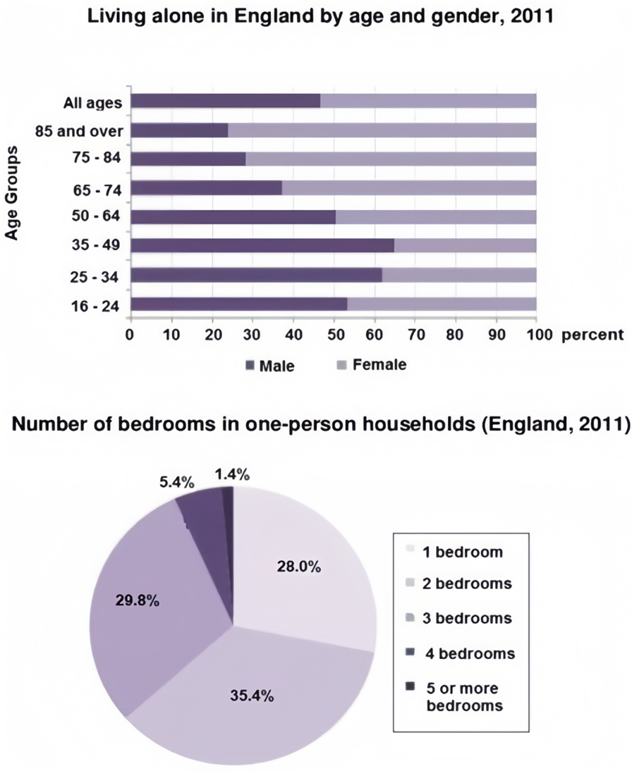
The bar chart below shows the proportions of English men and women of different ages who were living alone in 2011. The pie chart compares the numbers of bedrooms in these one-person households.
Summarise the information by selecting and reporting the main features, and make comparisons where relevant. Write at least 150 words.
Sample 1:
The first chart compares the percentage of English people living alone in terms of age distribution by gender in the year 2011. The second chart gives information about how many bedrooms these one-person households had in the same year. The trend suggests that women aged 65 and over were more likely to live by themselves than men in England. At the same time, it is also noticeable that the majority of one household lived in a two-bedroom residence.
According to the bar chart, there were more men who lived alone than women in age groups under 65. Close to 65% of men aged 35 to 49 lived by themselves in that year, but this proportion shrank with age. From 65 onward, it is shown that the figure for women who lived alone was increasing, at around 63% in the 65 to 74-year-old bracket and that there was 76% in the 85 and over age group.
In the pie chart, it can clearly be seen that for all age groups, 35.4% of one-person households in England lived in a two-bedroom residence. There were similar percentages of people living alone in one bedroom and a three-bedroom house, at 28% and 29.8%, respectively. Only 1.4% of one-person households lived in houses that had more than five bedrooms.
Overall, a higher number of older women lived alone compared to men, and most English residents lived in a two-bedroom house.
Sample 2:
The bar chart displays the proportions of English men and women of different ages living alone in 2011, while the pie chart illustrates the distribution of the number of bedrooms in these one-person households.
Overall, females constituted a higher proportion of those living alone compared to males, particularly in older age categories. The most common number of bedrooms in single-occupant homes was two.
According to the bar chart, the "All Ages" and 16-24-year-olds categories had balanced proportions between males and females. For the 25-34 and 35-49 age groups, males outnumbered females, with nearly 65% of individuals living alone in the 35-49 category being men. In contrast, females dominated the older age groups, with women constituting around 72% of single occupants aged 75 to 84 and 76% of those aged 85 and over, leaving men at 24% in the latter category.
Regarding the number of bedrooms, 35.4% of one-person households had two bedrooms, making it the most popular choice. Additionally, one-bedroom and three-bedroom homes accounted for 28% and 29.8% of the total, respectively, and less than 7% of single-occupant homes had four or more bedrooms.
Sample 3:
The provided charts offer insights into single-occupant households in England during 2011. The bar chart delineates the distribution of individuals living alone across various age groups and genders, while the accompanying pie chart provides data on the number of bedrooms in these solitary residences.
Notably, a higher percentage of females chose to live alone compared to their male counterparts. This discrepancy was particularly pronounced in the elderly demographic. Additionally, the charts highlight that two-bedroom homes were the most prevalent in single-occupant households.
A significant gender disparity is evident among individuals aged 65 and above living alone in England in 2011, with females constituting the majority. Around 72% of single occupants in the 75-84 age group and 76% in the 85 and above category were women. Conversely, in the 35-49 age bracket, men represented nearly 65% of those residing alone.
In terms of the number of bedrooms, the majority of one-person households in England, 35.4%, featured two bedrooms. One-bedroom and three-bedroom homes accounted for 28% and 29.8%, respectively, of the total. Notably, less than 7% of these solitary residences had four or more bedrooms.
Sample 4:
The two charts give information about single-occupant households in England in the year 2011. The bar chart compares figures for occupants' age and gender, and the pie chart shows data about the number of bedrooms in these homes.
Overall, females made up a higher proportion of people living alone than males, and this difference is particularly noticeable in the older age categories. We can also see that the most common number of bedrooms in a single-occupant home was two.
A significant majority of the people aged 65 or over who were living alone in England in 2011 were female. Women made up around 72% of single occupants aged 75 to 84, and 76% of those aged 85 or over. By contrast, among younger adults the figures for males were higher. For example, in the 35-49 age category, men accounted for nearly 65% of people living alone.
In the same year, 35.4% of one-person households in England had two bedrooms, while one- and three-bedroom homes accounted for 28% and 29.8% of the total. Under 7% of single-occupant homes had four or more bedrooms.
Sample 5:
The bar chart provides a breakdown of English men and women of different ages who were living alone in 2011, while the accompanying pie chart illustrates the distribution of the number of bedrooms within their one-person households.
Overall, older women were more likely to live alone than their male counterparts, while younger men were more prone to solitary living compared to younger women. Additionally, most individuals living alone resided in homes with one to three bedrooms, with two-bedroom properties being the most prevalent.
Focusing on the bar chart, the proportion of women living alone increases with age, especially after the age of 65, where nearly 70% of such individuals are female, far exceeding the percentage of males. In contrast, younger age groups show a reversed trend, with more men opting for single-person households, particularly among those aged 35 to 49, where men represent a significant majority. A similar pattern can be seen in the 16-24 and 25-34 age groups, with men consistently outnumbering women. In the 50-64 age group, however, the percentage of men and women living alone is equal.
The pie chart reveals that the majority of single-person households consist of two or three bedrooms, with two-bedroom homes accounting for 35.4% and three-bedroom residences making up 29.8%. One-bedroom properties are also common, representing 28% of the total. Larger homes, including those with four or more bedrooms, are rare among single occupants, with just 5.4% having four bedrooms and only 1.4% featuring five or more.
Sample 6:
The bar chart illustrates the proportions of English men and women of different ages who were living alone in 2011, while the pie chart provides information about the number of bedrooms available in these one-person households.
In general, older women were more inclined to live independently compared to their male counterparts, whereas younger men showed a greater tendency to live on their own than younger women. Additionally, most one-person households were comprised of homes with one to three bedrooms, with two-bedroom accommodations being the most common.
Delving into the bar chart, it is clear that the trend of living alone shifts notably with age. For individuals over 65 years, women dominate the figures, making up a much larger share compared to men. This gap becomes particularly significant for the 75-84 and 85-and-over categories, where women outnumber men considerably. Conversely, men are more represented among younger age brackets, especially those aged between 35-49, where their share peaks. In the 16-24 and 25-34 groups, men also outstrip women, showing a preference for solitary living during their youth. The only age range with an equal proportion of both genders living alone is 50-64.
The pie chart reveals that two-bedroom residences make up the highest portion of single-occupant homes, followed closely by three-bedroom ones. One-bedroom homes are also frequent among these households, while properties with four or more bedrooms are uncommon. Notably, only a very small fraction of these single-occupant residences features five or more bedrooms.
Sample 7:
The bar chart demonstrates the proportions of English men and women of different ages who were living alone in 2011, while the pie chart displays the distribution of the number of bedrooms in their one-person households.
A significant pattern emerges in both visuals: older women were more likely to live by themselves than their male counterparts, and younger men were more inclined toward independent living compared to younger women. Additionally, the majority of these single-occupant residences consisted of one to three bedrooms, with two-bedroom homes forming the largest segment.
In greater detail, the bar chart reveals that among individuals aged 65 and above, women clearly outnumber men in solitary living, especially in the oldest age categories, where female occupancy rises dramatically. In contrast, the trend is reversed for younger age groups, with a higher proportion of men living alone, most notably between the ages of 35 and 49. A similar male dominance is observed in the 16-24 and 25-34 brackets, indicating that men are more inclined to live independently during their younger years. The age group 50-64 is the only category where the ratio of men and women living alone is perfectly balanced.
The pie chart illustrates that two-bedroom homes are the most frequent choice among these households, followed by those with three bedrooms. One-bedroom accommodations also constitute a substantial share, while larger properties with four or more bedrooms are relatively rare. Only a small minority of single-occupant homes contain five or more bedrooms, emphasizing the preference for compact living spaces.
Sample 8:
The bar graph compares the ratio of English males and females of different ages. In 2011, clusters who resided independently are presented in the pie chart with information on the count of bedrooms they possessed. Generally, a high number of British females chose to live solitary as their age advanced, and the majority of houses belonging to these individually residing people contained one to three sleeping rooms. As per the bar chart, approximately 55% of British females were living alone, a higher rate compared to males. In the year 2011, this statement was especially valid for older ladies because approximately 70% of them. had lived apart as compared to less than 30% of males who were over 65 years old. The proportion between the two. In 2011, the individuals of all genders who were living by themselves and were between the ages of 50 to 64 years old had exact similarities. However, younger English males preferred to live individually more than their female individuals. On average, six out of ten were males who resided alone during their younger age, from 16 to 49 years old. The majority percentage of unmarried men were between the ages of 35 and 49 years old. However, for women, it was different as most single females were above the age of 80 years.
The pie chart shows that a majority of houses occupied by single individuals have one to three bedrooms. Among them, two-bedroom houses are the most common with roughly 35%, which is about 6% more than three-bedroom apartments. Very few singles reside in large homes with many rooms, and around a quarter of these dwellings contain just a single room.
Sample 9:
The bar chart compares the proportion of English guys and females from diverse age bunches who lived independently in 2011, whereas the pie chart shows the number of rooms they had. Generally, more British ladies lived alone when they got more seasoned, and most of these independently living persons' houses comprised one to three rooms.
According to the bar chart, more British females, generally 55%, lived alone than that of guys in 2011. Typically, especially genuine for mature ladies since generally 70% of them lived independently, compared to less than 30% of guys over 65 a long time ancient. The proportion of both sexual orientations living alone who were 50 to 64 a long time ancient in 2011 was precisely the same. In any case, more youthful English guys favoured to live exclusively more than their female partners. Six out of ten, on a normal, were men who lived solo when they were more youthful, 16-49 a long time ancient. The most noteworthy rates of single guys in this category were between 35 and 49 a long time ancient, whereas this proportion was most noteworthy for the ladies over 80 a long time ancient.
The pie chart delineates that most of the single persons' houses had one to three rooms and two-bedroom houses for such individuals were the most elevated, around 35%, surpassing the three-bedroom flats by generally 6 percent. Barely they had bigger houses with numerous rooms and around one-fourth of these homes had as it were one room.
Sample 10:
The bar chart uncovers data about the English guys and females, in 8 diverse age bunches, who lived alone in 2011. The pie chart provides information about the number of rooms within the houses with one inhabitant. By and large, 34-49 a long time people had the most noteworthy rate of living alone, whereas 85 a long time and over had the least. Most of the houses with one inhabitant had two rooms, and less than 2% of one-person families had 5 or more rooms. In 2011, less than 50% of all age bunches of English people lived alone. The foremost proportion of people who had a private house was more than 50% among 16 to 64 ages, bunches of men and ladies. On the other hand, more than 64 a long time ancient people were less sharp at living alone with approximately 30% for 75-84 a long time ancient, far less than 30% for 75-84 and fair over 20% for 85 and over, individually.
Within the case of the number of rooms, 35.4% of private houses with one inhabitant had 2 rooms, which was followed by 3 rooms with 29.8% and rooms with 28%, separately. In any case, as it were less than 7% of one-person family units had 4 or more rooms.
Sample 11:
The two charts present data on single-occupant households in England in 2011. The bar chart compares the age and gender distribution of occupants, while the pie chart illustrates the distribution of the number of bedrooms in these homes.
In general, a higher percentage of females lived alone compared to males, and this difference was particularly noticeable among older age groups. Additionally, the most common configuration for single-occupant homes was having two bedrooms.
A significant majority of individuals aged 65 or over who lived alone in England in 2011 were female. Women accounted for approximately 72% of single occupants in the age range of 75 to 84, and 76% among those aged 85 or older. Conversely, among younger adults, there was a higher proportion of males living alone. For instance, in the 35-49 age category, men constituted nearly 65% of single occupants.
Regarding the number of bedrooms in single-occupant homes, approximately 35.4% of such households had two bedrooms. One-bedroom and three-bedroom homes accounted for 28% and 29.8% of the total, respectively. Less than 7% of single-occupant homes had four or more bedrooms.
In summary, the charts provide insights into single-occupant households in England in 2011. Females comprised a larger proportion of individuals living alone, especially among older age groups. Furthermore, homes with two bedrooms were the most common configuration for single occupants.
Sample 12:
The bar graph compares the ratio of English males and females from different age groups who lived individually in 2011, while the pie chart shows the number of bedrooms they had. Overall, more British women lived alone when they got older and most of these separately living persons' houses comprised one to three bedrooms.
According to the bar chart, more British females, roughly 55%, lived alone than that of males in 2011. This is particularly true for the aged women since roughly 70% of them lived separately compared to less than 30% males over 65 years old. The ratio of both genders living alone who were 50 to 64 years old in 2011 was exactly the same. However, younger English males preferred to live individually more than their female counterparts. Six out of ten, on an average, were men who lived solo when they were younger, 16-49 years old. The highest percentages of single males of this category were between 35 to 49 years old while this ratio was highest for the women over 80 years old.
The pie chart depicts that most of the single persons’ houses had one to three bedrooms and two-bedroom houses for such people was the highest, around 35%, exceeding the three-bedroom apartments by roughly 6 percent. Scarcely they had larger houses with many rooms and around one-fourth of these homes had only one room.
Sample 13:
The bar chart compares the figures of a person living alone with different genders and ages in England in the year 2011. The pie chart indicates data showing the number of bedrooms in these homes at the same period.
Overall, the women had the bigger percentages of people living alone than men. We can also see that the most common number of bedrooms in one person was two.
Females had around 77% of one person aged 85 or over, and 72% of those aged 75 to 84. By contrast, females had smaller proportion than males from 25 to 49 aged. For example, in the 35- 49 age category, men had the biggest figure of people living alone, at nearly 65%.
In 2011, 35.4% of one person households had two bedrooms. Whilst third bedroom and one bedroom were the second and third of the most of these houses in England, 29,8% and 28.0% respectively. There were nearly under 7.0% of the other bedrooms.
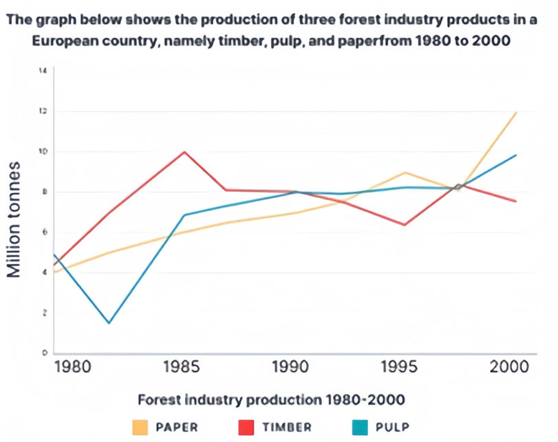
The graph below shows the production of three forest industry products in a European country, namely timber, pulp, and paper from 1980 to 2000.
Summarise the information by selecting and reporting the main features, and make comparisons where relevant. Write at least 150 words.
Sample 1:
The graph below shows the production of three forest industry products in a European country, namely timber, pulp, and paper, from 1980 to 2000.
Overall, while all three categories fluctuated wildly throughout the period, they ultimately increased substantially.
In 1980, even though pulp had the highest production initially (roughly 5.5 million tons), it plummeted to just over 2 million tons and was immediately overtaken by timber in the following years. From 1982 to 1985, both timber and pulp had similar increasing trends, rising sharply from 6.5 to 10 and 2.2 to 6.5 million tons, respectively. From 1985 to 1990, pulp’s figure kept growing at a slower rate while timber dipped to 8.0 million tons in 1987 and remained there till 1990. Paper consistently grew from 4.0 to 6.5 million tons during this time frame.
For the remaining period, timber declined to around 6.2 million tons before bouncing back to 8.0 in 1997 and slightly decreased to 7.8 in 2000, ultimately finishing last. In contrast, despite a slight dip in 1997, the paper almost doubled its 1990 figure and reached first place in 2000. In the same period, pulp gradually rose from 8.0 to approximately 10.0 million tons.
Sample 2:
The line chart demonstrates the production trends of three forest industry products - timber, pulp and paper - in a European country over a 20-year period, from 1980 to 2000.
Overall, it can be observed that all three categories had fluctuated throughout the period. Pulp and paper, in particular, experienced an upward trend, while timber saw a downward trend.
In terms of pulp and paper production, pulp was marginally higher than paper in 1980, with nearly 6 million tonnes and 4 million tonnes, respectively. Following a sharp decline, pulp production began to recover in 1985, climbing from 7 million tonnes to 10 million tonnes by the end of the period. Similarly, paper production rose steadily until a slight fallback in 1995, and then increased rapidly, peaking at 12 million tonnes in 2000.
Regarding timber, the production started at 5 million tonnes in 1980 and rose sharply to 10 million tonnes in 1985. However, over the following 15 years, the production figure saw a gradual decrease and eventually reached nearly 8 million tonnes at the end of the period.
Sample 3:
The given graph depicts the production of wood pulp, timber, and paper in a European country between 1980 and 2000. Overall, the growth in paper production was substantial and steady throughout the period, while the quantity of wood pulp increased moderately with some disruptions. Timber, on the other hand, was the only product to have such irregularities and experienced significant fluctuations.
In 1980, paper production began at 4 million tonnes, which climbed steadily to 9 million tonnes before experiencing a slight dip to 8 million tonnes in 1997-98. The quantity then recovered and reached its peak at 12 million tonnes in 2000.
Wood pulp started with the highest production of the three commodities, with 6 million tonnes, but dropped to about 3.6 million tonnes by 1983. It immediately rose again and tripled the previous level in 1985. However, there was not much growth in the following period, and the production remained between 7-10 million tonnes.
Between 1980 and 1985, the production of timber increased dramatically, from 5 million tonnes to 10 million tonnes, before declining to just over 6 million tonnes until 1995. Production grew once again to 8 million tonnes in the final five years of the era before rapidly falling off once more.
Sample 4:
The provided graph illustrates the production trends of timber, pulp, and paper in a European country from 1980 to 2000.
Throughout the entire period, all three categories experienced notable fluctuations, yet collectively demonstrated substantial overall growth.
The initial production of pulp slightly surpassed that of paper in 1980, with approximately 6 million tonnes for pulp and 4 million tonnes for paper. Subsequently, pulp experienced a significant decline to under 2 million tonnes in 1982 before a recovery to about 7 million tonnes in 1985 and then a substantial 10 million tonnes by the conclusion of the period. Conversely, paper production displayed a consistent increase from 4 to a high of approximately 9 million tonnes in 1995, momentarily slowing in 1995, before surging rapidly and reaching its pinnacle at 12 million tonnes by 2000.
In contrast, timber production commenced at 5 million tonnes in 1980, swiftly escalating to 10 million tonnes by 1985. However, over the ensuing 10 years, timber production exhibited a gradual decline to hit a low of about 6 million tonnes in 1995. Then, this figure rebounded before dropping again to under 8 million tonnes by 2000, concluding in the lowest position.
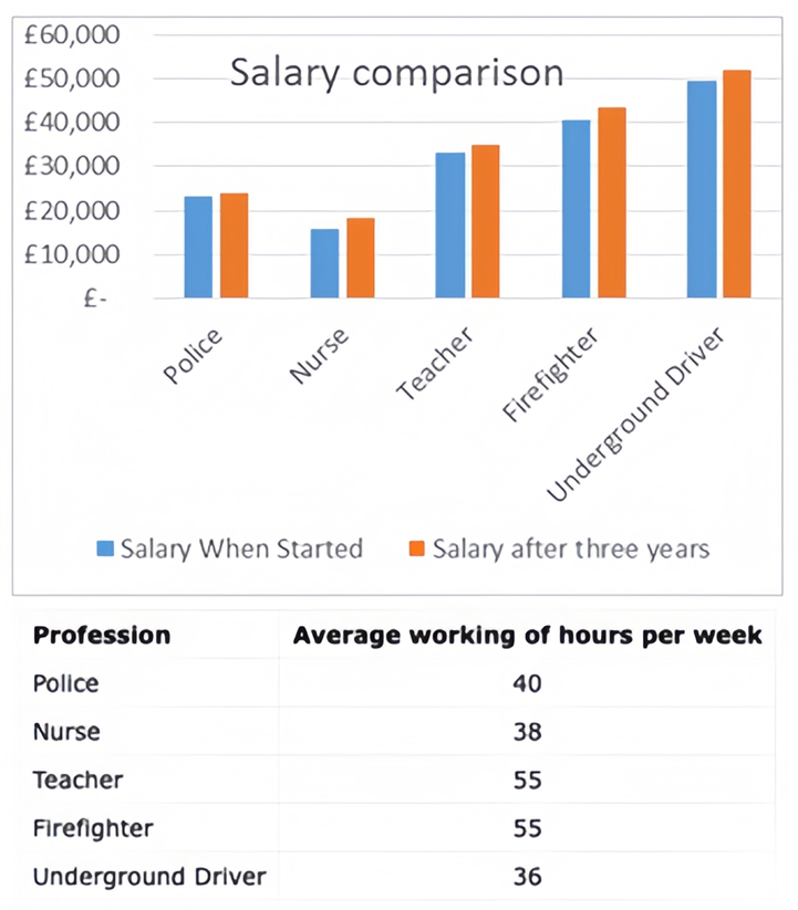
The chart below shows information about various professions in the U.K. and their salaries. The table shows the average working hours per week for each profession.
Summarise the information by selecting and reporting the main features, and make comparisons where relevant. Write at least 150 words.
Sample 1:
The bar chart and table demonstrate the income and average weekly working hours for several occupations in the UK.
Overall, it is evident that in the UK, most professions witness a wage raise after three years of experience. However, there is a significant gap in average weekly working hours amongst careers, with teachers and firefighters having substantially higher weekly working hours than underground drivers.
According to the bar chart, underground drivers receive the highest starting income of 50,000 pounds and a salary increase to nearly 51,000 pounds after three years. Nurses, on the other hand, have the lowest earnings, starting at around 17,000 pounds and rising to over 19,000 pounds after three years. Police officers’ salaries remain relatively stable during the three-year period, hovering around 22,000 pounds.
According to the data in the table, teachers and firefighters spend the most weekly hours at work, both averaging 55 hours per week. On the contrary, underground drivers put in the fewest hours per week, clocking in at just 36 hours on average.
Sample 2:
The provided bar chart and table delineate income variations and average weekly working hours across various occupations in the UK.
Overall, the data reveals a common trend of salary escalation across most professions after a three-year tenure. However, a substantial divergence exists in the average weekly working hours among occupations, with teachers and firefighters dedicating considerably more hours per week, contrasting with underground drivers.
In the bar chart, underground drivers commence with the highest initial income, starting at £50,000, escalating marginally to nearly £51,000 after a three-year period. These figures surpass firefighters’ and teachers’ by about £10,000 and £20,000 in each corresponding year. Conversely, nurses initiate with the lowest earnings, commencing around £17,000 and progressing to over £19,000 after three years. Meanwhile, police officers maintain relatively consistent salaries, hovering near £22,000 throughout the three-year timeframe.
Examining the table data, both teachers and firefighters record the highest weekly work hours, averaging 55 hours per week. In contrast, underground drivers maintain the shortest workweek, averaging only 36 hours per week. In comparison, the average working hours of police officers are 40, compared to 38 working hours a week of nurses.
Sample 3:
The bar graph and table compare the starting salaries and salaries after three years of five different professions: underground train drivers, nurses, teachers, firefighters, and police officers. It also shows the average weekly working hours of each profession.
Several trends can be identified from the data. The underground train driver had the highest salary both at the start and after three years, earning just under £50,000 per year, while the nurse earned the least with a salary of only around £15,700. In terms of salary increments, the underground train driver received the greatest increase of £2,500 over three years, whereas the police officer received the lowest rise of £600.
Importantly, despite all professions receiving pay increases, the same professions remain at the opposite end of the salary scale after three years. The underground train driver continues to be the highest paid, while the nurse's salary remains the lowest. So, in summary, while individual salaries increased, the overall trend between the highest and lowest-paid professions persisted over the period shown.
Sample 4:
The line graph compares the average salaries and weekly working hours of four different jobs in the UK: police, nurses, firefighters, and underground drivers.
The graph clearly shows that underground drivers have both the lowest average weekly working hours and the highest salaries. They typically work 36 hours per week and earn £50,000 in their first year, rising to £51,000 after three years. In contrast, firefighters have among the highest average weekly working hours at 55.
Police officers work an average of 40 hours per week. Their starting salary of £2,100 sees a modest rise to £2,300 over three years. Firefighters have the longest weekly working hours of 55, but their salaries are the second highest. They earn £40,000 in the first year, growing to £41,000 after three years.
In summary, underground drivers benefit most from working the fewest hours yet earning the highest pay. Nurses face the opposite situation, with high working hours yet relatively low wages.
Sample 5:
The bar chart and table compare the starting salaries and earnings after three years, as well as the average weekly working hours, of several occupations in the UK. Underground drivers earn the highest starting wage of £50,000 according to the bar chart. Their salary increases slightly to just under £51,000 after three years. In contrast, nurses have the lowest pay, commencing at approximately £17,000 and rising to over £19,000 subsequently. Police officers' salaries remain relatively stable during the three years, around £22,000.
The table provides data on the average weekly working hours for each profession. Teachers and firefighters top the list with 55 hours per week on average. In stark contrast, underground drivers put in the fewest hours, only 36 per week.
In summary, the visuals demonstrate that while underground drivers enjoy the top starting salary, teachers and firefighters work significantly longer hours weekly than other occupations such as underground drivers, according to the information presented.
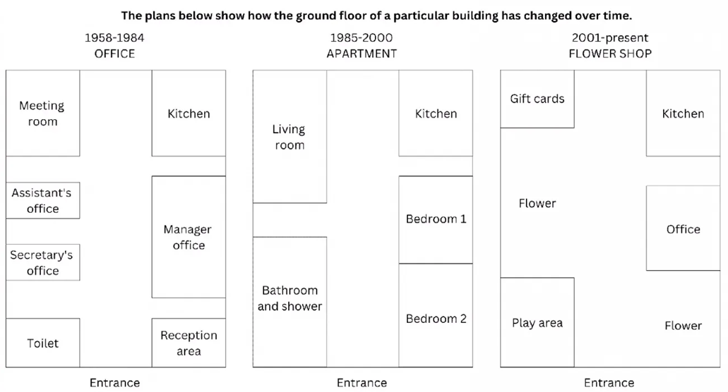
The plans below show how the ground of a particular building has changed over time.
Summarise the information by selecting and reporting the main features, and make comparisons where relevant. Write at least 150 words.
Sample 1:
The floor plan shows how a building has changed from 1958 to the present day.
Looking from an overall perspective, it is readily apparent that the building has served both commercial and residential purposes with the only area remaining unchanged being the kitchen. At present, the flower shop has a more open layout compared to when it was an apartment and office.
In 1958, the building was used as an office with a meeting room in the top left corner of the floorplan, an assistant’s and secretary’s office below there and a toilet in the bottom left corner. In 1985, the meeting room was extended and turned into a living room and a large bathroom and shower took the place of the offices and toilet. The florist shop contained a gift card room in the top left, above a large open space for flowers and a play area in the bottom left corner.
On the right side, the kitchen in the top corner was unaltered across all iterations of the ground floor. In comparison, there was a manager’s office on the right-hand side and a reception area in the bottom corner. These spaces were allocated for bedrooms in the apartment and are now an office and additional space for flowers.
Sample 2:
The plan depicts the ground floor of a specific building and how it developed throughout three distinct time periods.
Overall, the position of the kitchen area and the main entrance of the ground floor remain unchanged over time.
From 1958 to 1984, the ground floor served as an office space. A restroom was built to the left of the entrance, followed by offices for assistants and secretaries, and a meeting room at the far end. Meanwhile, on the right-hand side of the entrance, the manager's office was built halfway between the kitchen and the reception area.
Between 1985 and 2000, the ground floor was renovated to become an apartment. The manager's office and reception area were merged to create two bedrooms in front of the kitchen. On the other side, the previous facilities were no longer retained, and a living room and bathroom with a shower were erected in their place.
Since 2001, the ground floor has been transformed into a flower shop. The play area was constructed on the left side of the entrance, which was previously the bathroom. The living room was converted into a gift card storage place, and the previous two bedrooms were replaced with a new office, complete with flowers on the opposite and left sides.
Sample 3:
The images depict the progressive evolution of a building’s ground floor layout, transitioning from an office to an apartment and ultimately transforming into a flower shop.
Overall, throughout the depicted periods, the entrance and kitchen retained their fixed positions, remaining unaltered amidst the notable transformations.
Initially, from 1958 to 1984, the entrance was on the southern side, leading to a reception area adjacent to the manager’s office on the right, and a kitchen was situated in the northeast corner. On the opposite side, a meeting room was in the northwestern corner while a toilet was positioned in the southwestern one. Between them were the assistant’s and secretary’s rooms.
Between 1985 and 2000, the office transformed into an apartment. The entrance and kitchen remained unchanged, but the manager’s office and reception were removed to create two bedrooms. The meeting room and assistant’s office were replaced by a spacious living area, while the toilet expanded into a bathroom with showers.
From 2001 to the present, the area has been converted into a flower shop. The bedrooms were repurposed into a flower display area and an office. The entrance and kitchen remained fixed, while the living room turned into a gift card section. Another flower display and a play area were placed adjacent to the gift card section on the left.
Sample 4:
The given illustrations represent the modifications made to the ground floor of a building over a certain period.
Overall, the area has undergone significant changes as it transformed into an office, apartment, and flower shop. However, the entrance and the kitchen have remained unaltered throughout the period.
From 1958 to 1984, the entrance was on the south side of the building. The reception area was next to the manager's office on the right of the entrance. The kitchen was in the northeast corner, and the meeting room was opposite the kitchen. Furthermore, the assistant's and the secretary's rooms were on the meeting room's south side. To the left of the entrance was the toilet.
Between 1985 and 2000, the office was transformed into an apartment. The entrance remained unchanged, but the manager's office and the reception area were demolished to create two new bedrooms. The kitchen retained its location in the northeast. A large living room replaced the meeting room and the assistant's office, while the toilet was expanded into a bathroom and shower.
Finally, from 2001 to the present, the area was converted into a flower shop. The two bedrooms were turned into a flower display area and an office in the southeast direction. The entrance and the kitchen were still in the same place, and the gift cards area in the northwest replaced the living room. Moreover, on the gift cards' south side, there was another flower display area and a play area.
Sample 5:
The map illustrates the changes to the ground floor of a building from 1985 to the present. Overall, the most significant modification is that the office facilities were changed for domestic purposes as the building was transformed into an apartment and then repurposed a second time to serve as a flower shop. In terms of layout, only the kitchen remained unchanged over the years.
On the left side, when the building functioned as an office, the meeting room and assistant’s office were located in the top-left corner. In the period from 1985 to 2000, the office was replaced by a living room and then subsequently a gift card and flower area has been there from 2001 to the present. Additionally, the secretary’s office and toilet from the office were demolished to make way for a bathroom when the building was used as an apartment. Now, a small play area has been constructed in this place.
On the right side, two bedrooms were added at the expense of the manager’s office and the reception area as the office building was converted into an apartment. They were then removed to allow for an office and second flower area in the florist’s shop. By contrast, the kitchen is the only room that remained unchanged over all three iterations of the building’s ground floor.
Sample 6:
The ground floor of a particular building is depicted on the three plans at three distinct times. Overall, the general layout has changed over time depending on the period’s goal. Offices were located on the floor from 1958 to 1984. In the upper right corner of the design, there was a kitchen, then a manager’s office, and finally a reception area. A restroom was located on the side of the reception area opposite it, and the remaining space along the hallway was set aside for a conference room and offices for secretaries and assistants.
From 1984 to the next 15 years, the ground level was converted to an apartment. The remaining rooms on the left were demolished to make room for a bathroom with a shower, and the conference room and assistant’s office were transformed into a living area. The kitchen remained on the right side, but the two other rooms were transformed into two bedrooms.
From 2001 onwards, the kitchen retained its position, but the two bedrooms were repurposed into an office and flower display area when the ground floor began selling flowers. Currently, the left side of the hallway has a play area, a place to make gift cards, and a flower display area in the middle.
Sample 7:
The diagram illustrates the proposals for a ground floor of a particular structure developed from 1958 to present times.
Overall, the kitchen remained unchanged throughout the time frame, whereas the meeting room, offices, toilet, reception area, bedrooms, and living rooms were remodeled into gift cards, play area, and flower fields from 2001 to now.
From 1958 to 1984, the office consisted of a meeting room in the north. Behind it was the assistant’s and secretary’s office directly opposite in the west, whereas the manager’s office was in the east. The kitchen was located adjacent to the meeting room. Both the toilet and reception area can be found at the rear of the office in the southwest and southeast, respectively.
In the year 1985- 2000, the offices were removed and replaced with a living room in the north. The bathroom and shower were located in the south. The office and reception area were converted into bedroom 1, and the next was bedroom 2.
Looking at 2001 to the present times, the living room was transformed into a gift cards shop, which was reduced in size in the north. Behind was a flower field and an office adjacent to it. The play area was created in the south in the flower shop. And a flower field is seen at the rear of the office. The kitchen remained the same over the 60 years.
Sample 8:
The given consecutive images depict the renovation of an apartment base floor over decades from 1958 to the present day.
The first picture reveals that the said floor was dedicated to office space for the period of 1958 to 1984. In all, the office had seven rooms. The largest room was occupied by the Manger and was located between the kitchen and reception. Exactly opposite the manager’s room was two rooms, one for the secretary and the other for an assistant. On either side of the rooms was a washroom and Meeting room. The corridor divided the major rooms at the center.
The same floor was converted to a two-bedroom apartment during the 1985 to 2000 era. In place of the manager room and reception, two bedrooms were made, and combining the office rooms, a living room was shaped. The corner washroom was enlarged into a bathroom and shower.
Until the existing time from the year 2001, the flat is transformed into a flower shop. The entrance is the same, but now the bedrooms are replaced with a kitchen and office. The corridor space is dedicated to a flower display, and the allotted play area and gift cards area are now situated adjacent to each other.
Sample 9:
The plans illustrate the transformation of the ground floor of a building from an office (1958-1984) to an apartment (1985-2000), and finally to a flower shop (2001-present). Overall, the building has been repurposed multiple times, adapting to different uses while retaining some structural consistency, especially the location of the kitchen.
In the initial period (1958-1984), the layout was organised as an office. It comprised a reception area near the entrance, adjacent to a toilet. To the left were the secretary’s office, assistant’s office, and a meeting room. The right side featured the manager’s office and a kitchen.
From 1985 to 2000, the space was converted into an apartment. The reception area was transformed into a living room. The meeting room and offices were replaced with two bedrooms. The kitchen remained in the same location, but the manager’s office was converted into a bathroom and shower.
Since 2001, the ground floor has been functioning as a flower shop. The layout changed significantly: the living room area turned into a gift cards section, the two bedrooms were replaced by flower display areas, and the kitchen stayed in place. The bathroom was converted into an office, and the reception area became a play area.
Sample 10:
The floor plan shows the building's evolution from 1958 to the present. From an overall perspective, it's easy to see that this building has been used for both commercial and residential purposes, with the only thing remaining unchanged: the kitchen. Today's flower shops have a more open plan compared to when they were apartments or offices.
In 1958, the building was used as an office, with a conference room in the upper left corner of the plan, an assistant and secretary's office below, and a toilet in the lower left corner. In 1985, the conference room was expanded and converted into a living room. A large bathroom and shower were built in place of the office and toilet. The flower shop had a gift card room on the top left, a large open space for flowers above, and a play area in the bottom left corner. On the right side, the kitchen in the upper corner remains unchanged in all versions of his first floor. By comparison, there is an administrator's office on the right and a reception area in the bottom corner. These rooms were intended as bedrooms in the apartment, but now serve as an office and additional space for flowers.
Sample 11:
From 1958 to the present day, the floorplan visually demonstrates a building's transformation. A comprehensive view immediately reveals that both commercial and residential purposes have utilized the edifice, with only one section - the kitchen - remaining unaltered. Currently operating as a flower shop, it boasts an airier layout compared to its previous state when serving as an apartment and office space.
The building served as an office in 1958, featuring a meeting room at the floorplan's top left corner. Below that, one could find both the assistant's office and secretary’s quarters; meanwhile - the placement being strategic - a toilet occupied position in its bottom left corner. Fast forward to 1985: renovations transformed this space entirely – extending what was once just a humble meeting room into spacious living quarters; moreover, large bathrooms with showers replaced not only those offices but also took over for that previously existing WC area. Ascending towards higher levels of utility and convenience within modern architectural design principles - the florist shop showcased its versatility too - hosting additional functional rooms such as gift card storage on its uppermost wing while reserving ample sections below dedicated solely towards blossoming flora (large open flower exhibit) along side recreational amenities like play zone situated strategically within it - specifically at the structure's lowermost segment!
Across all ground floor iterations, the top corner kitchen on the right side remained unaltered. Contrastingly, a manager's office occupied the right-hand side, and a reception area nestled in the bottom corner. The apartment once allocated these spaces for bedrooms; however, they now serve as an office and provide supplementary space for flowers.
Sample 12:
This floor plan shows the ground floor or changes in a particular building from 1958 to the present. Usually, this ground floor or building was converted into three different uses such as an office, an apartment, and a flower shop.
Nothing had changed except the kitchen, everything else had been renovated or removed. From 1958 to 1984, the first floor or outbuildings of the building were used as offices, and for the next 15 years as apartments. The first difference is that instead of the toilet and office to the left of the office entrance, there is now a bathroom and shower. They then painted the reception area and caretaker's office, creating two bedrooms on opposite sides of the apartment's bathroom and shower. In his two plans, the kitchen was used the same way, but the office conference room was moved to the living room.
Meanwhile, from 2000 to the present, the first floor and building have been converted into a flower shop. For about 15 years, there were two bedrooms on the right corner as you entered the front door, one of which was designated to increase the space for displaying flowers, and the other bedroom was used as a florist's office. In addition, people minimized bathroom and shower space and converted it into play areas. Additionally, the living room area was also reduced in order to convert it into gift cards. You can clearly see how this ground floor or building has changed between 1958 and today.
The kitchen remained untouched over time, but the bathroom was expanded into a playground and the assistant's and secretary's offices were removed to make room for flowers. The reception area to the right of the entrance was also used by people to change clothes and was later used as a flowerbed. There used to be a nursery school office across from the secretariat, but it is now a florist's office. The final difference is the conference room, now used for gift cards.
Sample 13:
The diagrams illustrate the evolution of a building's ground floor from 1958 to the present day, demonstrating significant alterations (= change) in its function and internal layout.
Initially, from 1958 to 1984, the building served as an office with seven distinct rooms, including a reception area, a meeting room, and various offices for administrative staff. Over time, the number of rooms decreased, reflecting the changing use of the building. From 1985 to 2000, it was transformed into an apartment with five main rooms, combining the former toilet and secretary's office into a bathroom and shower area. In the subsequent transformation into a flower shop, the space was further consolidated (= combined) into four main areas, with the bathroom and shower area being replaced by a smaller play area.
The meeting room has been the most verstile space throughout the years. It expanded into a larger living room when the building became an apartment and later downsized to a gift card section when it was converted into a flower shop, indicating a significant reduction in size compared to its original dimensions. Remarkably, the kitchen is the only section that has remained consistent in both location and function throughout the building's history, situated (= located, sited) at the right corner in all three layouts.
These plans reveal not only the structural evolution of the building but also the shifting (= changing) priorities corresponding to its usage. The original office layout accommodated various functions with multiple rooms, whereas the apartment layout favoured more spacious living quarters with fewer but larger rooms. The current flower shop arrangement (= layout) prioritizes a visually appealing environment, incorporating (= including) areas dedicated to flowers to enhance the commercial setting's ambiance.
Sample 14:
The provided plans illustrate the evolution of a building's ground floor from 1958 to the present, highlighting its conversion (= change, transformation, alteration) from an office to an apartment and finally to a flower shop.
Initially, in 1958, the ground floor was designed for office use, with a reception area at the entrance. This area was flanked by a secretary's office and a toilet on one side and a meeting room on the other. The back of the floor housed the manager and assitant's offcie, as well as a kitchen.
By 1985, the space had been repurposed into a residential apartment, featuring a living room adjacent to the entrance. This was accompanied by a kitchen of similar size to its previous iteration. The rest of the floor was divided into two bedrooms, a bathroom with a shower, and a small corridor linking these rooms.
The most recent change, from 2001 onwards, transformed the building into a flower shop. The entrance now leads directly into the flower area, with the reception replaced by a play area. The kitchen remains, while what were once bedrooms in the apartment are now designated for gift cards and an office. Notably, the manager's office and the assistant's office have been replaced by spaces for flower arragements, indicating a reorientation of the floor plan to suit the needs of a retail business.
Comparing the three layouts, there are significant changes in the use and designation of space. While the kitchen and the position of the entrance have remained constant throughout the transformantions, the rest of the layout has been substantially altered to accommodate the changing functions of the building. The transformation from office to apartment to flower shop indicates adaptability and a shift in focus from administrative, to residential, and finally to commercial use. The most noticeable difference is the creation of an open play area where there were once formal offices, reflecting a more informal and customer-oriented approach in the building's current function.
The graph and chart below give information about migration to the UK. The graph below shows how long immigrants in the year 2000-2008 intended to stay in the UK. And the pie chart shows reasons for migration in 2008.
Summarise the information by selecting and reporting the main features, and make comparisons where relevant. Write at least 150 words.
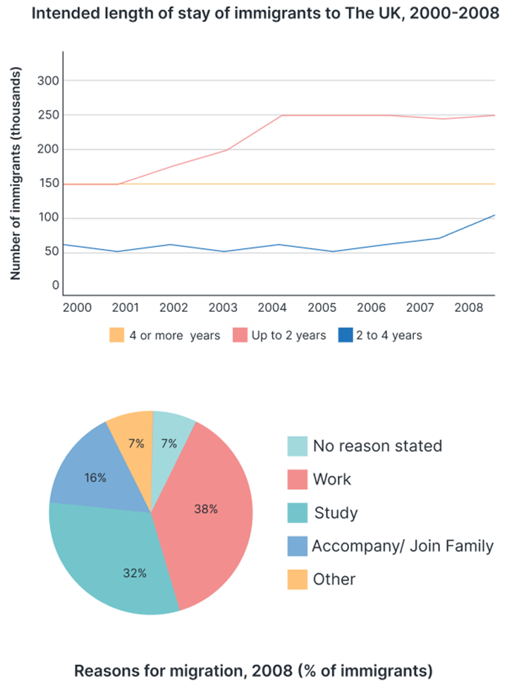
Sample 1:
The line graph represents immigrants' intended duration of stay in the UK from 2000 to 2008. The pie chart demonstrates the reasons behind migration to the UK in 2008.
In general, most immigrants planned to reside in the UK for a maximum of two years. In addition, work was the primary reason for migration to the UK in 2008.
In 2000, most immigrants aimed to reside in the UK for "up to 2 years" and "4 or more years" (both categories were around 150,000). The following years saw a substantial increase in the former category, peaking in 2004 (at roughly 250,000). In contrast, those intending to reside for four or more years had a stable figure throughout the period, fluctuating around 150,000. Lastly, in the same time frame, the number of immigrants planning to stay for 2 to 4 years ranged between 50,000 to 60,000, with a significant jump to 100,000 in 2008.
In 2008, the pie chart delineates that work and study were the most prominent reasons for migration, accounting for 38% and 32% of all immigrants, respectively, while accompanying or joining the family constituted only 16%. Finally, unlisted reasons and non-respondents both comprised 7% each.
Sample 2:
The graphs present data on migration to the UK. The pie chart demonstrates the purposes for migration in 2008, while the line chart indicates the duration of expected stays from 2000 to 2008.
Overall, the line graph reveals that the majority of immigrants expected to stay in the UK for no more than two years. According to the pie chart, work was the key cause of migration in 2008.
In 2000, the number of immigrants in the “up to 2 years” and “4 or more years” categories were equal at 150 thousand. However, in 2001, the number of immigrants intending to migrate for up to 2 years considerably increased, peaking at 250 thousand in 2004. Meanwhile, the amount of people planning to resettle for 4 or more years remained relatively stable, hovering about 150 thousand. Also, between 50 and 100 thousand immigrants are expected to stay for 2 to 4 years throughout the period.
The pie chart reveals that 38% of all immigrants came for work, making it the most prominent factor. Study ranked second, accounting for 32% of all immigrants, followed by accompany/join family at 16%. Other reasons and those who did not respond both made up 7% of the total.
Sample 3:
The two illustrations provide insights into immigration trends in the UK between 2000 and 2008, focusing on duration of stay and motivation for relocation.
The data reveals that short-term stays, up to two years, were the most prevalent, with job opportunities being the predominant reason for moving.
Looking closely at the graph, it is evident that short-term immigrants constituted the largest segment. Initially, this group was around 150,000 strong in 2000, swelling steadily to peak at 250,000 by 2004, with this figure remaining static until 2008. In contrast, immigrants intending to stay for four years or longer maintained a consistent population of 150,000 throughout the period. Meanwhile, a smaller group, planning a two to four-year stay, showed the modest growth from 50,000 in 2000 to 100,000 in 2008.
Switching to the chart, it is clear that employment opportunities were the primary draw for migrants, accounting for 38% of the total. This was 6% higher than those immigrating for education. Family reunification prompted 16% of migrations, with the remaining 14% split evenly between unspecified reasons and other causes.
Sample 4:
The pair of depictions offer an in-depth look at immigration patterns in the United Kingdom from the start of the millennium until 2008, cantering on the length of stay and the impetus for making the move.
An analysis of the data divulges that transitory residences, not surpassing a two-year span, held the majority, with vocational prospects emerging as the chief rationale for relocation.
Upon examining the information about migration to the UK, it's apparent that transient immigrants comprised the largest demographic. Initially, this contingent held a strength of approximately 150,000 in the year 2000, experiencing a steady augmentation to reach its zenith at 250,000 by 2004. Intriguingly, this number remained constant until the end of the recorded period in 2008. In stark opposition, immigrants harbouring intentions to establish a home for a period of four years or beyond maintained a persistent count of 150,000 over the course of the observed timeline. Conversely, a minority group, envisioning a stay extending from two to four years, demonstrated a moderate escalation from 50,000 in 2000 to 100,000 by 2008.
Shifting attention to the pie-chart, it becomes unequivocally evident that the lure of employment opportunities served as the paramount magnet for migrants, accounting for a notable 38% of the entire pool. This was a full 6% greater than those electing to immigrate for academic advancement. The motive of family reunification spurred 16% of these translocations, leaving the remaining 14% to be equally distributed between undetermined reasons and various other triggers.
Summarise the information by selecting and reporting the main features, and make comparisons where relevant. Write at least 150 words.
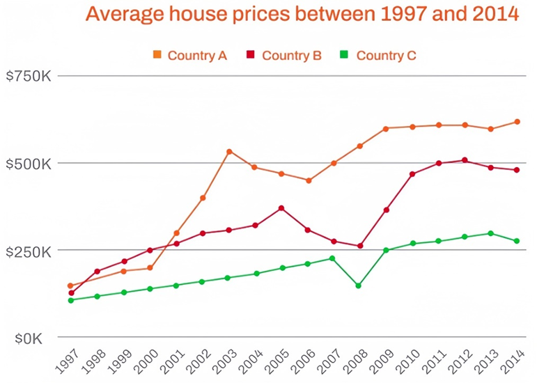
Sample 1:
The graph demonstrates the average house prices in three countries, A, B, and C, from 1997 to 2014.
Over the time period, average housing prices in all three countries had generally climbed. Additionally, for the vast majority of the period, country A’s average house cost was greater than those of countries B and C.
Country A’s average property cost increased considerably from $130K in 1997 to $510K in 2003. Housing prices, however, witnessed a minor fall of $80K between 2003 and 2006, followed by a gradual recovery until 2014, when prices peaked at $625K.
In 1997, the average property price in countries B and C was approximately $125,000. Yet, by 2005, the average house price in country B rose to around $375K, whereas prices in country C only increased to around $250K by 2007. Prices in nation B were markedly lower from 2005 to 2008, then significantly higher until 2012, when prices fell to roughly $500K at the end of the period. Likewise, prices in country C declined until 2008, then climbed steadily until 2013 after slightly dropping to roughly $260K.
Sample 2:
The line graph depicts the average property prices in three nations, A, B, and C, from 1997 to 2014.
Overall, throughout the period, the average house price in each of the three nations increased but with some fluctuations. In addition, in most years, nation A had the highest figure.
In 1997, country A had the most expensive house price (around $180k). The following year, country B overtook country A’s position and was the first to reach $250k in 2000. However, just a year later, country A regained its top 1 rank and remained in this position for the remaining period. From 1997 to 2007, all countries had upward trends, but country A peaked in 2003 (around $530k) while country B peaked in 2005 (around $350k).
In 2008, countries B and C substantially dropped to $260k and $180k, respectively, before climbing back in 2009. Approaching 2014, all 3 countries hit their new high records approximately in 2012 and 2013. In 2014, countries A, B, and C ultimately finished at roughly $625k, $500k, and $260k, respectively.
Sample 3:
The line chart illustrates variations in average house prices in Countries A, B and C from 1997 to 2014. Overall, house prices in all the countries experienced an upward trend, with houses in Country A being the most expensive by the end of the period. Also noticeable is that housing prices in Country B had a similar pattern to Country C albeit always higher.
Looking initially at Country A, although house prices started the highest at about $140000, they were overtaken by Country B in 1998, but soon regained the leading status after 2 years. From 2000, prices soared almost continually, reaching a high point of roughly $625000 in 2014, despite a notable dip from 2002 through to 2006.
Regarding housing prices in Country B and C, both maintained relatively stable growth throughout. The prices in these countries both began at approximately $125000, but since 1998, the gap started to widen. Country B rose dramatically, reaching its high of just over $500000 in 2012 while the other country peaked at about $300000 in 2013. Interestingly, both countries saw a huge drop in 2008 and a marginal decline at the end of the period.
The table shows the number of exchange students from universities in Europe to Australia and vice versa.
Summarise the information by selecting and reporting the main features, and make comparisons where relevant. Write at least 150 words.
Exchange students from universities in Europe to Australia | ||
Countries | 2007 | 2009 |
France | 61 | 60 |
Sweden | 32 | 42 |
United Kingdom | 31 | 25 |
Germany | 27 | 63 |
The Netherlands | 36 | 36 |
Total | 186 | 226 |
Exchange students from universities in Australia to Europe | ||
Countries | 2007 | 2009 |
France | 37 | 58 |
Sweden | 33 | 27 |
United Kingdom | 32 | 23 |
Germany | 18 | 26 |
The Netherlands | 32 | 18 |
Total | 152 | 152 |
Sample 1:
The following tables demonstrate the amount of exchange students from European universities to Australian universities and vice versa.
Over the period, the total number of exchange students from universities in Europe to Australia climbed significantly, whereas the total number of exchange students from Australia to Europe remained stable.
Examining the number of exchange students from European colleges to Australia, it is discovered that the number of French students decreased from 61 in 2007 to 60 in 2009. In contrast, Germany saw a substantial growth from 27 students in 2007 to 63 students in 2009. The Netherlands, on the other hand, remained unchanged at 36 exchange students throughout the two years.
Considering the number of Australian university exchange students in Europe, the data indicates that France and Germany both experienced a noticeable increase. The number of students in France went from 37 to 58, and the number of students in Germany increased from 18 to 26 over the period. In contrast, the number of exchange students in the Netherlands decreased significantly from 32 in 2007 to 18 in 2009.
Sample 2:
The provided tables present the figures regarding the exchange of students between European and Australian universities during the given period.
Overall, there was a surge in the total count of exchange students from European to Australian institutions. Conversely, the total number of students going from Australian universities to European counterparts remained relatively constant.
Analyzing the exchange of students from European universities to Australian institutions, the total number increased from 186 to 226 students. France led in the count of exchange students with 61 individuals in 2007, which slightly reduced to 60 by 2009. The Netherlands maintained stability with 36 students across both years. Conversely, the United Kingdom experienced a decline from 31 to 25, while Sweden and Germany displayed an opposing trend, rising from 32 and 27 to 42 and 63, respectively, by 2009.
Shifting focus to Australian university students participating in exchange programs in Europe, the total number sustained at 152 students. France remained the highest contributor of exchange students in both 2007 and 2009, recording 37 and 58 students, respectively. Germany also exhibited a similar upward trend, albeit with lower initial figures (18 to 26). In contrast, Sweden, the United Kingdom, and the Netherlands reported nearly identical numbers (33, 32, and 32, respectively) in 2007, and observed decreases in student numbers by 6, 9, and 14 in 2009.
Sample 3:
The tables provide data on how many students were exchanged between European and Australian universities.
Overall, while the total number of exchange students from Europe to Australia rose, the reverse shows no changes. Additionally, in 2009, Germany had the highest number of exchange students in the first table, whereas France held this position in the second table.
Regarding the first table, although France had the largest number of exchange students (61) in 2007, it marginally declined to 60 in 2009. The Netherlands had a similar trend where it stayed exactly stable at 36 for both years. Finally, while the United Kingdom plummeted from 32 to 23, Sweden and Germany had the opposite trend, reaching 42 and 63, respectively, in 2009.
The second table shows France had the most exchange students in 2007 and 2009, 37 and 58, correspondingly. Germany also had a comparable growing trend, with lower numbers (18 to 26). In comparison, Sweden, the United Kingdom, and the Netherlands almost had identical figures (33, 32, and 32, respectively), and they all witnessed decreases in 2009.
The chart below shows the expenditure on three categories among different age groups of residents in the UK in 2004.
Summarise the information by selecting and reporting the main features, and make comparisons where relevant. Write at least 150 words.
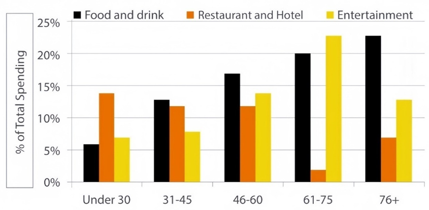
Sample 1:
The bar graph compares the spending patterns of five age cohorts on different products and services in the UK in 2004. Overall, there was a general trend of increasing expenditure on food and beverages with age. Additionally, while the proportion of total spending on dining and hotel accommodation dipped in the 61-75 age group, this bracket allocated the highest share on leisure activities.
Regarding food and drink, the over 76-year-olds ranked 1st as roughly 23% of their spending was allotted to this category. This was followed by the 61-75, 46-60 and 31-45 age groups at precisely 20%, approximately 17% and 13%, respectively.
Concerning eateries and hotels, the youngest cohort of under 30 spent the highest share at nearly 15%, which was minimally greater than comparable figures for the 31-45 and 46-60 age brackets, at around 13%. The oldest people expended about 7% whereas residents aged 61-75 had the lowest rate at below 3%.
Turning to recreation, residents aged 61-75 spent the most, at over 23%. Furthermore, citizens under 30 and 31-45 years old shared an equivalent proportion of approximately 7%, which was about half the budget of the 46-60 and over 76 age groups.
Sample 2:
The bar chart depicts the expenditures in three categories by age group for UK residents in 2004.
Overall, as the age increases, food, drink, and entertainment expenditure gradually rose. However, while food and drink kept climbing with age, entertainment spending peaked for the 61-75 age group before declining for the age 76+.
Regarding food and drink, the figure started at only over 5% for the age group under 30 and consistently increased with age. Ultimately, this category reached its highest percentage for the 76+ group, at roughly 23%. As for entertainment expenditure, its figure grew similarly with age, from around 6% (age group 30) to approximately 23% (age group 61-75). Despite this, entertainment suddenly dropped by 10% for the 76+ group.
Turning to restaurant and hotel expenditure, the age group under 30 had the most significant proportion (almost 15%) out of the three categories. As the age increases, the figure declined slightly to 12% (aged 46-60) before plummeting to only 2% (aged 61-75). For the oldest age group, restaurant and hotel bounced back to roughly 6%, but the category was still the lowest.
Sample 3:
The bar chart gives information about how people in five different age groups in the UK spent their budgets on three different categories in 2004.
Overall, people allocated a greater percentage of their budgets to food and drinks and entertainment as they aged, while the opposite was the case for restaurants and hotels.
Looking first at spending on food and drinks, people under 30 spent the least on it, allocating only 6% of their budgets to this category, and spending on it steadily rose through the age groups, with the oldest group, aged over 76, spending 23% of their money on it.
Restaurants and hotels made up the largest share of the youngest group’s budget, at 13%. The 31-45 and 46-60 age brackets allocated similar proportions to dining out and staying in hotels, both at around 12%. By contrast, 61-to-75-year-olds spent just 2% on doing so, around a quarter of the figure for those over 76.
Spending for entertainment purposes rises with age, except for the oldest group, as spending rose from 7% by the under 30s to 23% spent by the 61-75 age group. However, people over 76 spent much less, at only 13% of their total budget.
Sample 4:
The bar chart illustrates the distribution of expenditures across various categories in the United Kingdom in 2004.
Overall, the elderly population allocated the majority of their budget to food, drink, and leisure activities, while younger individuals prioritized dining out and socializing.
Individuals aged 46 to 60 and over 76 spent the most on food and drink, accounting for approximately 17% and 23%, respectively. They also spent a considerable portion of their budget on leisure activities, with just under 15% for the former group and approximately 13% for the latter. In contrast, those aged 61 to 75 spent the most on entertainment activities, accounting for 23% of their budget, followed by food and beverages, which constituted 20%. The three groups spent the least on restaurants and hotels, with all spending less than 12%.
Moving on to the spending patterns of individuals aged 31 to 45, this cohort predominantly dedicated their financial resources to food and hotels, with both categories accounting for approximately 13%. However, they spent the least on leisure activities, with just under 7%. In contrast, individuals under 30 prioritized hotels and restaurants, allocating just under 15% of their budget. This figure was double that of their expenditure on food and drink and entertainment, which accounted for just over 5%.
Sample 5:
The bar chart delineates the percentage of expenditure distribution for different categories in the United Kingdom in 2004.
Overall, seniors spent most of their money on food and drink and leisure activities, while individuals under 30 paid significantly for dining and staying out.
People aged 46 to 60 and over 76 spent the most on food and drink, with approximately 17% and 23%, respectively. This was followed by the total spending on spare time interests, with just under 15% for the former group and about 13% for the latter. The proportion of the money paid for entertainment activities by those at 61 to 75 years old constituted 23%, while that of food and beverages ranked second, with 20%. The three groups spent the least on restaurants and hotels, with all under 12%.
31 to 45-year-old adults mainly paid for food and hotels with merely 13% each, whereas they spent the least on pastime hobbies with nearly 7%. Those under 30 used their expenditure for hotels and restaurants the most, with just under 15%, which doubled the figure for food and drink and entertainment with just over 5%.
Sample 6:
The graph demonstrates the expenditures on three categories, namely food and drink, restaurants and hotels, and entertainment, by various age groups of UK residents in 2004.
Overall, the data indicates that food and drink expenditures increase with age. Also, food and drink expenses were the highest for the majority of age groups, followed by restaurant and hotel expenses and entertainment.
Regarding the specific category of food and drink, those aged 76 and older incurred the highest expenditures, approximately 23% of the total amount. The age group under 30 had the lowest expenditures, accounting for only 6% of total expenditures.
On the other hand, the age group under 30 had the highest restaurant and hotel expenditures, at 14% of the total, while the age group 61-75 had the lowest, at 2% of the total. In contrast, the percentage of total spending allocated to entertainment was highest for those aged 61 to 75 and lowest for those aged under 30, at 23% and 7% respectively.
Sample 7:
The expenditures for UK citizens in 2004 are shown in a bar chart broken down by age group into three categories. Overall, spending on food, drink, and entertainment increased gradually as people became older.
The amount of money spent on entertainment facilities varied depending on the group. Communities aged 61 to 75 prioritized this area, allocating roughly 23% of their total spending on it. However, people under 30 paid little attention to these kinds of activities, allocating only 6% of their budget to them.
Records indicate that the average person between the ages of 61 and 75 spent less than 5% of their income on dining out and lodging. On the other hand, almost 10% of the budgets for these locations came from the 31 to 45 and 46 to 60 age groups.
Sample 8:
The given bar charts reveal the percentage of citizen’s expenditure divided into three categories: food and drink, restaurant and hotel, and entertainment among the different age groups in the UK in 2004.
Overall, after 60 years the most expenditure was food and drinks as well as entertainment whereas, hotel and restaurant were on least. Age by age we can clearly see the rise in food and drinks although restaurant and hotel were fallen except 76.
For people under 30, the percentage of food, drinks and entertainment was roughly the same as 6 while for restaurant and hotel it was 14%. For 31 to 45 group, English people expenditure was above tenth on food and drinks and restaurants and hotels, but 7% was on entertainment. Between 46 to 60 pages, 16% and 14% were for food and entertainment, restaurant and hotel proportion was same as last mentioned groups.
The peak expenditure proportion was just below a quarter for entertainment and food categories among people above 61 ages. However, the lower was only 2% on restaurant and hotel for above 61, and below 75 ages additionally, A fifth had food and restaurants. Over 75 groups, entertainment proportion was double that of restaurant and hotel.
Sample 9:
The presented graph displays the expenditures made by UK residents in 2004 on three categories: food and drink, restaurants and hotels, and entertainment, across different age groups.
Overall, the data suggests that expenses on food and drink tend to increase with age. Moreover, food and drink costs were the highest for most age groups, followed by expenses on restaurants and hotels and entertainment.
In terms of food and drink expenses, individuals aged 76 and above had the highest expenditures, accounting for approximately 23% of the total amount. Conversely, the age group under 30 had the lowest expenses, contributing only 6% of the total expenditures.
On the other hand, the age group under 30 had the highest expenditure on restaurants and hotels, representing 14% of the total, while the age group 61-75 had the lowest, accounting for only 2% of the total. In contrast, the percentage of the total spending allocated to entertainment was highest for those aged 61 to 75, at 23%, and lowest for those aged under 30, at 7%.
Sample 10:
The given bar chart illustrates the percentage of money that people from five age brackets in the UK spent on three categories in 2004.
Overall, while people under 45 spent more on restaurants and hotels, the opposite is true for the three other age groups. Moreover, those older than 46 poured more money into food and drinks as well as entertainment.
As regards the youngest age group, they spent about 6% on eating and drinking, which was half of that of the 31-45 ones. It is obvious that restaurants and hotels and entertainment accounted for around 13% and 7% respectively of people under 45’s expenditure.
For the other groups, they spent the least on restaurants and hotels. In particular, the percentage of the 46-60-year-old citizens was around 12%, compared to 2% and 7% of that of the 61 to 75 and over 76 group respectively. Meanwhile, people from 61-75 years old spent about 24% of their money on entertainment, which was twice as high as that of two other groups. Moreover, the data for food and drinks of the three oldest age brackets were also relatively high with the respective figures at around 17%, 20% and 23%.
Sample 11:
The given bar chart illustrates how people of different age groups in the United Kingdom spent their money on three distinct categories in the year 2004.
Overall, the older the citizens were, the more they spent on Food and drink and Entertainment. It is also noticeable that senior citizens aged 61 and above expended the least on services in restaurants and hotels.
In terms of Food and drink, the over 76-year-olds ranked first among all age groups with the proportion of spending on this category being 23%, which was slightly higher than the figure for people who were 61 to 75 years old. This was followed by the 46-60 and 31-45 age groups, who put aside around 15% of their total spending on food and drink. However, people aged 30 and younger only allocated a marginal amount of 6% of the expenditure for the category.
Regarding the other two categories, while the youngest group spent the highest share on restaurants and hotels at almost 15%, people in the age range of 61 to 75 only paid little for this, at merely around 2%. In contrast, the latter expended the largest rate of spending on recreational activities, at well over 20%. Additionally, there was a similar percentage in the expenses on entertainment of the two age groups 46-60 and 76+, at approximately 13% each.
Sample 12:
The given column graph compares the amount of money spent by five age groups of the British citizens on three different items, in the year 2004. It is interesting to note that the spending on food and drinks was the least by the under 30s, and the highest by the above 76 age group.
It is noticeable that the largest proportion of spending went on food and drinks in most age groups, except for the under 30s and those between 61 and 75 years of age. Expenditure on restaurant and hotel was almost similar among all age groups below 60 years. They spent 12- 14% on this sector. The 61-75 and the 76+ age groups spent 2% and 7% respectively on restaurant and hotel. The under 45s spent less on entertainment than on restaurant and hotel, but the vice versa was true for all the other given age groups. The 61–75-year-olds, showed the highest discrepancy in their spending on these two areas. They spent 2% and 23% on restaurant and hotel, and entertainment respectively.
Overall, it is observed that as age advanced, the spending priorities of people changed. Older age groups spent more on food and drink and entertainment. However, the 76+ age group did not give much importance to entertainment.
Sample 13:
The provided bar chart illustrates the spending patterns across three distinct categories among UK residents in 2004, segmented by age groups.
In general, there is a noticeable upward trend in expenditures on food, drink, and entertainment as age advances. However, expenses on restaurants and hotels exhibited a declining trajectory.
Regarding food and drink expenditures, the percentage began at slightly over 5% for the under-30 age group and steadily rose with each older age bracket. Ultimately, this category reached its zenith for the 76+ age group, comprising approximately 23% of expenditures. In contrast, entertainment spending exhibited a similar trajectory, increasing from roughly 6% (age group 30) to approximately 23% (age group 61-75). Nevertheless, there was a sudden 10% drop in entertainment spending within the 76+ age group.
Turning to expenses on restaurants and hotels, the under-30 age group allocated the largest proportion, nearly 15%, among the three categories. However, as age increased, this figure witnessed a gradual decline, reaching 12% for the 46-60 age group before plummeting to a mere 2% for the 61-75 age group. Among the oldest age group (76+), expenditure on restaurants and hotels experienced a slight rebound, reaching approximately 6%, yet it remained the lowest proportion among the categories.
Sample 14:
The bar chart illustrates the expenses on three types of daily consumption by various age groups in the UK during the year 2004.
Overall, different age groups presented distinct daily consumption habits. While residents under 30 years old spent most on restaurant and hotel, the 60-75 age group on entertainment; other groups, however, tended to allocate the majority of their expenses to food and drink.
Regarding the spending related to food and drink, the percentage generally rose as age increased, starting from approximately 5% for those under 30 to nearly a quarter for individuals over 75.
A similar pattern emerged in the cost of entertainment, where the proportion also grew with age, from 5% to the peak at 23% for the 60-75 group and dropped to 13% for the 75+ group.
Conversely, it is noticeable that the older people were, the less they spent on restaurant and hotel. The expenditure reached the highest point at nearly 15% for the youngest, remained relatively constant at 12% for the 30-75 years old, and dropped to 7% for those over 75.
Summarise the information by selecting and reporting the main features, and make comparisons where relevant. Write at least 150 words.
| Amount in litres | ||
Nations | 1990 | 2000 | 2010 |
Netherlands | 11,262,000 | 11,155,000 | 11,466,000 |
Australia | 11,246,000 | 11,105,000 | 9,165,000 |
Tanzania | 87,000 | 142,000 | 155,000 |
Guatemala | 26,000 | 55,000 | 84,000 |
Sample 1:
The table illustrates the yearly production of milk in the Netherlands, Australia, Tanzania, and Guatemala in 1990, 2000 and 2010.
Overall, in 1990, Netherlands and Australia had the highest milk output with almost identical volumes. In 2010, however, Australia was the only country witnessing a downward trend while other countries increased.
Considering the Netherlands and Australia, the two leading countries in 1990, milk production in these nations began at almost the same level (11.262 million and 11.246 million). In the decade that followed, the populations of both countries decreased by around 100,000. In 2010, the Netherlands regained first place by increasing to 11,466,000 liters, while Australia continued to decline further to 9,165,000 liters.
In contrast, Tanzania and Guatemala started with much lower milk production figures in 1990, with 87,000 liters and 26,000 liters, respectively. However, over the next twenty years, both countries experienced a significant surge in milk production, with Tanzania nearly doubling its production to 155,000 liters, and Guatemala almost tripling its production to 84,000 liters.
Sample 2:
The table compares four nations in terms of annual milk production in 1990, 2000, and 2010.
In general, the Netherlands does not show a remarkable increase in its production of milk, although this country outdid the others. Noticeably, while the data for Australia displays a decline, that for Tanzania and Guatemala indicates extensive increases.
As mentioned, the Netherlands, albeit the largest milk producer, did not grow significantly. The figures record that it dropped by 107,000 liters in the first decade, and although it climbed back to 11,466,000 liters in the following decade, the gap between the initial and final levels is relatively insignificant. Starting at roughly the same level as the Netherlands in 1990, Australia even plummeted by approximately 2,000,000 liters by 2010.
Tanzania and Guatemala both show a rise, but while figures for the former increased nearly twofold (87,000–155,000 liters), those for the latter almost quadrupled (26,000–84,000 liters). Despite that, Guatemala still remained in the lowest rank during the given period.
Sample 3:
The data given in the table shows the changes in the annual production of milk in four different nations during 1990, 2000 and 2010.
In general, while the production of milk annually in Netherlands, Tanzania and Guatemala showed an increasing trend, that of Australia declined over the given period. Netherlands was the largest producer of milk throughout the period.
In 1990, the annual production of milk was higher in Netherlands than in other countries and it produced 11,262,000 litres of milk. This production rate dropped moderately to 11,155,000 litres in 2000 before showing a significant rise to 11,466,000 litres in 2010. Tanzania’s milk production annually was much lower than Netherlands. Its production inclined noticeably from 87000 litres in 1990 to 155,000 litres in 2010. Likewise, the quantity of milk produced in Guatemala showed an upsurge to more than double in 2000 and reached 55,000 litres from 26,000 litres in 1990, thereafter it considerably improved to 84,000 litres in 2010.
In contrast, the annual milk production rate in Australia showed a steady drop from 11,246,000 litres in 1990 to 9,165,000 litres in 2010 after reaching 11,105,000 in 2000.
Sample 4:
The table demonstrates the annual milk production of four countries, namely Tanzania, Guatemala, Australia, and the Netherlands in the years 1990, 2000, and 2010.
Overall, the data reveals a significant increase in milk production for Tanzania and Guatemala during the given period. The Netherlands remained the top milk producer among the countries, while Guatemala recorded the lowest milk production.
Looking specifically at Tanzania and Guatemala, Tanzania’s milk production rose from 87,000 liters in 1990 to 155,000 liters in 2010, while Guatemala’s increased from 26,000 liters in 1990 to 84,000 liters in 2010. Despite these improvements, both countries still recorded the lowest milk production compared to Australia and the Netherlands.
On the other hand, Australia’s milk production decreased noticeably between 1990 and 2010, from 11,246,000 liters to 9,165,000 liters. In contrast, milk production in the Netherlands increased slightly from 11,262,000 liters in 1990 to 11,466,000 liters in 2010, which made it the biggest milk producer among the four nations.
Sample 5:
The given table illustrates the yearly production of milk in the Netherlands, Australia, Guatemala and Tanzania in 1990, 2000 and 2010. A cursory glance at the graph is enough to make it clear that the maximum production of milk was in the Netherlands throughout the given period.
The Netherlands produced 11,262,000 litres of milk in 1990, but in 2000, the production fell slightly to 11,155,000 litres, but after that it picked up again and reached an all time high of 11,466,9000. Australia was closely behind the Netherlands in the production of milk in 1990. It produced 11,246,000 litres of milk in 1990, but the production fell gradually and reached 9,165,000 litres by 2010. Tanzania, and Guatemala increased their milk production from 87,000 and 26,000 in 1990 to 155,000 and 84,000 litres respectively in 2010. The least milk production was in Guatemala throughout the period of twenty years. However, the biggest proportionate increase was also seen in Guatemala as the milk production more than doubled from 1990 to 2000.
Overall, the production of milk increased in all given countries except for Australia, where it decreased over the given period of two decades.
Sample 6:
The table illustrates annual milk production volumes in the Netherlands, Australia, Tanzania, and Guatemala over a span of two decades, specifically the years 1990, 2000, and 2010.
Overall, this period marked a notable increase in milk production for the Netherlands, Tanzania, and Guatemala, with only Australia showing a reduction. The data highlights not only the dominance of the Netherlands and Australia in terms of volume but also the significant growth trajectories of the emerging producers, Tanzania and Guatemala.
It is evident that the Netherlands and Australia were leading producers, with their figures markedly surpassing those of Tanzania and Guatemala. Initially, in 1990, both countries reported production slightly exceeding 11 million litres. However, by the turn of the millennium, a modest dip occurred in the Dutch figures, followed by a rebound to 11.5 million litres in 2010, indicating a resilient dairy sector. In contrast, Australia experienced a gradual decrease over the 20-year period, concluding with 9.2 million litres, reflective of a sustained downward trend.
Tanzania, starting from a modest base of 87,000 litres, saw a substantial proportional increase over the next twenty years, reaching 155,000 litres by 2010. This growth, although significant, pales in comparison to Guatemala, which, despite starting as the smallest producer at 26,000 litres, expanded production more than threefold, culminating at 84,000 litres.
Sample 7:
The table provides a comparative analysis of the production of milk annually in four countries: the Netherlands, Australia, Tanzania, and Guatemala, at three pivotal points in time - 1990, 2000, and 2010.
Overall, the Netherlands and Australia dominated the production of milk annually, though with contrasting trajectories over the two decades. While the Netherlands showed resilience and an eventual increase in production, Australia’s figures declined steadily. Conversely, Tanzania and Guatemala, starting from lower production levels, exhibited substantial relative increases by 2010.
In detail, the Netherlands started with a production of 11,262,000 litres in 1990, which slightly decreased to 11,155,000 litres in 2000, before rising to 11,466,000 litres in 2010. Australia, on the other hand, saw a gradual decline from an initial production nearly identical to the Netherlands at 11,246,000 litres, descending to 11,105,000 litres in 2000, and further down to 9,165,000 litres by the end of the period.
Shifting focus to Tanzania and Guatemala, both countries' dairy sectors were marked by growth. Tanzania's production was a mere 87,000 litres in 1990, which then experienced more than a seventeen-fold increase to 155,000 litres in 2010. Guatemala, despite producing the least milk initially, at 26,000 litres, managed a significant escalation in its dairy industry, with production climbing to 84,000 litres in 2010, demonstrating more than a threefold increase.
Sample 8:
The provided table delineates the annual milk production in the Netherlands, Australia, Tanzania, and Guatemala during the years 1990, 2000, and 2010.
Overall, both the Netherlands and Australia emerged as the leading milk producers. Australia was the sole country witnessing a decline in milk production, while the other nations experienced an upward trajectory.
Examining the Netherlands and Australia, the top producers in 1990, both commenced their milk output at nearly identical levels, standing at 11.262 and 11.246 million liters, respectively. Subsequently, over the ensuing decade, both countries encountered a marginal decrease in production by approximately 100,000 liters. However, in 2010, the Netherlands reclaimed the leading position by augmenting its production to 11,466,000 liters, whereas Australia continued its descent, plummeting further to 9,165,000 liters.
In contrast, Tanzania and Guatemala initiated the 1990 period with considerably lower milk production figures, registering 87,000 liters and 26,000 liters, respectively. Over the subsequent two decades, both nations underwent substantial expansions in milk production. Tanzania nearly doubled its production, reaching 155,000 liters, while Guatemala nearly tripled its output, reaching 84,000 liters by 2010.
Sample 9:
The table illustrates how annual milk production in various countries changed over three years, 1990, 2000 and 2010. Overall, the amount of milk increased in all countries except for Australia, whose milk yield dropped. It can also be seen that the Netherlands possessed the highest figure in all years.
In 1990, the Netherlands and Australia were dominant in milk production, with 11,262,000 and 11,246,000 liters, respectively. These numbers dwarfed those of the remaining countries, as Tanzania produced 87,000 liters, whereas Guatemala reported merely 26,000 liters.
Ten years later, the levels of the Netherlands and Australia had decreased slightly, but they remained close, at over 11 million liters. The other two countries’ yield, meanwhile, rose significantly, as Tanzania recorded 142,000 liters in 2000, and the figure for Guatemala doubled to 55,000. By 2010, the milk production in the Netherlands climbed to nearly 11,500,000 liters, which remained as the top figure that year. Australia’s milk yield, in contrast, dropped significantly to 9,165,000 liters, which amounted to four-fifths of the data in the Netherlands. The level for Tanzania increased to 155,000, and while Guatemala continued to rank in last place, this country experienced the largest margin of growth. There were 84,000 liters of milk produced in Guatemala in 2010, which was over three times its 1990 figure.
Sample 10:
The table compares milk production volumes of four countries over two decades.
In general, there was a decrease in the total output over the period surveyed, despite growth recorded for most of the countries.
More specifically, the top contributors were the Netherlands and Australia. Both countries recorded slightly over 11.2 million liters of milk yield in 1990, which declined by 107,000 liters and 141,000 liters, respectively, over the subsequent decade. By 2010, the former had bounced back to a record high (11,466,000 liters), while a 2-million-liter drop was documented in the latter.
Production volumes in the remaining two countries were much smaller despite substantial growth there. Despite having doubled its production capacity, Tanzania merely collected 155,000 liters, a little over one percent of the Dutch figure, in 2010. Smaller numbers were reported for Guatemala, where cows only generated 26,000 liters in 1990. Even after a threefold increase, milk yield here (84,000 liters) remained by far the lowest in 2010.
Sample 11:
The table presents data on the annual milk production in four countries, namely the Netherlands, Australia, Tanzania, and Guatemala, over the period from 1990 to 2010.
Overall, the table demonstrates that milk production in the Netherlands and Australia remained consistently high, although showing some fluctuation, while Tanzania and Guatemala experienced significant growth in their production.
The Netherlands and Australia were the top milk producers, with annual output exceeding 11 million liters in all three years. The Netherlands maintained a relatively stable production, ranging from 11,262,000 liters in 1990 to 11,466,000 liters in 2010. In contrast, Australia witnessed a slight decline in production from 11,246,000 liters in 1990 to 9,165,000 liters in 2010.
Tanzania and Guatemala displayed a contrasting pattern. While Tanzania’s milk production witnessed a substantial increase from 87,000 liters in 1990 to 155,000 liters in 2010, Guatemala experienced a gradual rise from 26,000 liters to 84,000 liters in the same period. This indicates a significant development in milk production in Tanzania compared to Guatemala.
Sample 12:
The table provides information about annual milk production in four nations at ten-year intervals from 1990 to 2010.
Overall, the Netherlands was reported to be the leading milk producer among the four. In addition, the production levels in Australia underwent a consistent fall, while those in the other countries showed a general upward trend after three decades.
The first impression from the data is that the Netherlands’ figures in 1990 and 2000, at over 11.2 million and 11.1 million litres, respectively, almost equated to Australia’s. Dutch milk production, after undergoing similar declines, rose to nearly 11.5 million litres in 2010, whereas Australian counterparts reduced their yield by almost 2 million.
Milk production in Tanzania and Guatemala was relatively modest compared to the aforementioned countries. Tanzania’s milk yield started at 87,000 litres and experienced a massive surge to exceed 1.5 million litres at the end. Seeing a less considerable rise, meanwhile, the amount of milk produced in Guatemala reached 84,000 litres in the final year from a starting figure of 26,000.
Sample 13:
The table charts compare the production of milk in the Netherlands, Australia, Tanzania, and Guatemala in the years 1980, 2000, and 2010 presented in liters. Overall, it is noticeable that Netherlands, Tanzania, and Guatemala followed an increasing trend, while there was a decrease in milk production in Australia over the given timeframe.
To begin with, the Netherlands had the highest milk output throughout the given years. In 1990, 11,262,000 liters of milk were produced in the Netherlands, with only a 46,000-liter difference in Australia. It dropped to 11,155,000 liters in 2000 before it showed a significant rise to 11,466,000 liters in 2010.
However, Tanzania produced much lesser milk than the Netherlands, with 87000 liters of milk in 1990, and it noticeably inclined to 1,55,000 liter in 2010; likewise, the production of milk in Guatemala witnessed an upsurge over the years, and an amount of 84, 000 liters was produced 2010.
In contrast, milk production in Australia showed a steady decline from 11,246,000 in 1990 to 9,165,000 in 2010 after reaching 1,42,000 in 2000.
Sample 14:
The table chart gives information about the manufacture of milk in four different nations (Netherlands, Australia, Tanzania, and Guatemala) between 1990 and 2010.
Overall, in terms, the Netherlands remained constant to the biggest produced throughout these periods, but in the second period, it dropped slowly. While decreasing milk liters in Australia compared to Tanzania and Guatemala, these intervals rapidly increase significantly.
On the one hand, by 1990, Netherlands and Australia had a rise in construction, about 11,262,000 – 246,000, respectively. By contracts, Tanzania creates 87,000 higher than Guatemala, whose liters about 26,000.
However, in 2000 milk production in the Netherlands had dropped slightly. Likewise, Australia had approximately 11,105,000 liters. Furthermore, (Tanzania and Guatemala) have increased substantially. During 2010 the Netherlands was growth to 11,466 000 liters, similar to Tanzania and Guatemala, had soared enormously to nearly 1,55,00 Tanzanian liters, and thus, 84,000 to other countries except for Australian manufacture of milk had declined to around 9,165,000.
Sample 15:
The graph provides data on how much milk was produced annually in the Netherlands, Australia, Tanzania, and Guatemala over three decades, from 1990 to 2010.
Overall, the amount of milk in the Netherlands, Tanzania, and Guatemala witnessed a rising trend, while the opposite was true for Australia. In addition, Guatemala consistently had the least milk production among the four given countries throughout the examined years.
In 1990, the Netherlands and Australia, which were the first and second leading countries, produced 1,1262,000 litres and 11,246,000 litres of milk, respectively. Although the Netherlands experienced a minor drop in milk production in 2000 to 11,155,000 liters in 2000, this figure witnessed a recovery of 11,466,000 litres in the following 10 years. In contrast, the figure for Australia bottomed out at 9,165,000 litres at the end of the period.
Tanzania and Guatemala began the examined period with a modest milk production of 87,000 litres for the former and 26,000 litres for the latter. Significantly, in the next two decades, both of these figures rocketed to peak at 1,55,000 litres and 84,000 litres in the same order.
The graph and chart below give information on the average daily maximum and minimum temperature in degrees Celsius and the average number of days with rainfall each month for two Australian cities.
Summarise the information by selecting and reporting the main features, and make comparisons where relevant. Write at least 150 words.
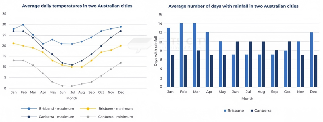
Sample 1:
The graphs show the average daily temperatures in two Australian cities and the average number of days per month with rainfall.
Overall, the minimum and maximum temperatures in Brisbane were higher than those in Canberra in general. Additionally, while the average daily temperature trends were similar between the two cities, with cooler weather occurring from April to September, the rainfall trends were opposite.
In Brisbane, the hottest average daily maximum temperature occurs in February, reaching around 30℃. Canberra’s hottest average maximum daily temperatures occur from December to February and reach approximately 27℃. The lowest average daily minimum temperature in both cities occurs in July, dropping to around 10℃ in Brisbane and 1℃ in Canberra.
Meanwhile, the highest average number of days with rainfall in Brisbane are in December to April, with the highest figures occurring in February and March at 14 days with rainfall per month. Canberra, on the other hand, experiences its rainiest months from June to August, at an average of 10 days with rainfall per month.
Sample 2:
The charts compare the lows and highs in average daily temperatures (°C) as well as the average number of rainy days during a year between two Australian cities, Brisbane and Canberra.
The statistics reflect that Brisbane is much warmer than Canberra. However, they both have in common that their temperatures tend to be higher in the first and last quarters of the year. As for rainfall, Brisbane generally experiences more rainy days than Canberra, except between June and October.
Maximum temperatures in Brisbane peak in February (30°C) and December (28°C), lowering towards June and July (21°C). Canberra’s warmest months also coincide with Brisbane’s, although the temperature is not as high (27°C). Nevertheless, in June and July, Canberra’s maximums (11–12°C) almost equal Brisbane’s minimums (10–11°C), while its minimums even get close to freezing point (1–2°C).
At its summit, Brisbane records up to 13–14 days of rainfall in the first quarter, while Canberra shows only half of that figure. In April, May, November, and December, the gap lessens, yet Brisbane’s figures (10–12) are still significantly higher than Canberra’s (7). Only from June to October does the reverse happen: Canberra experiences 8–10 days of rainfall compared to 7–8 days in Brisbane.
Sample 3:
The line graph juxtaposes the mean daily temperature in Brisbane and Canberra throughout a year, whilst the bar graph delineates the frequency of precipitation each month in these two cities.
It is readily apparent that Canberra experiences lower temperatures than Brisbane during both winter and summer. An intriguing observation is the higher incidence of rainfall in Brisbane's summer, whereas Canberra records a greater number of wet days in the winter.
Focusing on temperature, Brisbane witnesses similar patterns of daily maximum and minimum temperatures, approximately 27 and 25 degrees respectively, during the months of January and March. However, July records a notable disparity of 10 degrees. In stark contrast, Canberra maintains a steady monthly temperature variation of about 7 degrees, demonstrating a less pronounced fluctuation compared to Brisbane.
Turning to precipitation, Brisbane registers the highest frequency of rainy days in February and March with 14 days each, followed closely by January with 13 days and 12 days each in April and December. On the other hand, Canberra's weather pattern displays a distinct consistency from June to August, with each month experiencing 10 wet days. Interestingly, the rainfall days in Canberra in October align with Brisbane's November, equating to a third of the month.
Sample 4:
The line graph provides a comparative study of the average daily temperature fluctuations in Brisbane and Canberra over the span of a year, while the bar graph elucidates the frequency of rainy days on a monthly basis in the aforementioned cities.
Upon analysis, it is indisputable that Canberra is generally cooler than Brisbane during both winter and summer. Notably, Brisbane experiences a higher incidence of precipitation in the summer, whilst Canberra sees more rainy days in the winter season.
With regards to the temperature variations, the peak and the trough temperature during January and March in Brisbane are strikingly similar, at around 27 degrees and precisely 25 degrees respectively. Contrastingly, the greatest temperature variance is observed in July with a divergence of 10 degrees. Conversely, Canberra presents a uniform temperature difference of around 7 degrees each month, underscoring its lesser temperature fluctuation as compared to Brisbane.
In terms of precipitation, Brisbane endures the most rainfall with 14 rainy days in February and March, 13 days in January and 12 days in both April and December. However, Canberra sees a steady rate of rainfall from June to August, with each month recording 10 rainy days. Intriguingly, the occurrence of rainy days in Canberra in October mirrors that in Brisbane's November, tallying to approximately a third of the month.
Sample 5:
The graph and chart illustrate the average daily temperatures and the average number of rainy days between two cities in Australia: Brisbane and Canberra.
The data indicate that Brisbane is significantly warmer than Canberra. However, both cities share a similar temperature pattern, where the temperature tends to be higher in the first and last quarters of the year. In terms of rainfall, Brisbane generally has more rainy days than Canberra, except for the period between June and October.
Brisbane experiences its highest maximum temperatures in February (30°C) and December (28°C), which then decrease towards June and July (21°C). Similarly, Canberra's warmest months coincide with Brisbane's, although the temperature is not as high (27°C). However, in June and July, Canberra's maximum temperatures (11-12°C) almost match Brisbane's minimum temperatures (10-11°C), while its minimum temperatures can even reach a freezing point (1-2°C).
Brisbane has up to 13-14 days of rainfall in the first quarter, while Canberra only has half that figure. In April, May, November, and December, the difference between the two cities lessens, but Brisbane's figures (10-12) are still significantly higher than Canberra's (7). Only from June to October does the situation reverse, with Canberra experiencing from 8 to 10 days of rainfall compared to 7-8 days in Brisbane.
Sample 6:
The graph and chart provide information on the average daily temperatures in degrees Celsius and the number of rainy days per month for Brisbane and Canberra in Australia.
Overall, Brisbane has a higher temperature than Canberra all year round, with the highest temperature in Brisbane recorded in February. Brisbane experiences more rainy days each month from November to May, whereas Canberra has more rainy days from June to October.
Brisbane's maximum daily temperature reaches 30°C in February before dropping to 21°C in April. After rising to 23°C, it again falls to 21°C in June and July. In comparison, Canberra's temperature drops to approximately 11°C in July, only half of Brisbane's temperature. In the last five months of the year, both cities experienced an increase in temperature, with Brisbane reaching around 29°C and Canberra around 27°C in December. Regarding the minimum daily temperature, Brisbane starts at around 21°C in January and gradually decreases to 10°C in July and August before rising to 20°C at the end of the year. Canberra's minimum daily temperature follows a similar pattern, starting at 18°C in January, dropping to 1°C in June and July, and rising to approximately 12°C in December.
In addition, Brisbane experiences an increase in rainy days from 10 in November to 14 in February and March before decreasing to 10 in May. Canberra experiences around six rainy days per month for most of the year. From June to October, Brisbane has only 7 or 8 rainy days per month, while Canberra has 8 to 10 rainy days.
Sample 7:
The graph and charts compare the temperatures in degrees Celsius and the number of rainy days monthly in Brisbane and Canberra, Australia.
Despite similar periodic fluctuations, Brisbane’s maximum and minimum temperatures are consistently higher than Canberra’s. Moreover, the largest numbers of days with rainfall in Brisbane fall in the first half of the year, but an opposite pattern is recorded in Canberra.
Brisbane’s maximum and minimum temperatures start at 28 and 27 degrees, the gap of which widens from April to July and ultimately makes a striking difference of 10 degrees. The temperatures soar in the remaining months and similarly end at under 30 degrees. Meanwhile, Canberra’s statistics maintain a gap of 8-10 degrees throughout the period. Standing at 22 and 13 degrees in January, this city’s maximum and minimum temperatures experience a significant drop, reaching troughs of 10 degrees and 1 degree in July, before starting to rise again later in the year. Regarding the number of days with rainfall, Brisbane experiences 10-14 rainy days in the first five months, with the peaks recorded in February and March. After a plateau of 10 days between June and August, this figure reduces by three days in December. Meanwhile, Canberra experiences seven rainy days from January to September, with eight days in March being the exception. In the last quarter of the year, this figure sees a 50% surge to end at 12 days.
Sample 8:
The provided graph displays the average daily maximum and minimum temperatures in degrees Celsius (°C) for Brisbane and Canberra, while the accompanying chart illustrates the average number of days with rainfall in each city per month.
Overall, both cities experienced a decline in average daily temperatures from February to July. Brisbane consistently recorded higher temperatures than Canberra. Furthermore, Brisbane generally experienced a greater number of rainy days than Canberra, although Canberra showed a higher number of rainy days between June and October.
In January, both cities had similar average daily maximum temperatures, around 27°C. Brisbane reached its peak average daily maximum temperature of 30°C in February, while Canberra's remained relatively constant. From February to July, both cities experienced a decline in maximum temperatures; Brisbane's dropped to 21°C and Canberra's to 11°C. Subsequently, temperatures in both cities gradually rose, reaching 29°C in Brisbane and 27°C in Canberra by December.
Concerning rainfall, Brisbane saw a relatively constant number of rainy days, fluctuating between 12 and 14 days from December to March. This contrasted with a lower average of 7 days from June to September. Canberra, conversely, exhibited more stable rainfall patterns, with 7 or 8 rainy days from November to May, increasing to 10 days from June to August.
Country | 1990 | 2000 |
Bahamas | 235 | 187 |
Brazil | 55 | 13580 |
Cambodia | 1 | 1 |
Chile | 68 | 88 |
Jordan | 50 | 157 |
Luxembourg | 548 | 728 |
New Zealand | 531 | 557 |
Romania | 68 | 8012 |
Sample 1:
The table demonstrates how many automobiles every 1,000 people in eight different nations owned in 1990 and 2000.
Overall, there was an upward trend in all countries expect for Bahama and Cambodia. Meanwhile, Luxembourg always had the most cars while Cambodia had the least.
In 1990, the number of cars in Luxembourg and New Zealand was similar, at 548 and 531, which was twice higher than the figure for Bahama, at 235. For Chile and Romania, their numbers were exactly the same, at 68, while Brazil had five more vehicles than Jordan, at 55 and 50 respectively. Out of 1,000 inhabitants, there was only one vehicle in Cambodia.
By 2000, the number of cars in Jordan had seen a threefold rise, significantly to 157. Similarly, although the figures for Lusummala and New Zealand grew up to 728 and 557, their trends were just moderate. For Chile and Romania, they had the same growth to 88 and 80 in 2000. In contrast, Bahama was the only country experiencing a downward trend to 187 in 2000, and interestingly, the number in Cambodia did not change at all over the period in question.
Sample 2:
The table compares the amount of motor vehicles per 1000 people in eight different countries in 1990 and 2000.
Overall, Brazil and Romania saw huge increases in the rate of vehicles per population, while Cambodia had the lowest figures of all eight countries in both years.
In 1990, the highest rates of vehicles per 1000 people were found in Luxembourg and New Zealand, at 548 and 531 vehicles per thousand people respectively. The Bahamas followed, with 235 vehicles per 1000 people. Meanwhile, the figures for Brazil, Chile, Jordan, and Romania fluctuated between 50-68. Cambodia had the lowest figure of 1 vehicle per 1000 people.
By 2000, the figures for Brazil and Romania had increased more than tenfold, reaching 13,580 and 8012. Vehicle numbers in Luxembourg and Chile increased slightly, to 728 and 88 per 1000 people, while the figure for Jordan tripled. The figures for New Zealand and Cambodia stayed relatively the same, however the number of vehicles per 1000 people in the Bahamas dropped to 187.
Sample 3:
The chart illustrates the number of motorized vehicles per 1,000 citizens in 8 nations in 1990 and 2000.
Overall, the figure for Cambodia was consistently the lowest in the period. Moreover, the number of motorized vehicles increased in most countries, with Brazil and Romania experiencing the most significant rise.
In 1990, there were only 55 vehicles per 1,000 people in Brazil, ranking 5th among 8 countries, while the figure for Romania was also low at just 68, standing in 4th place. In the following decade, these numbers rose exponentially to 13,580 and 8,012 in that order, putting them in the first and second rank in the table. On the contrary, although in 1990 motor vehicles were most popular in Luxembourg and New Zealand, in 2000, they only stood at the 3rd and 4th place, registering an increase of just around 140 and 88 vehicles. The figure for Chile was slightly higher than that of Jordan in 1990, but within a decade, Jordan’s figure tripled to 157, overtaking Chile.
Bahamas and Cambodia were the only two nations left out of the upward trend in the rate of motorized vehicles. There was a fall of 48 vehicles per 1,000 people in the Bahamas while that of Cambodia remained unchanged at just 1.
Sample 4:
The table delineates the comparison of motor vehicle ownership per 1000 individuals across eight distinct countries in 1990 and 2000.
Overall, Brazil and Romania experienced surges in vehicle ownership rates, whereas Cambodia consistently reported the lowest figures among the surveyed nations across both years.
In 1990, Luxembourg and New Zealand boasted the highest ownership rates, standing at 548 and 531 vehicles per thousand individuals respectively. The Bahamas trailed closely behind at 235 vehicles per 1000 people. Conversely, Brazil, Chile, Jordan, and Romania exhibited figures ranging from 50 to 68. Cambodia registered the lowest ownership rate, merely 1 vehicle per 1000 people.
By 2000, Brazil and Romania demonstrated exponential growth, to 13,580 and 8012 vehicles respectively per 1000 people. New Zealand, Luxembourg, and Chile observed modest rises, recording 557, 728, and 88 vehicles per 1000 individuals, while Jordan tripled its previous figure. Conversely, the vehicle ownership rate in the Bahamas declined to 187 vehicles per 1000 people, and Cambodia was the unique nation with its figure maintaining unaltered and lowest.
The graph below shows the number of enquiries received by the Tourist Information Office in one city over a six-month period in 2011.
Summarise the information by selecting and reporting the main features, and make comparisons where relevant. Write at least 150 words.
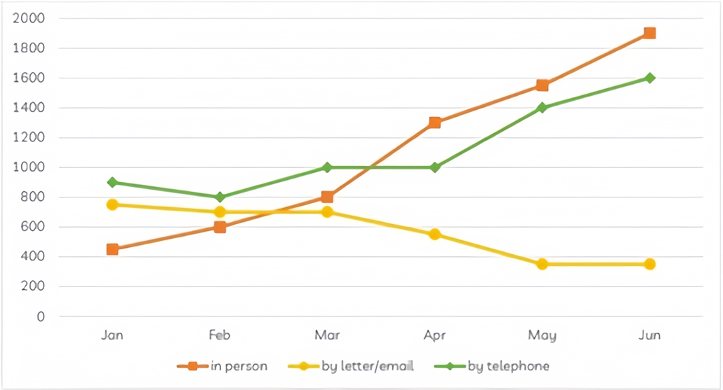
Sample 1:
The line chart illustrates the number of inquiries sent to the Tourist Information Office in a particular city through three means of communication between January and June of the year 2011.
It is clear that visitors to the city made more inquiries in person and via telephone, while letters or emails became a less common choice. Also, the number of enquiries in person experienced the most dramatic change among the given methods.
In the first month of 2011, the Tourist Information Office received 900 enquiries from telephone, while just under 800 ones were sent by letter or email. Not many tourists chose to ask for information in person, with just over 400 queries. Over the next three months, telephone still remained the most popular method with 1000 enquires. Meanwhile, the number of enquiries made in person saw a considerable growth to 800 of emails, surpassing the figure for email and postal enquiries.
From March to June, the office received significantly more enquiries in person. Just after four months, the number of enquiries by this way soared by more than 1,000 to peak at 1,900 in June. The period also recorded a significant rise to 1,600 in the figure for telephones. By contrast, fewer people sent emails or letters to make enquires and the number ended at the lowest point of only under 400.
Sample 2:
The line chart illustrates the number of inquiries sent to the Tourist Information Office in a particular city via three means of communication, between January and June in 2011.
It is clear that visitors to the city made more inquiries in person and via telephone, while written letters and emails became the least common choices. Additionally, the number of enquiries in person experienced the most dramatic change among the different options.
In January, the Tourist Information Office received 900 telephone enquiries, while just under 800
letters and emails were received. Not many tourists chose to ask for information in person, with just over 400 queries. Over the next three months, the telephone still remained the most popular method of enquiry, at approximately 1000 queries.
Meanwhile, the number of enquiries made in person saw considerable growth to 800, surpassing the figures for emails and postal enquiries. From March to June, enquires in person were the most
common method of inquiry. By June, the number of in person enquires soared by more than 1,000 to peak at 1,900. During this period, there was also a significant rise in the figure for telephone enquiries, from 1000 to 1600. By contrast, fewer people sent emails or letters to make enquiries, with slightly less than 400 enquiries in May and June.
Sample 3:
During the first six months of 2011, the line graph compares the number of questions received by one particular Tourist Information Office via three different channels: telephone, letter/email, and direct communication. Overall, the office received significantly more inquiries via phone and directly from tourists, as opposed to a gradually declining preference for mailing platforms over the time period provided.
Tourists called the office with about 900 questions, which was the highest number in January. This figure then fell by 100 in February and March before rising to 1000 in March and April, followed by a sharp increase to around 1600 inquiries in June. Similarly, the number of in-person inquiries increased the most, from 450 to 1900, making face-to-face communication the most common method of obtaining travel information.
The trend in written inquiries was the polar opposite. After remaining relatively stable at around 700 questions for the first three months, the number dropped to just 350 questions in May and June.
Sample 4:
The graph demonstrates the quantity of questions received by the Tourist Information Office in one city over the first half of the year 2011. Overall, the number of enquiries received in person or by telephone each month increased over this period, whereas this figure decreased for enquiries received by letter or mail.
In January of 2011, it can be seen that enquiries in person were the fewest, at around 400 that month, compared to around 900 by telephone and 780 by letter or email. However, by June, while this number of enquiries for in person and by telephone has risen to 1900 and 1600 respectively, it has fallen to less than 400 by letter or mail.
It can also be seen that in person enquiries increased every month, surpassing enquiries by letter or email for the first time in March, and enquiries by telephone for the first time in April. Meanwhile, the number of enquiries by letter or email was uniformly lower than that by telephone across the period, with the gap between the two widening from around 100 in January to more than 1200 in June.
Sample 5:
The given line graph illustrates how many inquiries were received via different means by the Tourist Information Office in a particular city from January to June in 2011.
Overall, there was a gradual decrease in the number of enquiries received through telephone calls, while the opposite was true for face-to-face interactions and written correspondence. It is also evident that the figure for inquiries received in person experienced a dramatic rise to become the most popular from March onwards.
Just under 800 queries were dispatched to the Tourist Information Office via mail in January, with a subsequent slight decline to 700 queries two months later. The opposite changes were seen in the figures for enquiries sent in person and by calling, which grew from about 400 to 800 enquiries and from 900 to 1000 enquiries, respectively.
Between March and June, the number of inquiries received by the Tourist Information Office through direct interactions and telephone conversations continued to climb, by 1100 and 600 inquiries, in that order. Conversely, the figure for enquiries received via written correspondence kept dropping by 300 inquiries in May and remained unchanged in the concluding month.
Sample 6:
The presented line chart illustrates the volume of inquiries directed to a Tourist Information Office in a specific city across the initial half of 2011 through three distinct communication channels.
Overall, individuals visiting the city preferred making inquiries in person or via telephone, whereas opting for letters or emails became less prevalent.
In January 2011, the Tourist Information Office received roughly 900 inquiries via telephone, slightly less than 800 through letters or emails, and just over 400 in person. From February to April, telephone inquiries consistently maintained dominance, averaging around 1000 per month. However, a surge in in-person inquiries was witnessed, escalating to 800 queries in April, surpassing email and postal inquiries whose figure dropped modestly.
The months from May to June marked a notable escalation in in-person inquiries, reaching a peak of 1,900 in June after soaring by over 1,000. Concurrently, a substantial uptick was noted in telephone inquiries, amounting to 1,600 in June. In contrast, fewer individuals resorted to emails or letters for inquiries, plummeting to under 400 in June, marking the lowest point within the specified period.
Sample 7:
The line graph illustrates the number of enquiries made in person, by letter or email and by telephone at a Tourist Information Office in the first half of 2011. In general, we can see that tourists were most likely to enquire through phone calls in the first three months of 2011 while face-to-face enquiries exceed the number of such after April, reaching approximately 1900 enquiries by June. Based on the considerable growth of nearly 1500 enquiries received in person and the later surge of 600 enquiries made via telephone, it can be deduced that more tourists tended to ask for help after they arrived in the city from April to June. In contrast, the number of written enquiries remained more or less unchanged at roughly 700 in the first three months of the year, after which, it dropped a great deal in the later months to just below 400. Overall, it can be inferred that the peak season of the tourist centre is probably between April and June as the total number of enquiries increased a great deal.
Sample 8:
The line chart illustrates the number of inquiries sent to the Tourist Information Office in a particular city via three means of communication - telephone, letter/email, and in person - over a six-month period from January to June in 2011.
It is clear that in-person and telephone inquiries saw substantial increases, while written letters and emails became less common. Notably, inquiries made in person experienced the most dramatic growth.
In January, the Tourist Information Office received 900 telephone inquiries, while just under 800 letters and emails were received. Only around 400 tourists sought information in person. Over the next three months, the number of telephone inquiries remained steady, hovering at approximately 1000.
However, in-person inquiries rose sharply, reaching 800 by March, surpassing the figures for letters and emails. From March to June, in-person inquiries became the most common method, peaking at 1,900 in June, a significant increase of over 1,000 from January. Telephone inquiries also showed a notable rise, climbing from 1,000 to 1,600 by June. In contrast, the number of inquiries made via letter or email steadily declined, reaching just below 400 by May and June.
Overall, in-person and telephone inquiries grew significantly over the six months, while written methods of communication saw a marked decrease.
Sample 9:
The line chart illustrates the number of inquiries sent to the Tourist Information Office in a particular city via three means of communication, between January and June in 2011.
Overall, there is a contrasting trend in the queries made using different modes of communication, where doubts by mail have reduced over the period of time. While queries made through telephone and in person witness a rising trend. It is clearly seen that in person queries have risen dramatically compared to others.
In January, the Tourist Information Office received 900 phone calls and just under 800 letters and emails. With just over 400 queries, not many tourists chose to ask for information in person. The telephone remained the most popular method of inquiry for the next three months, with approximately 1000 queries.
Meanwhile, the number of in-person inquiries increased significantly to 800, surpassing the figures for email messages and postal inquiries. From March to June, the most popular method of inquiry was in person. By June, the number of in-person inquiries had increased by over 1,000, peaking at 1,900. During this time, the number of phone inquiries increased significantly, from 1000 to 1600. In May and June, however, fewer people sent emails or letters to inquire, with slightly less than 400 inquiries.
Sample 10:
The provided line graph depicts the distribution of questionnaires administered to a travel center in one specific area over the course of six months in 2011. In summary, the number of inquiries made in person and via telephone experienced a gradual increase, while there was a slight decrease in the volume of letters and emails seeking information.
Going into further detail, in January, telephone inquiries were the most common type, reaching a peak at 1000. Subsequently, from January to April, there was some fluctuation, with the number of telephone inquiries remaining between 800 and 1000. Following this period, there was a noticeable uptick, with the number of telephone inquiries rising from 1000 to 1600 over a two-month period. Additionally, in January, in-person inquiries were the least frequent, but they surged to approximately 2000 in June. Before March, in-person inquiries overtook letters in volume, and after March, they surpassed phone-based inquiries.
Conversely, letters were the second most prevalent type of inquiry in January, with a count of 800. Following this, there was a period of stability at 800, but over the next four months, the volume of letters gradually declined, ultimately reaching 400.
Sample 11:
The provided line graph illustrates the distribution of questionnaires distributed to a travel center in one specific area over a six-month period in 2011. In summary, there was a gradual increase in the number of in-person and telephone inquiries, while there was a slight decline in the volume of letters and emails requesting information.
Delving into the specifics, in January, telephone inquiries were the most common type, totaling 1000. Subsequently, from January to April, there was some fluctuation, with telephone inquiries remaining within the range of 800 to 1000. Following this period, there was a modest increase, with telephone inquiries rising from 1000 to 1600 over the course of two months. Additionally, in January, in-person inquiries were the least frequent, but they experienced a substantial surge, reaching approximately 2000 in June. Before March, in-person inquiries surpassed letters in volume, and after March, they even exceeded phone-based inquiries.
On the other hand, letters were the second most prevalent type of inquiry in January, with a count of 800. Following this, there was a period of stability at 800, but over the subsequent four months, the volume of letters gradually decreased, ultimately reaching 400.
Sample 12:
The line graph provides an overview of tourist inquiries made at the Tourist Information Office in a specific city from January to June 2011. There are three primary methods visitors can use to make these queries: in-person, via letter/email, or by telephone. Notably, these channels were relatively less utilized in the first month, with lower figures. However, a significant shift in the pattern occurred as in-person and telephone inquiries experienced substantial growth throughout the following months, while queries via letter/email exhibited the opposite trend.
In January, the highest number of inquiries, surpassing 800, were made by telephone. This number fluctuated over several months until April, after which it gradually increased, culminating in 1600 inquiries. In contrast, inquiries made via writing a letter or email remained just below 800. This figure held steady for the subsequent two months before dropping to its lowest point in May and June, with fewer than 400 inquiries.
Conversely, the number of in-person inquiries started at just over 400 in January, representing the lowest figure. However, there was a fivefold increase in the number of tourist queries, peaking in June and ending with slightly less than 2000 inquiries.
Sample 13:
The line graph provides an overview of tourist inquiries made at the Tourist Information office in a particular city from January to June 2011.
In general, when considering the available methods for making inquiries, tourists displayed a clear preference for asking questions in person, as opposed to using letters/emails or telephones. Notably, the number of written inquiries gradually declined throughout the survey period, in contrast to the trends observed for the other two channels.
To start, in January, there were 400 inquiries made in person, which steadily increased to over 1800 by the end of the survey in June. Similarly, telephone inquiries started at around 900 in the first month, dipped to 800, and then rebounded to remain at 1000 in March and April. However, despite this rise, the number of inquiries made via telephone could not match those made in person, accounting for 1600 inquiries in June.
Lastly, written inquiries began at approximately 800 in January but experienced a slight decrease to less than 600 in April. Afterward, they remained relatively stable at less than 400 from May until the end of the survey period.
Sample 14:
The line chart depicts the number of inquiries directed to the Tourist Information Office through three communication methods (in person, by letter or email, and by phone) in a specific city during the first half of 2011.
In general, inquiries were predominantly made by visitors in person and via phone, while written emails and letters were the less popular choices. Additionally, the most notable shift occurred in the number of in-person inquiries.
In January, there were 900 telephone inquiries made to the Tourist Information Office at the beginning of the period, gradually increasing to approximately 1600 in June. In contrast, only 400 letters and emails were sent to the tourist authority in January. The number of in-person inquiries increased significantly over the next three months, peaking at around 2000 inquiries, making it the most popular platform by the end of the period. In contrast, the number of written emails and letters steadily declined throughout the period, reaching a low point of 390 queries in May and June.
Sample 15:
The graph illustrates the number of inquiries received by the Tourist Information Office in a city over a six-month period in 2011.
In general, the three distinct lines on the graph represent three different methods through which tourists sought information. Notably, there was a significant increase in inquiries received in person, while the number of inquiries received by letter or email showed a decreasing trend.
In January, the Tourist Information Office received approximately 450 inquiries in person, while around 790 inquiries were sent via email or letter. Telephone inquiries were the most popular, with 900 calls recorded. In the following two months, the number of in-person inquiries steadily increased to 800 meetings, but it did not surpass the number of telephone inquiries.
From April to June, there was a noticeable decline in the number of inquiries received via letter or email. In contrast, the office continued to receive a substantial number of inquiries in person and via telephone. Moreover, the data highlighted a significant increase in the number of inquiries received in person, making it the leading method by June, with a total of 1900 inquiries.
Sample 16:
The provided line chart illustrates the number of inquiries received by the tourist information office in an urban area over a six-month period in 2011.
In general, there is a clear distinction in the trends of inquiries sent through different channels. The number of telephone inquiries decreased, while the opposite trend is observed for inquiries made in person and via letter or email. Additionally, after March, the number of in-person inquiries surpassed the other two methods.
In January, the highest number of inquiries, approximately 900, was made via telephone, while inquiries made in person and via letter or email were nearly 800 and over 400, respectively. From January to March, the number of in-person inquiries gradually increased, followed by a dramatic surge to approximately 1900 in June, making it the predominant method for inquiries in the office.
On the other hand, telephone inquiries experienced some fluctuations, hovering between 800 and 1000 during the first four months, followed by a clear increase to 1600 by the end of the period. Meanwhile, the number of inquiries made via letter or email gradually declined to approximately 400 and remained stable until the end of the six-month period.
Sample 17:
The chart provides an overview of the number of inquiries made to the Tourist Information Office in a specific city from January to June 2011. Inquiries were categorized into three types: in-person, telephone, and email/written correspondence.
In general, telephone and in-person inquiries witnessed an increase during this period, while email and written correspondence inquiries declined.
In January, the Tourist Information Office received around 800 inquiries via telephone, while in-person inquiries numbered half as many. The number of telephone inquiries experienced slight fluctuations until April when it began to rise significantly, reaching approximately 1100 inquiries by June. In contrast, in-person inquiries surpassed telephone inquiries in March and continued to climb, peaking at around 1200 inquiries in June.
Conversely, the number of email and letter inquiries saw a slight decline from January to March, followed by a more pronounced decrease in the subsequent months. By June, the figure for email and letter inquiries had dropped to approximately 200.
Sample 18:
The following chart illustrates an overview of tourist questions in a tourist center during the first half of 2011.
Overall, tourists ask their questions by three various ways, that is, in person, by telephone, and by letter. The first two methods experienced an increasing trend during these 6 months, while written and email enquiries were less prominent.
The number of people enquiries in person was approximately 450 in January (the minimum numbers compared to others). There was a significant growth in the number of in-person enquiries, reaching 1900 in June (maximum number compared to others). In January, the number of telephone questions was around 900, then it experienced a slight decrease to 800. Following this dip, there was a gradual increase to 1000 in May and maintaining this level until Apr. After that, there was a notable upward from Apr to Jun and achieved to 1600.
The inclination of people to ask their questions by letter/ email witnessed a slight downward to approximately 700 in Feb remaining constant until Mar. It then declined to around 390 in Mar and stayed this level until Jun.
Sample 19:
The line graph depicts the volume of queries made to a certain city’s tourist information office between January and June of 2011 using three different channels of communication.
It is obvious that phone calls and in-person inquiries from visitors to the city increased, but emails and letters declined in popularity. Also, among the mentioned ways, the number of inquiries made in person saw the most significant shift.
The Tourist Information Bureau received 900 phone inquiries in the first month of 2011, while slightly under 800 were addressed through letter or email. Just around 400 travelers choose to ask for information directly, which is not very many. With 1000 inquiries during the next three months, telephone inquiries continued to be the most common mode. Yet, compared to email and postal inquiries, the number of face-to-face inquiries increased significantly to 800 emails.
The office had a large increase in in-person inquiries from March to June. For four months, the number of inquiries received in this manner increased by more than 1,000, reaching a high of 1,900 in June. The number of telephones increased significantly during this time, reaching 1,600. In contrast, fewer individuals sent letters or emails to inquire, and the total fell to just under 400 at its lowest point.
The world health organization recommends that people should eat five or more portions of fruit and vegetables per day. The bar chart shows the percentage of males and females in the UK by age group in 2006.
Summarise the information by selecting and reporting the main features, and make comparisons where relevant. Write at least 150 words.
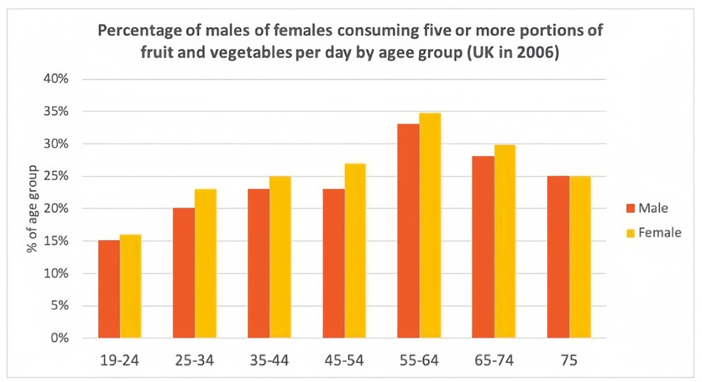
Sample 1:
The bar graph provides the rate of men and women in the UK who included at least five servings of fruit and vegetables into their daily diet in 2006, divided by age cohorts. Overall, there was a general trend of increasing fruit and vegetable consumption with age which peaked at the 55-64 age group for both genders. Additionally, the proportion of females who reached the goal was higher than that of males in most categories, except for the 75 one.
Regarding men, the proportion of residents aged 55-64 consuming five or more portions of fruit and vegetables daily was the highest at approximately 33%, whereas the 19-24 age group had the lowest rate at 15%. People from 25 to 54 shared comparable rates of around 20 to 23%. The figure for the 65–74-year-old bracket made up roughly 28%, about 3% higher than that of elders aged 75.
Concerning women, the 55–64-year-old group ranked 1st at nearly 35%, followed by the 65-74 and 45-54 age cohorts at approximately 30% and 27%, respectively. The shares of the two age groups of 35-54 and 75 were identical at 25%, slightly greater than that of the 25–34-year-olds at roughly 23%. The youngest age profile had the lowest rate of around 15%.
Sample 2:
The provided chart delineates the proportions of males and females in the UK adhering to the World Health Organisation’s (WHO) guideline of consuming five or more servings of fruits and vegetables per day across various age brackets in 2006.
Overall, a greater proportion of females across all age categories adhered to the recommended daily intake of five or more portions of fruits and vegetables. Additionally, the 55-64 age bracket recorded the highest percentages for both genders complying with the WHO’s guidelines for fruit and vegetable consumption.
The age group of 19-24 years reported the lowest adherence to the recommended fruit and vegetable intake, with 16% for females and 15% for males. Compliance rates consistently escalated in each subsequent age category until reaching a peak in the 55-64 age group.
In 2006, approximately 35% of females and 32% of males within the 55-64 age range met the WHO’s recommendation of five or more servings of fruits and vegetables per day. The proportions dropped gradually when age ascended, recording around 30% for females and 27% for males adhering to the prescribed intake. Meanwhile, roughly 25% of individuals in each gender aged 75 and above met the WHO’s daily fruit and vegetable recommendation.
Sample 3:
The chart shows the percentages of males and females in the UK that consumed the World Health Organisation’s recommendation of five or more portions of fruit and vegetables per day according to different age groups in 2006.
Overall, it is clear that a higher percentage of females in every age group consumed the recommended five or more portions of fruit and vegetables per day. Furthermore, the highest percentages of men and women who consumed the WHO’s recommendation for fruit and vegetables came from the 55–64-year-old age group.
In 2006, around 35% of females and 32% of males aged between 55-64 years-old consumed five or more portions of fruit and vegetables per day. This was followed by men and women aged 65-74 years-old, at around 27% and 30% respectively. Meanwhile, around 25% of those aged 75 and above consumed the WHO’s recommended daily intake of fruit and vegetables.
The lowest percentage of men and women that consumed the daily recommended fruit and vegetable intake came from the 19–24-year-old group, at approximately 15% each. The figures for both men and women continued to increase in each age group up to the 55–64-year-old group.
Sample 4:
The bar graph given demonstrates how many British men and women, in 2006, met the World Health Organization's guideline of eating five servings of fruit and vegetables daily.
Overall, females outperformed males across all age groups among those who followed the World Health Organization's "green" dietary guidelines. In addition, for both genders, the percentage was most significant between the ages of 55 and 64.
In 2006, approximately one-third of males aged between 55 and 64 consumed enough fruit and vegetables daily. This was followed by men and women aged 65-74, at around 5% less. Meanwhile, precisely a quarter of those aged 75 and above consumed the WHO's recommended daily intake of fruit and vegetables.
Regarding the other age groups, as the ages were decreasing, there was a declining trend of people following WHO's recommendation. From the age group 45-54 to 25-34, their proportions fell from roughly 27% (females) and 22% (males) to 22% (females) and 20% (males), respectively. Ultimately, as the figure reached the 19-24-year-old group, the percentage of men and women became lowest, at just approximately 15% each.
The first chart below shows the percentages of women and men in a country involved in some kinds (cooking, cleaning, pet caring and repairing the house). The second chart shows the amount of time each gender spent on each task per day.
Summarise the information by selecting and reporting the main features, and make comparisons where relevant. Write at least 150 words.
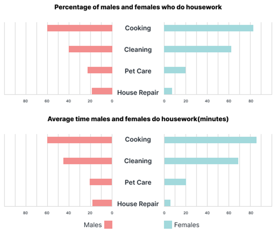
Sample 1:
The first column chart illustrates the proportion of men and women who do housework. In contrast, the second column chart indicates the average time each group spends on those jobs.
Overall, both charts show that women did the most cooking and cleaning. In addition, the pet care statistics for men and women are roughly identical.
The first graph shows that most women and men cooked for their families (86% and 60%, respectively). In addition, compared to males, women were around 20% more likely to take on the cleaning chore (40% and approximately 60%, respectively). Moreover, the percentage of men who care for pets exceeded 20%, but the number for the other group was precisely 20%. Finally, although 19% of males did home repairs, just 8% of women did so.
According to the second graph, the average woman spent 90 minutes preparing meals, whereas men spent around 90 minutes. Furthermore, the average time women spent cleaning their homes was slightly more than 60 minutes, whereas the average time males spend cleaning their homes was around 15 minutes less. Lastly, home maintenance was least focused on by both genders, but males devoted around 15 more minutes than women.
Sample 2:
The bar graphs compare the proportion for males and females of an unspecified nation who participate in and how much time they spend daily doing four household duties. Overall, the percentage of both genders doing housework corresponds with the average minutes for these tasks, with cooking being the most dominant figure in each chart. Additionally, a higher share of men is involved in house repairs and pet care, whereas the opposite is true for cleaning and cooking.
Regarding the involvement of each sex in housework, over 80% of women cook, moderately higher than men at 60%. Similarly, the proportion of females cleaning the house, at about 62%, is 12% higher than that of males. In contrast, while approximately 23% of men spend time for pet care and just under 18% of them do house maintenance, the corresponding figures for women are 20% and nearly 10%, respectively.
Turning to the time allocated on each task, women perform over 80 minutes for cooking and about 70 minutes for cleaning, compared to men with 60 and roughly 45 minutes for these chores, correspondingly. While both genders share an identical amount of time for their pets at 20 minutes, men outnumber in terms of house maintenance with roughly 19 to only approximately 5 minutes.
Sample 3:
The given butterfly charts illustrate the proportion of males and females who do housework, and the average time both genders give to household chores. It is clear from both charts that cooking and cleaning are done by more women and men, and these tasks demand more time of both genders per day than the other two tasks, which are caring for pets and doing household repairs.
More females than males do cooking and cleaning. The percentage of women involved in these two tasks is 80% and 60% respectively, which is 20% more for each task than men. Almost equal percentage (20-22%) of men and women are involved in pet care. Almost double men (18%) than women (9%) are involved in house repairs.
As far as the average time spent on cooking and cleaning is concerned, here too women outstrip men by spending approximately 20 minutes more on each task per day than men. Both, males and females spend on an average 20 minutes per day on pet care. Women spend approximately 5 minutes per day, whereas men spend three times more time on house repairs. Overall, apart from house repairs, in all the given household chores, women take the lead.
Sample 4:
The first graph illustrates the proportions of males and females in a nation engaging in certain household chores, whereas the second chart demonstrates the amount of time each gender spent on each task daily.
It is noticeable that the figures for cooking and cleaning are highest for both men and women. Also, people of both genders spend the least amount of time on house repairs.
The proportion of men involved in cooking is highest, at 60% while the opposite is true for house repairs, at only about 18%. Similarly, 82% of women do cooking, as opposed to about 8% for house repair work. Males doing cleaning work at home make up 40%, and the figure is 22% lower than that for women doing the same chore. Around 20% of men and women are involved in pet care.
Men spend an hour daily on cooking and 45 minutes on house cleaning. The amounts of time males spend on pet care and house repairs do not exceed 20 minutes per day. About women, they spend most of their time cooking, about 85 minutes, whereas the converse holds true for house repairs, only 5 minutes every day. About an hour is spent on cleaning work by women, which is around three times as much as pet care chore.
Sample 5:
The bar charts illustrate the proportions of males and females doing different tasks of housework, and the average time both sexes spent on doing each household chore a day.
Overall, more women than men performed the tasks of cooking and cleaning, while more men were in charge of pet care and house repairs. In addition, cooking and cleaning consume more time than the other tasks.
The percentage of women cooking was around a third higher than that of men spent doing the same task, at 90% and 60% in turn. Likewise, with 62%, the proportion of females involved in cleaning was 20% higher than that of males. In terms of the average time spent on these two common house chores, women outstrip men by allocating approximately 20 minutes more for each task per day than men.
Turning to another home task, an almost equal percentage of men and women (22% and 20%, respectively) are involved in pet care. Twice as many men as women took charge of repairing household appliances (18% compared with 9%). Both males and females devote, on average, 20 minutes per day to pet care. Women spent approximately 5 minutes per day on house repairs, which is three times less than the amount of time men spent on this task.
Sample 6:
The data presented in the charts illustrates the percentage breakdown of males and females engaging in specific household chores in a particular nation, along with the average duration devoted to these tasks.
Overall, cooking emerged as the predominant chore undertaken by both genders, accounting for the highest participation and time allocation.
In this country, cooking was conducted by slightly over 80% of women, contrasting with approximately 60% of men who partook in this activity. Similarly, cleaning activities were carried out by about 60% of women, whereas the corresponding figure for men was around 40%. Conversely, a marginally larger proportion of men engaged in pet care, constituting just above 20%, while house repair tasks were twice as prevalent among men, approximately at 18%, compared to about 8% of women.
Regarding the time allocated to these chores, women dedicated over 80 minutes daily to cooking and nearly 70 minutes to cleaning. In contrast, men spent slightly less time, with approximately 60 minutes on cooking and nearly 45 minutes on cleaning tasks. Although equal time was devoted to pet care by both genders, men notably spent a substantially greater duration on house repairs, averaging just under 20 minutes per day, surpassing the time allocation of women in this domain (about 6 minutes).
Sample 7:
The charts show information relating to the percentage of males and females in a particular country who did certain kinds of tasks at home, and the average time they spent doing those tasks.
Overall, cooking and cleaning were the two tasks that were performed by the largest percentage of both men and women, and the two tasks that men and women spent the most time performing.
In this particular country, just over 80% of women spent time cooking, compared to around 60% of men. Similarly, while 60% of women spent time cleaning, the figure for men stood at around 40%. On the other hand, a slightly larger percentage of men were involved in pet care, at just over 20%, while the figure for house repairs was double that of women, at approximately 18%.
In terms of the time spent performing these tasks, women spent over 80 minutes a day cooking, and just under 70 minutes a day cleaning. The time men spent on these same tasks was slightly less, at 60 minutes and approximately 45 minutes respectively. Additionally, while both men and women spent an equal amount of time on pet care, men spent significantly more time doing house repairs, at an average of just under 20 minutes per day.
Sample 8:
The bar charts present data on the engagement of men and women in various household tasks and the time they allocate to these chores daily in a specific country. A clear trend can be discerned from the charts: women are shown to participate more and spend more time on home tasks than men.
In terms of involvement, over 80% of women engage in cooking and cleaning, compared to less than 70% of men for the same tasks. Pet care and house repairs show a lesser gender discrepancy, with approximately 60% of females and around 50% of males involved in pet care, while house repairs are performed by slightly over 20% of women and nearly 30% of men.
Regarding the average time spent, women dedicate roughly 70 minutes to cooking and 60 minutes to cleaning daily, significnatly surpassing men, who allocate about 30 minutes to each of these tasks. Pet care sees both genders spending close to 50 minutes, indicating a more balanced distribution of time. The most notable difference is seen in house repairs, where men spend approximately 20 minutes daily double the time women contribute to this chore.
The charts collectively suggest a traditional division of labor, with women taking on more of the daily cooking and cleaning responsibilities, while men are more involved in occasional tasks like house repairs. The data implies (= indicates) that while there is some overlap in activities like pet care, significant disparities remain in how household labor is divided by gender.
The table describes the changes of people who went for international travel in 1990, 1995, 2000 and 2005 (million).
Summarise the information by selecting and reporting the main features, and make comparisons where relevant. Write at least 150 words.
The table describes the changes of people who went for international travel in 1990, 1995, 2000 and 2005 (million) | ||||
1990 | 1995 | 2000 | 2005 | Area |
448.9 | 615.2 | 669.2 | 693.7 | Toral |
18.2 | 20.8 | 26.9 | 28.7 | Africa |
80.5 | 112.5 | 118.2 | 113.2 | America |
60.2 | 80.3 | 117.4 | 135.8 | Asia and the Pacific |
280.2 | 390.3 | 393.2 | 400.2 | Europe |
9.8 | 11.3 | 13.5 | 15.8 | Middle East |
Sample 1:
The table illustrates the numbers of international visitors to five different areas from 1990 to 2005.
As can be observed from the table, the figures for international travelers experienced upward trends throughout the period, and Europe proved to be the most popular destination for travelers around the world.
Regarding the three most favored destinations in 1990, with 280.2 million visitors, international travelers to Europe outnumbered those to America, Asia, and the Pacific (80.5 million and 60.2 million visitors, respectively). 15 years later, the figure for international visitors to Europe witnessed considerable increases and ended up at 400.2 million visitors, which made this area still head-the list. Despite being ranked third on the list in 1990, the number of visitors to Asia and the Pacific surpassed 113.2 million visitors to America and gradually rose to 135.8 million in 2005 to be the second most popular destination.
Turning to the other destinations, there were 18.2 million visitors in Africa, nearly twice as many as the number of travelers in the Middle East (9.8 million visitors). Then, the figures for people traveling to Africa and the Middle East steadily went up and ended at 28.7 and 15.8 million visitors in turn.
Sample 2:
The table illustrates international traveler statistics across five global regions from 1990 to 2005.
Overall, a continual rise in international tourism occurred during the observed period. Europe notably stood out as the primary destination among the five regions.
Initially, international travelers numbered around 449 million, gradually increasing to about 690 million over 15 years. Europe consistently dominated, accounting for over half of the global traveler count. Starting at 280.2 million in 1990, Europe’s numbers climbed steadily, surpassing 400 million by 2005.
In contrast, America, Asia, and the Pacific hovered around 80 to 60 million, respectively. However, their trends diverged. America peaked at 118.2 million in 2000 before a subsequent decline of 5 million in 2005. Meanwhile, Asia and the Pacific showcased consistent growth, overtaking America in 2015 with approximately 136 million visitors. Africa and the Middle East had fewer travelers initially, with 18.2 and 9.8 million, respectively. Yet, both regions demonstrated gradual increments, culminating in 28.7 and 15.8 million visitors.
Sample 3:
The table shows the number of persons from various parts of the globe who traveled overseas between 1990 and 2005.
It is obvious that the overall number of foreign travelers rose dramatically throughout the time. Also, Europe had the highest number of foreign travelers in all years.
Almost 280 million Europeans traveled globally in 1990, while 80 million Americans and 60 million Asian Pacific residents did as well. In that year, 18.2 million Africans traveled overseas, whereas the number for the Middle East was just around half that, at 9.8 million.
For the next fifteen years, the number of European travelers increased steadily, reaching a high of 400.2 million in 2005. The number of foreign travelers from Asia Pacific increased rapidly, from 80.3 million in 1995 to more than 138 million in 2005. Nevertheless, the number of Americans who traveled reached a high of 118.2 million in 2000 before falling to 113.2 million in 2005. The estimates for the other areas also climbed throughout the time, with African visitors totaling 28.7 million and Middle Eastern visitors totaling 15.8 million.
Sample 4:
The table presents (= describe, show, illustrate) data on international travel from various global regions over a 15-year period, sepcifically in 1990, 1995, 2000, and 2005, with figures in millions.
A clear (= apparent, evident) upward trend in international travel is evident across all regions, with the total number of travelers rising from 448.9 million in 1990 to 693.7 million by 2005. Europe accounted for the majority of this increase, starting at 280.2 million travelers in 1990 and reaching 400.2 million in 2005. Notably (= especially), this represents an approximate 43% rise over the 15 years.
Asia and the Pacific also saw substantial growth, with numbers increasing from 60.2 million to 135.8 million, more than doubling their 1990 figures. This region showed the highest relative increase. The Americas followed a similar upward trajectory, though less pronounced, from 80.5 million to 113.2 million.
In contrast, Africa and the Middle East experienced more modest growth. African international travel numbers rose from 18.2 million to 28.7 million, while the Middle East increased from 9.8 million to 15.8 million. Although these increases are less significant in comparison to other areas, they still reflect a consistent growth in international travel.
The data suggest (= indicate) a robust growth in the travel industry, with Europe and Asia-Pacific regions leading the surge. The steady increase across all areas indicates an expanding global interest in international travel, potentially fueled by economic growth, increased air travel accessibility, or other factors not specified in the table.
In summary, the table indicates that international travel has become increasingly popular from 1990 to 2005, with Europe being the most frequented destination. The doubling of travelers from Asia and the Pacific points to (= suggest, indicate) dynamic changes in global travel patterns during this period.
Sample 5:
The table illustrates the information regarding the number of people from different regions around the world who traveled internationally between 1990 and 2005.
Overall, the total number of people traveling internationally increased significantly over the period. In addition, most of the international travelers were Europeans, while the Middle Eastern were not keen on making overseas trips.
Regarding the international travellers of Europe, Asia and the Pacific, and America, the number of people that made overseas trips in the three countries during 1990 were 280.2 million, 60.2 million and 18.2 million respectively. In the next 5 years, Europe witnessed a significant growth of roughly 110 million in the number of international travelers, while a small increase of around 25 million in American and Asian and Pacific people was recorded. In the last 10 years, although the figure of overseas tourists in Europe and America remained stable at 400.2 million and 113.2 respectively, Asia and the Pacific reported a record growth of 55.5 million overseas tourists.
Turning to African and Middle Eastern people, African international tourists stood at 18.2 million in 1990, which was twice as many as Middle Eastern. The final year saw a steady increase of 10 million and 5 million in African and Middle Eastern overseas tourists respectively.
Sample 6:
The data illustrates the number of individuals traveling abroad from various regions of the world between 1990 and 2005.
It is evident that the total number of international travelers experienced a significant increase over this period. Additionally, Europe consistently recorded the highest number of international travelers throughout the years.
Approximately 280 million Europeans traveled globally in 1990, while 80 million Americans and 60 million residents from the Asia-Pacific region did the same. During that year, 18.2 million Africans traveled abroad, whereas the Middle East saw around 9.8 million travelers.
Over the next fifteen years, the number of European travelers steadily rose, reaching a peak of 400.2 million in 2005. Meanwhile, travelers from the Asia-Pacific region saw a rapid increase, from 80.3 million in 1995 to over 138 million in 2005. However, the number of American travelers peaked at 118.2 million in 2000 before declining to 113.2 million in 2005. The figures for other regions also saw consistent growth throughout this period, with African travelers totaling 28.7 million and Middle Eastern travelers totaling 15.8 million.
Sample 7:
The given table compares the changes in the number of international travelers in different regions, in the years 1990, 1995, 2000 and 2005. It is clear that the total number of international travelers increased in the given 15-year period. However, the increase was the most marked from 1990 to 1995.
According to the statistics, Europeans like traveling abroad the most, with the highest figure of around 280 million in 1995 and reached an all-time high of nearly 400 million in the year 2005. By contrast, the Middle East had the least number of people travelling abroad, which grew from 9.8 million in 1995 to 15.8 million in 2005. Africa and Asia and the Pacific experienced a similar increasing trend of international tourists from 1990 to 2005.
In America, people showed a great willingness to travel abroad between 1990 and 1995, from 80.5 to 112.5 million. Then, the number stayed more or less at the same level till 2005. Likewise, Europe also experienced a very significant increase from 1990 to 1995, in the overseas travel population, but after 1995 there was an increase of only 10 million.
Overall, Europe contributed the most in overseas travel, whereas the Middle East had the least share of overseas travelers.
Sample 8:
The given table demonstrates the number of international travelers in 5 distinct regions in 4 different years.
Overall, the total number of overseas travelers increased consistently over the period. In addition, Europe was the most popular destination compared to the other four areas.
According to the data, initially, there were roughly 449 million international tourists, gradually growing to around 690 million after 15 years. During the same time frame, Europe dominated with the highest figure throughout all recorded years, comprising more than half the total number of international travelers worldwide. Specifically, in 1990, Europe’s number was 280.2 million, and it kept rising to over 400 million in 2005.
Regarding the other regions, the numbers of America, Asia, and the Pacific were relatively similar, around 80 and 60 million, respectively. However, these two regions had different trends; while America peaked in 2000 (118.2 million) before declining, Asia and the Pacific consistently went up and overtook America in 2015 at around 136 million. Finally, Africa and the Middle East were the least popular destinations, starting with just 18.2 and 8.2 million, respectively. These two regions had the same trends, gradually increasing by almost 1.5 times.
Sample 9:
The table shows how many people, in millions, in 5 different areas went on international trips from 1990 to 2005, in five-year increments. Overall, there was an upward trend in the number of people traveling abroad in all areas, with the majority of foreign travelers originating from Europe.
In 1990, there were nearly 450 million people traveling overseas in total and this number grew considerably thereafter and reached about 694 million in 2005. Initially, about half of the outbound traveling population were Europeans, at 280.2 million, followed by 80.5 million Americans. Afterwards, they both rose significantly and by 2005, the former reached its high point at 400.2 million, whereas the latter, after steady growth to a peak of just over 118 million in 2000, had experienced a slight decrease to 113.2 million at the end of the period.
Regarding the other areas, 60.2 million people from Asia and the Pacific made trips abroad in 1990, much higher than those of Africa and the Middle East, with the respective figures being 18.2 million compared to 9.8 million. Over 15 years, international travelers from Asia and the Pacific more than doubled to about 136 million, while Africa's and the Middle East's numbers also increased steadily and finished at almost 29 and 16 million, respectively.
Sample 10:
The given table depicts, in millions, details of international travellers from 5 different regions, for 5 years - 1990, 1995, 2000 and 2005.
It is clear that the total number of people travelling overseas increased over the 15-year period although the increase was more significant in the first 5 years.
The data reveals that Europeans, at 280.2 million, constituted more than half of the total travellers which was 448.2 million in 1990. Thereafter, there was a dramatic surge in European travellers reaching 390.3 million in 1995. Subsequently, the increase was only marginal to reach 400.2 million in 2005. Conversely, the Middle East had the least number of overseas travellers, viz., 9.8 million in 1990 which rose gradually to 15.8 million in 2005.
Although America occupied the second place with 80.5 million travellers in 1990, in 2005, Asia and the Pacific region surged ahead to occupy the second spot with 135.8 million international travellers. Africa, in comparison, with 18.2 million travellers in 1990, which gradually increased to 28.7 million in 2005, performed better than the Middle East with respect to the number of international travellers.
Sample 11:
The provided table illustrates the number of international travelers from five regions-Africa, America, Asia and the Pacific, Europe, and the Middle East-between 1990 and 2005, with figures given in millions.
Overall, a clear upward trend in the total number of international travelers is evident throughout the period. While the total number increased significantly, America's figuresexperienced some fluctuation.
In 1990, a total of 448.9 million individualsundertookinternational travel. This figure experienced a substantial increase to 615.2 million by 1995, followed by further, albeit less dramatic growth to reach 693.7 million in 2005. The Middle East, Asia and the Pacific, and Africa all demonstrated consistent growth in international travel. Specifically, the Middle East saw its numbers rise from 9.8 million in 1990 to 15.8 million in 2005. Similarly, Africa's figures increased from 18.2 million to 28.7 million during the same period. Asia and the Pacific experienced more than a doubling of its international travelers, reaching 135.8 million in 2005. Europe also witnessed a dramatic rise, increasing from 280.2 million in 1990 to 390.3 million in 1995.
America's international travel figures started at 80.5 million in 1990, increasing to 112.5 million in 1995 and further to 118.2 million in 2000. Unlike other regions, however, a slight decrease to 113.2 million was observed in 2005.
Sample 12:
The given table chart illustrates the information about the international travelers in 5 different areas in 4 different years.
According to the table presented, about 450 million international travelers visited different parts of the world initially in 1990, and this number has gradually increased to about 700 million in 2005. Europe received the largest number of international tourists, accounting for more than 50% of the total travelers. In 1990, over 280 million tourists out of a total of 448.9 million traveled on the European continents alone, and this number reached over 400 million in 2005, when the total number of international travelers was about 693 million.
The Americas, Asia and the Pacific were two other favorite tourist destinations among international travelers, and in 1990 they received about 80 million and 602 million tourists, respectively. After 15 years, the number of international travelers in the Asian region has increased to 135.8 million people, which is higher than in America. Africa welcomed about 18.2 million international travelers in 1990, which increased to 28.7 million in 2005. Finally, the Middle East region had the lowest number of foreign tourists, starting at 8.9 million in 1990 and reaching 15.8 million in 2005.
Overall, it is clear that international visitors were increasing between 1990 and 2005. Europe attracts the most tourists in each year while relatively fewer people prefer to visit the middle east during the given period.
The charts below show the percentage of time working adults spent on different activities in a particular country in 1958 and 2008.
Summarise the information by selecting and reporting the main features, and make comparisons where relevant. Write at least 150 words.
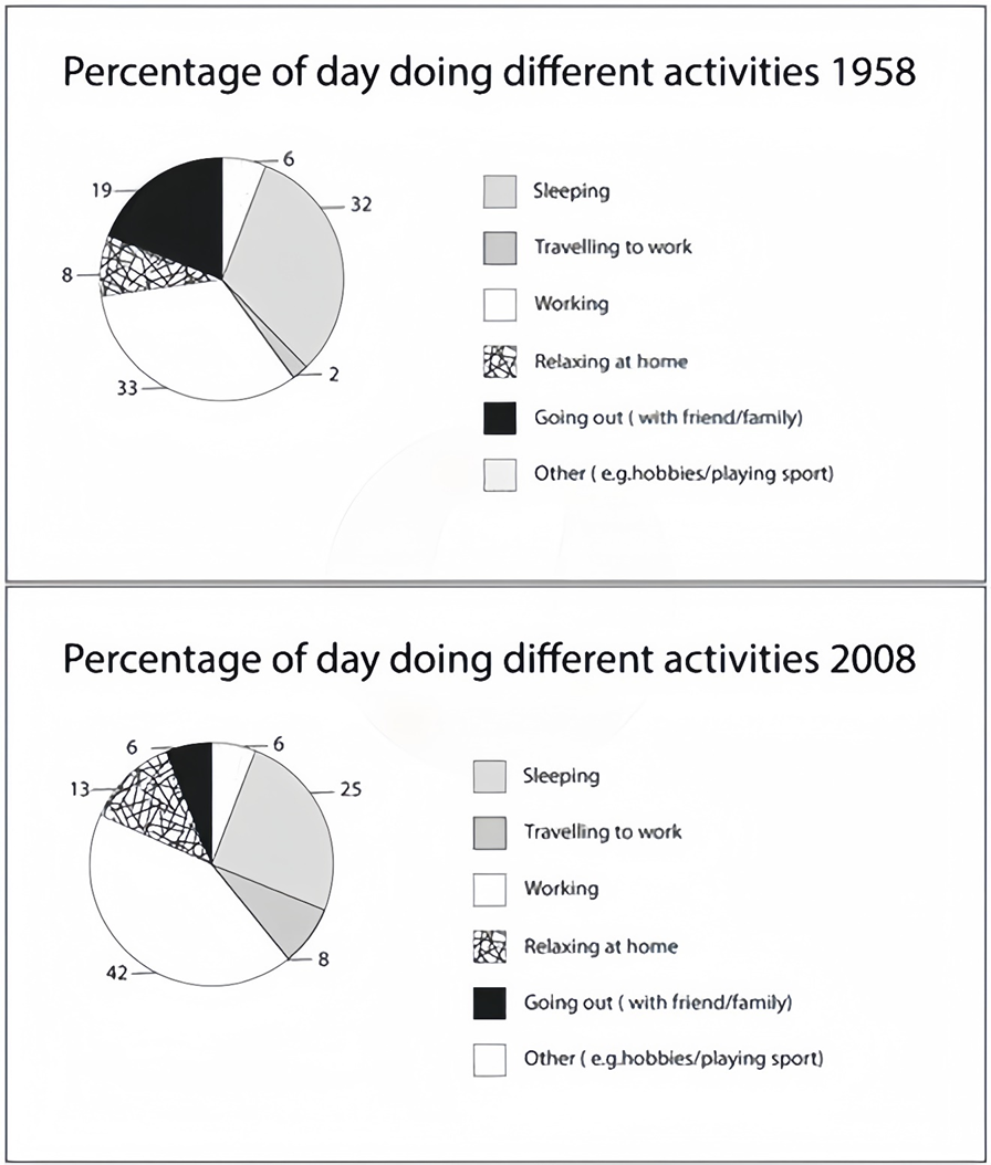
Sample 1:
The pie charts illustrate the average percentage of an employed person’s day spent doing different activities in 1958 and 2008, in a particular country.
Overall, employed people in this particular country spent the most amount of time in a day, in both 1958 and 2008, at work. Furthermore, there was an inverse relationship between working and sleeping over the 50 years.
In 1958, working people in this country spent one-third of their day at work, followed by just under one-third of their day sleeping. Going out with friends or family took up the next largest portion of time in a day, at 19%. Meanwhile, travelling to work was the activity that took up the least percentage of time in someone’s day.
Fifty years later, the percentage of a day that people spent at work increased to 42%, while the figure for sleeping had dropped to 25%. Less time was spent going out with family and friends (6%), but more time was allocated to relaxing at home (13%). In addition, the figure for the portion of the day that people spent travelling to work quadrupled to 8% over the period.
Sample 2:
The pie charts illustrate the percentage of time adults waste during their working day on various tasks in a particular nation between 1958 and 2008.
Overall, the percentage of time spent working and sleeping was the highest in 1958. Additionally, while the time spent on every other activity increased, the percentage spent going out and sleeping declined.
According to the first chart, the percentage of time spent on working and sleeping was similarly the highest, at 33% and 32%, respectively. Going out accounted for 19%, while relaxing at home was 11% less. Furthermore, the total percentage of time spent on other activities, such as playing sports (6%) and traveling to work (2%), was equal to the percentage of time spent relaxing at home (8%).
In the second chart, the working percentage increased significantly to 40%. Meanwhile, the percentage of time spent sleeping decreased by 7%. Moreover, the percentage spent relaxing at home was 5% larger in 2008. The percentage of time spent on other activities was identical to time spent on going out with friends, at 6%. Finally, the time spent travelling to work increased to 8% in 2008.
Sample 3:
The provided pie charts outline the average time distribution of an employed individual to daily activities in a specific country during 1958 and 2008.
Overall, work and sleep constituted the most significant portions of a working adult’s time in both 1958 and 2008. While the percentages allocated for traveling to work, working and relaxing at home ascended, the time spent socializing and sleeping experienced a decline.
In 1958, approximately one-third of the day was devoted to work (33%), followed by an almost similar duration spent on sleep (32%). Going out with friends or family accounted for 19% of their daily routine. Meanwhile, commuting to work and relaxing at home occupied smaller segments, comprising only 2% and 8%, and the residual 6% was attributed to other activities such as hobbies or sports.
From that time to 2008, the proportion of time dedicated to work significantly increased to 42%. Simultaneously, the duration allocated for relaxation at home saw a notable rise, representing 13% of the day, and the time spent commuting also quadrupled to 8%. Conversely, the time distribution for sleep diminished to 25%, while socializing with family and friends also reduced to 6%. The sole category which stayed unaltered was others, at 6%.
Sample 4:
The pie charts illustrate changes in the proportion of time that working adults spent on different activities in 1958 and 2008.
It is clear that in both years, working accounted for the largest percentage of time, while the surveyed people spent the least proportion of time on commuting. Also, the figure for going out witnessed the most dramatic change.
Looking at the information in more detail, we can see that in the initial year, 33% of the time was allocated to working, closely followed by the figure for sleeping (32%). By contrast, people only spent 2% of their time on commuting. Going out took up 19% of a day, and this figure was more than twice the figure for relaxing at home. The proportion of time distributed to other activities such as hobbies and playing sports was 6%.
In the year 2008, the proportion of time people spent on working and relaxing at home saw a remarkable rise to 42% and 13% respectively. The most drastic change could be found in the time allocated for commuting, with the figure growing by 4-fold. By contrast, there was a sharp decline in the percentage of time distributed to going out and sleeping by 13% and 7%. In this year, people still spent 6% of their time on other activities.
Sample 5:
The provided charts illustrate the percentage of the day working from those who were experiencing adulthood, in terms of activities in 1958 and 50 years later.
Taken as a whole, a brief assessment of the information reveals that the working adults relied on almost all their time for work. The time dependent on working and sleeping has an inverse bond over 50 years.
To begin with, in 1958, workers spent roughly 1/3 of their days at work and less than 1/3 of their days sleeping. After that, outdoor activities with friends and family accounted for 19%. Additionally, spending time reaching the workplace had the lowest percentage of traveling to work at 2%.
Besides, in 2008, the statistics of working days witnessed a significant increase. This figure rose to 42%, and the sleeping days, in contrast, declined to 25%. Furthermore, the percentage of commuting days experienced had increased four times to 8%.
The first chart below gives information about the money spent by British parents on their children’s sports between 2008 and 2014. The second chart shows the number of children who participated in three sports in Britain over the same time period.
Summarise the information by selecting and reporting the main features, and make comparisons where relevant. Write at least 150 words.
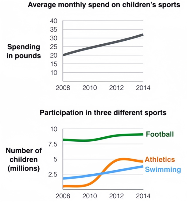
Sample 1:
The line graphs provide insights into the average monthly expenditure by British parents on their children’s sports activities and the corresponding participation figures in football, swimming, and athletics from 2008 to 2014.
It is evident that parental spending on children’s sports witnessed a steady annual rise over the six-year period. In terms of participation, football emerged as the most favored sport, with significantly higher engagement compared to swimming and athletics.
In 2008, British parents allocated approximately £20 per month to their children’s sporting pursuits. This figure experienced a gradual upward trajectory, reaching slightly over £30 by the end of 2014.
Regarding the number of participants in various sports, football dominated the scene in 2008, attracting around 8 million British children. In contrast, swimming and athletics lagged behind, with approximately 2 million and less than 1 million participants, respectively. While football participation remained relatively stable over the subsequent six years, swimming witnessed an almost doubling of participants to nearly 4 million, and athletics experienced a nearly fivefold increase, reaching a substantial level.
Sample 2:
A rendered line chart shows how much money parents in Britain spent on their children’s sporting activities over a period of 7 years from 2008 to 2014 as well as the percentage of young people who participated in those three activities.
Overall, it is clear that only a tiny percentage of youths participated in the initiative’s athletics during the whole time period, while the final year had the highest percentage of expenditures.
From the first chart, it is evident that the average monthly spending on juvenile sports activities was around 20 pounds in the first year and 25 pounds in the second year, but it peaked at almost 32 million pounds in the previous year.
As observed from the second chart, when it comes to the number of sports participants in 2008, there were almost 1 million children taking part in athletics which gradually rose to a figure of nearly 5 million by 2014. Swimming, on the other hand, showed a steady rising pattern almost doubling in 2014 from nearly 2 million participants to close to 4 million. Conversely, football remained the most popular sport with its numbers exceeding the other two sports. The numbers, however, displayed a meagre rise. With the highest numbers recorded overall in 2008 (nearly 8 million), it stayed the highest in 2014 with participants reaching approximately 8.5 million.
Sample 3:
The line graphs show the average monthly amount that parents in Britain spent on their children’s sporting activities and the number of British children who took part in three different sports from 2008 to 2014.
It is clear that parents spent more money each year on their children’s participation in sports over the six-year period. In terms of the number of children taking part, football was significantly more popular than athletics and swimming.
In 2008, British parents spent an average of around £20 per month on their children’s sporting activities. Parents’ spending on children’s sports increased gradually over the following six years, and by 2014 the average monthly amount had risen to just over £30.
Looking at participation numbers, in 2008 approximately 8 million British children played football, while only 2 million children were enrolled in swimming clubs and less than 1 million practised athletics. The figures for football participation remained relatively stable over the following 6 years. By contrast, participation in swimming almost doubled, to nearly 4 million children, and there was a nearly fivefold increase in the number of children doing athletics.
Sample 4:
The graphs provide data about the amount of money British parents spent on their children’s sports over the period from 2008 to 2014 as well as the quantity of children who took part in three particular sports over the equivalent time span.
A brief analysis of the graphs indicates that the level on spending on children’s sports increased significantly, while participation in the three sports highlighted also grew overall.
In 2008, parents in Britain spent pounds per month on their offspring’s sports. However, this figure climbed steadily over the following six years, and by 2014 it stood at approximately 32 pounds.
Football had by far the highest level of participation throughout the period, with roughly 9 million participants in 2014, up from just over 8 million in 2008. In addition, athletics saw the largest overall increase, climbing substantially from under half a million children in 2008 to almost 5 million only 6 years later. Finally, the number of children taking part in swimming underwent strong growth, doubling from under 2 million to around 4.
Sample 5:
The capital expenditure of British parents on their child sports activities from 2008 to 2014 and the proportion of youth indulging in three activities in Britain is depicted by rendered line chart.
Overall, it can be vividly manifested that the maximum per cent of expenditure was in the final year whilst the minuscule percentile of teenagers involved in Athletics in the initiative throughout the period.
After analysing it, it can be clearly seen that with regard to the average monthly expenditure on youth sports activities in the initial year, it was about 20 pounds against 25 pounds in the following year; however, it reached a peak value of nearly 32 million in the last year.
Probing ahead, in connection with the participation in distinct sports in 2008, tops the list while it escalated by nearly 1 million in the final year. Nonetheless, nearly 1 million and 5 million juveniles participated in athletics correspondingly. Nevertheless, more than 2 million children indulged in Swimming activity in 2008, which remained steady until 2010 and witnessed an incline of about 1.5 million in 2014.
The graph below shows the percentage of workers from five different European countries that were absent for a day or more due to illness from 1991 to 2001.
Summarise the information by selecting and reporting the main features, and make comparisons where relevant. Write at least 150 words.
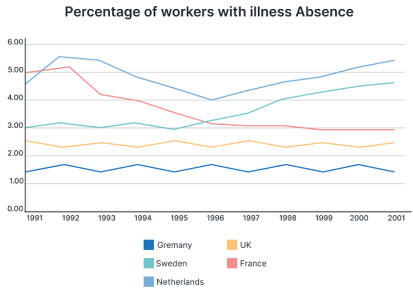
Sample 1:
The line graph shows the proportion of employees in five European nations who took a day or more off due to illness between 1991 and 2001.
Overall, despite significant changes, the proportion of sick days taken by Dutch workers remains higher than in any other country. On the other hand, France showed a declining tendency, while Sweden showed an increasing trend. The trends in the UK and Germany were quite similar, with the UK's numbers being slightly higher.
From 1992 and 2001, the Dutch had the highest rate of employees out sick, ranging from just under 6% to just over 8%. The French economy also steadily declined throughout this time, dropping to a low of 3% in 1999 and staying at that level until the conclusion of the decade.
In comparison, the percentage of Swedish employees off sick rose by 1.75 percentage points between 1999 and 2001, hitting a high of 4.75 percent that year. The United Kingdom and Germany, the only nations to see no change, had their rates steady at around 3.75 and 1.5 percent, respectively.
Sample 2:
The line chart illustrates the rate of employees who took at least one day of sick leave in different European nations from 1991 to 2001. Overall, while the proportion of workers who were absent by sickness in the Netherlands and Sweden increased over the given period, France had a reverse trend. Additionally, the UK and Germany remained fairly constant during the period examined.
France and the Netherlands started the period around 5%. One year later, the rate of workers with illness absence in the Netherlands increased by approximately 0.5%, before plummeting to just over 4% in 1996. The figure then recovered gradually to about 5.4%, being the highest among the five nations. Furthermore, after standing at around 5% for the first two years, France witnessed a plunge to 3% by 1999, followed by a plateau for the rest of the period.
Turning to the remainder, the proportion of laborers with sick leave in Sweden remained nearly stable at roughly 3% from 1991 to 1995, after which it ascended significantly to about 4.7% by 2001. Both the UK and Germany experienced almost no change throughout the period, with the former being around 2.5% and the latter being relatively smaller at approximately 1.5%.
Sample 3:
The graph depicts the proportion of workers from five European nations who took sick leave for a day or more between 1991 and 2001.
Overall, it is obvious that the Netherlands almost always accounted for the highest percentage, despite fluctuations. France and Sweden showed opposite trends, with a slide for the former and a climb for the latter. Only the UK and Germany shared the same pattern, even though the UK’s figure was noticeably higher.
Specifically, the Netherlands led in the percentage of employees who missed work due to illness, fluctuating between 4% (in 1996) and approximately 5.75% (in 1992 and 2001). During that time, France saw a steady decline, hitting its lowest point of 3% in 1999 and remaining there until the end of the period. In contrast, the proportion of workers with sickness absence in Sweden significantly increased by 1.75%, peaking at 4.75% in 2001. The two remaining countries, the UK and Germany, witnessed little variation as their figures stabilized, respectively, at about 3.75% and around 1.5%.
Sample 4:
The presented line chart delineates the fluctuating rates of employees taking sick leave across several European nations from 1991 to 2001.
Overall, variations in sickness absence rates are evident in different countries. The Netherlands consistently registered the highest rate of individuals taking sick leave from work, whereas Germany reported the lowest rate among all years examined.
The Netherlands and France commenced the period with a comparable rate of around 5%. Subsequently, the former witnessed a slight increase by approximately 0.5% within a year before undergoing a substantial decline to just over 4% by 1996. However, a gradual recovery ensued, reaching a peak of approximately 5.4% in 2001. In contrast, the latter experienced a substantial drop to 3% by 1999 and thereafter plateaued for the remainder of the period.
In Sweden, the rate of sick leave among laborers remained relatively steady at about 3% between 1991 and 1995, before undergoing a surge to approximately 4.7% by 2001. On the other hand, both the UK and Germany demonstrated minimal fluctuations over the period. The UK remained consistent around 2.5%, while Germany sustained a notably lower rate of around 1.5%.
Sample 5:
The line graph illustrates the percentage of workers who took sickness absences in five European countries - Germany, Sweden, the Netherlands, the UK, and France - between 1991 and 2001.
Overall, the Netherlands consistently had the highest percentage of workers taking sickness absences, while Germany had the lowest. Over the decade, the percentage of workers taking sickness absences decreased in the Netherlands and France, while it showed an upward trend in Sweden and the UK. Germany experienced a slight decline followed by stability.
In 1991, the Netherlands had the highest percentage of workers with sickness absences at around 5.5%, followed closely by France at approximately 4.5%. Both countries experienced a downward trend over the following years, with the Netherlands seeing a significant drop to about 3.5% in 1996 before gradually increasing again to around 4.8% by 2001. France, on the other hand, showed a consistent decrease throughout the decade, reaching its lowest point of around 3% by the end of the period.
Germany started with the lowest percentage of workers taking sickness absences at just over 1.5% in 1991. This figure decreased slightly over the next few years and then remained stable at around 1.25% from 1995 onwards. In contrast, Sweden and the UK, which began with similar percentages to Germany, experienced different trends. Sweden saw a steady rise, overtaking Germany and the UK by the late 1990s and reaching nearly 4% by 2001. The UK’s percentage also increased slightly from about 2% in 1991 to just over 3% in 2001.
The graph below shows the hours of teaching per year done by each teacher in four different countries in 2001.
Summarise the information by selecting and reporting the main features, and make comparisons where relevant. Write at least 150 words.
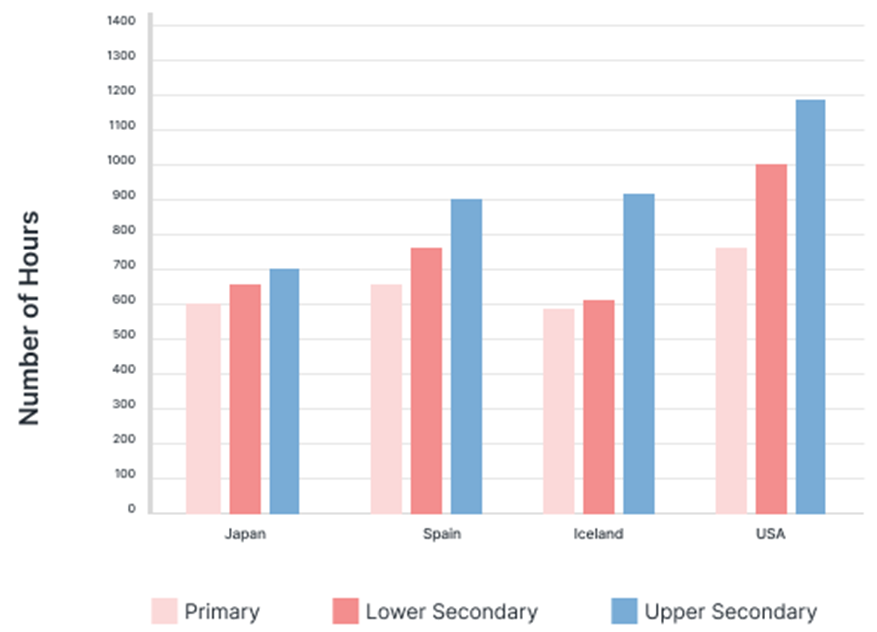
Sample 1:
The bar charts illustrate the duration of time that teachers in four countries spent teaching across three different educational levels in 2001.
Overall, American teachers worked for the most extended hours while Japanese teachers worked for the least. In addition, there was a significant contrast in the hours worked between upper-secondary and lower-level teachers in Ireland.
In Japan, primary school teachers worked 600 hours, 50 hours less than those in Spain but 10 hours more than in Ireland. In the United States, primary school teachers worked over 750 hours, equivalent to the number of hours worked by middle school teachers in Spain.
In all four countries, the number of hours worked by lower secondary teachers was higher than that of primary school teachers, with American teachers working the most extended hours of over 1,000. In Spain and Ireland, upper secondary teachers worked 900 hours, 150 and 200 hours more than middle school teachers in Spain and high school teachers in Japan, respectively. Upper-level teachers in the United States spent the most time working nearly 1,200 hours at schools.
Sample 2:
The column graph represents data on average teaching hours by each educator in 2001 in Japan, Spain, Iceland and the USA in the primary, lower secondary and higher secondary school levels. Generally speaking, a US tutor on an average spent more hours on schooling than that of Japanese, Spanish and Icelandic teachers in 2001 and the time spent on teaching increases with the class levels in all countries.
According to the illustration, an instructor in Japan, Spain and Iceland typically spent around 600 hours in 2001 to teach elementary level students. This duration in the USA was the highest, roughly 750 hours. A US mentor taught lower secondary students for exactly 1000 hours in the same year, and it was roughly 600 hours in Iceland and Japan. However, lower secondary teachers in Spain disbursed roughly 750 hours each to their students. Finally, the time spent to teach higher secondary pupil in the USA was approximately 1200 hours which was 300 hours less in Iceland and Spain and precisely 700 hours in Japan.
Sample 3:
The bar graph outlines the average duration a teacher spent on three different levels in four different countries in 2001.
Overall, the teaching hours at the secondary level were higher than those of primary level and the US tutors spent more time teaching than the teachers in the other three countries did.
A US teacher spent more than 700 hours to teach primary students in 2001 while a Japanese educator disbursed exactly 600 hours for teaching the same graders. Time allocated to teaching elementary student by a Spanish teacher was 50 hours higher than that of Japanese teacher, but it was less than 600 hours in Iceland. An American teacher’s average schooling duration in 2001 for lower secondary students was 1000 hours which was 300 to 400 hours higher than the teaching duration by a teacher in the other three countries.
Finally, higher secondary students received almost 1200 hours’ lectures by a teacher in the US and this duration was noticeable higher than that of other countries. In Japan, an upper secondary level teacher taught for 700 hours in 2001, almost 500 hours less than that of a US teacher. In Iceland and Spain, teaching duration by a higher secondary level teacher was approximately 900 hours, about 300 hours less than that of an American teacher.
Sample 4:
The bar chart compares the number of teaching hours undertaken by primary and secondary school lecturers in Japan, Spain, Iceland, and the USA in 2001. Overall, teachers in Japan and Spain had a similar workload in primary and lower secondary levels. The duration of work appeared to be highest in upper secondary across all countries, with the exception of Iceland. Furthermore, American teachers worked the longest hours.
The minimum number of working hours for teachers was 600 hours, which was observed in Japanese schools; primary and lower secondary schools in Spain. In Iceland, this figure was only witnessed in primary schools and increased to 800 hours in lower secondary schools, which marked the longest working hours for teachers in that country. There was a slight reduction in the number of hours in upper secondary schools.
Shifting focus to the United States, primary school teachers spent approximately 850 hours in the classroom. The longest duration was reported in lower and upper secondary schools, with each amounting to around 1100 hours, more or less. The workload in Spain’s upper secondary schools came closest to this figure, reaching 1000 hours.
Sample 5:
The given bar chart demonstrates the number of hours taught primary, lower secondary, and upper secondary by teachers in the US, Japan, Spain, and Iceland in 2001.
Overall, lower secondary and upper secondary teachers in the US taught significantly more hours than their counterparts in the other three countries. In addition, teachers in the primary grades put in comparable hours in all four countries.
Primary and lower secondary teachers in Iceland had the fewest working hours (at approximately 600). Notably, upper-level secondary school teachers in Iceland undertook an enormous workload of about 900 hours. In Japan, teachers at all levels worked between 600 and 700 hours, with hardly any variation between grade levels.
Primary teachers in the US and Spain worked similar hours, at around 650. However, lower secondary and upper secondary teachers in Spain worked 750 and 900 hours, respectively, whereas lower secondary and upper secondary teachers in the US worked 1000 and 1200 hours, respectively. Finally, teachers' workload gradually grew in Spain as they progressed from lower classes to higher grades, but in the United States, this increase was more dramatic.
Sample 6:
The bar charts describe how much time a teacher spent at three school levels in four different countries in 2001.
Overall, teachers in the US had to work the longest hours, while Japanese teachers spent the least time at schools. Notably, there was a stark difference in working hours between upper secondary teachers and two lower-level ones in Iceland.
Teachers at primary school in Japan worked for 600 hours, 50 lower than in Spain and 10 higher than in Iceland. This figure in the USA was the highest, at over 750 hours, equivalent to the number of hours Spanish middle school teachers spent at work. On average, lower secondary level educators in all four countries worked more hours than primary ones by over 50 hours and higher, and the figure for the USA stood highest at 1000.
Both Spain and Iceland recorded a number of 900 working hours from upper secondary teachers. This number was 150 and 200 hours more than their Spanish colleagues at middle school and Japanese high school teachers, respectively. At nearly 1200 hours, upper-level American educators spent most time at schools.
Sample 7:
The bar chart delineates a comparison of the average working hours among elementary, middle, and high school teachers across four distinct countries in 2001.
Notably, it is evident that teachers in the USA dedicated longer hours to work than their counterparts. Additionally, the working hours of high school teachers exceeded those at primary and lower secondary levels.
At the primary school level, teachers in the USA logged approximately 750 hours, surpassing Spain’s working hours by a notable margin of 100. Meanwhile, Japan and Iceland registered slightly lower working durations, approximately 600 and 580 hours, respectively. Moving to the lower secondary school level, teachers in the USA experienced a considerable increase of around 250 hours compared to primary educators. Spain demonstrated a moderate rise of 100 hours, while Japan and Iceland showcased marginal differences, with an increase of approximately 50 hours or less.
Examining the upper secondary school teachers’ workload, the USA maintained the highest working hours, totaling just under 1200 hours, while Japan recorded the lowest at 700 hours. Teachers in Spain and Iceland reported similar working durations, at approximately 900 hours each.
Sample 8:
The bar chart illustrates the number of teaching hours per year undertaken by educators at three distinct educational levels in four countries during the year 2001.
Overall, it is evident that teachers in the United States were required to work the most extensive hours, while their counterparts in Japan logged the fewest. Strikingly, there was a pronounced discrepancy in working hours between the upper secondary educators and the other two levels in Iceland.
In Japan, primary school teachers worked for 600 hours, 50 hours fewer than in Spain and 10 hours more than in Iceland. The figure in the USA topped the chart at over 750 hours, mirroring the number of hours that Spanish middle school teachers devoted. On average, educators at the lower secondary level in all four countries exceeded the primary level by more than 50 hours, with the USA's figure being the highest at 1000 hours.
Moving onto upper-secondary teachers' data, both Spain and Iceland observed about 900 working hours, 150 hours more than Spanish middle school teachers and 200 hours more than Japanese high school educators. American upper-level teachers, with nearly 1200 hours, invested the most time in schools.
Sample 9:
The bar chart illustrates the number of hours each teacher spent teaching at primary, lower secondary, and upper secondary levels across four countries - Japan, Spain, Iceland, and the USA - in 2001.
Overall, teachers in the USA dedicated the highest number of hours to teaching across all educational levels compared to their counterparts in Japan, Spain, and Iceland. Notably, the time committed to teaching progressively increased from primary to upper secondary levels in each country.
In greater detail, Japanese, Spanish, and Icelandic teachers devoted approximately 600 hours to teaching primary students, while American teachers spent around 750 hours, marking the highest figure for primary education. For the lower secondary level, teachers in the USA spent a substantial 1000 hours, contrasting with about 600 hours in both Japan and Iceland. Meanwhile, Spanish lower secondary teachers dedicated approximately 750 hours to their teaching duties.
At the upper secondary level, the number of hours each teacher spent teaching was highest in the USA, reaching nearly 1200 hours. In comparison, Spanish and Icelandic teachers spent about 900 hours teaching upper secondary students, while Japanese teachers recorded the lowest time commitment at roughly 700 hours. This shows a clear disparity in teaching hours among countries, with American educators consistently leading across all educational levels.
Sample 10:
The bar chart illustrates the number of hours each teacher spent teaching across three educational levels - primary, lower secondary, and upper secondary - in Japan, Spain, Iceland, and the USA in 2001.
In general, the number of hours each teacher spent teaching increased with the level of education in all four countries. American teachers consistently dedicated the highest amount of time to teaching at each educational level, while Japanese teachers recorded the lowest hours, particularly at the upper secondary level.
Specifically, teachers in the USA invested more than 700 hours in primary education, compared to exactly 600 hours in Japan. Spanish teachers spent around 650 hours at the primary level, while Icelandic educators recorded slightly less than 600 hours. Moving to lower secondary education, American teachers led again, committing 1000 hours, a figure that was around 300-400 hours more than the time spent by teachers in Japan, Spain, and Iceland.
In upper secondary education, American teachers once again allocated the most hours, with nearly 1200 hours spent teaching. In comparison, teachers in Iceland and Spain each spent approximately 900 hours, while Japanese upper secondary teachers dedicated around 700 hours, marking the lowest figure. These differences highlight the variation in teaching hours among these countries, with the USA consistently requiring the highest teaching workload across all educational stages.
Sample 11:
The bar chart presents data on the number of hours each teacher spent teaching at three educational stages - primary, lower secondary, and upper secondary - across four countries (Japan, Spain, Iceland, and the USA) in 2001.
Overall, teachers in the USA dedicated the most hours to teaching at all levels, while Japan consistently reported the fewest hours, especially at the upper secondary level. Additionally, across all four nations, the hours spent teaching generally rose with each advancing educational stage.
Breaking down the data, Japanese, Spanish, and Icelandic teachers spent a similar amount of time in primary education, approximately 600 hours, with the USA leading by a wider margin, as American teachers invested around 750 hours at this level. For lower secondary students, the number of hours each teacher spent teaching in Japan and Iceland remained close to 600, while in Spain, it increased to around 750 hours and surged in the USA to approximately 1000 hours.
At the upper secondary level, American teachers committed nearly 1200 hours, which was notably higher than their counterparts in other countries. Iceland and Spain recorded around 900 hours for their upper secondary educators, while Japan trailed significantly with its teachers spending about 700 hours. This data highlights a considerable variation among countries in terms of teaching hours, with the USA demonstrating a significantly higher teaching workload across all school levels.
Sample 12:
The bar chart displays the number of hours each teacher spent teaching at primary, lower secondary, and upper secondary levels in four countries - Japan, Spain, Iceland, and the USA - during 2001.
Overall, it is evident that the number of hours each teacher spent teaching generally increased with the level of education across all countries. Additionally, American teachers recorded the highest teaching hours at each level, contrasting with Japan, where teachers committed the least time, particularly at the upper secondary level.
In more detail, primary school teachers in the USA dedicated over 700 hours to their teaching duties, exceeding the teaching hours of their Japanese, Spanish, and Icelandic counterparts, who each spent close to 600 hours. In lower secondary education, American teachers continued to lead, with around 1000 hours, which was significantly higher than the hours recorded in Japan and Iceland, where lower secondary teachers averaged close to 600 hours. Spanish lower secondary teachers, meanwhile, devoted approximately 750 hours.
When it comes to upper secondary education, American teachers again recorded the highest figure, with nearly 1200 hours spent teaching. In contrast, teachers in Spain and Iceland each spent roughly 900 hours at this level, while Japanese upper secondary teachers committed about 700 hours. This data underscores the considerable differences in teaching hours among these countries, with the USA consistently at the top across all education levels.
Sample 13:
The bar chart illustrates the average teaching time in different school categories in Japan, Spain, Iceland and USA in 2001.
Overall, it is apparent that USA teachers spent the most hours teaching in all 3 types of schools. In addition, while teaching time for upper secondary students was the least in Japan, that for primary and lower secondary was the lowest in Iceland.
Almost 1200 hours, the highest figure in the chart, was spent on teaching upper secondary classes in the USA. The second highest data in this category belonged to Iceland, standing at slightly more than 900 hours. In comparison, there was only 700 hours of teaching by Japan teachers, almost half the figure of USA.
Regarding primary schools, Iceland, Japan and Spain's teaching hours fluctuated around less than 600 to 650. The USA, on the other hand, recorded a significantly higher number of approximately 750 hours. Pupils in lower secondary schools in America had 1000 hours of studying, while those in Iceland spent less than that around 300 hours, which was also reported as the lowest statistics in this category.
The graph below shows the number of overseas visitors to three different areas in a European country between 1987 and 2007.
Summarise the information by selecting and reporting the main features, and make comparisons where relevant. Write at least 150 words.
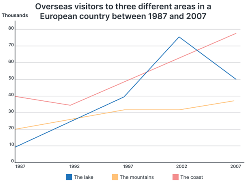
Sample 1:
The chart illustrates a comparison of the three kinds of foreign tourist visits to a certain European nation during a twenty-year period, beginning in 1987 and ending in 2007.
Overall, the majority of survey years showed that most foreign visitors flocked to coastal locations, while mountainous places received the fewest. Furthermore, the number of visitors visiting all three locations rose throughout this time frame.
Over 40,000 tourists from outside of this European nation visited its shore in 1987. Its number plummeted to roughly 35,000 in 1992 but has steadily increased since then, peaking at over 75,000 in 2007. Meanwhile, the annual number of international visitors to the mountains ranged from 20,000 to 30,000 in the first half of the decade and then jumped to 35,000 in 2007.
For the first fifteen years, the number of international visitors to this country's lakes steadily increased, reaching a high of 75,000 in 2002. In the following years, however, this number dropped dramatically, reaching 50,000 in 2007.
Sample 2:
The chart presents a comparative analysis of three categories of foreign tourist visits to a specific European nation from 1987 to 2007.
In general, there was a consistent increase in the number of tourists across all three locations throughout the specified period. Coastal areas witnessed the highest influx of foreign tourists in almost all the periods.
The year 1987 marked the arrival of over 40,000 foreign tourists to the nation’s coastal regions. However, this figure experienced a decline, dropping to approximately 35,000 visitors by 1992. The numbers then surged significantly, peaking at over 75,000 visitors by 2007. Conversely, visits to mountainous locations started at the second highest level of 20,000, progressing to over 30,000 in 1997. Thereafter, this figure stayed unaltered towards 2002 before a modest increment to about 38,000 in 2007.
The volume of international tourists visiting the country’s lakes saw consistent growth over the initial fifteen years, reaching a pinnacle of 75,000 visitors in 2002. Subsequently, there was a substantial decline in visitation, plummeting to 50,000 by the year 2007.
Sample 3:
The graph illustrates the number of tourists to three distinct regions in a European country, spanning from 1987 to 2007. Overall, the places have experienced an increased tourist attraction from the past two decades.
Initially, the coast, with around 40,000 visitors, was known to be the most popular region among the three. On the contrary, the lakes were the least liked, only comprising around 10,000 visitors. It is also notable that both the coast and the lakes had the same number of maximum visitors in this period, which was around 75,000.
By 2007, the coast had become the most popular tourist destination, having visited by almost 75,000 visitors. Although the lakes too saw a steep rise initially, the visitors started to decline, gaining the maximum attraction of approximately 75,000 tourists in 2002. By 2007, it had declined to 40,000 visitors. The mountains surprisingly did not experience any great inclination. They only had around 15,000 more visitors since 1987.
Sample 4:
The given graph illustrates the number of overseas travellers who visited three different attractions in a European country from 1987 to 2007. It is noticeable that the number of tourists visiting all the areas witnessed an upward trend over the given period.
In 1987, the coast attracted the most overseas visitors, with 40 thousand while the converse held true for the lakes, with only 10 thousand. Over the next two decades, the number of overseas tourists opting for the lakes rose gradually to approximately 35 thousand. Similarly, there was a dramatic jump in the number of visitors to the lakes to about 75 thousand, followed by a drop to 50 thousand in 2007.
At the beginning of the period, 20 thousand tourists from other countries visited the mountains. The mentioned attractions welcomed 30 thousand visitors in 1997 and the figure remained relatively stable until 2002. At the end of the period, the number of tourists to the mountains reached the highest point of 35 thousand.
Sample 5:
The given line graph depicts information about how many foreigners visited three separate regions in a European nation, during the span of a 20-year period from 1987 to 2007.
Overall, the most notable detail is that those three regions all attracted an increasing number of foreigners. In addition, the lakes’ tourist figures witnessed the most dramatic change among those given.
In more detail, at approximately 10,000 visitors in 1987, the quantity of foreign travelers who were attracted to the lakes gradually rose to around 50,000 in 2000, before peaking at approximately 75,000 tourists in 2002, This figure then dropped back down to approximately 50,000 people in 2007.
With regards to tourist numbers in coastal and mountainous areas, the overall figures increased, however mountainous areas remained the least attractive travel option out of the three. In 1987, the number of those who chose the coast as a travel destination stood at 40,000, compared to only 20,000 travelers who went to the mountains. In the next 14 years, the coast witnessed a slight decrease in the quantity of visitors by a few thousand, which was followed by a significant climb to around 60,000 people, whereas the number of those visiting mountainous areas went up remarkably to 30,000 in 2001.
In the final 6 years, while the quantity of overseas tourists going to the coast rose moderately to above 70,000, there was a slight climb in those who paid a visit to the mountains to about 35,000.
Sample 6:
The line chart details statistics about foreign travellers to three types of tourist destinations in an unspecified nation in Europe from 1987 to 2007. Overall, all categories witnessed an upswing with the most significant growth being seen in the number of tourists to the lakeside areas.
The coastal region welcomed the highest level of alien sightseers in the first year, at 40,000. Despite dipping to about 35,000 five years later, it recovered rapidly and consistently to approximately 76,000 in the final year.
Regarding the visitors to the mountainous attractions, this figure rose moderately from 20,000 in 1987 to 30,000 in 1997. Subsequently, it documented a period of stability until 2002, followed by a rise of nearly 7,000 by the end.
Finally, starting at the lowest result of 10,000 in the beginning, the number of overseas tourists to the lakes surged to 40,000 by 1997. In the next five years, it increased more sharply to a peak of just over 75,000 which surpassed the coast, before dropping quickly back to second position with 50,000 by 2007.
Sample 7:
The given outline is the number of people who have gone to the distinctive three places (the coast, the mountains, and the lakes) in the European nation from 1987 to 2000. Looking at the by-and-large structure it is quickly clear that the number of worldwide guests to the coast has diminished over the past five years. In spite of the first moo numbers, there has been a sharp increment in the number of guests to the lake by the conclusion, whereas those going to the mountains have expanded slowly.
After dissecting the chart, it can be seen that in 1987, 40% of worldwide people went by the coast which declined to around 35% in 1992. After that, the esteem expanded to roughly 75% in 2007. While, in 1987, 20% of universal people went to see the mountains which expanded consistently to around almost 33% in 2007.
In 1987, the rate of outside guests was 10%, expanding to 40% by 1997. This figure rose to 72% in 2002, sometime recently dropping to 50% in 2007. The coast had the most elevated guest numbers among the three zones. In the interim, both the coast and the mountains experienced development in their guest tallies.
Sample 8:
The line chart outlines the number of universal sightseers gone by the diverse three places in a European nation from 1887 to 2007. The unit is measured in thousands. By and large, it can be apparent that an expansive lion's share of guests went to Europe in 2002 and 2007, and a few thousand individuals in 1987. A look at the chart reveals that more at that point 70 thousand people went by the lakes in 2002, and the same number of individuals went to the mountains in 2007. Within the same year, a decrease was observed in the number of guests who went to lakes as it was 50 thousand. In 1987, as it was, 40 thousand individuals visited the coastal regions, and after that sudden expanded drift watched from 1992 to 2007.
For the mountain ranges, 20 thousand individuals went in 1987, and exceptionally few increases were observed over a period of time. Around 35 thousand sightseers went by the mountains in 2007.
The chart below shows the percentage of people born in and outside of Australia living in cities, towns, and rural areas in 1950 and 2010.
Summarise the information by selecting and reporting the main features, and make comparisons where relevant. Write at least 150 words.

Sample 1:
The chart gives information about the percentage of people living in cities, towns, and rural areas in Australia in 1950 and 2010, in terms of those born in Australia and those born elsewhere.
Overall, it is clear that living in a city was far more common for both groups of people in both 1950 and 2010. Furthermore, the percentage of both groups of people living in cities increased over the period.
In 1950, around 50% of people born in Australia lived in a city. Meanwhile, 20% of people born in Australia lived in a town, compared with around 30% living in rural areas. By 2010, the number of those living in cities had increased to approximately 65%, while the percentage of those living in towns and rural areas dropped to a little over 15% each.
On the other hand, the percentage of people born outside of Australia that lived in cities was around 60% in 1950, and 80% in 2010. Notably, a significant portion of those who weren’t born in Australia lived in rural areas in 1950 (40%); however, this figure dropped substantially in 2010 to around 5%.
Sample 2:
The graph depicts the proportion of Australians living in cities, towns, and rural regions between 1950 and 2010 based on whether they were born in Australia or overseas.
Overall, it is evident that city life was far more prevalent for both categories in both 1950 and 2010. Moreover, the proportion of both populations residing in urban areas rose over time.
In 1950, over fifty percent of Australians were born in cities. Around 30% of those born in Australia resided in rural regions, whereas 20% lived in cities. In 2010, roughly 65% of the population resided in cities, while the percentages of people residing in towns and rural regions fell to around 15% each.
In contrast, over 60% of those born outside of Australia resided in cities in 1950, compared to 80% in 2010. Interestingly, a large proportion of non-Australians (40% in 1950) resided in rural regions; nevertheless, this percentage declined significantly to 5% in 2010.
Sample 3:
The given bar chart depicts the living area of Australian and non-Australian from 1995 to 2010. Overall, there was significant shift towards urban living amonth both groups, as opposed to a dramatic decline in rural populations, with those living metropolitans dominating the chart in both years.
Regarding 1995 residential preferences, nearly half of the Australian-born citizens lived in cities, which was approximately 15% lower than the figure for their foreign counterparts. Rural areas ranked second in both charts, with 30% and 40% of local and overseas inhabitants, respectively. Only about 10% of the non-Australian nationals preferred to stay within urban areas, while the corresponding figure for native Australians was double the former in the same year.
In terms of 2010 tendency, both local and foreign inhabitants living in cities remain dominante in the chart, after substaintial rises to around 66% of native Australians and 80% of their foreign counterparts. In contrast, the rural population underwent the most dramatic drops in 2010 when rural regions became the least popular, at about 17% of native Australians and 5% of foreign residents. A less remarkable decline was seen in the percentage of Australian and non-Australian citizens opting for towns, to below 20% in 2010, at about 17% and 10% in order.
Sample 4:
The graph delineates the distribution of Australians in cities, towns, and rural areas from 1950 to 2010 based on their birthplaces, whether in Australia or overseas.
Overall, city dwelling emerged as the dominant trend for both native-born and overseas-born Australians in 1950 and 2010. Furthermore, there was a surge in the urban population over the years while the percentage of living in town and rural areas decreased.
In 1950, cities hosted more than half of the Australian-born population, compared to nearly 30% residing in rural areas and about 20% in towns. By 2010, the urban population had increased substantially to approximately 65%, while the proportions in towns and rural regions dropped to nearly 15% each.
60% of non-Australians resided in cities in 1950, which surged to 80% by 2010. Notably, a significant percentage of foreign-born Australian nationals (40% in 1950) lived in rural areas, yet this declined remarkably to a mere 5% by 2010. Living in towns was the least preferred option of people born outside Australia in 1950, amounting to just over 10%, which stayed unchanged in 2010 but became the second favorite living site before rural areas.
Sample 5:
The bar charts illustrate the percentage of Australia-born and foreign-born people who reside in cities, towns, and rural areas in Australia from 1995 to 2010.
Overall, the percentages of people living in cities both in and outside Australia were highest and moderately increased over the years. Meanwhile, the percentages of residents in towns and rural areas both in and outside Australia significantly decreased.
Regarding the Australia-born population, the figure for city dwellers in Australia was 50% in 1995, compared to 20% of people living in towns and 30% of those residing in rural areas. 15 years later, while the percentage of urbanites rose by 10%, the figures for town and rural residents experienced declines of 3% and 13%, respectively, to both end at 17%.
Moving on to the foreign-born populations in Australia, 60% of people dwelled in cities, followed by 40% of town residents and 10% of people inhabiting rural areas in 1995. In 2010, the figure for city dwellers grew to 80%, while the percentages of people settling down in towns and rural areas dropped to 10% and 8%, respectively.
Sample 6:
The provided charts illustrate the proportion of individuals living in cities, towns, and rural areas in Australia in 1950 and 2010, in terms of those born in Australia and those born everywhere.
Taken as a whole, a brief assessment of the information reveals that living in a city was far more common for both groups of people in both 1950 and 2010.
To begin with, the statistics of citizens in 1950 who were born in Australia accounted for roughly 50% and experienced substantial growth of approximately 65% after exactly 60 years in cities. Meanwhile, the figures for people born in Australia witness a downward trend, from 20% in 1950 to approximately 17% in 2010. Furthermore, there was a substantial decline in the ratio of rural areas in Australia, which dropped moderately from roughly 30% to around 17% during the period from 1950 to 2010.
For the rest of the chart, the rate of living outside Australia peaked between 60% and 80% in 1950 and 2010. There were also two downward trends in towns and rural areas, from around 15% to approximately 13% and exactly 40%, which decreased sharply by 5% in 1950 and 2010.
Summarise the information by selecting and reporting the main features, and make comparisons where relevant. Write at least 150 words.
Underground Railway Systems | |||
City | Date opened | Kilometres of route | Passengers per year (in millions) |
London | 1863 | 394 | 775 |
Paris | 1900 | 199 | 1191 |
Tokyo | 1927 | 155 | 1927 |
Washington DC | 1976 | 126 | 144 |
Kyoto | 1981 | 11 | 45 |
Los Angeles | 2001 | 28 | 50 |
Sample 1:
The table provided gives information on the underground railway systems in terms of the routes covered, passengers travelling annually and the year the railway system was initiated. The indicated information in the table is for six cities.
As per the table, the oldest underground railway service provider is in London and also covers the longest rail routes (1863 and 394 km of routes). On the other hand, Los Angeles is the latest as it opened in 2001 and covers the second least railway route of 28 km.
Furthermore, Tokyo railway service initiated in 1927 but consists of the largest number of travellers (1927 passengers) among all six other cities, while it is Kyoto that consists of the least number of travellers (45 passengers).
Overall, two of the oldest systems are London and Paris but it is Paris and Tokyo that has a large number of passengers travelling annually; meanwhile, it is London that has the largest route travelled (394 km).
Sample 2:
The supplied table gives data on underground railway system in six metropolitan cities namely: London, Paris, Tokyo, Washington DC, Kyoto and Los Angeles. As is observed, the London railway system is the oldest among the six and has the longest rail route and the most recent railway system in Los Angeles having a small route and fewer passengers using the railway system each year.
London railway system was opened in 1863 and has a total of 394 km. route. The Paris railway system was started in 1900 and has 199 km. route but has a far larger passenger (1191 million per year) than the London railway (775 million passengers per year). Again, Tokyo railway has the largest passengers using the system and this railway station was started in the year 1927.
The two most recent railway stations are Kyoto and Los Angeles those started in the year 1981 and 2001 consecutively and have 11 and 28 km. of routes only. The 11 km. route of Kyoto railway station is the smallest route among the six mentioned cities.
Sample 3:
The given table shows data on underground railway systems of six cities namely London, Paris, Tokyo, Washington DC, Kyoto and Los Angeles and compares these rail stations opening date, route and passengers number. As is observed from the given data, London underground railway system was established before other railway systems of other cities and they have the largest route for this railroad. But Tokyo railway system has the highest number of passengers per year among the given cities.
London railway system was established in 1863, which makes it the oldest underground railway system and it has more than 390 km route which is also the largest route among these six cities. Each year more than 700 million passengers use these underground railway stations in London. Paris underground railway system was started in 1900 and it has almost 200 km route with more than 1190 millions of passengers. Again, Tokyo underground railway system has the largest passengers (more than 1900 million) and it was established in 1927 that has 155 km of route. Kyoto underground railway system was opened in 1981, and it has the smallest route of 11 km and least passengers (45 millions) use this system among the mentioned six cities. Washington Dc and Los Angeles underground railway systems were established in 1976 and 2001 with comparatively smaller routes and few passengers. The Los Angeles underground railway system is the latest railway system in terms of the date it was opened and has the second smallest route (28 km) and passengers (50 million).
In conclusion, the oldest underground railway system is in London and Tokyo has the largest number of passengers of their underground railway system.
Sample 4:
The given table provides data about the underground rail transit systems in six different cities, namely London, Paris, Tokyo, Washington DC, Kyoto and Los Angeles. The statistics provided are the year opening the railway systems, the kilometres of route and the total number of travellers per year in millions.
As is given in the table, London railway service was the first to launch compared to other five cities, i.e., in 1863, and it covers a total distance of 394 kilometres. By contrast, the city of Los Angeles has the newest underground railway, which was opened in 2001, and it falls under the second least used with a mere 50 million commuters and the second shortest length with just 28 kilometers, whereas the Kyoto railway system stands at the last spot with 45 million people and 11 kilometers length respectively.
Interestingly, the Tokyo rail transit system, which was built in the year 1927, has the highest number of passengers, which accounts for 1927 million followed by Paris with a large user base of 1191 million.
Overall, it can be inferred from the presentation that most of the early built and longest rail routes have significantly higher numbers of passengers, compared to modern and short length transit systems.
Sample 5:
The table shows data about the underground rail networks in six major cities.
The table compares the six networks in terms of their age, size and the number of people who use them each year. It is clear that the three oldest underground systems are larger and serve significantly more passengers than the newer systems.
The London underground is the oldest system, having opened in 1863. It is also the largest system, with 394 kilometres of route. The second largest system, in Paris, is only about half the size of the London underground, with 199 kilometres of route. However, it serves more people per year. While only third in terms of size, the Tokyo system is easily the most used, with 1927 million passengers per year.
Of the three newer networks, the Washington DC underground is the most extensive, with 126 kilometres of route, compared to only 11 kilometres and 28 kilometres for the Kyoto and Los Angeles systems. The Los Angeles network is the newest, having opened in 2001, while the Kyoto network is the smallest and serves only 45 million passengers per year.
Sample 6:
The table displays the date opened, number of kilometers and passengers each year in millions for subway systems in various cities.
Looking from an overall perspective, it is readily apparent that the earlier underground railways tend to be longer and now serve more passengers per year relative to the more recent ones. Tokyo stands out for serving by far the most passengers and London for being both the oldest and largest.
London opened first (1863) and is nearly twice as expansive (394 kilometers) as the second largest subway, in Paris, which opened in 1900 and is 199 kilometers long. However, Paris now has more passengers compared to London (1,191,000,000 to 775,000,000). Tokyo was the next oldest having been constructed in 1927 with routes measuring a total of 155 kilometers and being made use of by 1,927,000,000 passengers annually.
The more modern subways are Washington D.C. (1976), Kyoto (1981), and Los Angeles (2001). Washington is the largest of the 3 at 126 kilometers with 144,000,000 yearly passengers. Kyoto is by far the smallest (11 kilometers) and serves relatively few individuals (45 million). Similarly, the Los Angeles subway is 18 kilometers in cumulative length and only 50,000,000 people travel on it each year.
Sample 7:
The table presents data on the underground railway networks in six cities.
Overall, the three oldest systems, in London, Paris and Tokyo, have longer routes and carry many more passengers every year than the three in Washington DC, Kyoto and Los Angeles.
Opening in 1863 and covering 394 kilometers, London's is the oldest and longest of the systems in the six cities. Railway systems opened in Paris in 1900 and Tokyo in 1927. Even though they are less than 200 kilometers long, they have the largest annual passenger numbers, at 1927 million for Tokyo and 1191 million for Paris.
Kyoto and Los Angeles were the last two of these cities to have their own railway networks. These two networks also have the shortest routes, at 11 and 28 kilometers respectively, and are used by the smallest numbers of passengers per year, at 45 and 50 million respectively. Compared with the two networks mentioned above, the one in Washington DC is relatively long, at 126 kilometers, and has a relatively large yearly passenger count, at 144 million.
Sample 8:
The given data illustrates the information of opening date, the number of passengers traveling per year, along with the radius of the underground railway network in kilometers for six different cities.
Overall, it is noticeable from the data that Tokyo is the busiest railway among the other five cities with the highest number of passengers per year. Whereas, Kyoto has the least number of travelers per year.
To begin with, London has the oldest rail transport system with the highest radius of the rail network, approximately 394 kilometers, and 775 million people are using this public transport every year. Moreover, Paris and Tokyo were opened in 1900 and 1927, but Tokyo had the largest number of commuters than Paris, with a small route of 155 kilometers, respectively 1927 million.
Even though the route of the Paris network is not quite larger than 199 kilometers, 1191 million people travel every year. Washington Dc rail network is about 126 kilometers. It was opened in 1976, and 144 million commuters use it per year. In addition, Los Angeles and Kyoto were opened in 2001 and 1981; the Los Angeles rail network radius is similarly double that of the Kyoto rail network, but both networks had approximately a similar number of travelers every year, less than 50 million.
Sample 9:
The provided table chart reflects information about the opening date, length of routes (in kilometers), and how many people traveled in underground railway systems in six different cities.
Overall, it is clear seen that London was the city among all the given cities where the first underground railway Station was introduced, with the longest route. However, the highest number of people traveled to the Tokyo railway station.
Initiating with London and Paris, where the railway station was opened in 1863 and 1900 with 394 km and 199 km, respectively. But there was a huge difference between the passengers, as for London the figure stood at 775 million and 1199 million for Paris. A great difference was seen in the number of travelers in Tokyo and Washington DC, as the number of people traveling in Tokyo was far more (1927 million) than that of Washington DC (144 million), despite the little difference between lengths of track.
Kyoto and Los Angeles, in contrast, were the least in terms of passengers as the railway station in Kyoto came into use in 1981, while in Los Angeles in 2001. The length of the route of Los Angeles was more than twice (28 km) of the former (11km). There was only a difference of 5 million people in both cities as the latter’s passenger number was 50 million and the former 45 million.
Sample 10:
The table shows the details regarding the underground railway systems in six cities.
London has the oldest underground railway system among the six cities. It was opened in the year 1863, and it is already lye years old. Paris is the second oldest, in which it was opened in the year 1900. This was then followed by the opening of the railway systems in Tokyo, Washington DC and Kyoto. Los Angeles has the newest underground railway system and was only opened in the year 2001. In terms of the size of the railway systems, London, for certain, has the largest underground railway systems. It has 394 kilometres of route in total, which is nearly twice as large as the system in Paris. Kyoto, in contrast, has the smallest system. It only has 11 kilometres of route, which is more than 30 times less than that of London.
Interestingly, Tokyo, which only has 155 kilometres of route, serves the greatest number of passengers per year, at 1927 million passengers. The system in Paris has the second greatest number of passengers, at 1191 million passengers per year. The smallest underground railway system, Kyoto, serves the smallest number of passengers per year as predicted.
In conclusion, the underground railway systems in different cities vary a lot in the site of the system, the number of passengers served per year and in the age of the system.
Sample 11:
The accompanying tabular table summarizes statistical information on subterranean train networks in six major cities.
Six networks of subterranean railways are compared in terms of their age, route length, and annual ridership. Clearly, the three oldest subterranean train systems are longer and serve a greater number of people than the three younger railroads.
According to the chart, London possesses the world's oldest underground train system, which began operation in 1863. Additionally, the system is the longest, spanning 394 kilometers. Paris has the second-largest system, with a 199-kilometer route, which is about half the length of London's tube, but it has a higher annual ridership. Meanwhile, Tokyo's metro system, although being the third in length, is unquestionably the most heavily utilized, with 1,927 million riders each year.
Further investigation reveals that among the remaining three newer metros, Washington DC's is the longest, spanning 126 kilometers. The Los Angeles subway is the newest, having debuted in 2001. It covers a distance of just 28 kilometers and carries 50 million passengers. Despite being only 11 kilometers long and serving 5 million fewer people per year than the Los Angeles network, the Kyoto network is much more efficient.
Sample 12:
The given table highlights the details of underground railway systems across six cities, including the routes covered, annual passenger numbers, and the year each system began operation.
Overall, it is evident that London and Paris have the oldest systems among all, with London having the lengthiest route.
To begin with, London boasts the oldest underground railway, originating in 1863, covering a vast route of 394 km. In contrast, Los Angeles, the most recent addition in 2001, has the second shortest route of only 28 km. Interestingly, the 11 km route of Kyoto railway station is the smallest one among all the mentioned cities.
Despite Tokyo’s railway commencing in the year 1927, it accommodates the highest passenger count annually, with 1927 million travellers. Conversely, Kyoto records the lowest passenger count at just 45 million. The underground railways in Washington DC and Los Angeles began operating in 1976 and 2001, respectively; they have smaller routes and fewer passengers compared to other cities. However, Paris and Tokyo witness the highest annual passenger numbers, while London has the longest route travelled.
Sample 13:
The table provides information about the underground railway systems in six cities. Overall, the older systems in London, Paris, and Tokyo have longer routes and carry significantly more passengers annually compared to those in Washington DC, Kyoto, and Los Angeles.
London’s railway system, which began operating in 1863 and is about 394 km long, is the oldest and longest among the mentioned six cities. Then, Paris and Tokyo’s systems opened later, in 1900 and 1927 respectively. Despite being shorter, with less than 200 kilometres each, they have the highest yearly passenger numbers, with Tokyo at 1927 million and Paris at 1191 million.
Thirdly, Kyoto and Los Angeles have the newest systems, with the shortest routes of 11 and 28 kilometres respectively. Similarly, they serve the fewest passengers annually, with Kyoto at 45 million and Los Angeles at 50 million. With Washington DC’s railway system, a route length of 126 kilometres falls in between in terms of length and yearly passenger count, with 144 million passengers annually.
Sample 14:
The table illustrates the data on the number of passengers in millions, the length in kilometers of six subway systems and when they were introduced.
Looking from an overall perspective, it is readily apparent that earlier subways had more commuters and covered longer distances compared to more recent ones. Tokyo’s railway system had the most passengers by far, while London’s was opened earliest and registered the longest route.
Tokyo’s railway system was introduced in 1927, accounting for the highest number of passengers at 1927 million, which was significantly higher than two earlier subways in Paris (1900) and London (1863), representing 1191 million and 775 million, respectively. In terms of their lengths, London was longest, recording 394 kilometers in total, followed by Paris and Tokyo, with the former registering 199 kilometers and the latter 155 kilometers.
Turning to newer railways, the Los Angeles’s subway system was most recently opened in 2001, which saw a comparable figure in the data for passengers with Kyoto’s, accounting for 50 million and 45 million, in turn. Both railways shared relatively short travel distances, with the subway in Los Angeles being more than double Kyoto’s statistics at 28 and 11 kilometers, for each. Lastly, Washington DC’s railway was established in 1976, extending for 126 kilometers and serving 144 million passengers annually.
Sample 15:
The provided table lists the routes served by underground railway systems, the number of passengers who travel there each year, and the year the system was established. Six cities are covered by the information shown in the table.
The table shows that the longest rail routes (1863 and 394 km) are serviced by London Underground, which is also the oldest provider of underground railway services. Los Angeles, on the other hand, opened in 2001 and is the newest, covering the second-shortest railway route at 28 km.
In addition, Kyoto has the fewest travelers (45 passengers), while Tokyo has the most travelers (1927 passengers) out of the six cities. Tokyo railway service was established in 1927.
All things considered, London and Paris are two of the oldest systems; however, the cities with the highest annual passenger volumes are Paris and Tokyo; on the other hand, London has the longest route traveled, at 394 km.
Sample 16:
The chart provided delineates the intricacies of subterranean rail networks across six prominent cities, presenting a clear chronological progression in their inception alongside the extent of their routes and their patronage.
Commencing with an overview, it's noticeable that London boasts the distinction of pioneering the underground railway system, with the longest network and a substantial annual ridership. Conversely, the nascent systems in Kyoto and Los Angeles, despite their modernity, manifest as the least extensive with comparably modest user figures.
Drilling down into specifics, London's system, a progenitor dating back to 1863, stretches over 394 kilometers and facilitates the transit needs of 775 million passengers yearly. Paris, while inaugurated later in 1900, manages a 199-kilometer network that surprisingly surpasses London's in passenger count, clocking in at 1191 million annually. Tokyo, which saw its underground rail service commence in 1927, stands out with an impressive 1927 million passengers per annum, traversing a network of 155 kilometers.
The final pair, Kyoto and Los Angeles, initiated their services in 1981 and 2001 respectively, exhibit the shortest routes among the list - Kyoto with a mere 11 kilometers, yet serving 45 million passengers, and Los Angeles with 28 kilometers accommodating a similar passenger volume of 50 million.
Sample 17:
The table provided offers a comparative analysis of subterranean transit systems within six global cities, detailing their inception dates, the span of their networks, and annual passenger numbers.
An overview of the data reveals a notable disparity in the maturity and scale of these underground railway systems. London emerges as the forerunner, both in terms of historical establishment and network length, while the newer systems of Kyoto and Los Angeles are characterized by their limited reach and lower passenger traffic.
Delving deeper, London's underground, inaugurated in the 19th century, commands a vast network of 394 kilometers and caters to 775 million travelers each year. Paris, with its system operational from the turn of the 20th century, has half the route length of London's but sees a higher footfall of 1191 million passengers annually. Tokyo's network, the youngest of the three oldest systems, boasts the highest number of users, with 1927 million utilizing its 155 kilometers of rail annually.
On the more recent end of the spectrum, the systems in Kyoto and Los Angeles, launched in 1981 and 2001 respectively, are modest in comparison. Kyoto's 11 kilometers of track serve 45 million passengers, whereas Los Angeles, despite having a track just over twice the length, sees a comparable usage at 50 million.
Sample 18:
The table elucidates pivotal details regarding the underground railway systems in six distinct metropolises, encapsulating the year each system commenced, the extent of their routes in kilometers, and the annual influx of passengers.
In an overarching perspective, the tableau underscores a dichotomy between the venerable and expansive network of London’s underground and the nascent, albeit smaller-scale networks typified by Kyoto and Los Angeles. This chasm delineates the historical progression and current magnitude of the underground railway infrastructure within these cities.
Scrutinizing the details, London's venerable underground railway, unveiled in the 19th century, spans an extensive 394 kilometers, ferrying 775 million passengers yearly. In a remarkable contrast, despite a later start in 1900, Paris's underground spans a shorter route of 199 kilometers yet surpasses London with a staggering 1191 million passenger movement per annum. Tokyo, another city with a historic system initiated in 1927, leads in patronage, with its 155 kilometers of railways being traversed by an unparalleled 1927 million passengers annually.
The younger systems, embodied by Kyoto and Los Angeles, which embarked on their underground journeys in 1981 and 2001 respectively, present a starkly different scale. Kyoto's diminutive 11-kilometer system accommodates 45 million passengers, while Los Angeles, with a network spanning 28 kilometers, supports a similar patronage of 50 million.
Sample 19:
The table compares the subway systems of six cities in terms of the date they opened, the length of their routes, and the number of passengers they serve per year. The data is presented in three columns and six rows, with each row representing a different city.
The most striking feature of the table is that London has the oldest and the longest subway system among the six cities, having opened in 1863 and having 394 kilometres of routes. It also has the second highest number of passengers per year, with 775 million, only slightly behind Paris, which has 1191 million. Paris’s subway system opened in 1900 and has 199 kilometres of routes, making it the second oldest and the third longest.
Tokyo and Washington DC have similar subway systems in terms of the date they opened and the length of their routes. Tokyo’s subway system started operating in 1927 and has 155 kilometres of routes, while Washington DC’s subway system began in 1976 and has 126 kilometres of routes. However, Tokyo has a much higher number of passengers per year, with 1927 million, compared to Washington DC’s 144 million.
Kyoto and Los Angeles have the newest and the shortest subway systems among the six cities, having opened in 1981 and 2001 respectively and having 11 and 28 kilometres of routes respectively. They also have the lowest number of passengers per year, with 45 and 50 million respectively.
In summary, the table shows that there is a great variation in the subway systems of the six cities, both in terms of their age and size, as well as the number of people they transport annually.
Sample 20:
The table provides information on the subway systems of six cities around the world, namely London, Paris, Tokyo, Washington DC, Kyoto, and Los Angeles. It shows the year each system was inaugurated, the total route in kilometres, and the annual passenger count in millions.
It is clear from the table that London has the most established and extensive subway system of the six cities, having been opened in 1863 and having 394 kilometres of routes. It also serves a large number of passengers every year, with 775 million, which is only slightly lower than Paris, which has the highest passenger count of 1191 million. Paris’s subway system is the second oldest and the third longest of the six cities, having started in 1900 and having 199 kilometres of routes.
Tokyo and Washington DC have subway systems that are similar in terms of the length of their routes, with 155 and 126 kilometres respectively, but differ greatly in terms of the number of passengers they carry per year, with Tokyo having 1927 million and Washington DC having 144 million. Tokyo’s subway system is also much older than Washington DC’s, having begun in 1927, while Washington DC’s started in 1976.
Kyoto and Los Angeles have the newest and the shortest subway systems of the six cities, having been inaugurated in 1981 and 2001 respectively and having 11 and 28 kilometres of routes respectively. They also have the smallest number of passengers per year, with 45 and 50 million respectively.
In summary, the table reveals that there is a significant variation in the subway systems of the six cities, both in terms of their history and size, as well as the number of people they transport yearly.
Sample 21:
Interestingly, the given table basically provides information about the underground railway systems in six different cities of the world along with detailed information on their years of opening, their kilometres of route and passengers per year in millions. Let’s have a summarized written account of it.
Initially, London, the oldest underground railway system of the world is given which was built in 1863 with the longest 394 kilometres route facilitating 775 million of people per year. In the same way, in Paris, the same kind of system was established in 1900 with a total length of 199 kilometres amazingly accommodating 1191 million people every year. In 1927, an underground railway was opened in Tokyo which was 126 kilometres long transporting 1927 millions of passengers yearly.
If we move on, we find that the system was initiated in Washington DC in 1976, having 126 kilometres of route giving transport facilities to 144 million people every year. Koyoto comes next, which was started in 1981 with only 11 kilometres of route and, surprisingly, it is addressing 45 million passengers every year. Lastly, the system was constructed in 2001 in Los Angeles with kilometres route facilitating 50 million people every year.
Analytically speaking, London has the oldest and the longest underground railway system of the world whereas Tokyo’s Railway System is facilitating the maximum number of people per year.
Sample 22:
The provided tabular chart shows statistical data about underground rail networks in six major cities.
Overall, six networks of subsurface railway systems are compared in terms of their eld, length of the route and the figure of commuters who board them per annum. It is evident that the three oldest underground systems are longer and assist considerably more passengers than the other three newer railways.
A glance at the table reveals that London has the oldest underground railways that commenced functioning in 1863. It also has the longest route with 394 kilometres. Paris is the second-largest system which is around half of the length of London’s tube, with 199 kilometres of route although it is boarded by more travellers per year in comparison to London. Furthermore, third in terms of length, Tokyo’s metro is clearly the highest used, receiving 1927 million passengers yearly.
Probing further, as far as remaining three newer metros are concerned, the Washington DC’s is the lengthiest of them three, with 126 kilometres. Los Angeles’ tube covers a distance of merely 28 kilometres and is the newest, having opened in 2001 and 50 million people move around by using it. Whilst the Kyoto network is the shortest route of only 11 kilometres and serves 5 million passengers less per year than that of L.A.
Sample 23:
The table shows the underground railway networks in six major cities of the world focusing on London, Paris, Tokyo, Washington DC, Kyoto and Los Angeles. A comparison has been carried out between the three cities of London, Paris and Tokyo, which are the oldest with that of Washington DC, Kyoto, and Los Angeles. The comparison has been made in terms of the dates when it started. And, the route of these underground railways is kilometers, and the passengers that these railways carry every year in millions. The oldest amongst them all is the London Underground Railway which opened in 1863. And, it has the longest line of routes spread across 394 kilometers in the city. In comparison, Paris has an underground railway route that spreads around 199 kilometers, which is half the kilometers covered by the London Underground Railways. However, the London underground railways could carry only 775 million passengers every year. While the Paris railways, 1191 million passengers have been carried every year since it opened in 1900. While Tokyo's underground railways opened in 1927 and were spread only across 155 kilometers. They carried the highest number of passengers, yearly including 1927 million passengers on a yearly basis. Washington DC, Kyoto, and LA saw the opening of the underground railways much later in 1976, 1981, and 2001 respectively. Accordingly, DC’s underground railway spread across 126 kilometers carrying only 144 million passengers yearly. While Kyoto, which was only 11 kilometers, carried only 45 million passengers yearly. For Los Angeles, the railways spread across 28 kilometers and carried 50 million passengers. Thus, Kyoto has the shortest route and carries the least number of passengers.
Sample 24:
The table depicts the underground railway networks in six cities of the world focusing on London, Paris, and Tokyo, which are the oldest. And Washington DC, Kyoto, and Los Angeles are the newest. A comparison has been carried out between these cities of London, Paris, and Tokyo with that of Washington DC, Kyoto, and Los Angeles. It is in terms of the dates when it started, the route of underground railways in kilometers, and the passengers that these railways carry every year in millions. The oldest amongst all the six is the London Underground Railway, it started in 1863 and has the longest route which spread across 394 kilometers in the city. Comparing London’s underground railway with Paris's underground railway which was opened in 1900. The route spreads around 199 kilometers which is half the kilometers covered by the London Underground Railways. However, the London underground railways are able to carry only 775 million passengers every year. While the Paris underground railways have a total of 1191 million passengers being carried every year. Another major city, Tokyo, has an underground railway that opened in 1927 and is spread only across 155 kilometers. It carries, however, the highest number of passengers compared to all the six cities yearly with 1927 million passengers on a yearly basis. Washington DC, Kyoto, and LA saw the opening of the underground railways much later in the late 1900s. Washington DC opened its underground railways in 1976, Kyoto in 1981, and LA in 2001. Accordingly, DC’s underground railway spread across 126 kilometers carrying only 144 million passengers on a yearly basis. On the other hand, Kyoto has an underground railway spread only for 11 kilometers and carries only 45 million passengers yearly. For Los Angeles, the railways spread across 28 kilometers and carried 50 million passengers. Thus, Kyoto has the shortest route and carries the least number of passengers.
Sample 25:
The table displays the origin of the underground railway networks in six cities of the world including London, Paris, Tokyo, Washington DC, Kyoto and Los Angeles. A comparison has been carried out between these cities of London, Paris, and Tokyo with that of Washington DC, Kyoto, and Los Angeles. It is based on the dates when it started, the route in kilometers of these underground railways and the passengers in millions that these railways carry every year. The oldest amongst all the six is the London Underground Railway which started in the late 19th century in 1863. It has the longest route which spreads across 394 kilometers in the entire city. Comparing London’s underground railway with Paris's underground railway, which was opened in 1900, the route of Paris spreads around 199 kilometers. This implies that London’s underground railway is almost twice as big as Paris’. Accordingly, the London underground railways are able to carry only 775 million passengers every year. And the Paris underground railways carry around 1191 million passengers every year. Another major city in the world that has one of the oldest underground railways is Tokyo, which opened in 1927 and is spread only across 155 kilometers. It carries the highest number of passengers compared to all the six cities yearly, implying 1927 million passengers on a yearly basis. Washington DC, Kyoto, and LA saw the opening of the underground railways much later in the late 1900s. Washington DC opened its underground railways in 1976 which spread across 126 kilometers carrying only 144 million passengers on a yearly basis. Kyoto opened its underground railways in 1981 which spread across only 11 kilometers and carries only 45 million passengers yearly. In the case of LA in 2001 the underground railways spread across 28 kilometers and carried 50 million passengers.
Sample 26:
The table shows data regarding the underground railways in 6 cities with respect to their age, length, and numbers of passengers per year.
Overall, the 6 selected cities span a wide range of underground systems with London’s subway being both the oldest and longest, while Tokyo’s underground railway serves by far the highest number of passengers per year.
The London underground railway dates back to 1863, making it the oldest subway system in the table followed by the Paris underground, which opened in 1900. In contrast, Los Angeles has the youngest underground railway of the 6 cities, dating back to only 2001. However, while London and Paris also have the longest subway systems, with 394 and 199 km respectively, Los Angeles is only the second shortest at 28 km. The shortest underground railway belongs to Kyoto (11 km).
Regarding the numbers of passengers served, Tokyo’s is by far the busiest subway with 1927 million passengers per year, despite having less than half the length of railway compared to London underground railway, which transports only 775 million people per year.
The chart below shows the percentage of adults of different ages in the UK who used the Internet every day from 2003-2006.
Summarise the information by selecting and reporting the main features, and make comparisons where relevant. Write at least 150 words.
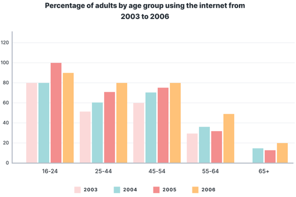
Sample 1:
The chart displays the ratio of daily adult Internet users across various age groups in the UK between 2003 and 2006
Overall, it is clear that the younger the participants were, the more they used the Internet. Furthermore, the number of people who enjoyed the Internet has an upward trend over the studied period.
First, the 16-24 years old participants were the most active Internet users with the general percentage of 80% and over throughout the four-year period, even peaking at 100% in 2005. However, the figure for this age group dropped slightly to 90% in the next year.
The second and third most avid Internet users were citizens aged 25-44 and 45-54, with relatively similar rates, increasing steadily from approximately 50% and 60%, in turn, to 80% by the end of 2006. The figure was slightly higher in the 45-54 years old group in the first two years, whose difference with the 25-44 age group was 10% in both years.
The statistics for the remaining groups were considerably less, with only about half of the people from 55-64 years old that were interested in using the Internet daily in 2006. However, the figure for this age group was lower in previous years, standing at around a third of its population. The least engaged Internet users were the 65+ age group with a moderate increase from 18% to 20% between 2003-2006. Notably, in 2003, people aged 65 and above did not use the Internet.
Sample 2:
The given bar graph illustrates the ratio of people of various age categories in the UK being reported to use internet between 2003 to 2006.
It is crystal clear that the ratio of young people from age 16 to 24 was highest among any other age group in terminal years. On the other hand, the least users of internet were the adults of 65+ in the whole time zones.
The masses between 16 to 24 were the major users of internet as the percentage climbed to 80 in 2003 and 2003. Moreover, in 2005 it escalated to 100 but slightly decreased at 90 in 2006. Preceding further, adults between 25-44 reported that the percentage rose from 50 to 80 every year, respectively. Similarly, the same trend was observed between the age group of 45-54 but this time the ratio increased from 60 to 80 with minimal difference.
On the other hand, the experienced individuals of age 55-64 used 30,38,37 and 45 percent of internet in the given time, respectively. At the end, people of age 65 and above surfed the least internet at the ratio of 15 in 2003, 14 in 2004 and one fifth in 2005 but no record of 2006.
Sample 3:
The bar chart illustrates the percentage of Internet users in the UK over the 4-year period from 2003 to 2006. The initial impression from the chart is that the rates of people using the Internet in the UK generally enjoyed upswings in most age brackets. It is also clear that a much larger percentage of people aged between 16 and 24 used the Internet compared to the other age groups.
In 2003, the figure for 16-to-24-year-old Internet users ranked first at 80%, followed by the 45-to-54-year-olds (60%), the 25-to-44-year-olds (50%) and the 55-to-64-year-olds (30%); no data was recorded for the 65+age group this year. In 2004, whilst internet usage of the 25-to-44, the 45-to-54, the 55-to-64 and the 65+ all rose to 60%, 70%, 55% and 15% respectively, the figure for the youngest age bracket plateaued.
In 2005, the figure for Internet users at the age of 16 to 24 reached a remarkable 100% – the highest of any age group, in any year – before undergoing a drop to 90% in 2006. In the meantime, the proportions of Internet users belonging to the remaining age groups saw similar increases to 80% (the 25-to-44 and the 45-to-54), 50% (the 55-to-64), and 20% (the 65+).
Sample 4:
The given bar graph illustrates the percentage of netizens of different age groups, between 2003 and 2006, in Great Britain.
Overall, the maximum internet users belonged to the youngest age group (16-24years), whereas the oldest age group (the over 65's) had the least percentage of Internet users. All age groups experienced an upward trend as far as their daily use of the Internet is concerned.
In detail, in 2003 and 2004, the internet users in the 16-24 age group were 80%. In 2005, this figure increased significantly to 100% but decreased slightly to 90% in 2006. In the 25-54 group, there was a gradual growth in the percentage of internet users, from about 50% to 60% in 2003 to 80% in 2006.
The percentage of 55–64-year-olds who used the net ranged between 30 and 35% from 2003- 2005 but grew significantly by 15% by 2006. With regard to the over 65-year-olds, their percentage increased slightly from 18 to 20% over the four-year period.
The pie charts below show the percentage of five kinds of books sold by a bookseller between 1972 and 2012.
Summarise the information by selecting and reporting the main features, and make comparisons where relevant. Write at least 150 words.
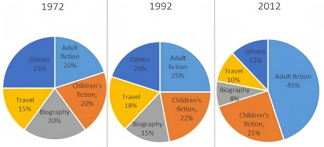
Sample 1:
The pie charts detail sales by a bookseller between 1972 and 2012 according to genre.
Looking from an overall perspective, it is readily apparent that adult fiction became by far the most popular type at the expense of the genres which declined in popularity (others, biography, and travel). Interest in children’s fiction also increased.
In 1972, this particular bookseller sold relatively equal proportions of each type with others leading at 25%, followed by adult fiction, children’s fiction, and biography all at 20%, and travel lowest at 15%. By 1992, adult fiction had risen by 5%, while others and biography declined by the same number. Travel and children’s fiction grew by 3% and 2%, respectively.
In the final year surveyed, adult fiction surged to 45% and children’s fiction ticked up slightly to 25%. The rise of adult fiction was compensated for by dramatic drops for the remaining genres with others finishing at 12%, travel at 10%, and biography 8%.
Sample 2:
The pie charts illustrate the sales percentages of books across five genres sold by a bookseller from 1972 to 2012.
Overall, it is evident that the proportion of adult fiction book sales increased over the years, while the sales of biography books exhibited a declining trend.
Initially, in 1972, the ‘other’ books category dominated the market, comprising approximately 25% of total sales. In contrast, adult fiction, children’s fiction, and biography books each represented 20% of total sales. Travel books constituted a smaller segment at 15%. By 1992, adult fiction had taken the lead in sales at 25%, while children’s fiction and the ‘other’ category each accounted for around 20% of total sales. In the same year, travel and biography books made up 18% and 15% of sales, respectively.
By 2012, adult fiction books constituted 45% of book sales. Additionally, children’s fiction represented 25% of the market. Both travel and ‘other’ book categories saw a decrease, each accounting for about 10% of total sales. In contrast, biographies had the smallest share of sales at just 8%.
Sample 3:
The pie charts illustrate changes in book sales by genre for a particular bookseller in 1972, 1992, and 2012.
Overall, there was a pronounced increase in sales of adult and children's fiction. Meanwhile, biographies, travel, and other genres experienced a decline, with adult fiction emerging as the best-selling genre by 2012.
In terms of fiction, sales of books aimed at adults started at 20% of total sales in 1972, and grew impressively to 45% by 2012, making it the leading genre. Children's fiction also showed growth, starting at the same level as adult fiction but increasing more modestly to 25% by the end of the period.
Turning to other categories with a downward trend, unspecified types of books initially outsold the rest, constituting a quarter of the total sales. However, the figure then experienced a significant drop, and by 2012 had more than halved (12%). Similar changes, but to a lesser extent, were also observed in biography sales, starting at 20% before slumping by 12% in 2012.
Sample 4:
The provided pie charts compare different book genres in terms of their sales from a bookseller over a 40-year period, starting in 1972.
Overall, it is evident that in 1972, the sales of different book genres were relatively balanced. However, from 1992 onwards, adult fiction and children’s fiction gained increasing popularity, with adult fiction becoming the best-selling genre throughout this period, while other genres saw a decline in sales.
In 1972, the share of adult fiction stood at 20%, equal to the figures for children’s fiction and biographies, which also accounted for 20% each. Travel books closely followed behind and made up 15% of total sales, while the remaining 25% was distributed among other genres.
Over the next 40 years, the sales of adult fiction registered an over twofold increase to 45%, making it the most popular genre. Similar changes, but to a lesser extent, can be seen in children's fiction sales, whose sales grew modestly to 25%, securing them as the second most popular genre. Meanwhile, sales of travel books rose gently to 18%, after which they plunged to 8% at the end of the period. Biographies and other genres witnessed substantial decreases, with the former dropping to 10% and the latter halving to just 12%.
Sample 5:
The pie charts illustrate the percentage distribution of five categories of books sold by a bookseller over three different years: 1972, 1992, and the final year of the analysis 2012.
Overall, adult fiction saw a significant rise in sales over the years, becoming the dominant genre by the end. In contrast, other genres, including biography and travel, experienced declines, while children's fiction showed a modest increase in popularity.
In 1972, book sales were relatively balanced among the genres. The 'others' category led with 25%, followed by adult fiction, children's fiction, and biography, each constituting 20% of the sales, while travel was the least popular at 15%.
By 1992, adult fiction had increased its share to 25%, a 5% rise from 1972. However, the 'others' and biography categories both decreased by 5%, settling at 20% and 15%, respectively. Travel and children's fiction showed slight growth, with travel moving up to 18% and children's fiction to 22%.
In the final year of analysis, adult fiction soared to 45%, nearly doubling its share since 1992. Children's fiction also increased, reaching 25%. Conversely, the other genres saw marked declines: 'others' dropped to 12%, travel fell to 10%, and biography dwindled to 8%. This shift highlights a growing preference for adult and children's fiction over the other genres.
Sample 6:
The pie charts illustrate the books sales by a retailer in 5 different genres between 1972 and 2012
Overall, it is clear that adult fiction slowly became the most popular genre with a considerable increase in sales. The other 4 genres all experienced a moderate drop in sales in the 40-year period.
In 1972, all five genres shared the same sales figure at around a fifth of the total sales each. Books in the fiction and travel categories climbed slightly in sales at around 2-5% in the following 20 years whereas biography and other book genres were consumed less with a 5% decrease in sales.
In 2012, adults’ fiction grew dramatically in popularity and sales were twice as high as in 1992. Sales for fiction books for children also experienced a minimal growth of 3 percent and remained the second preferred book genre. Consumers were buying less biographies, travel and other types of books which is represented in the steady fall in sales to just around a tenth in all 3 categories.
Sample 7:
The pie charts illustrate the percentage distribution of five different types of books sold by a bookseller in 1972, 1992, and 2012. The book categories include adult fiction, children’s fiction, biography, travel, and others.
Overall, the most notable trend is the significant increase in the sales of adult fiction from 1972 to 2012, while the popularity of other categories like travel and biography diminished over time. Children’s fiction remained fairly stable during the period, with only a slight fluctuation in its share of sales.
In 1972, the largest share of book sales was travel and adult fiction, each accounting for 25%. This was followed by children’s fiction and biography, both making up 20%, while “others” occupied the smallest share at 15%. By 1992, the proportion of adult fiction had slightly increased to 25%, while children’s fiction sales also saw a slight rise to 22%. Travel and biography both saw a reduction, with travel decreasing to 18% and biography to 15%.
By 2012, the sales of adult fiction had surged significantly, accounting for 45% of total sales, making it by far the most popular category. Children’s fiction also increased to 25%, while the share of travel books dropped further to just 10%. Similarly, biography sales fell to 8%, and the category of “others” declined to 12%.
Sample 8:
Three diagrams, from 1972, 1992, and 2012, show the percentage of people's chosen book types in each of those three years. These choices are further broken down into five groups, including Others, Adult Fiction, Children's Fiction, Biography, and Travel. The overall pattern indicates that the changes between 1972 and 1992 were not as significant as those between 2012 and 2013.
First, compared to numbers from 1972, the "Others" and Biography categories have continuously declined. In 1972, the "Others" category had a share of the market of 25 percent of all books sold; by 1992, that percentage had dropped to 25 percent. And in 2012, it fell even further, to just 12% - a decrease of more than 50% from where it had been. Similar trends were seen in the market for biography books. It saw a decline from 20% in 1972 to 15% (a one-fourth fall) in 1992 before reaching an all-time low of 8% by the end. The categories that witnessed the most increase throughout these years were adult fiction and children's fiction. The former saw a humongous gain of 20% from the 1992 number. While the latter did not experience as much growth, increasing from 20% in 1972 to 2% and 3%, respectively, in the years 1992 and 2012. Last but not least, sales of travel-related books climbed from 15% in 1972 to 18% in 1992 before declining to 10% in 2012.
Sample 9:
The ratio of people's preferred book types in each of the three years—1972, 1992, and 2012—is depicted in three diagrams. These options are further divided into five categories: Others, Adult Fiction, Children's Fiction, Biography, and Travel. The overall pattern suggests that the differences between 2012 and 2013 were more dramatic than those between 1972 and 1992.
First off, 1972 was the year that saw the greatest sales of other publications. The adult, children's, and biography categories account for 20% of all books sold, though. However, in 1972, a very small number of travel books were actually sold. Additionally, adult fiction novels accounted for the bulk of sales in 1992. Moreover, the bookshop sold 20% or so of the children's books and other titles. However, only 18% and 15% of consumers, respectively, said they enjoyed buying travel and biography books. But, in 2012, 45% of people said they were more likely to buy adult fiction. Additionally, children's books accounted for 25% of sales. However, other categories like travel and others account for about 10% of book sales. As a result, a bookshop sold a small portion of biographies in 2012. The majority of individuals prefer to buy adult fiction. But only a small ratio of people is interested in buying travel novels throughout the course of time, it is abundantly evident from the entire information.
Sample 10:
The pie chart shows details of the bookseller who sold five different categories of books from 1972 to 2012. It includes adult fiction, children's fiction, biographies, travel, and others. The information has been converted to percentages. When viewed from a broad viewpoint, it is clear that merchants shared the most adult fiction books within the time frame.
Overall, it appears that there were more significant differences between 2012 and 2013 than there were between 1972 and 1992. Travel novels, in comparison, provided the least context. In the first year, the sales percentiles for adult literature, children's fiction, and biography books remained the same and were roughly one-fifth orderly. This is ostensibly clearly evident. The proportion of adult fiction novels broadcast on television then nearly surpassed 50% in 2012. A small difference of 3% was also seen in the percentile of travel journals sold when compared to biography books, although only insignificantly. As we look at the remaining data, we see that only 12% of the other topic notebooks were sold. In 1992, however, the sales increased by 8%. Following the previous year, salesmen sold a smaller percentage of biographies this year. Adult fiction book sales increased by double in 2012 after that. It is very clear from the data that most people choose to purchase adult fiction. Whereas just a small proportion of customers are interested in purchasing travel novels over time.
Sample 11:
The pie charts illustrate the proportion of five different types of books sold by a bookseller over a period of 40 years from 1972 to 2012.
As can be seen from the charts, the percentages of adult and children's fiction had a tendency to increase gradually. Meanwhile, the 1972-2012 period saw a continual decrease in the figures for the 3 remaining kinds. Additionally, the figure for adult fiction experienced the most significant change.
In 1972, the figures for adult and children's fiction accounted for the same proportion of the total consumption, at 20%. After 40 years, while the percentage of children's fiction increased slightly to 25%, there was a dramatic growth in the proportion of turnover of adult fiction and then this figure reached a peak of 45%.
A slight fall was witnessed in the figure for biography during the 1972-2012 period, from 20% to 8%, a difference of 12%. At the same time, there was a fluctuation in the sales of travel books. After accounting for 15% in 1972, it hit the highest point of 18% in 1992, followed by a drop to 10% in 2012. On the contrary, in terms of other types, there was a consistent change from 20% to 12%, a smooth fall of 8%.
Sample 12:
The three pie charts compare the proportion of five different kinds of books according to the sales of bookseller from 1972 to 2012.
Overall, it can be clearly seen that the rates of fiction books became the most widely sold, whereas the figure for the rest of books decreased remarkably over the given period.
In terms of adult fiction and children's fiction were sold, the datas on the former and the latter were parallel, at 20 percent in 1972. However, the rate of adult fiction vended surpassed that of children's fiction, at 25 and 22 percent, respectively in the following 20 years. Furthermore, adult fiction was the highest portion, at 45 percent, while the figure for children's fiction continued to rise mildly to 25 percent at the end of the surveryed period.
Turning to the remaining books, biography was less popular than ‘others’ books in a 40-year period, the gaps were 5, 5 and 4 percent, respectively. Meanwhile, the proporton of travel books gained the least popularity in 1972, at 15 percent, followed by a significant increase to 18 percent in 1972 before hitting the bottom at 10 percent in 2012.
Sample 13:
In 1972, there was an equal sale of adult fiction, children’s fiction and biographies, which constituted 20% each. Travel books had the least sales of 15%, whereas all other books had the maximum sales of 25%.
In 1992, a quarter of the sales were of adult fiction, which was a rise of 5% from the figures on 1972. The sales of children’s fiction and travel grew by 2% and 3% respectively, whereas those of biography and other books dropped by 5% each.
The sales of adult fiction almost doubled after another two decades (2012) and reached 45%. Children’s fiction had slightly more retail (25%) than that in 1992. Together, adult and children’s fiction, dominated the market with a sale of just under three quarters. The sales of all other categories fell markedly and together made up just over a quarter of the sales.
Overall, fiction gained popularity, while biographies, travel books and other miscellaneous books lost their public appeal over the given period of four decades.
The diagram below shows the multistage production of pears as canned fruits.
Write a report for a university lecturer describing the process below. Write at least 150 words.
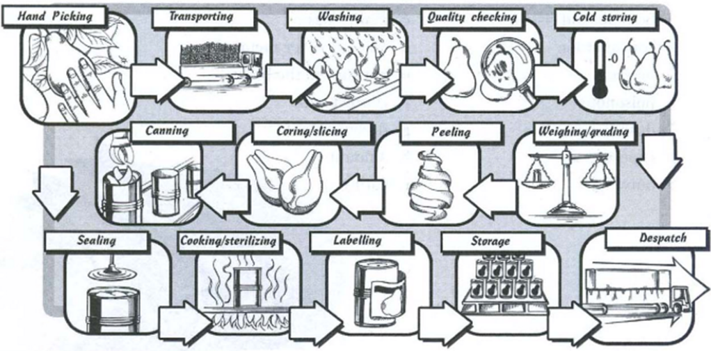
Sample 1:
The diagram highlights the steps involved in the production of canned pears. There are several stages that take place between picking the fruit and sending it to stores to be sold.
After the fruit is picked by hand, it is transported by truck to the factory. At the canning facility, it is washed then checked to ensure that it is of suitable quality. Fruit that passes the quality control stage is kept in cold storage until it is ready to be canned.
In the next part of the process, the fruit is first weighed and given a grade. Next, the skin is removed along with the core before it is cut into smaller pieces. Now the slices are ready to be put into cans, which are then sealed. Following this, the cans are cooked at a temperature that is high enough to cook the fruit and sterilize the cans. Once this has been done, the cans are labelled and then placed in storage. Finally, the finished product can be dispatched to where it is sold.
The canning process aims to guarantee that the canned fruit is of a high quality and safe to eat.
Sample 2:
The diagram presents the whole process of producing canned fruit under modern manufacturing conditions. Overall, fresh fruit is harvested and processed through various steps with the help of equipment to be canned and put on the shelf for sale.
First, the fruit is hand-picked by farmers and then transported to the factory by truck. After initial cleaning, the fruit goes for quality assurance and cold storage to ensure freshness. Another quality control procedure is employed. At this stage, the fruit is then weighed and graded to remove poor quality ones. Qualified fruit is then peeled and sliced into pieces, with the core being removed. These pieces are to be put in cans by automatic robotic arms. Afterwards, cans are sealed and sterilised through a special heating process, followed by labeling process. Finished products are stocked on pallets and stored awaiting for orders. Finally, they are distributed to stores via truck. Thanks to automation and machines, canned fruit can be mass produced with consistent quality.
Sample 3:
The diagram shows the process of canning fresh pears. The first step is to handpick pears from trees. And then, they are transported to the cannery using large trucks. At the cannery, the pears get thoroughly washed and undergo a quality test where the poor-quality lot is taken out.
The selected pears are put into cold storage. When ready for canning, the pears are weighed and graded. After this step, the pears are peeled, and the cores are removed. They are then sliced into the required sizes and put into cans. Juice or syrup may also get added to the cans.
Once the cans have been filled, they are sealed and cooked overheated to ensure adequate sterilization. When the cans are cool, a label is attached, and they are placed into storage. Post this, the canned pears get ready to be despatched to supermarkets for the purpose of selling.
Sample 4:
The diagram shows how fresh fruit is canned. First the fruit is picked from trees by hand. It is then transported to the cannery by large trucks. At the cannery the fruit is washed and quality checked, and any poor-quality fruit is rejected. The good quality fruit is put into cold storage. When it is ready for canning the fruit is weighted and graded. The grading ensures that fruit of a similar size is kept together. After this the fruit is peeled and the cores are removed. It is then sliced into the required sizes and put into cans. Juice or syrup is also added to the cans. Once the cans have been filled, they are sealed and cooked overheated to ensure that the cans are sterilised. When the cans are cool, a label is attached, and they are placed into storage. The canned fruit is now ready to be dispatched to supermarkets and sold.
Sample 5:
The process diagram demonstrates different steps in manufacturing canned pears. Overall, the production comprises fourteen steps, starting with harvesting the fruit, continuing with canning the product, and ending with distribution.
The first nine steps involve processing the fruit for packaging. First, the pears are picked manually and then transferred to a place designated for rinsing. After being verified for the quality, they are then preserved in cold conditions. This is followed by a stage of grading by the weight of the pears, after which the cores and seeds are removed and the pears are sliced, ready for the next stage of packaging.
The final product is the outcome of the remaining steps. Slices of pears are packed into cans, which are then sealed. In the next step, the cans undergo a process of cooking and sterilizing. After being labeled, the products are placed into storage before being transported for distribution.
Sample 6:
The diagram illustrates how to produce canned fruit step by step. It is clear that there are several main steps in the process, from the picking of the pears to the final canned product.
In the first stage of the process, ripe pears are picked by hand and then transported to the factory where the pears are washed and then checked for quality under a magnified view. Next, the defective pears are taken away and the good ones are cooled in storage at a specific temperature. Then the pears are weighed and graded into different grades. Following this, the pears are peeled before slicing them, and then their cores are also removed.
In the next step, these cored and sliced pears are put in cans and sealed before being cooked. This also sterilizes the cans filled with pears. After this, the cans are labeled and stored and are finally dispatched to the supermarkets for sale.
Overall, it can be seen that the process of canning pears is a complex process involving many steps.
Sample 7:
The given diagram is a process map detailing the different steps involved in the production of canned pears.
In an overview, the handpicked pears undergo seven stages of processing until canning and there are four further steps before they can be distributed.
The pears for canning are handpicked and transported to the production center where they are thoroughly cleaned before they undergo a quality control process. The pears which pass the quality check are then moved to a storing facility kept in cold temperatures. The next step is weighing and grading the pears after which the outer skin of the sorted pears is peeled off, the seeds are removed, and they are sliced. The sliced pears are then canned and sealed and in the next steps the canned pears are cooked and sterilized. The labels are stuck on the cans which are moved to the storage facility, ready to be dispatched.
The bar chart shows the percentage of the total world population in four countries in 1950 and 2002, and projections for 2050.
Summarise the information by selecting and reporting the main features, and make comparisons where relevant. Write at least 150 words.
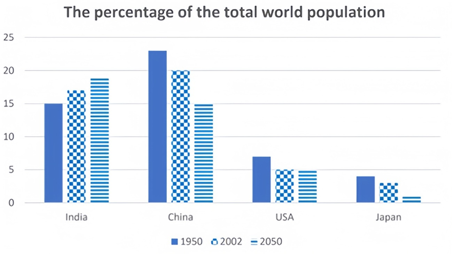
Sample 1:
The bar chart illustrates the proportion of the total world population in four countries (India, China, USA and Japan) in 1950, 2002, and predicted figures for 2050. Overall, the figures for the proportion of world population decreased for all countries except India. Additionally, India is the only country where the proportion of world population is expected to have increased by 2050.
In 1950 and 2002, China made up the greatest proportion of world population, despite a slight decrease in its figures from approximately 23% to 20%. Similarly, the USA and Japan also experienced a decline of around 2% over the same period, with figures at around 5% and 2.5% respectively in 2002. In contrast, the opposite could be seen in India where the figure increased from approximately 15% to 17% in 2002.
In 2050, the figures for China and Japan are predicted to continue to drop to around 15% and 2% respectively, while the figure for the USA is likely to remain unchanged, at 5%. Meanwhile, India’s percentage of world population is projected to continue rising to 19%.
Sample 2:
The bar chart gives information on the share of the total world population by four countries of India, China, USA and Japan, as well as the forecasts for 2050. Most strikingly, it can be seen that India is forecasted to overtake China in 2050 as having the most populous country. Furthermore, the population of Japan is predicted to shrink even further in the future.
Starting in the 1950s, China was by far the most populated country out of the 4, making up close to a quarter of the world’s population. Meanwhile, India came in second at 15 percent, followed by the USA and Japan, at around 7 and 4.5 percent respectively. However, in the subsequent years, China’s share of the world’s population fell steadily, and is expected to fall below India’s - in 2002, it fell to 20%, while India’s population grew to 15% of the world population. By 2050, it is projected that China’s fall of the world total inhabitants would again fall to 15%, while India would usurp it at around 18 percent.
Meanwhile, the US’ population in 2002 was 5% of the world’s total, and this is expected to remain the same by 2050. Meanwhile, the population of Japan as a proportion of the total is expected to fall from 3 percent to 1 percent by mid century.
Sample 3:
The given bar chart depicts the global share of population in four countries namely India, China, USA, and Japan in 1950 and 2002, along with projections for 2050.
Overall, India and China were the two most populated countries and are expected to maintain this high level of population in 2050. Furthermore, it is expected that China, the USA, and Japan will see a decrease in their share of the global population, while India will experience an increase over this period.
Starting with the 1950-2002 period, China’s population constituted the largest share of the global population, followed by India, the USA, and Japan, in that order. However, this period of time witnessed a moderate decrease in China’s proportion of the world population, from 23% to 20%. On the contrary, India’s share rose gradually from 15% to 17%. Besides, the USA and Japan had a significantly smaller global share of the population, both decreasing to just under 5%.
In the year 2050, India's population is expected to surpass China's, making up the largest global share of the population as this country will continue its gradual rise to 19%. The figure for China, in contrast, is predicted to drop significantly to 15%, just below India. The USA's total population, by contrast, is expected to remain unchanged at 5% whereas that of Japan will decrease from 3% to 1%.
Sample 4:
The bar chart presents data on the distribution of the global population across four nations in the years 1950, 2002, and projected figures for 2050. Overall, there are significant shifts in population percentages among these nations during the specified time frame.
In 1950, China held the position of the most populous nation, with a substantial 23% of the global population, while India accounted for 15%. In contrast, the United States and Japan contributed to 7% and slightly less than 5% of the world population, respectively. By 2002, India’s population share exhibited a gradual increase, whereas China, the USA, and Japan all experienced a decline in their respective figures.
In 2050, India is predicted to become the most populous nation, with an estimated population share of nearly 20%. In contrast, the population proportions for China and Japan are expected to decrease to 15% and approximately 2%, respectively. Meanwhile, the United States is forecasted to maintain its population percentage at 5%.
Sample 5:
The bar chart illustrates the proportion of global population in four nations in two years 1950 and 2002, and also predictions for 2050.
It is clear that while the percentages of population in India increases, the reverse is true for the other countries over the period shown. Additionally, China and India have highest proportions of population, whereas the figure for Japan is by far lowest during the research period.
In 1950, China was the most populous nation with the figure registering around 23%, while the Indian population accounted for 15% of world population. In contrast, about 7% of people in the world were from the USA, compared to only less than 5% from Japan. In 2002, the rate of the Indian population rose slowly, while China, the US and Japan all saw declines in their figures.
In 2050, India is predicted to have the largest population as illustrated by an increase to nearly 20%. By contrast, the proportions of population in China and Japan are projected to decrease to 15% and about 2% respectively. Meanwhile, the figure for the USA is likely to remain the same, at 5%.
Sample 6:
The chart shows the change in the percentage of world population in 4 countries from 1950 to 2005. Overall, the percentage of population in China, the USA and Japan has been on the decrease while the opposite is true in India. It is clear that China and India were and are projected to be two most populated countries.
In 1950, China was the most populous country as its population was equivalent to around 23% of the total world population, followed by India accounting for 15% of the world population. The percentage of the USA and Japan's population were much lower, at around 5%.
Over the next 100 years, the percentage of Chinese and Japanese population is projected to decrease significantly to 15% and 1% respectively, while there is a projected decline to 5% in the figure for the USA. In contrast, only India is projected to have a strong population growth, and it will be the most populated with nearly 20% of the global population concentrated in this country in the mid of 21st century.
The charts below show the comparison of time spent, in minutes per day, by UK males and females on household and leisure activities in 2008.
Summarise the information by selecting and reporting the main features, and make comparisons where relevant. Write at least 150 words.
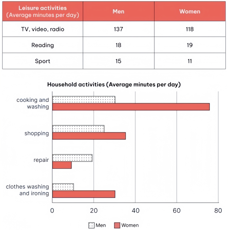
Sample 1:
The given mixed charts compared the amount of time (measured in minutes per day) allocated by UK males and their counterparts on housework and entertainment in 2008.
Overall, it can be seen from the charts that the most popular activities for both genders were watching TV, videos and listening to the radio. It is also evident that while men tent to spend more time on recreational activities, women dedicated a more considerable amount of time to household chores.
In terms of leisure pursuits, 137 minutes was the amount of time spent each day by men to watch TV, videos and listen to the radio, which were also the most common types of activities among three categories examined. The amount used by women to do the same things was 19 minutes less, at 118 minutes per day. Similarly, men invested 15 minutes in sport exercises, 4 minutes more than women did. Men and women, interestingly, devoted quite a comparable amount of time in a day for reading, 18 and 19 minutes per day, respectively.
Concerning household chores, women allocated most of their time on cooking and washing (nearly 80 minutes/day), nearly double men (around 30 minutes/day). For shopping, women spent a bit under 40 minutes while this number for men was 25 minutes. Clothing washing and ironing were also more time-consuming activities for women compared to men, as this took women about 30 minutes each day to finish, three times the amount for men. As for repair, this was the only category where men spent more time the women did, as they spent nearly 20 minutes of each day to repair, twice as much as the time women spent on the same activity.
Sample 2:
The table compares men and women in terms of the average time spent on various pastimes, while the bar chart illustrates the time allocated to housework. The survey was carried out in the UK in 2008.
Overall, for both genders, while watching TV, videos, and listening to the radio were the most popular leisure activities, cooking and washing dishes were the chores that took up the most time. What is also notable from the chart is that men spent more time on most leisure activities compared to women whereas women dedicated significantly more time to household tasks.
In terms of pastimes, both genders preferred watching TV, videos, and listening to the radio, with men dedicating around 137 minutes daily, about 20 minutes more than women. Men also engaged more in sports, averaging 15 minutes compared to women’s 11 minutes. Conversely, reading was the only activity where women spent more time, albeit slightly, at 19 minutes as opposed to men’s 18 minutes.
Regarding household chores, women spent the majority of their time cooking and washing dishes, averaging 75 minutes daily, more than twice the time men spent. Shopping was the second most time-consuming task for both genders, with women also spending more time than men, with respective figures being approximately 35 minutes and around 25 minutes. A similar pattern was seen in clothes-related chores, where women spent 30 minutes, triple the time men dedicated. Lastly, men spent just under 20 minutes on repairs, double the time women allocated to this task.
Sample 3:
The bar chart and table illustrate how much time men and women in the UK allocated to housework and entertainment in 2008. Units are measured in minutes per day (mins/day).
Overall, the most popular leisure activities for both genders were watching TV, videos, and listening to the radio, while cooking and washing dishes were the most time-consuming household chores. Notably, men spent more time on most leisure activities compared to women, who dedicated significantly more time to household tasks.
In terms of recreational pursuits, watching TV, videos, and listening to the radio were by far the most common, with men spending more time than women (137 compared to 118 mins/day). Reading, however, was the only activity in which women invested more time than men, with respective figures of 19 and 18 mins/day.
As for household chores, women devoted the most time to cooking meals and washing dishes, at 75 mins/day on average, approximately double the figure for males, at about 30 minutes. The next most time-consuming activity for both genders was shopping, with women averaging around 35 and men roughly 25 mins/day. This pattern continued with clothes-related chores, where women spent 30 mins/day, three times the amount men did. In contrast, the amount of time men spent on repairs was twice as much as that of women, at nearly 20 mins/day.
Sample 4:
The charts provide a comparison of the average daily time, in minutes, spent by men and women in the UK on various household and leisure activities in 2008.
Overall, the data reveals that men in the UK spent more time on leisure activities, particularly watching TV and engaging in sports, whereas women dedicated more time to household chores such as cooking, washing, and ironing.
According to the table, men dedicated significantly more time to leisure activities such as watching TV, video, and listening to the radio, averaging 137 minutes per day compared to 118 minutes for women. Men spent 18 minutes reading, slightly less than the 19 minutes spent by women. Additionally, men allocated 15 minutes to sports activities, while women spent only 11 minutes on the same.
The bar chart highlights the gender disparities in household tasks. Men spent approximately 30 minutes on cooking and washing, whereas women spent around 75 minutes daily on these activities. In terms of shopping, men spent about 25 minutes, while women spent around 35 minutes. When it came to repair work, men invested nearly 20 minutes, significantly more than the 10 minutes spent by women. Lastly, men spent about 10 minutes on clothes washing and ironing, in contrast to the 30 minutes spent by women.
Sample 5:
The table and bar chart illustrate the average time allocation for different types of leisure pursuits as well as household duties by gender in the UK in 2008.
Overall, it can be seen that males engaged more in recreational activities, while females handled more household chores. In addition, both groups preferred entertainment through TV, radio, and video the most, whereas cooking and washing were the most time-consuming tasks.
In terms of leisure pursuits, men spent 137 minutes per day on TV, radio, and video entertainment, compared to 118 minutes by women. Notably, the amount of time allocated for media consumption was disproportionately higher than that for books and sports exercises, which took up less than 20 minutes each. In particular, men and women spent 18 and 19 minutes reading books every day, respectively. Physical activities were the least preferred, with men spending 15 minutes and women 11 minutes.
Regarding housework activities, women devoted nearly 80 minutes per day to preparing meals and cleaning dishes, which was double the time spent by men. The second time-consuming task was shopping, with women dedicating just under 40 minutes and men approximately 25 minutes. Laundry tasks consumed 30 minutes of women everday, three times higher than the time spent by men. Men, on the other hand, devoted more time to home maintenance than women, with 20 minutes compared to 10 minutes, respectively.
Sample 6:
The charts show data about the average time, in minutes, that males and females in the UK spent on different house chores and leisure activities each day in 2008.
In general, it is obvious that both men and women in the UK dedicated the most time to watching TV, video, and listening to the radio. Furthermore, women typically spent more time on household activities, including cooking, washing, and ironing.
In terms of entertainment, men allocated more time to watching TV, video, and listening to the radio, with an average of 137 minutes per day, compared to 118 minutes for women. Men engaged in sports activities 15 minutes daily, 4 minutes more than women did. Additionally, both genders dedicated nearly 20 minutes each day to reading.
The bar chart illustrates the disparity in house chores between men and women. Men allocated roughly 30 minutes per day to cooking and washing, whereas women dedicated more than double that amount of time to these tasks, at 75 minutes. When it came to shopping, men devoted about 25 minutes, while women spent approximately 35 minutes daily. Men in the UK excelled in time invested in repair work, allocating almost 20 minutes per day, which was twice as much as women.
Sample 7:
The charts depict the daily time, in minutes, that UK males and females devoted to household and leisure activities in 2008.
Overall, both genders primarily spent their leisure time engaged in watching TV, videos, and listening to music. In terms of household chores, women typically invested more time than men, except in the area of home repairs where men were more active.
According to the first chart, TV, videos, and radio emerged as the most popular leisure activities for both genders, with men averaging 137 minutes per day compared to 118 minutes for women. On the other hand, activities such as reading books and playing sports were considerably less popular, with both genders spending less than 20 minutes daily on each.
The second chart indicates a notable disparity in the time spent on household tasks, with women generally dedicating more time than men. Specifically, women spent 75 minutes per day on cooking and washing, whereas men allocated only 30 minutes. Women also spent 35 minutes on shopping and 30 minutes on clothes washing and ironing, compared to men who spent 25 minutes and just 10 minutes, respectively. In contrast, men devoted slightly under 20 minutes to repair work, while women spent less than 10 minutes.
Sample 8:
The table and bar chart compare men and women in the UK regarding their average time spent on pastimes and housework in 2008.
Overall, it is noticeable that for both genders, TV, video, and radio were the most favored leisure activities while cooking and washing were the most time-consuming household tasks. Moreover, men generally spent more time on entertainment, whereas women dedicated considerably more time to housework.
Looking first at freetime activities, both genders favored watching TV, videos, and listening to the radio, with men spending 137 minutes per day and women 118 minutes per day on these activities. Males also engaged in sports more, at 15 minutes daily compared to 11 minutes of their female counterparts. However, for reading, the time allocated among both males and females was nearly comparable at 18 and 19 minutes, respectively.
Regarding housework, women dedicated the greatest amount of time on cooking and washing dishes, at 75 minutes per day, which was double men's figure. Shopping was the second most time-intensive task, with the numbers being 25 minutes for males and 35 minutes for the other gender. The same pattern, but to a greater extent, can be witnessed in the figures of clothes washing and ironing, which tooks housewives 30 minutes on a typical day, triple that of their husbands. Conversely, repairing was the only household chore that men spent more time than women, averaging nearly 20 minutes compared to 9 minutes.
Sample 9:
The table and bar chart give information on how much time males and females spent on recreational activities and household chores per day in 2008.
Overall, both genders had the longest period of leisure activity on TV, video and radio. On average, there are significant differences between the amount of time spent by males and females on household work.
One striking feature regarding the table is that men had 137 minutes of leisure time on TV, video and radio per day, compared to 118 minutes for women. The same trend can be found in sport as males expended 15 minutes on this daily activity whereas females merely 11 minutes. Meanwhile, reading was equally popular among both genders, accounting for 18 minutes and 19 minutes respectively.
For the second bar chart, it is noticeable that females worked their highest amount of time cooking and washing dishes, which occupied approximately 75 minutes per day, threefold longer than that of males. Females also spent far more time on shopping, clothes washing and ironing. On the contrary, repair activities took up males almost 20 minutes, which doubles that of females.
Sample 10:
The chart and table provide information on the amount of time men and women spent on various leisure and household activities, measured in average minutes per day.
Overall, men tend to spend more time on leisure activities, particularly watching TV, while women dedicate significantly more time to household chores such as cooking and washing. The time spent on reading is nearly the same between men and women, while activities like sports and repairs are more male-dominated.
Regarding leisure activities, men spent the most time watching TV, video, and radio, with an average of 137 minutes per day, which is 19 minutes more than women. The time spent on reading was almost identical between genders, with men spending 18 minutes and women 19 minutes per day. Men also spent slightly more time on sports, at 15 minutes, compared to 11 minutes for women.
In terms of household activities, women spent the most time on cooking and washing, averaging 74 minutes per day, while men spent just under half that time at 30 minutes. Women also spent more time shopping and doing clothes washing and ironing, averaging 34 and 58 minutes per day, respectively. In contrast, men spent only 13 minutes shopping and 19 minutes on clothes washing and ironing. However, men spent slightly more time on repairs, averaging 19 minutes per day, compared to 9 minutes for women.
Sample 11:
The table and bar graph illustrates the average minutes that British males and females allocate each day to different recreational activities and house chores. Overall, both genders in the UK spend the longest time on TV, videos, and radio. Additionally, women allot more time every day on most houseworks, except for repairing.
Regarding entertainment, British men and women spend the longest time watching television, videos and listening to the radio at 137 and 118 minutes per day, respectively. Males play sport for an average of 15 minutes every day, which is 4 minutes higher than the figure for females. Moreover, nearly 20 minutes a day are dedicated to reading by each gender.
Concerning household activities, women in Britain allocate approximately 75 minutes to cooking and washing, while they only spend roughly more than half an hour on shopping or washing and ironing clothes. The figures for men for those three house chores are relatively smaller, with roughly 30 minutes for cooking and washing, about 25 for shopping, followed by nearly 10 minutes for washing and ironing clothes. Male citizens in the UK only dominate in the time for repairing work at nearly 20 minutes per day, which is double that of females.
Sample 12:
The table provides a breakdown on time spent on recreation, while the bar chart details the amount of time for household chores in a country by gender in 2008. Overall, there are two out of three leisure activities where men spent more time than women did. Females, meanwhile, were generally more active in daily household tasks than males were.
With regard to daily recreation, using the TV, radio, and watching videos were the most time-consuming activity for both genders, which took men around 137 minutes, and women 118 minutes on average. Women, in contrast, used slightly more time to read than men did, with 19 and 18 minutes, respectively. Finally, males from this country spent a quarter-hour on sports, which was nearly 1.5 times the figure for females.
It can be seen from the bar chart that kitchen-related tasks required more time than any other activity did. Women in this country used nearly 80 minutes per day to cook and wash dishes, whereas the level for men was below half of that, with around half an hour. Females allocated over 30 minutes daily to shopping, washing and ironing clothes, and they recorded the lowest figure in repairing, with under 10 minutes. None of these chores took more than 30 minutes of men’s time on average, and notably, men spent twice the amount of women’s time on repair work. Laundry-related activities took this country’s males the least time, with 10 minutes, which corresponded to one-third the figure for females.
The chart below shows the number of international applicants to the universities of one European country.
Summarise the information by selecting and reporting the main features, and make comparisons where relevant. Write at least 150 words.
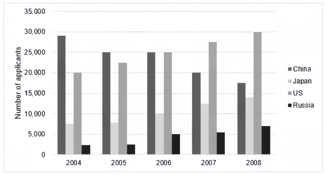
Sample 1:
The given bar chart illustrates the number of applicants from four different countries who applied to a European university between 2004 and 2008.
Overall, the chart clearly indicates that China’s dominance as the largest applicant pool for the European university declined over the five-year period and was eventually overtaken by the United States. Despite an increase, the number of students from Japan and Russia were significantly lower than the other two.
In 2004, China had the highest number of applicants, with nearly 30,000 students applying to the European university. However, this number decreased steadily over the next five years, reaching just 18,000 by 2008. In contrast, the United States, which ranked second in 2004, saw a consistent increase and surpassed China in 2007, rising to almost 30,000 by the end.
Japan and Russia also experienced an increase in the number of applicants, but the figures were much lower compared to the aforementioned countries. Specifically, the figure for Japan nearly doubled, rising to approximately 15,000, while that from Russia tripled, reaching about 7,000 in 2008.
The graph and table below give information about water use worldwide and water consumption in two different countries.
Summarise the information by selecting and reporting the main features, and make comparisons where relevant. Write at least 150 words.
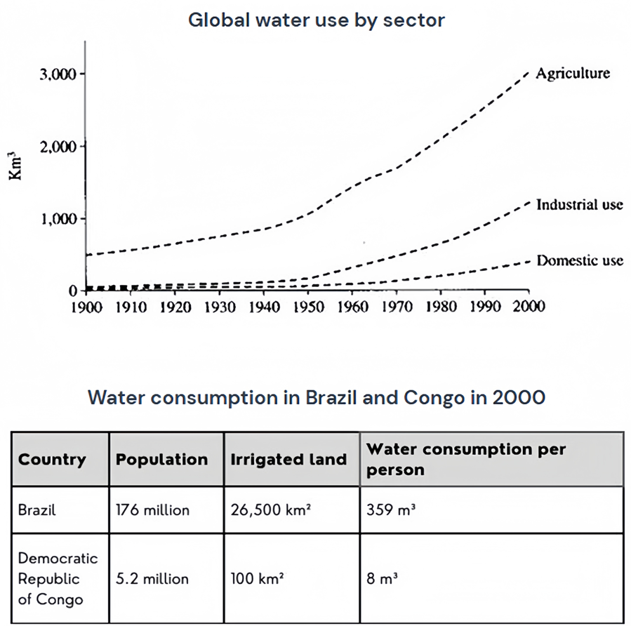
Sample 1:
The line graph shows global water consumption in three different sectors between 1900 and 2000, while the table compares water use in Brazil and the Democratic Republic of Congo in 2000.
Overall, water consumption increased in all three sectors, but agriculture consumed far more water than the other two. Brazil was a much bigger water consumer than Congo.
Agriculture remained the most water-consuming industry. It used about 500 km3 of water in 1900 and this number increased dramatically to around 3,000 km3 in 2000. Less than 100 km3 of water was used for either industrial or residential purposes in 1900. Not until around 1950 did water consumption rise significantly, eventually reaching by 2000 roughly 1000 km3 for the former and 500 km3 for the latter.
Brazil had a population of 176 million, an irrigated land area of 26,500 km2, and a per capita water consumption of 359 m3. In comparison, the corresponding figures for Congo were only 5.2 million, 100 km2, and 8 m3. This made Brazil a much larger water user than Congo.
Sample 2:
The graph and the table portray the utilization of water around the world and consumption of water in two different countries.
The major portion of water consumption in terms of global usage was done by the agriculture sector. Industrial agents were the second largest users of water worldwide, followed by domestic users of the general population. The table shows the contrast in water utilization between a large country like Brazil and a smaller nation like the Democratic Republic of Congo.
The line graph shows that the consumption of water worldwide had gone from below 1000 km3 to over 3000km3 for the agricultural sector from 1990 to 2000. Water consumption for the industrial sector increased to a little over 1000 km3 and almost 500 km3 for domestic use from 1990 to 2000.
From the table, it can be seen that the water consumption in Brazil is quite larger than that in The Democratic Republic of Congo. This is due to the vast difference in the population and land area of the two countries.
Sample 3:
The graph shows how the amount of water used worldwide changed between 1900 and 2000.
Throughout the century, the largest quantity of water was used for agricultural purposes, and this increased dramatically from about 500 km³ to around 3,000 km³ in the year 2000. Water used in the industrial and domestic sectors also increased, but consumption was minimal until mid-century. From 1950 onwards, industrial use grew steadily to just over 1,000 km³, while domestic use rose more slowly to only 300 km³, both far below the levels of consumption by agriculture.
The table illustrates the differences in agriculture consumption in some areas of the world by contrasting the amount of irrigated land in Brazil (26,500 km³) with that in the D.R.C. (100 km²). This means that a huge amount of water is used in agriculture in Brazil, and this is reflected in the figures for water consumption per person: 359 m³ compared with only 8 m³ in Congo. With a population of 176 million, the figures for Brazil indicate how high agriculture water consumption can be in some countries.
Sample 4:
The table compares water consumption between Brazil and the Democratic Republic of the Congo for the year 2000, while the graph presents information about water usage in agriculture, industry, and domestic use between 1990 and 2000.
Overall, all three of these sectors have seen a considerable growth in the worldwide use of water since the middle of the 20th century. During the period in question, Brazil's water usage was noticeably higher than that of the Democratic Republic of the Congo (DRC).
Water consumption for agriculture was 500 km3 per year in 1900, but since 1940, it kept dramatically increasing, which peaked in 2000 at over 3000 km3. However, up until 1950, when considerable growth began, industrial and home water usage had a lacklustre performance. These industries (agricultural and industry) have had a slight rise in water usage since 1950. Even while industrial usage has always outpaced home consumption, it remained significantly lower than the level of use in the agriculture sector.
On the other hand, while having only roughly one third population of DRC, Brazil consumed 26,500 km2 of water in 2000 while DRC used only 100 km2. As a result, in 2000, Brazil's per-person water consumption was more than 40 times higher than that of the DRC.
Sample 5:
The table furnishes a comparative analysis of water consumption patterns in Brazil and the Democratic Republic of the Congo (DRC) for the year 2000, while the graph elucidates the sectorial water usage delineating agriculture, industry, and domestic consumption from 1990 to 2000.
A remarkable global upsurge in water usage across the aforementioned sectors is evident since the mid-20th century. During the scrutinised duration, Brazil's consumption patterns significantly overshadowed the DRC's.
Agricultural water consumption, standing at a mere 500 km3 per annum in 1900, witnessed a dramatic escalation post-1940, culminating in 2000 at an exorbitant 3000 km3. In stark contrast, up until 1950, industrial and domestic water usage reflected an unimpressive trend. These sectors initiated a modest upturn in their water consumption post-1950. Despite industry consistently exceeding domestic use, it trailed significantly behind the agricultural sector.
Contrastingly, Brazil, despite having roughly a third of the DRC's population, manifested a staggering consumption of 26,500 km2 of water in 2000, dwarfing DRC's meagre 100 km2. Consequently, Brazil's per capita water consumption in 2000 was a whopping 40 times that of the DRC.
Sample 6:
The line graph and accompanying table provide insight into the patterns of water use globally over the last century, as well as comparing the specific water consumption metrics in Brazil and the Democratic Republic of Congo as of the year 2000.
The overarching trend depicted by the graph is a significant rise in global water usage across three key sectors: agriculture, industry, and domestic needs. Agriculture has consistently been the dominant consumer, with its water use escalating from approximately 500 cubic kilometers in 1900 to an estimated 3,000 cubic kilometers by the turn of the millennium. Industrial water use, initially modest, began to climb around 1950, reaching just above 1,000 cubic kilometers, while domestic consumption experienced a more gradual increase to about 300 cubic kilometers.
In stark contrast, the table presents a detailed snapshot of water use in Brazil and the Democratic Republic of Congo. Brazil's extensive irrigation for agriculture covers 26,500 square kilometers, which dwarfs the Democratic Republic of Congo's 100 square kilometers. The impact of this agricultural activity is reflected in the per capita water consumption figures: a Brazilian uses 359 cubic meters of water, vastly outstripping the 8 cubic meters used by a Congolese individual. When these figures are contextualized against Brazil's large population of 176 million, the scale of water used for agriculture becomes even more pronounced.
Sample 7:
The provided illustrative data delineates the trajectory of water use worldwide over a century and delineates consumption in two distinct nations.
An examination of the graph reveals a stark upward trajectory in global water use, segmented into agricultural, industrial, and domestic categories. Agriculture claims the lion's share, with its consumption skyrocketing from a meager 500 cubic kilometers in the early 1900s to a staggering 3,000 cubic kilometers by the year 2000. Meanwhile, industrial and domestic sectors also demonstrated an uptick in water use worldwide, with industrial water consumption ascending to just over 1,000 cubic kilometers, and domestic use, though increasing more modestly, reaching 300 cubic kilometers by the century's end.
The accompanying table provides a comparative lens on water use in Brazil versus the Democratic Republic of Congo. The sheer scale of Brazil's irrigation - an expansive 26,500 square kilometers - contrasts sharply with the Democratic Republic of Congo's modest 100 square kilometers. This discrepancy is further evidenced in per capita water consumption figures: an average Brazilian's water footprint is 359 cubic meters, a stark contrast to the 8 cubic meters for a Congolese counterpart. With Brazil's robust population of 176 million, the data illustrates the profound impact of agricultural practices on water use worldwide and individual water consumption.
Sample 8:
The graph and table below give information about water use worldwide and water consumption in two different countries.
The charts compare the amount of water used for agriculture, industry and homes around the world, and water use in Brazil and the Democratic Republic of Congo.
It is clear that global water needs rose significantly between 1900 and 2000, and that agriculture accounted for the largest proportion of water used. We can also see that water consumption was considerably higher in Brazil than in Congo.
In 1900, around 500km³ of water was used by the agriculture sector worldwide. The figures for industrial and domestic water consumption stood at around one fifth of that amount. By 2000, global water use for agriculture had increased to around 3000km³, industrial water use had risen to just under half that amount, and domestic consumption had reached approximately 500km³.
In the year 2000, the populations of Brazil and the Congo were 176 million and 5.2 million respectively. Water consumption per person in Brazil, at 359m³, was much higher than that in Congo, at only 8m³, and this could be explained by the fact that Brazil had 265 times more irrigated land.
Sample 9:
The given graph shows the water consumption in different sectors and how water usage changes rapidly from 1900 to 2000. It also compares the consumption of water in the agriculture sector in two different countries according to their population.
Throughout the century, the highest water consumption could be observed in agricultural sector respectively which was initially 500 km³ and rose steadily approximately to 3000 km³ respectively. Usage of water was recorded at a minimal level in 1900, and it remained the same in half of the century. In 1950 and onwards, water consumption in industrial sector grew significantly to over 1000 km³ while in domestic sector slightly increment in water usages can be seen which was about only 300 km³.
The given table illustrates the water consumption in different areas of the world. Irrigated land in Brazil was 26,500 km2 with the population of 176 million and water consumption per person was 359 m³ whereas D.R.C possesses 100 km2 irrigated land with the lowest number of population (only 5.2 million) and they consumed 8 m³ water per person respectively. Moreover, Brazil consumed more water while Congo consumed less water in irrigated lands.
Sample 10:
The line graph and table demonstrate the trends of the global water use in three different sectors from 1900 to 2000 and compares the water usage in Congo and Brazil in 2001. There was an overall upward trend in water use in these three sectors over this period. Water consumption in Brazil was much higher than that of Congo.
Consuming water in agriculture, industrial and domestic fields all increased dramatically during this time. The figures for agriculture show the most significant changes of all. Between 1900 and 1950 its quantity rose to around 1,000 km3 and then there was a sudden rise of 2,000 km3 in 2000. The patterns of industrial and domestic water consumption were very similar to each other. Starting at almost 100 and 50 km3 respectively in 1900 and had remained nearly constant until 1950. After that, the former jumped noticeably to around 110 km3 in 2000. Likewise, the latter saw a significant peak, rising by nearly 5 times (from approximately 50 to 250 km3) at the same time.
It is clearly seen from the table that the water consumption in Brazil, which had 176 million people, was significantly higher than that of Congo in spite of lower population in Congo (5.2 million), which had 265 times as less space as Brazil had.
Sample 11:
The provided graph and table data reveals information about the usage of water in all around the world and also compares the water consumption, population and irrigated lands in Brazil and Congo.
Firstly, it can be stated that water was mainly used by three major sectors which were agriculture, industrial and domestic sectors. Secondly, Brazilian citizens consumed more water than the people of Congo did.
According to the line graph data, the irrigational need for water was dominant world widely. This consumption was around 500 km3 in 1990; however, it increased sharply to approximately 3000 km3 in 2000. The amount of industrial water consumption and domestic water usage were almost similar in 1990. Both of these water consumptions steadily remained sample until 1950. After that, the industrial sector consumed water more rapidly to over 1000 km3 in 2000. After 1970 the domestic needs for water increased but the highest consumption of water was in the agriculture sector.
The table depicts that, Brazil had far more population (176 million) than that of Congo (5.2 million). Irrigated land in Brazil was 25,500 square km while it was only 100 square km in Congo. Finally, the water consumption by Brazilian was 359 cubic meters per person compared to only 8 cubic meters by each citizen of Congo.
Sample 12:
The volume of water consumed in three sectors - agriculture, industry and domestic, in the twentieth century is demonstrated in the line graph. Meanwhile, the given table illustrates the differences between agricultural and personal water consumptions in Brazil and Congo in 2000.
As the line graph represents, the highest quantity of water was consumed, throughout the given years, for farming and it soared remarkably from 500 km3 to around 3000 km3 in 2000. An inconsiderable amount of water was used for industrial and domestic purposes till the mid of the century. From 1950 onward, industrial water use rose steadily to above 1000 km3 while domestic utilisation of water climbed more slowly to approximately 300 km3.
By looking at the table it is clear that Brazil had 176 million population and 26500 km2 irrigation fields compare to Congo that had 5.2 million population and just 100 km2 arming lands in 2000. Consequently, the volume of water consumed by an average Brazilian was overwhelmingly greater than the water consumption of a person who lived in Congo.
Sample 13:
The charts provided show global water usage across different sectors together with a comparison of water consumption in two countries. Overall, there was a significant increase in water consumption, particularly for agricultural use. The table shows, however, that variation exists at the national level.
From the graph we can see that water consumption was rising from 1900 onwards. This trend accelerated exponentially from around 1950. Agricultural use rose the most, with a sixfold increase from 500 to 3000 km³. The rise in industrial and domestic consumption was less steep. Water usage in these sectors grew to 1100 and 300 km³ respectively by the end of the period.
A comparison of water use in Brazil and the DRC shows that although a global trend is discernable, water utilisation can vary between countries. Even after allowing for differences in population and land use, the difference in per capita consumption is striking. The figure is 359 m³ for Brazil compared to just 8 m³ for the DRC.
Sample 14:
The charts show the global water consumption for homes, businesses, and agriculture as well as the water consumption in Brazil and the Democratic Republic of Congo.
It is evident that the world’s water needs increased dramatically between 1900 and 2000, with agriculture using the majority of that water. Furthermore, evident is the fact that Brazil used a lot more water than Congo.
It is clear that the majority of the water used by agriculture increased dramatically between 1900 and 2000, contributing to the world’s water needs. It is also clear that Brazil used a lot more water than Congo.
Brazil and Congo had respective populations of 176 million and 5.2 million in 2000. Brazil had 265 times more irrigated land than Congo, which may account for the country’s significantly higher water consumption per person (359 m³) than that of the latter country (8 m³).
Sample 15:
The provided charts offer a comprehensive comparison of water utilization globally and, more specifically, in Brazil and the Democratic Republic of Congo. This analysis aims to uncover trends in water consumption across agriculture, industry, and homes.
It is evident from the charts that the global demand for water witnessed a remarkable increase from 1900 to 2000, with agriculture being the predominant sector for water utilization. Furthermore, a substantial contrast in water consumption emerges when comparing Brazil and the Democratic Republic of Congo.
In 1900, global agricultural water usage reached around 500km³, overshadowing industrial and domestic consumption, which stood at approximately one-fifth of that volume. Fast forward to 2000, and the worldwide agricultural water demand surged to around 3000km³, industrial usage rose to nearly half that amount, while domestic consumption reached approximately 500km³.
In the year 2000, Brazil and the Democratic Republic of Congo housed populations of 176 million and 5.2 million, respectively. Strikingly, water consumption per person in Brazil was notably higher at 359m³ compared to a mere 8m³ in Congo. This stark contrast can be attributed to Brazil’s possession of 265 times more irrigated land.
Sample 16:
The graph provides information about global use of water from 1900 to 2000, while the table shows how water was consumed in two specific countries in 2000.
Overall, water use in all sectors increased significantly in all sectors between 1900 and 2000, while Brazil consumed much more water per person than the Democratic Republic of Congo.
Agriculture was the biggest consumer of water throughout the twentieth century. In 1900, about 500 km3 of water was used in this sector, and by 2000 this level had grown dramatically to around 3000 km3. Domestic and industrial water use was quite low in 1900, but both climbed significantly over the next 100 years. In 2000, industrial water use was at 1300km3, while domestic use was at approximately 400 km3.
As for the two countries shown in the table, there are some major differences. Brazil’s population in 2000 was 176 million, which was about 35 times higher than the DRC’s population of 5.2 million. Moreover, while the DRC only had 100 km2 of agricultural land, Brazil’s figure was more than 250 times higher than this (26,500 km2). The difference in water use per person was also great, with a total of 359 m3 per person in Brazil and just 8 m3 in the DRC.
Sample 17:
The graph presents an overview of global water usage in the twentieth century, while the table provides a comparison of water use in 2000 in two specific countries: Brazil and the Democratic Republic of Congo (DRC).
From the graph, it is evident that the total amount of water used around the world increased enormously between 1900 and 2000. Further to this, the graph and the table also show that agriculture is the main factor behind water consumption.
Agriculture was the largest water user throughout the hundred years covered in the graph, and its use grew six-fold over that time from 500km3 to 3000km3. Water use in the industrial and domestic sectors was relatively low in 1900, but then climbed substantially over the next century. By 2000, industrial water use stood at about half that of agriculture, while domestic use had risen to the level agriculture had been at in 1900.
In 2000, the respective populations of Brazil and the DRC were 176 million and 5.2 million. However, water consumption per capita in Brazil was 359m3 compared to only 8m3 in the DRC. This huge difference can be explained by the fact that Brazil (26,500km2) had more than 250 times the amount of irrigated land than the DRC (100km2).
Sample 18:
The line graph illustrates the amount of global water used in agriculture, industrial use and domestic use from 1900 to 2000. In general, there is a diffrence in the consumption between these sectors.
To specify, the amount of global water used in agriculture was highest with almost 3000 km3 in 100 years. Following that, the amount of global water in industrial use was lesser nearly 2 times than the amount of those in agriculture, about 1400 km3. The lowest amount of global water consumption was about 400 km3 belonged to domestic use.
Turning to the table, there is a slightly difference in water consumption in Brazil and Congo in 2000. With 176 million citizens and 26,500 km2 of irrigated land, Brazilian consumed 359 m3 water per person in 2000. Meanwhile, dramatically lesser than Brazil in population and irrigated land (5.2 million and 100 km2, respectively), Democratic Republic of Congo has only 8 m3 water consumption per person in that year.
Sample 19:
The table compares water usage per person, in cubic metres. The comparison is between Brazil and the Democratic Republic of the Congo in the year 2000. While the line graph depicts the global rate of water consumption by three sectors (agricultural, industry, and housing) in km3 between 1900 and 2000. Agriculture accounted for the majority of the water utilised, and overall, all three sectors had increased worldwide water consumption throughout the last century. Brazil also consumed a lot more water than Congo, by a wide margin.
Regarding the use of water on a worldwide scale, agriculture accounted for roughly 500 km3 in 1900. Whilst the comparable estimates for the other two were said to be close to one-fifth of that amount. After about half a century, the figures for industrial and domestic use started to gradually rise. It was until they stood at approximately 1000 km3 and 500 km3 respectively at the end of the period. Over the next 100 years, agricultural water consumption increased steadily to 3000 km3. While industrial and domestic water consumption increased at a more gradual pace.
Brazil had 176 million people, and Congo had 5.2 million people according to the statistics, and the former had 265 times more irrigated land than the latter. These aspects make it simple to comprehend why the water consumption rate per person in Brazil (359 m3). It was about 45 times greater than the same number for Congo.
Sample 20:
The graph displays the change in global water usage between 1900 and 2000 as well as the relative water consumption of two nations to their respective populations.
The biggest amount of water was utilised for agriculture throughout the century, and in the year 2000, this rose significantly from around 500 km3 to nearly 3,000 km3. Though consumption was relatively low until the middle of the twentieth century, water use in the industrial and home sectors both rose. From 1950 forward, industrial usage increased gradually to slightly over 1,000 km3. While home use increased more slowly to only 300 km3, both far less than the levels of consumption by agriculture.
The comparison between the extent of irrigated land in Brazil (26,500 km3) and the Democratic Republic of the Congo (100 km2). It can be seen in the table that highlights the disparities in agricultural consumption in different regions of the world. According to the data on water use per person, Brazil uses a tremendous quantity of water for agriculture - 359 m3 as opposed to just 8 m3 in Congo. The statistics for Brazil, which has a population of 176 million, show how much water may be used for agriculture in certain nations.
Sample 21:
The given line graph delineates how much global water was used in three distinct sectors between 1990 and 2000. The table compared water consumption in Brazil and the democratic republic of Congo in 2000.
Overall, it is clear that water consumption increased in all three sectors, but agriculture took more than others. On the other hand, Brazil contributed the least to Congo in water consumption.
An in-depth analysis shows that agriculture was the largest consuming industry, using about 500 km3 of water in 1990, and the ratio dramatically increased to 3000 km in the year 2000. Less than 1000 km3 was used for both industrial and domestic use in 1990, until 1950, the number rose significantly, whereas eventually, by 2000, reaching roughly about 1000 km3 for the former and 500 km3 for the latter.
Coming to water consumption in 2000, the population was 176 million in Brazil, and the figure was very less, which was 5.2 million in Congo. Brazil had 26,500 km2 of irrigated land and a water consumption per person of 359 m3. In comparison, the corresponding figures for Congo were only 100 km2 and 8 km3. This made Brazil a much larger water user than Corgo.
Sample 22:
The line graph shows the global rate of water consumption by three sectors (agriculture, industry, and homes) in km³ between the years 1900 and 2000, and the table compares water usage per person, in cubic meters, in Brazil and the Democratic Republic of Congo in the year 2000.
Overall, the amount of water consumed globally by all the three sectors rose within the century with agriculture accounting for the largest portion of the water used. In addition, the figures for water consumption, population, and irrigated lands in Brazil were all significantly higher than those of Congo.
Regarding global water consumption, agriculture was responsible for about 500 km³ of water usage in 1900, while the corresponding figures for the other two sectors were reported to be at nearly one-fifth of that amount. Over the following 100 years, the consumption rate of water by agriculture rose steadily to 3000 km³, and the figures for industrial and domestic use increased gradually and stood at approximately 1000 km³ and 500 km³ respectively at the end of the period.
In terms of the figures for Brazil and Congo, the population of the former was at 176 million and that of the latter at 5.2 million. Moreover, Brazil had 265 times more irrigated land, which explains why the water consumption rate per person in it (359 m³) was almost 45 times higher than the figure for Congo.
The diagrams below show the present building of a college and the plan for changes to the college site in the future.
Summarise the information by selecting and reporting the main features, and make comparisons where relevant. Write at least 150 words.
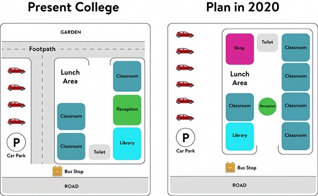
Sample 1:
The maps show the current building and site layout of a college, and the proposed future changes.
Overall, the main changes to the college will include the expansion and renovation of the college building, with the addition and removal of several rooms and facilities. A number of changes to facilities outside of the building are also proposed.
The existing entrance to the building is on the northern side and accessed via a footpath which runs adjacent to the garden on the north and the car park on the western side of the building. The future plans propose that the new entrance will be on the southern side of the building, adjacent to the main road and bus stop. The footpath and garden surrounding the building will be removed, and the existing car park expanded to accommodate more cars.
Inside the building, there is currently a classroom, reception, and library along the eastern side. The future plans propose that the reception area will be moved to the centre of the building towards the new entrance at the south, and the library relocated to the western side, making way for four new classrooms. The toilets will be moved to the opposite end of the building, where the old entrance was, and a new shop will be built next to the existing lunch area.
Sample 2:
The diagram displays information about the present layout of a college site and the prospective plans for its future layout. As can be observed, the future design would remove footpaths and the garden, instead opting for a larger car park and main building. In addition, there would be more classrooms and an extra shop.
At present, there are two footpaths traversing across the site, separating the main building from the garden and car park. The current car park has a maximum capacity of only four cars. Meanwhile, there are three classrooms in the main building, two on the right side of the entrance and one on the left.
In the new design, the entrance would be placed on the opposite side of the building next to the road, and there would be four classrooms on its right and one on its left. The reception area would also be moved from the side of the building to the main corridor, while the library would be switched to the opposite side. Furthermore, toilets would also be situated on the other side of where it is now. In the top left of the building, there will be a new shopping area. Finally, the car park will be expanded to be able to accommodate 7 cars at once while the bus station and road remain unchanged.
Sample 3:
The given illustrations depict the differences between the current structure of a college and a revised vision in 2020.
Overall, looking at the diagrams, it is immediately obvious that the school campus is expected to see some significant changes. Futhermore, the most noticeable transformation are the ebstablishment of the new classrooms and the expansion of the parking lot.
Accorind to the current structure, there is an existing entrance to the north of the building, accesible by the pathway which runs adjacent the garden on the north and a car park on the west side of a unversity campus. This structure will be modified according to the proposed plan. The garden and the footpath surrounding the building will be removed and the original parking will be extended to accommodate more cars.
Inside the college, there is a classroom, the reception and the library along the eastern side. On the west of the building, two classrooms and a lunch area are offered, and a toilet is situated between a classroom on the southwest corner and the library. However, according to the suggested plan, the reception area will be moved to the center of the building towards the new entrance at the south, while the library will be relocated to the opposite side, making way for 4 new classrooms. Moreover, the toilet will be removed to the area where the entrance used to be. Adjacent to the lunch area, there will be the construction of a shop.
Sample 4:
The maps illustrate the current layout of part of a college campus and the proposed changes to be carried out in the future.
Overall, according to the plans, both the main building and the car park will be larger, replacing both the footpaths and the garden at the far end of the campus.
Outside the main building, there are currently 2 footpaths, one of which provides access to the college, and the other runs alongside the car park to the west of the school down to the bus stop on the main road in the south. These footpaths and the garden in the north will both be removed to allow for the expansion of the car park, while the bus stop and the road will remain as they are.
With regard to the main building, presently, from the entrance at the far end, a lunch area is located on the right-hand side, opposite a classroom on the other side. Further inward, visitors then see a pair of classrooms to the right, a reception area and library to the left, and the toilet in the middle against the back wall. According to plans, the entrance is to be relocated next to the bus stop. The new building will have four classrooms on one side, opposite a library, a classroom, a lunch area, and a new shop on the other. The toilets will be moved from the “road” end of the building to the far end, while the reception will be reduced in size and moved to the corridor, facing the new entrance.
Sample 5:
The diagrams show how a college will be changed in 2020. Overall, the plan involves the changes in both inside and outside the building of the college.
The most notable changes outside will be the expansion of the building and the enlargement of the car park to provide more parking lots. Because of this, the footpaths, which can be used to access the building, and the garden in front of the building will be removed.
Inside the building, the entrance is now opposite the garden. There is an area for having lunch and two classrooms on the left of the building, and toilets in the middle, and a classroom, a reception and a library on the right. In the future, the entrance and the reception will be rearranged to the closet side to the road and the bus stop while the toilets will be on the opposite side. The right side of the building will be enlarged with four classrooms. On the left, there will be a library moved from the right to, a new shop, and one classroom and the lunch area which will be unchanged.
Sample 6:
The given pictures depict the present and the future map of a college building. It is clear that many radical changes are proposed for the building in the future.
At present, to the north of the rectangular campus is a garden opposite the entrance. Along the west wall there is a footpath and a car park, and towards the south there is the bus stop. There are two classrooms on the southwest side and there is also a slightly bigger classroom on the north-eastern corner. Towards the south of the classroom is the reception and the library. An open area for lunch is seen on the southwest side. The toilets are on the south.
The most significant change planned is that the new building will have its entrance on the front side whereas the present entrance is at the back. Therefore, in the time to come, the college will face the main road, and the bus stop would be right at the entrance. The footpath on the west side of the building will also become redundant and is planned to be merged with the car park so as to widen it. The present toilet on the south is planned to be shifted to the north. On the northwest a shop is planned to be made, and the lunch area is proposed to go towards the south of the shop. Instead of two classrooms on the western side the plan is to have one classroom and the library. The library is also planned to be smaller than the present library. The reception is planned to be in the middle and all along the left side there would be four classrooms.
Overall, it can be seen that the college of the future would look very different from the present and would have five classrooms instead of three.
Sample 7:
The given illustrations depict the differences between the current structure of a college and revised vision in 2020.
The existing entrance to the building is on the north side and is accessible via a footpath that runs next to the garden in the north and the parking lot on the west side of the building. Future plans assume that the new entrance will be on the south side of the building, next to the main road and bus stop. The path and garden surrounding the building will be removed and the existing car park expanded to accommodate more vehicles.
The inside of the building currently has a classroom, a reception room and a library on the east side. Future plans call for the reception area to be relocated to the center of the building with a new entrance to the south and the library to the west, giving way to four new classrooms. Toilets will be relocated to the opposite end of the building where the old entrance was, and a new store will be built next to the existing dining area.
Overall, the key changes to the college would include the expansion and renovation of the college building, with the addition and removal of several rooms and facilities. Several changes to the facilities outside the building are also proposed.
The charts below give information about the average working hours of full-time and part-time jobs by men and women in three countries in 2002 and compare them with the average hours in Europe.
Summarise the information by selecting and reporting the main features, and make comparisons where relevant. Write at least 150 words.
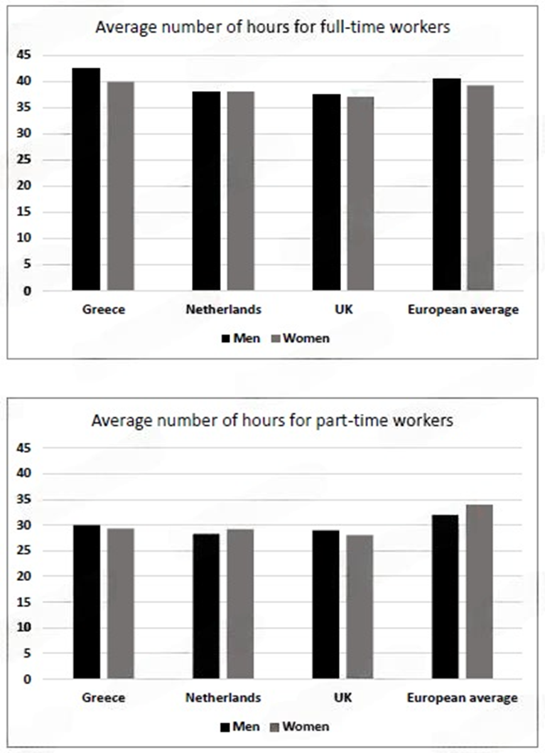
Sample 1:
The bar charts provide information about how long people in European countries worked in 2002 according to gender and employment status.
In general, full-time employees, regardless of their gender, worked longer hours than their part-time counterparts.
According to the first chart, the average number of hours worked by full-timers was around 40, with men contributing slightly longer hours than women did. The most hardworking among them were the Greeks, with 42.5 and 40 hours reported by male and female employees in this country, respectively. In comparison, a typical length was only 38 hours for Dutch workers, while even lower levels were recorded in Britain, especially for women (37 hours).
Part-time employment figures for the three countries were, on the other hand, below the average levels (34 and 32 hours for women and men). They were largely comparable, all within a three-hour range. Similar to the case observed in full-time employment, male workers in Greece worked the longest hours (30), while the workload was the lightest for women in the UK (27 hours).
The number of vehicles registered for use between 1996 and 2006 in a European country.
Summarise the information by selecting and reporting the main features, and make comparisons where relevant. Write at least 150 words.
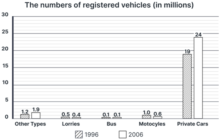
Sample 1:
The bar chart shows how many road vehicles were registered for usage in a particular country in Europe in two years, 1996 and 2006.
Overall, there was an upward trend in the registration of private cars and other vehicle types while lorries and motorcycles took the opposite direction, except buses whose figures remained unchanged. Among these categories, private cars had the highest registration in both years.
At the start of the period, by far the leading mode of transportation was private cars, with 19 million vehicles registered. The figures for the remaining options were negligible, ranging from 0.1 to 1.2 million vehicles.
Thereafter, the number of automobiles registered for private use witnessed a substantial increase, hitting a record high of 24 million in 2006. The trend for other types of vehicles was relatively similar, although the magnitude of change was less pronounced, with 1.9 million vehicles recorded in 2006. Conversely, the figures for motorcycles and lorries experienced a downward shift, declining to 0.6 and 0.4 million vehicles respectively at the end of the period. Finally, the number of registered buses in use remained stable at 0.1 million.
Sample 2:
The bar chart shows the number of registered road vehicles being used in a European country in 1996 and 2006. Overall, registered private cars and other types of vehicles showed an upward trend in numbers, with private cars experiencing the greatest increase, whereas negligible declines were seen in the numbers of registered lorries and motorcycles. In addition, private automobiles dominated other vehicles in both years, while the opposite was true in the case of bus registrations.
Private car registration stood at 19 million in 1996, after which it experienced a remarkable rise to 24 million in 2006. The only other category to witness an increase, albeit to a lesser extent, was other types of vehicles, which climbed from 1.2 million in 1996 to 1.9 million 20 years later.
Conversely, only half a million lorries were registered in 1996, compared to 1 million motorcycles registered in the same year. By 2006, the figures for both these vehicle types had dropped to 0.4 and 0.6, respectively.
Bus registrations, on the other hand, remained unchanged in both given years, with 0.1 million buses being registered in 1996 as well as in 2016, representing a minority among all the listed modes of transport.
Sample 3:
The bar chart depicts the changes in the quantity of registered road vehicles in a European nation between 1996 and 2006. Overall, except for lorries and motorcycles, the use of the remaining means of transport either increased or stayed unchanged. Furthermore, private cars were by far the most commonly used vehicle over the surveyed period.
It can be clearly observed that the disparity between car usage and other modes of transport was highly significant. In 1996, there were a total of 19 million private cars in use on the road, far exceeding the figures for all the remaining vehicles, which hovered merely between a marginal number of 0.1 million to 1.2 million.
The gap was further widened after a decade, in which the number of registered cars continued to top the chart after rising substantially to 24 million, roughly 12 times higher than that of other types of vehicles (1.9 million). Meanwhile, negligible declines to 0.4 and 0.6 million were recorded in the figures for lorries and motorcycles respectively, whereas bus usage remained unaltered at only 0.1 million in 2006.
Sample 4:
The bar chart illustrates the registration figures for various categories of vehicles in Europe over a decade, specifically from 1996 to 2006.
Overall, private cars had the highest number of registrations in both years, showing a significant increase over the decade. In contrast, the registrations for lorries and motorcycles declined, while the number of buses remained unchanged. The category of other types of vehicles also experienced notable growth.
In 1996, private cars dominated the vehicle registration landscape with 19 million units, which significantly rose to 24 million by 2006, indicating a growth of 5 million or a 26.3% increase. Similarly, the category of other types of vehicles also experienced an increase, climbing from 1.2 million in 1996 to 1.9 million in 2006, which corresponds to a rise of 0.7 million or approximately 58.3%.
Conversely, the registration figures for lorries and motorcycles demonstrated a different trajectory. Lorries, which had 0.5 million registrations in 1996, saw a minor decline to 0.4 million in 2006. This drop of 0.1 million constitutes a reduction of 20%. Motorcycles also fell significantly, recording a decrease from 1 million in 1996 to 0.6 million in 2006, representing a decline of 0.4 million or 40%. Interestingly, the number of buses remained static at 0.1 million throughout the decade.
Sample 5:
The bar chart provides information on the number of vehicles registered for use in a European country between 1996 and 2006, measured in millions, across categories including Other Types, Lorries, Buses, Motorcycles, and Private Cars.
Overall, Private Cars dominated vehicle registrations in both years, with a notable rise over the decade. Motorcycles and Other Types also increased, whereas Lorries saw a minor decrease, and Buses remained constant.
In 1996, Private Cars were the most registered vehicles at 19 million, rising significantly to 24 million by 2006, marking the highest increase among all categories. Other Types also saw growth from 1.2 million to 1.9 million.
Lorries experienced a slight decline from 0.5 million to 0.4 million, while Buses remained stable at 0.1 million over the decade. Motorcycles had an increase from 1 million to 1.6 million.
The line graphs show the percentage of people using public transport and people using private cars in five cities of Australia from 2000 to 2010.
Summarise the information by selecting and reporting the main features, and make comparisons where relevant. Write at least 150 words.
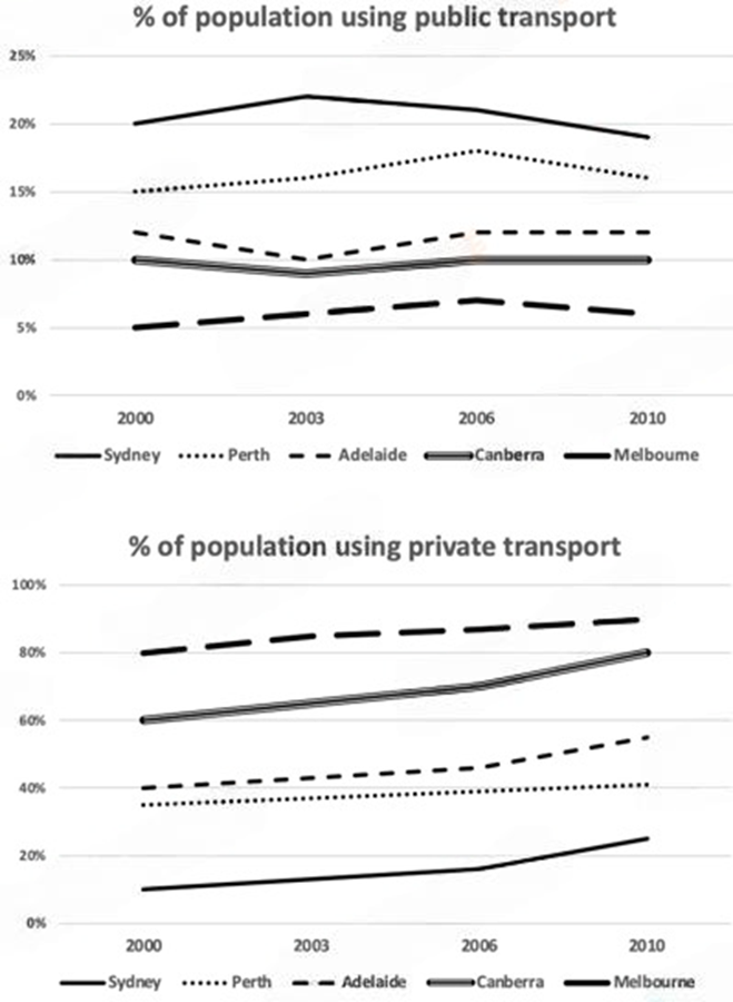
Sample 1:
The line graphs compare the changes in the proportion of people who used public and private transport in five Australian cities, during a decade between 2000 and 2010.
Overall, in all five cities, a larger percentage of people preferred private transport by 2010, and the greatest disparity can be found in Melbourne.
The percentages of public transport use in 2000 and 2010 were roughly the same in all the given areas, among which Sydney had the largest (about 20%), followed by Perth (around 15%), Adelaide (approximately 12%), Canberra (10%) and Melbourne (slightly more than 5%). Despite that, there were various ups and downs during the period. While the proportion in Sydney peaked at about 22% in 2003, the figure for Adelaide bottomed out at 10% in the same year, after which the former demonstrated a continuous decline, whereas the latter showed a slight increase. The rates in Perth and Melbourne reached their high points in around 2006, at nearly 18% and 7% respectively.
In terms of private vehicles, Melbourne and Canberra had the largest and the second largest user groups, at 80% and 60% respectively, and the former augmented by 10%, while the latter by 20%. In Adelaide and Perth, albeit a similar proportion in 2000 at 40%, a swifter growth was found in the former after 2006, approaching 60% by 2010. By contrast, only 10% of citizens in Sydney utilized private transport in 2000, although by 2010, this percentage had more than doubled to approximately 22%.
The graph below shows the percentage of households with different kinds of technology in the UK from 1997 to 2001.
Summarise the information by selecting and reporting the main features, and make comparisons where relevant. Write at least 150 words.
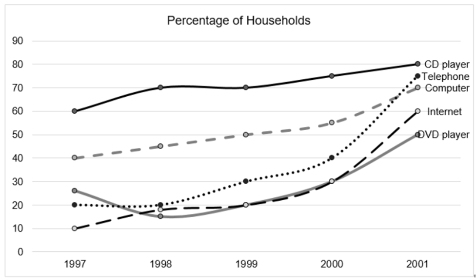
Sample 1:
The table shows how many British households had access to different types of technology over a period of five years.
Overall, all the technologies became more popular during the period surveyed, although the most common items remained unchanged.
The most prevalent home devices experienced relatively modest changes. Topping the list were CD players, which were owned by 60% of households in 1997 and 80% five years later. In comparison, the percentages of households with a computer and a DVD player, the second and third largest (40% and 26%) in 1997, went up by 30% and 25%.
The remaining types of technology, although less common early on, rose more substantially in terms of popularity. The number of households with a telephone was relatively stable at around 20% from 1997 to 1998, but then experienced a sharp increase to 75% in 2001. Similarly, in 1997, only 10% of households had internet access, but this figure rapidly doubled and ultimately achieved a whopping 50% growth.
Summarise the information by selecting and reporting the main features, and make comparisons where relevant. Write at least 150 words.
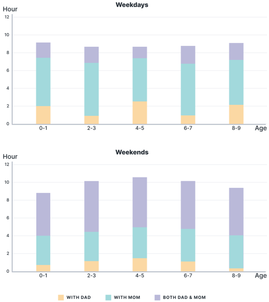
Sample 1:
The stacked column charts highlight the data about how much time moms, dads and both spend on child-rearing during weekdays and weekends.
Overall, it is evident that moms are responsible for childcare in more hours than dads throughout childhood on weekdays as well as weekends. Another interesting point is that at weekends, more hours are well allotted to family time with both parents' presence, and children from 4 to 5 tend to be with their dads more than other age brackets.
On weekdays, children devote a significant part of their day with moms rather than dads or both. To be more specific, children allocate a total of around 9 hours with their parents, which includes 5 to 6 hours with moms and 2 or less than 2 hours with dads (except for children from 4 to 5 who have a bit more than 2 hours with dads).
Different patterns can be seen during weekends when children can spend up to slightly over 10 hours with their parents, an hour more compared to normal days of the week. Playtime with both moms and dads is extended remarkably to approximately 6 hours though alone time with dads is reduced to less than 1 hour (except for children from 4 to 5 who spend relatively more than 1 hour with their dads).
Sample 2:
The bar chart compares how much time children of multiple age groups spend with their parents, as displayed by the amounts of time that children spend with each parent alone and both parents together.
In general, children of all age groups spend more time with their mother than their father alone throughout the week. On the weekends, children’s time with parents increases and this time is predominantly spent with both parents, rather than with each parent separately.
For the weekdays, children typically spend around 7 hours with their mother alone. Infants, in particular, have almost 8 hours which strictly involve their mother, which is more or less the same amount of time for children in the 2-3 and 6-7 age group in this regard. The time spent exclusively with their father, on the other hand, is rather limited, which is at most above 2 hours for the 4-5 age group and at least 1 hour for the 2-3 age group.
Regarding the weekends, the amount of time that children spend with both parents, which is no more than 2 hours during the weekdays, becomes roughly 5.5 hours on average on weekends. This is at the expense of the amount of time that is spent exclusively with mothers and fathers, lowering to an average of 3.8 hours and sub-1 hour respectively. Finally, children from the age of 2 to 7 spend an increased total of around 10 hours with their parents on weekends.
Sample 3:
The given bar chart illustrates how much time children of five different age groups spend with their parents.
Overall, it is clear that children spend much more time with both parents on weekends while mothers tend to carve more time to take care of their offspring during weekdays. Additionally, fathers generally spend the least amount of time with their children.
During weekdays, the amount of time that babies aged from 0 to 1 year old spend with their dads is lowest, at 2 hours, while they spend most of their time with their moms (roughly 6 hours) and around 1 hour with both. Similar patterns are evident in the remaining age groups: around 1-2 hours are spent with the fathers, approximately 6 hours with the mothers and about 1.5-2 hours with both.
The child-rearing time at weekends follows a relatively different pattern. Across the age brackets, the dads still allocate the smallest amount of time for their kids (normally under 1 hour) whereas the mothers' time allocation ranges from 3 to 4 hours and both parents together set aside between 5 and 6 hours to care for their children.
Sample 4:
The stacked bar charts delineate how much time children of various age groups spend with their parents. The initial impression from the charts is that whilst children spend more time with both parents at weekends, mothers allocate more time for child-rearing during weekdays. It can also be seen across the two charts that fathers (excluding the ‘with both’ classification) generally spent the least time with their children.
During weekdays, babies aged from 0 to 1 year spent the least amount of time (2 hours) with the fathers, the most time with the mothers (roughly 5.8 hours), and around 1.2 hours with both. Similar pictures are evident in the remaining age groups; around 1.5-2 hours are spent with the fathers, approximately 6 hours with the mothers, and 1-2 hours with both.
A relatively different pattern could be observed regarding the child-rearing time at weekends. Across the age brackets, the fathers still set aside the least time with their kids (only a negligible 0.25-0.5 hours), mom’s time allocation is around 3-4 hours, and both parents together put from 5 to 6 hours into caring for child kids.
The diagram illustrates how recycled paper is made.
Summarise the information by selecting and reporting the main features, and make comparisons where relevant. Write at least 150 words.
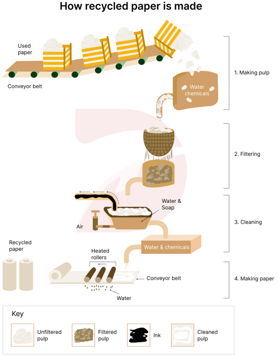
Sample 1:
The given diagram presents the stages involved in the process of recycling paper.
Overall, this process includes four main phases, beginning with the making of pulp and ending in the production of recycled paper.
In the first step of the recycling process, used paper is placed on a conveyor belt which moves it into a mixture of water and chemical agents, where the paper is broken down into individual fibers, forming a slurry-like pulp as a result. Next, the slurry undergoes a filtration process to assist in the removal of impurities.
This is followed by a stage of thorough cleaning, in which water, soap, and air are used to wash the pulp and eliminate ink residues before more water and chemicals are added to enhance the removal process. In the fourth stage, the cleaned pulp is poured onto another conveyor belt, which carries the pulp through a drying process involving the use of heated rollers to remove the water. Finally, the dried paper is then wounded into rolls of recycled paper, ready for use or distribution.
Sample 2:
The diagram illustrates the process for manufacturing recycled paper.
Overall, this is a mechanical process comprising four main stages: pulp creation, filtration, cleansing, and paper production.
The first stage starts with the collection of used paper, which is placed onto a conveyor belt. The paper is then transferred into a pulping machine, where it is mixed with water and chemicals to break it down into a slurry.
During the second stage, the pulpy mixture is sieved, which results in a more homogeneous and cleaner pulp. The third stage is the cleaning phase, where the pulp is thoroughly washed with water and soap. Additionally, the air is fed into the pulp so that smaller impurities, such as ink particles, can be removed. The pulp thereafter undergoes another round of chemical and water treatment.
Once the cleaning step has been completed, the pulp is laid out on a conveyor belt and passed through heated rollers, which press and dry the pulp into paper. The paper is subsequently rolled up, resulting in rolls of recycled paper ready for distribution and use.
Sample 3:
The drawing illustrates the step-by-step process of recycling paper.
Overall, it can be seen that this procedure consists of eight stages, divided into four main phases. This begins with the collection of used paper and ends with the attainment of recycled paper.
During the making pulp and filtering processes, used paper is first gathered in containers, which are put on a conveyor belt. Once reaching the end of the belt, the paper is deposited into a tank containing water and chemicals to be broken down into a slurry. This is followed by the slurry being filtered into another container.
In the cleaning and making stages, the filtered pulp is mixed with water and soap, and air is introduced in order to remove ink. Following this, the deinked pulp is transferred to a tub with water and chemicals, which then releases the clean pulp onto another conveyor belt. Heated rollers are subsequently introduced to dry the pulp, resulting in recycled paper, while excess water is collected separately.
Sample 4:
The diagram details the process of producing recycled paper. Overall, the process comprises four primary stages, commencing with a pulping phase, followed by filtration and cleansing stages, and culminating with the final recycled paper being rolled.
Regarding the pulp production and filtration stages, the boxes containing used paper are placed on a conveyor belt and transferred to a tank filled with water and chemicals. Subsequently, the paper is converted into pulp for additional processing. Next, the pulp is transferred to a receptacle equipped with perforations to eliminate impurities and then poured into a container.
Concerning the cleaning and papermaking stages, the pulp is put into a large floatation tank filled with water and soap. Air is pumped into the tank to help remove ink, enhancing the purity and whiteness of the pulp. Once the pulp has been de-inked, it is moved to another tank with water and chemicals for a final cleaning. In the next step, the pulp passes through heated rollers, during which water is extracted. Finally, long rolls of recycled paper are produced.
Sample 5:
The given diagram delineates the process of recycling used paper.
Overall, it can be clearly seen that there are 4 main stages in the process, commencing with the making of pulp from used paper and culminating with recycled paper as the final product.
In the first stage of creating the pulp, used paper is transported by a conveyor belt before being treated with a liquid consisting of water and chemicals in a tank to create unpurified pulp. And then in the filtering phase, water and soap are added into a tank to remove the ink from the raw pulp, with the assistance of the air pump.
Next, clean pulp, which is the outcome of the previous cleaning step, is moved through a line to the heated rollers. Here, the clean pulp is rolled flat to create sheets of new paper. Moreover, before the final product is made, in the process of flat-rolling and with the involvement of heat, the previously added water is completely removed.
Sample 6:
The picture depicts the step-by-step process of creating recycled paper.
Overall, the process consists of four key stages, which commences with the production and then filtration of raw pulp, proceeds to the deinking process, and culminates in the production of rolls of recycled paper crafted from purified pulp.
The initial step involves producing unprocessed pulp, which initiates with the pulp placement on a conveyor belt, followed by its descent into a water and chemical mixture. Subsequently, the blend is funneled into a bucket, extracting the liquid and releasing the filtered pulp into another container.
In the next stage, the filtered pulp is immersed in a bucket containing water, soap, and introduced air, causing the ink in the pulp to evaporate. Following this, the deinked pulp flows into another container to ultimately yield clean pulp. This is subjected to grinding by heated rollers on a conveyor belt to completely remove water, resulting in the production of rolls of recycled paper.
Sample 7:
The given illustration outlines the step-by-step process of recycled paper production.
Overall, the production line involves four main phases, beginning with the reception of wastepaper, followed by the subsequent filtration of raw pulp and the de-inking stage prior to the production of recycled paper.
First, once being delivered to the manufacturing plant, the collected wastepaper will enter the pulping stage on a conveyor belt. Here, it is submerged in a liquid which is a combination of water and chemicals to be converted into pulp with ink and other impurities. Therefore, the mixture is transferred to a perforated vat for the impurities to be filtered out.
The next step is when the ink is removed by pouring the filtered pulp into another vat filled with water and soap, under the effect of air pumped into it. Once this step completes, the ink exits through a separate tube, while the resultant clean pulp is channeled through another tube into a container where it is rolled into recycled paper by a series of heated rollers on a conveyor belt, ensuring the water within the paper is thoroughly expelled.
Sample 8:
The diagram illustrates the process of making recycled paper from used paper. The process involves four main stages: making pulp, filtering, cleaning, and making paper.
In the first stage, used paper is placed on a conveyor belt that moves it into a pulping machine. Here, water and chemicals are added to break down the paper into unfiltered pulp.
The second stage is filtering, where the unfiltered pulp is passed through a mesh to remove large impurities. This results in the filtered pulp, which is then ready for the cleaning stage.
During the third stage, the filtered pulp is mixed with water and soap, which helps to remove ink and other small contaminants. Air is also introduced to further clean the pulp. The cleaned pulp is then passed through another filtration process to ensure all impurities are removed.
Sample 9:
The diagram demonstrates the procedure for manufacturing recycled paper from used one.
The whole process involves seven steps which can be organized into three main stages. This includes collecting used paper, filtering it and processing the materials into the finished product.
Initially, unprocessed pulp is filtered by being placed on a conveyor belt and then submerged in water and chemical mixture. The blend is then poured into a straining bucket, separating the liquid and leaving filtered pulp.
Next, the filtered pulp undergoes a cleaning process, where it is submerged in a mixture of water, soap, and air. This process causes the ink in the pulp to evaporate, resulting in deinked pulp. The deinked pulp is then mixed with water and other chemicals in another vessel, eventually yielding clean pulp. Finally, the clean pulp is passed through heated rollers on a conveyor belt, where it is ground and transformed into rolls of recycled paper.
Sample 10:
The diagram illustrates the stages involved in the recycling of used paper.
Overall, the process encompasses a series of distinct phases, namely pulping, filtering, cleaning, and paper making. Specifically, it starts with a conveyor belting moving used paper and the final stage is when the paper is fully recycled.
Initially, used paper is conveyed on a belt to a vat, where it is mixed with water and chemicals to break it down into fibers, commonly referred to as unfiltered pulp. Following this, the substance is subjected to a filtration process to eliminate larger particles. The next phase is deinking, which involves the filtered pulp being treated with a mixture of water and soap to remove any remaining impurities. During this stage, an air pump is introduced to create bubbles, causing the ink to rise to the surface, which is then removed through a dedicated pipe. This step is essential for ensuring that the final product is free from any residual printing substances.
Once the pulp is cleaned, it is formed into rolls of recycled paper through the utilization of heated rollers, which expels any remaining water and facilitates the solidification of the paper into its final form.
Sample 11:
The provided diagram illustrates the process involved in recycling paper.
Overall, it is clear that the recycling of paper involves a comprehensive four-stage procedure, from the first treatment of wastepaper to the final production of usable recycled paper.
The initial phase commences when wastepaper is placed onto a conveyor belt. After that, it is transported to a container where it is mixed with water and chemicals, which facilitate the breakdown of the paper into a mushy substance called unfiltered pulp. This mixture then undergoes a thorough cleaning stage, where air, water and soap are introduced to eliminate impurities. Following that, the pulp goes through an additional bleaching step, which removes any remaining ink, resulting in a batch of clean pulp. As the final step, this purified pulp is passed through a heated roller, which dries the pulp and begins forming the recycled paper, ready for a new life in various applications.
Sample 12:
The diagram illustrates the process of industrially recycling used paper into new usable paper rolls.
Overall, this process is divided into four clear stages, beginning with turning used paper into pulp and ending with rolling clean pulp into new paper.
During the first stage, collected wastepaper is delivered on a conveyor belt and consequently soaked in a mixture of water and chemicals, turning the used paper into pulp in preparation for the next stage. The pulp mixture is then pushed through a filter in the second stage before the ink removal process.
Next, in the third stage, the filtered pulp continues to be soaked in water while an air pump is utilised to separate the ink from the pulp. Afterwards, the resulting clean pulp is run through heated rollers, during which, any excess water is drawn out. The outcome of this final stage is fresh rolls of recycled paper.
Sample 13:
The process graph illustrates the stages involved in the making of recycled paper.
Overall, it can be seen that used paper undergoes four main stages. The process begins with the production of pulp and ends with the rolling of clean pulp to make recycled paper.
In detail, in the first stage of the process, used paper is dropped into a tank containing water and chemicals, with the help of conveyor belt. The pulp is then filtered by putting into a barrel with holes. This process separates the impurities from the pulp, leaving them behind inside the barrel.
Following this is the cleaning stage, in which filtered pulp is washed with water and soap in a container. Air is also passed into the container with the help of an air pump, which is attached to the container. The ink gets removed in this stage. In the final stage, the clean pulp without ink is rolled with the help of the heated roller. The wastewater is removed and thus, recycled paper rolls are obtained.
Sample 14:
The diagram meticulously delineates the systematic process involved in recycling paper.
The process encompasses four principal stages: beginning with the creation of pulp and concluding with the production of recycled paper, each step intricately linked to form a continuous sequence.
Initiating this cycle, used paper is gathered and deposited on a conveyor belt, conveying it to a pulping machine. Here, amidst a blend of water and chemicals, the paper is disintegrated into a slurry. This slurry is then subjected to a filtration process, whereby the mixture is sieved to yield a cleaner, more uniform pulp, effectively preparing it for the subsequent cleaning stage.
In the third stage, the filtered pulp is rigorously cleansed using water and soap, with air being infused to facilitate the removal of fine impurities, including ink. This results in a clean pulp, which is then evenly distributed on another conveyor belt. Passing through heated rollers, the pulp is pressed and dried, finally emerging as sheets of paper. These sheets are rolled up, signifying the end of the recycling process and producing rolls of recycled paper ready for use.
Sample 15:
The linear manufacture of recycled paper is illustrated in the given diagram.
Overall, the process comprises various stages, commencing with the production of pulp, followed bystages of industrial parts cleaning and culminating in the completion of recycled paper.
In greater detail, the initial phase of making pulp is to transport used paper through a conveyor belt to a processed mixture of water and chemicals, where it is broken down and shredded into small pieces to create unfiltered pulp slurry. Having undergone a filtration stage to get rid of residues and impurities, the materials are then transmitted to a more complex process thereafter.
As far as the remaining steps are concerned, the filtered pulp is cleaned entirely by water, soap and air to remove ink and other contaminants before being added to another mixture of water and chemicals. Afterwards, the soaked materials are poured down into a conveyor belt, passing through heated rollers to evaporate the moisture. The manufacture ends with the wounding of dry paper sheets into recycled paper, ready to be consumed.
Sample 16:
The diagram details how recycled paper is made. Looking from an overall perspective, it is readily apparent that the process involves three main stages beginning with initial collection and transportation, followed by cleaning and processing, and lastly the rolling of the final product. The process is entirely man- made.
In order to produce recycled paper, used paper is first sourced and transported by conveyor belt to a processing plant. The used paper is then made into unfiltered pulp by using water and various chemicals. The pulp must then be filtered with water being removed.
After filtering is complete, the filtered paper pulp is sent by a tube to a container with water and soap to be further cleaned. The air is pumped into the container and the ink is removed. There is then additional cleaning with water and chemicals before the final rolling stages commence. To create usable recycled paper rolls, the cleaned and filtered pulp is placed on a conveyor belt where heated rollers flatten the paper and remove excess water.
The chart shows the division of household tasks by gender in Great Britain.
Summarise the information by selecting and reporting the main features, and make comparisons where relevant. Write at least 150 words.
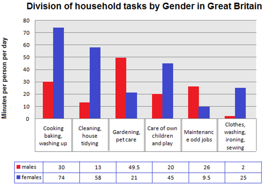
Sample 1:
The provided graph gives information on the time spent by male and female on household works in Great Britain. As is observed from the graph, female spent more time cooking, cleaning, clothing and child rearing while male spent more time on gardening and odd jobs.
According to the graph, female spend more than 200 minutes per day on household works while male spend about 140 minutes per day on those short of household jobs in Great Britain. On an average, female works more on household tasks like cooking, baking, cleaning, washing, house tidying, childcaring and sewing. For those short of jobs, women work almost 3 times than the men do. On the contrary, male work more on gardening, pet care, odd job maintaining more than women do and they spend the highest amount of time on gardening and pet caring while the female work their highest amount of time on cooking, cleaning and washing.
In conclusion, female work significantly more than men on household works like cooking, washing, cleaning and child nurturing while men spend their majority of time on household works like gardening, pet caring and odd jobs compared to the time they spend on household tasks.
Sample 2:
The bar graph portrays the division of household chores by gender in Great Britain. The unit of measurement is minutes per person per day.
Most household tasks are predominantly taken care of by women in Great Britain. Women also spend more time per day doing household work than men.
Tasks like cooking, baking, etc. are mostly taken care of by women with 74 minutes spent per person per day whereas men spend 30 minutes per person per day on such tasks. Women also significantly surpass men in cleaning, house tidying and household laundry. Women spend 45 minutes per person per day taking care of children whereas men spend 20 minutes on the same.
Men spend more time than women in gardening and pet care, where the time spent per person per day for men is 49.5 minutes, and that of women is 21 minutes. Men also spend more time doing maintenance jobs with 26 minutes per person per day, whereas women only spend 9 minutes.
Sample 3:
The bar chart compares the number of minutes which men and women (genders) on Britain spend each day on various household chores.
Overall, it is clear that women spend more time on these chores than men. Men spend more time than women on gardening/pet care and on maintenance/odd jobs, but significantly less time on all the other household tasks.
Females spend the most time on cooking baking, washing up, with a daily average of 74 minutes, compared with 30 minutes for males. There was also a noticeable difference in terms of cleaning the house and playing with the children. Women spend 58 and 45 minutes respectively each day on these activities. In contrast, men spend only 13 and 20 minutes on each of these. Men spend just 2 minutes daily average on washing/ironing clothes and sewing, much less than the 25 minutes for women.
There were only two tasks on which males spend more time than females. The figure for gardening/pet care was approximate 50 minutes for men and over 20 minutes for women. Finally, the maintenance/odd jobs were tasks which occupied the least time each day of women, at under 10 minutes, compared with 26 minutes for men.
Sample 4:
The bar chart illustrates how much time marriage partners from the UK spent on household chore.
Overall, women generally do much more housework than men, with only the exception of gardening, pet care and repairing tasks. Besides, women spend time in the kitchen more than the other activities.
First, the figures for females are exceptionally high in specific tasks such as cooking, cleaning, childcare which are over 70, just below 60, roughly 45. In contrast, the amounts of time in the males group are underwhelmingly low in comparison, which are 30, slightly above 10 and 20, in the same order. Moreover, men spend almost no time (only 2 minutes) for clothes chores.
On the other hand, the remaining activities like gardening, taking care of pet and maintenance odd jobs are mainly done by men, with the figures being nearly 50 minutes and over 25 minutes respectively. Regarding the females group, the data are lower than half of the figures for males.
Sample 5:
The chart shows the average number of minutes per day men and women in Great Britain spend on jobs around the house.
In total, men spend just over two-and-a-half hours on household tasks whereas women spend slightly less than four hours. Women spend more than twice as much time doing kitchen tasks such as cooking and washing up as men (74 minutes for women as opposed to 30 minutes for men. Women are also more active in cleaning the house- it takes 58 minutes of their day compared to / with 13 minutes for men – and childcare, where women put in more than twice as much time as men.
On the other hand, men are more active in gardening and pet care, where they spend twice as long as women, and maintenance and DIY, on which they spend 15 minutes more than women. Women account for almost all the time spent on washing and ironing clothes. This takes them 25 minutes, while / whereas men spend just 2 minutes on this task.
Overall, the figures show that women spend more time on routine domestic chores than men, while / whereas men do more household maintenance, gardening and pet care.
Sample 6:
The bar graph delineates the division of household tasks by gender in Great Britain, presenting a clear disparity in time allocation between males and females for various domestic activities.
At a glance, the overview indicates that females in Great Britain undertake a significantly greater portion of cooking, cleaning, and child-related tasks compared to males. Conversely, males predominate in activities such as gardening and performing odd jobs around the house.
Delving into specifics, females lead substantially in the kitchen, dedicating an average of 74 minutes per day to cooking, baking, and washing up, more than double the time spent by males. This trend of female dominance continues with cleaning and house tidying, where females invest 58 minutes daily, compared to just 13 minutes by their male counterparts. Childcare is another area where females are the primary contributors, spending 45 minutes per day, which is more than double the male contribution.
In contrast, the division of household tasks by gender in Great Britain shifts as we consider outdoor and less routine tasks. Males dedicate nearly 50 minutes to gardening and pet care, surpassing females by a significant margin. Similarly, when it comes to maintenance and odd jobs, males allocate more than twice the time females do. The only domain where both genders show minimal difference in time investment is clothing maintenance, including washing, ironing, and sewing, with females spending marginally more time.
Sample 7:
The chart in question documents the division of household tasks by gender in Great Britain, quantifying the daily minutes each sex dedicates to various domestic duties.
The overview unveils a pronounced imbalance in the division of household tasks by gender in Great Britain, with women bearing a heavier burden in indoor chores, while men are more engaged in outdoor and ad-hoc tasks. Notably, tasks related to cooking and cleaning are predominantly assumed by females, whereas gardening and maintenance are male-dominated domains.
Examining the data in finer detail, the disparity is stark in culinary and sanitation responsibilities. Women invest an average of 74 minutes per day in cooking, baking, and related cleanup, a figure which more than doubles the male investment in these tasks. Additionally, when it comes to tidying up the home, women allocate nearly an hour, dwarfing the male contribution of a mere 13 minutes. Childcare also follows this pattern, with females contributing 45 minutes daily - a figure that is again significantly higher than that of their male counterparts.
The division of household tasks by gender in Great Britain takes a turn when examining fewer routine tasks. Men devote approximately 49.5 minutes to gardening and pet care, a domain where they surpass women by a considerable margin. Odd jobs and maintenance also see men investing more time, with a notable 26 minutes per day, which is nearly triple the time spent by women. The graph does reveal a closer parity in tasks pertaining to clothing maintenance, with a slight inclination towards more female participation.
Sample 8:
The bar chart meticulously enumerates the division of household tasks by gender in Great Britain, showcasing the average time men and women spend on various domestic chores.
From an overarching perspective, the division of household tasks by gender in Great Britain reveals a traditional split in domestic labor. Women are the primary contributors to indoor tasks such as cooking, cleaning, and child rearing, whereas men allocate more time to outdoor and intermittent tasks such as gardening and maintenance.
Zooming in on the details, the chart indicates a significant gender disparity in the realm of kitchen activities, with women spending 74 minutes per day on cooking and cleaning up, contrasting with men's 30 minutes. Furthermore, women dedicate nearly an hour daily to cleaning and house tidying, which is significantly higher than the 13 minutes contributed by men. When it comes to nurturing and caring for children, women's involvement is substantial, at 45 minutes, compared to men's 20 minutes.
In terms of less frequent household duties, the division of household tasks by gender in Great Britain tilts towards men. Gardening and pet care see men spending almost 50 minutes each day, markedly more than the 21 minutes by women. For maintenance and odd jobs, men's involvement is nearly triple that of women's. Notably, the gap narrows concerning clothes maintenance, with women's time slightly eclipsing men's.
Sample 9:
The bar chart portrays the division of household tasks by gender in Great Britain, charting the minutes per day each gender devotes to a range of domestic duties.
The immediate takeaway from the chart is the uneven division of household tasks by gender in Great Britain, with women disproportionately shouldering indoor chores, and men more engaged in outdoor and sporadic tasks. This differential allocation is most evident in the spheres of cooking, cleaning, and childcare for women, and gardening and maintenance for men.
Detailing the division further, the graph illuminates that women in Great Britain spend 74 minutes per day on cooking, baking, and washing up, more than double the time men dedicate to these tasks. In cleaning and house tidying, women's daily efforts amount to 58 minutes, quadruple that of men's 13 minutes. Additionally, in the nurturing role of childcare, women average 45 minutes per day, markedly outpacing the male contribution.
Conversely, the division of household tasks by gender in Great Britain leans in favor of men when it comes to outdoor activities. Men allocate 49.5 minutes to gardening and pet care, an arena where their efforts surpass those of women. In the maintenance of odd jobs, men's dedication is also pronounced, investing 26 minutes daily, starkly contrasting with women's 9.5 minutes. However, in clothing care, which includes washing, ironing, and sewing, the gender time investment is more comparable, with women slightly ahead.
Sample 10:
The bar chart shows the average number of minutes per day men and women in Great Britain spend on jobs around the house. The trend suggests that women do more of the household chores compared to men.
According to the information shown, men only spend two-and-a-half hours on household tasks, whereas women spend slightly more than four hours. Women spend more than twice as much time doing kitchen tasks at 74 minutes compared to men who only do 30 minutes. This is a difference of more than double. Women are also more active in cleaning the house. 58 minutes of their day is spent cleaning, compared to only 13 minutes for men. Similarly, women put in more than twice as much time as men for childcare, with 25 more minutes of this kind of care being provided by women.
On the other hand, men are more active in the garden and with pet care, where they spend twice as much time as women. For maintenance and odd jobs around the house, men spend 15 minutes more than women do. Women account for almost all the time spent on washing and ironing clothes with a significant difference of 23 minutes spent on these chores by women. In fact, men spend only two minutes on this task.
Overall, the information shows that women spend more time on routine domestic chores than men, while men do more household maintenance, gardening and pet care.
Sample 11:
The bar chart details how household chores in Great Britain are divided between males and females. The chart illustrates a distinct gender disparity in the division of household tasks in Great Britain, with females generally spending more time on indoor chores such as cooking and cleaning, while males are more involved in outdoor activities like gardening and maintenance work.
It is immediately evident that cooking, baking, and washing up are predominantly undertaken by females, who spend an average of 74 minutes per day on these tasks, compared to just 30 minutes by their male counterparts. Similarly, females dedicate more time to cleaning and tidying up, with 58 minutes per day, which is significantly higher than the 13 minutes spent by males. In the realm of gardening and pet care, men spend approximately 49.5 minutes per day, surpassing women who allocate about 21 minutes to these tasks.
When it comes to childcare, females again take the lead, investing 45 minutes daily in the care and play of children, which is more than double the time spent by males, at 20 minutes. However, for maintenance and odd jobs, the roles reverse with men spending 26 minutes per day as opposed to women who contribute a comparatively lesser 9.5 minutes.
The last category, which includes clothes washing, ironing, and sewing, once more sees females spending more time, at 25 minutes per day, compared to a mere 2 minutes for males.
Sample 12:
The chart given above shows the average number of minutes per day British men and women spend in doing domestic tasks. In short, women spend about four hours in doing household tasks while men spend less than two and half hours.
The tasks that are more likely to be done by women than men include cooking, cleaning, washing and childcare. While women spend 74 minutes in doing tasks like cooking, baking and washing up, men spend just 30 minutes. Women are also far more active than men when it comes to doing tasks like cleaning and house tidying (58 minutes per day for women as opposed to just 13 minutes for men). The areas where men are more active than women are gardening, pet care and odd maintenance jobs around the house. On an average, men spend 49.5 minutes per day in gardening and pet care whereas women spend 21 minutes on these tasks.
Women spend twice as much time as men on childcare. They also account for nearly all the time spend on tasks like washing, ironing and sewing (25 minutes for women as opposed to just 2 minutes for men).
Overall, the chart shows that routine domestic chores are mainly done by women, while men prefer doing tasks like household maintenance, gardening and pet care.
Sample 13:
The chart shows the number of minutes per day spent by British men and women in doing household tasks. On an average, the women spend about four hours doing household tasks whereas the men spend less than two and half hours.
The tasks on which women spend more time than men include cooking, cleaning house, taking care of the children and laundry. In doing all these tasks, women spend approximately 200 minutes which is almost three times the time spent by men in these tasks. On the other hand, men spend twice the time than women in doing tasks like gardening and maintenance of odd jobs in the house. Men spend the highest time, almost 50 minutes, in gardening and petcare. While the women spend only 30 minutes for these tasks. The time spent by men in washing, ironing and sewing clothes is as low as 2 minutes per day as opposed to 25 minutes spent by women.
In short, women spend far more time doing household chores than men whilst men prefer to do gardening, petcare and maintaining odd jobs.
Sample 14:
The chart shows the division of household tasks by gender in Great Britain.
The chart statistically summarizes the average time it takes for men and women to do their daily chores at home in Great Britain.
The Office for National Statistics analyzes that women make up the large proportion of the time for jobs relating to cooking, baking, washing up, ironing, sewing, and caring their children. Meanwhile, men take charge of sweaty manual jobs such as gardening, pet care (49.5 minutes) or maintenance odd jobs (26 minutes). Taking job of cooking, baking and washing up for the example, it is the most time which women spend on with 74 minutes daily. The second most time spending is for cleaning, house tidying with 58 minutes. The author’s analysis of this data yields several key findings.
First, this data allows readers to look into detail the inequality between men and women. In general, though the statistics illustrates that men do help women in some household activities, the comparison of time between men and women is far equal. Men use less than one hour (slightly 49.5 minutes), and women use more than one hour (74 minutes) per day to share their marriage responsibility.
Second, the chart conjures up an image about a change in the men’s once mindset which household tasks sole belonged to women’s responsibility that was considered as a discrimination in society. Men can also share some daily housing activities with their partner, such as: 30 minutes for cooking, baking, washing up; 13 minutes for cleaning, housing tidying; 49.5 minutes, 20 minutes, and 26 minutes for gardening, pet care, care of own children and play, maintenance odd jobs, respectively. The most noticeable in the presentation is men the least like the job of clothes, washing, ironing, sewing (2 minutes).
Overall, the figures show that men would love to do daily routines which need more strength. Women much enjoy caring activities.
Sample 15:
The chart provides information about the division of household tasks by gender in Great Britain and the number of minutes per day spent by both males as well as females in doing various tasks. On an average, women spend approximately four hours doing the household tasks, whereas men spend less than two and half hours for the same. The tasks on which women spend more time than men include cooking, cleaning the house, taking care of the children and laundry. In doing all these tasks, women spend approximately 200 minutes which is almost three times the time spent by men in accomplishing these tasks. On the other hand, men spend twice the time than women in doing tasks like gardening and maintenance of odd jobs in the house. Men spend majority of their time, almost 50 minutes, in gardening and pet care whereas women spend only 30 minutes for these tasks. The time spent by men in washing, ironing and sewing clothes is as low as 2 minutes per day as opposed to 25 minutes spent by women. In a nutshell, women spend far more time when it comes to doing household chores than men who prefer to do gardening, pet care and maintenance of odd jobs.
The diagram below shows how one type of coal is used to produce electricity.
Summarise the information by selecting and reporting the main features, and make comparisons where relevant. Write at least 150 words.
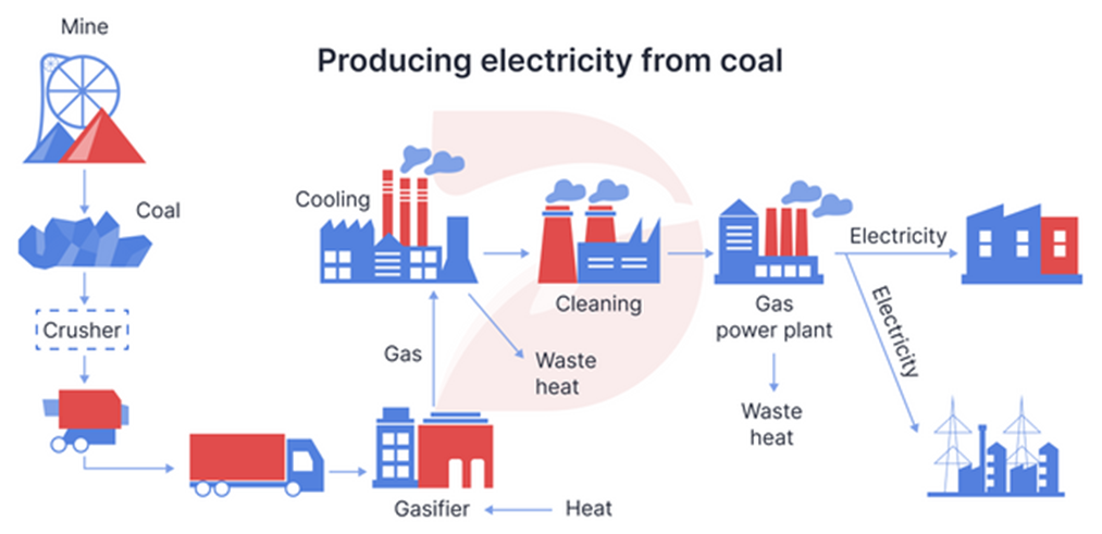
Sample 1:
The provided diagram illustrates how electricity is generated from coal.
Overall, the process includes several key stages, beginning with coal mining and culminating in power delivery to households and industries, with waste heat being a by-product at various stages.
The first step involves coal being mined at extraction plants. The mined coal subsequently undergoes crushing, breaking it down into finer pieces. These crushed coal fragments are then transported to a gasifier, inside which combustion occurs at elevated temperatures in order to convert the coal into gas.
After this phase is complete, the produced gas proceeds to a separate facility for cooling, with excess heat released as waste. Once cooled, the gas undergoes a cleaning stage whereby any impurities are removed. The purified gas then becomes the input for a gas power plant. Within the power plant, electricity is generated and distributed for domestic and industrial use. It is worth noting that even at this final stage, additional waste heat is still discharged as a by-product.
Sample 2:
The illustration demonstrates the generation of electricity by utilizing a particular type of coal. Overall, there are eight steps in the production, beginning with mining the coal, followed by various processes to the raw material, and ending with distributing the electricity to final uses.
The first five steps involve the conversion of coal into gas, which begins with coal being excavated from a mining plant. After that, it goes through a crushing machine and is delivered by trucks to another factory, where a gasification process transforms the crushed coal into gas. Subsequently, another facility is responsible for lowering the temperature of the gas and releasing the waste heat.
The remaining steps produce electricity. Cool gas is transported to another unit for cleaning and then becomes the input for a gas power plant. While electricity is generated, excessive heat is released as a source of waste. Finally, the electricity produced from the power plant is supplied for both household and industrial uses.
Sample 3:
The diagram illustrates the process of generating electricity from a particular kind of coal.
Overall, this process comprises multiple steps occurring at different facilities: starting from the mining of the coal to the production of gas, and eventually the generation of electrical power used for various purposes.
To begin with, coal is extracted from a mine, after which it is ground down by a crusher. The pulverized coal is then put into a mine cart before being loaded onto a truck for transportation. Once this material has been transported to the factory, it is heated to produce gas.
The process continues with the gas being sent to a separate facility, in which it is cooled while waste heat is discharged. After the cooling process is complete, the gas will be directed to a facility where it is purified. It is thereafter transferred once again to a power plant which uses the gas to generate electricity and expel any excess heat waste. Finally, the electricity produced is distributed via transmission lines to homes and industries.
Sample 4:
The drawing demonstrates how electricity is generated from a type of coal.
Overall, it can be seen that there are eight stages included in this procedure, commencing with the extraction of coal and completing with production of electricity. Also, the process takes place at a coal mine and several treatment facilities.
In the initial stage, coal is collected from coal mines. After undergoing a crushing stage, the coal is transported by trucks to a gasifier. This is where high temperatures are introduced, and the pulverized coal is heated and turned into gas, ready for the next steps.
The subsequent stage involves gas being delivered to a cooling plant from the gasifier. Following this, some of this gas is transported to another factory for cleaning, while waste heat is disposed of. After being cleaned, the gas is moved to a power plant to be converted into electricity. Finally, the generated electricity is distributed to households and factories, with waste heat being removed.
Sample 5:
The diagram illustrates how to generate electricity from coal.
Overall, the process comprises several stages, starting with the mining and crushing of coal, followed by the heating and cleaning of gas, and culminating in the generation and allocation of electricity.
At the start of the process, coal is extracted from a mine before being transported to a crusher, where it is broken down into smaller pieces in order to burn more efficiently. The coal lumps are then subjected to high temperatures in a gasifier, triggering a combustion reaction as gas and other by-products are produced. Subsequently, the gas is cooled down while the waste heat is released.
The process continues with the gas being cleansed to remove impurities, after which it is pumped into a gas power plant where electricity is generated. During this stage, more waste heat is discharged into the atmosphere. Finally, electricity is distributed to various households and industries.
Sample 6:
The diagram illustrates the various steps involved in the production of electricity from coal.
Overall, the procedure consists of six primary steps, beginning with the extraction of coal from mine and culminating in the distribution of electricity to the grid.
The process initiates at a coal mine, where coal is extracted and then transported to a crusher to be pulverized into small pieces. Following this, the crushed coal is conveyed to gasifiers, where it undergoes heating to transform into gas, followed by a cooling phase. During this phase, the waste heat generated in the gasifier can be later extracted and managed.
Once gasified, the coal-derived gas is cleaned to remove impurities, rendering it suitable for efficient power generation. The purified gas is then directed into a gas power plant where it fuels turbines to produce electricity. Finally, this resulting electricity is distributed to the grid and for consumer use.
Sample 7:
The given picture illustrates how a certain type of coal is used to generate electricity. Overall, there are three main stages in this process. It starts with the extraction of coal, continues with processing this material to generate electricity and culminates with distributing electricity to various locations for household and industrial purposes.
Regarding the material preparation stage, a specific type of coal is mined from coal mines using specialised equipment. It is then ground by crushers and dumped into crates. Finally, the crushed coal is delivered by trucks to thermal power plants.
Concerning the production and delivery stages, the coal received at the plant is first gasified using heat. The gas produced is subsequently pumped into a cooling system where waste heat is released. The following step involves cleaning the gas to remove any impurities before it is utilised to produce electricity in a power plant. At this plant, another volume of waste heat is also released, and the electricity is finally distributed to households for domestic use or to industrial areas.
Sample 8:
The diagram delineates the sequential stages involved in generating electricity from coal.
Overall, the process encompasses six primary stages, commencing with coal extraction from mine and concluding with electricity transmission to the grid.
The procedure starts by excavating coal from mines, followed by transportation to a crusher for pulverization into small fragments. Subsequently, the crushed coal is conveyed to gasifiers, where it undergoes heating to convert into gas before a cooling phase. Throughout this phase, the residual heat generated in the gasifier can be harnessed and managed.
Following gasification, the coal-derived gas goes through purification to eliminate impurities, ensuring optimal efficiency in power generation. The refined gas is then channeled into a gas power plant where it drives turbines to generate electricity. Ultimately, the produced electricity is distributed to the grid and made available for consumer use.
Sample 9:
The diagram illustrates the sequential phases involved in harnessing electricity from a specific type of coal.
To commence with, the coal extraction process begins with mining deep underground, followed by crushing to facilitate combustion. Following this initial phase, the crushed coal is transported via lorry to the factory, where it is introduced into a gasifier for combustion, transforming coal into raw syngas. Subsequently, after the syngas undergoes cooling, eliminating excess heat, it undergoes a purification process to remove impurities and pollutants, including carbon dioxide, mercury, and sulfur, ensuring minimal environmental impact. The purified gas is then utilized to drive a gas turbine within a power plant, generating electricity while waste heat is efficiently managed. Ultimately, the electricity generated is distributed across residential and industrial sectors through the national grid.
Overall, the process of generating electricity from coal involves several crucial stages, starting from coal mining and culminating in electricity distribution. This method boasts environmental friendliness by minimizing harmful emissions into the atmosphere.
Smoked foods are popular worldwide because of their special flavor and their long life. The diagram below shows the structure of a home smokey and how it is used.
Summarise the information by selecting and reporting the main features, and make comparisons where relevant. Write at least 150 words.
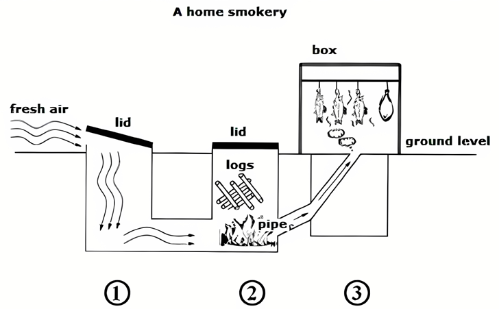
Sample 1:
The diagram illustrates the design and operation of a home smokery in detailed steps.
Overall, this structure is a two-part construction that comprises two wells installed underground, and a box built on the ground level. These two parts are connected using a pipe system and tunnel that allow fresh air and smoke to pass through to smoke food.
The whole process respectively takes place at 3 parts of the construction, commencing with fresh air passing through the lid and entering the first well. After that, the flow of air is then driven to the second well where it meets the burning logs and sparks the fire. During this stage, new logs are provided to feed the fire through a lid installed above.
In the last stage, smoke emitted from the fire ascends across a bent pipe to a box built on the ground level. In this box, food is hung above and smoked.
Sample 2:
The diagram demonstrates how a home smokery works. It can be seen that there are mainly three steps involved in the process.
The home smokery machine has three parts. The first part is an empty underground section with a lid on top at ground level. Fresh air is allowed to flow into the machine by opening the lid. The fresh air then goes into the second part of the machine which is very similar to the first part. In this part, a fire is started by adding logs through the lid on top. Once the fire is burning, the heat from it is coursed through a narrow pipe that leads to a box. This box is the third part of the machine and is located at ground level. In the box, the food items that need to be cooked are placed. The heat coming from the second part of the machine cooks the food items.
Overall, the diagram depicts that there are three steps in the process of cooking food in a Home Smokery.
Sample 3:
According to the diagram, the smokery has three chambers linked with each other by air passages at their bottoms. Two chambers are underground while the smoking box at the end of the process in above the ground. ieltsxpress
As regards the working mechanism of the system, first, the lid of the first underground chamber is opened to feed the smokery with fresh air. Then the air travels to the second underground chamber to burn logs of firewood to create smoke. After that, the smoke finds no way to escape through the top of this chamber because of its closure by a lid, but it is forced by the air supply to continue to move to the third and final section of the system. In particular, smoke is channeled through a pipe up to the smoking box on the ground where fish and meat are hung for being smoked.
In general, the diagram details how smoke can be created and how food curing takes place in a homemade smokery.
Sample 4:
An outline of the structure of a home smokery and the way it works are portrayed clearly in the given diagram.
Overall, it is clear that of the three steps, two steps happen under the ground, while the remaining happens above the ground level.
As shown in the diagram, the first part of the structure is an empty underground section with its lid opening at an elevated space above the ground level. This lid, when opened, allows air inside the structure to assist the smoking process.
In the second part, a similar structure is there with a lid at the ground level. This lid can be opened, and wooden logs can be placed inside the chamber. Smoking food can be initiated when these logs are burned. ieltsxpress
In the third part, a bended long funnel is directed upwards in a fixed structure, which has a wide opening at the bottom that connects the fireplace and a narrow opening at the top. When logs burn, smoke passes through this opening to the chamber above the ground level, inside which fish and meat are hung from the top for cooking.
Sample 5:
The diagram illustrates the construction and function of a domestic smokery, employed in the preparation of smoked foods.
Overall, the smokehouse is composed of four main components: a chamber for airflow and one for burning logs, a connecting pipe, and a smoking box where the food is actually smoked. The process contains 3 key stages beginning with the entry of air and ending with smoke in a trap box.
At the initial stage, fresh air is introduced into the chamber by opening the first lid, the air travels to the next designated place. This area is covered with a lid and is situated below ground level, which allows for the controlled burning of wood, an essential element in the smoking process. Subsequently, the smoke generated from the burning logs is channeled through a pipe that directs it upwards into the smoking box. This box, positioned above ground, is equipped with a crossbar to hang the food. The enclosed design ensures that smoke circulates around the food, allowing for an even and thorough smoking process.
Sample 6:
The illustration highlights the various components of a home smokery in cross section and its mechanics.
Overall, it can be seen that while the first and second stages of the process take place underground, the third and last stage occurs above ground level.
As shown in the picture, the first section of a domestic smokery is an empty chamber under the ground with a lid at ground level that can be opened to allow fresh air in. After entering the chamber, air continues to pass along a pipe leading to a second underground chamber. This chamber has a lid at ground level that can be opened to load logs in. These logs, with the help of air from the first chamber, are burned to produce smoke.
The process of smoking food happens in the last stage, where heat and smoke from the second chamber go upward through a pipe into the third and final box, which is above ground level. At the top of this box is suspended meat or fish, which is ready to be cooked or preserved by the method of smoking.
Sample 7:
The diagram illustrates how a home smokery is operated and structured.
Overall, the smokery comprises three parts, connected by pipes, beginning with a chamber through which air enters and ending with a box in which the food is smoked.
First, air enters an underground chamber. The entry of air is controlled by opening and closing the lid of this chamber. At the base, there is a pipe which takes air from the chamber into a second underground chamber, with a lid situated at ground level. This contains logs, which are heated, producing smoke. The pipe at the base of this chamber, allows heat and smoke to pass to the final stage.
The process of smoking the food takes place in the third and final box or chamber, about two-thirds of which is above ground level. The box is an enclosed structure. Heat and smoke enter through the pipe at the base, passing through bricks which are placed on top of this inlet pipe. The heat and smoke then rise to the top of the box, where the meat or fish to be smoked is suspended and smoked.
The charts below show the number of working hours per week, in the industrial sector, in four European countries in 2002.
Summarise the information by selecting and reporting the main features, and make comparisons where relevant. Write at least 150 words.
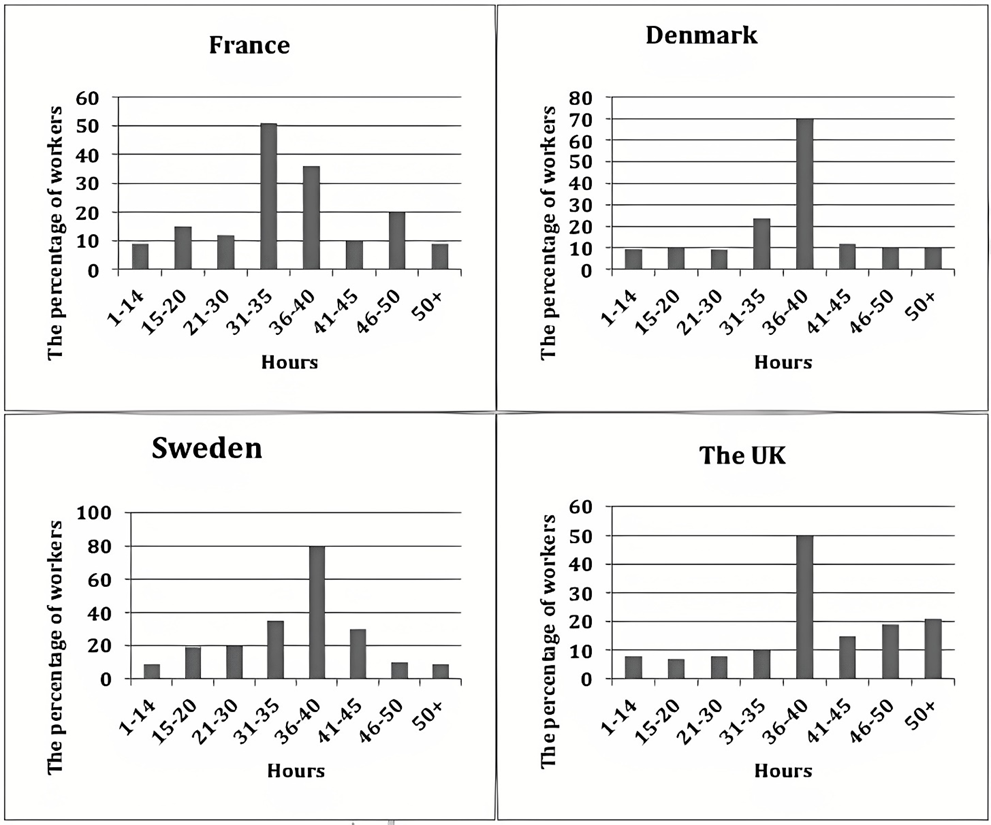
Sample 1:
The given column graphs compare the number of hours spent on work per week by industrial workers in France, Denmark, Sweden and the UK in 2002. In three countries, it can be seen that the maximum workers worked 36-40 hours, but in France the maximum workers worked 31-35 hours per week.
In France, approximately half the workers worked for 31-35 hours per week. The percentage of people who worked for 36-40 hours and 46-50 hours was 35% and 20% respectively. The figures for the rest of the working hours accounted for around 10% workers each.
Denmark and Sweden witnessed the highest proportion of people working for 36-40 hours, which was quite different from that of France. The second and the third place came from 31- 35 hours and 41-45 hours workers (25% and 10% in Denmark; 35% and 30% in Sweden). The proportion of people working for the remaining hours was higher in Denmark than in Sweden.
It is interesting to note that in the UK, the percentage of people working 50+ hours was the maximum. Almost 50% worked 36-40 hours per week.
Overall, France was a country where the people worked for the least hours, whereas the Swedish people spent the most time on work among the people from four different countries.
Sample 2:
The bar graphs illustrate the number of hours spent on work per week, in industrial sectors in France, Denmark, Sweden, the UK in 2002. Overall, it is apparent that the maximum workers worked 36-4- hours and least spending time 1-14 hours, but in France, the maximum workers worked 31 to 35 hours per week.
An in-depth analysis of the bar graphs reveals that, in France, approximately, half the workers work for 31 -35 and 36-40 hours, 50% and 38% respectively. Only 20% of workers are worked in 4650 hours. Other working hours are accounted for around 12%, and fewer workers each Denmark, Sweden and the UK witnessed the highest proportion of people working fr 36-40 hours, which was quite different from France. The second and third highest proportion for (31-35 and 41-45) Denmark and Sweden. Comparatively, Sweden’s little increase showed in the number of the hours who spent the time of workers almost 10%.
Furthermore, the percentage of workers time comparatively less in the UK workers hours and 46-50 hours and 50+ hours almost 20% of workers worked. On the other hand, comparatively, other European countries place 46-50 and 50+hours, only less than 10% witnessed by Sweden.
Sample 3:
The bar charts compare the number of weekly working hours of European citizens in the industrial sector in 2002 across four different countries: France, Denmark, Sweden, and the UK. Overall, the majority of employees in all countries worked more than 30 hours per week, with the most common working hours falling between 36 and 40 hours per week, except for France. It is clear that British people were most likely to work overtime.
Regarding France and Denmark, in both countries, a relatively small percentage of the population worked less than 30 hours or more than 40 hours, at just under 20%. By contrast, the most common working hour durations in France were 31-35 hours per week and 36-40 hours per week, demonstrated by around 50%, and 35% of the French population respectively. Experiencing a reverse trend, the former in Denmark was about half that of France, at 25%, while the latter range was twice as high as that in France, at around 70%.
Sweden had the highest percentage, at around 80%, of workers spent 36-40 hours in their workplace per week, followed by approximately 40% who worked 31-35 hours, and 30% who worked 41-45 hours. Meanwhile, approximately 50% of British employees worked for around 36-40 hours per week, which was higher than the percentage of those who dedicated 41-50 hours, at around 20%.
Sample 4:
The given column graphs illustrate the number of hours worked per week by industrial workers in France, Denmark, Sweden, and the United Kingdom in 2002.
In Denmark, Sweden, and the United Kingdom witnessed the highest proportion of workers worked for 36-40 hours, with figures 70, 80, and 50 respectively, while in the case of France, the proportion was 35%. In contrast, the majority in France at 50% worked for 31-35 hours. The figures for those working 31-35 hours stood at 22%, 35%, and 10% in Denmark, Sweden, and the United Kingdom respectively.
The percentage of employees working less than 30 hours was a minority in almost all countries, with only 10-15% of employees working this number of hours in all countries. The percentage of people working more than 40 hours was also very low, and in all countries, the figure was 10-25%.
Overall, it can be seen that the maximum workers worked 36-40 hours, but in France, the maximum workers worked 31-35 hours per week. France was a nation where the people worked for the least hours, whereas the Swedish people spent the most time on work among the people from four different countries.
Sample 5:
The given bar charts illustrate the weekly working hours in an industrial area amongst four countries, namely France, Denmark, Sweden and the United Kingdom, within the year 2002. Overall, most of the workers spent 36 to 40 hours working per week, except for French people. Moreover, British employees tended to work overtime more than the other countries.
Regarding France, the working population in the industry sector of this country usually spent around 31-35 hours a week working, followed by those who worked from 36 to 40 hours. This working hour pattern was, however, contradictory in Denmark, as the proportion of laborers allocating around 40 hours at work was significantly higher than that of the French counterpart, at nearly 75%. Noteworthily, the percentage of employees working fewer than 30 hours and more than 40 hours in these two countries did not exceed 20%.
In terms of the other two countries, it could be observed that Sweden had a similar pattern as Denmark, since the percentage of workers working 36-40 hours weekly took the highest position, at 80%. This figure was twice as great as those spending 31-35 hours at work in this European country. Meanwhile, the UK possessed the lowest percentage of employees working fewer than 31 hours within a week; yet the country had the highest rate of overtime workers, as more than one-fifth of the working populace spent over 50 hours per workweek laboring.
Sample 6:
The charts below show the number of working hours per week, in the industrial sector, in four European countries in 2002.
The charts provide data on the working hours which laborers employed in industrial sectors had to fulfill in four particular European countries in 2002.
Overall, it is evident that the majority of workers in four countries worked for 36 to 40 hours, with the exception of those in France, with the majority of them working for only 31 to 35 hours. It is also more likely for a British worker to dedicate more than 40 hours to their job every week, while it is quite rare for employees to commit only 30 hours or less a week.
Sweden was the country which saw the largest percentage of people having to fulfill a 36-hour-and-above workweek, 80% of them having to work for 36 to 40 hours. The figure for Denmark was slightly behind, at 70%, while only half of the industrial laborers in the UK and France were required to fulfill the same work hour.
It is significantly less likely for laborers in this sector to work for more than 40 hours, with figures hardly ever exceeding 20%. Around 15% to 20% of people employed in this sector in the UK had. The same is true for France, but at a lower proportion. Sweden saw a noticeable proportion working for 41 to 45 hours (around 30%), but the other two figures were negligible, while Denmark's data was minimal, with none surpassing 10%.
Having to dedicate less than 35 hours to working a week was uncommon for UK and Danish industrial workers, with only 10% and 20% of them having such commitment respectively. This working practice was more prevalent in Sweden, with two in five people, and most common in France, with around half of the workers in total.
France was the country with the highest proportion of people having to fulfill 30 hours of work per week; and figures scarcely (hiếm khi) exceeded 10% for all the countries surveyed.
Sample 7:
The bar graphs given illustrate the information about the work hours per week in the industrial sector in France, Denmark, Sweden and the UK, over the time period of 2002.
Overall, it can be seen that the highest workers worked 36-4 hours and the least 1-14 hours, but in France, the maximum worked 31 to 35 hours per week.
The bar graphs show that the ratio of employees who work 14 hours in France and Denmark was 10%; however, the percentage of people slightly inclined and reached 15% in France. Whilst the figure was similar in Denmark to work for 21-30 hours. 50% of employees work in trade for 31 to 35 hours in France, whereas it was half of Denmark. In Denmark, labourers work 36 to 40 hours, 70% of which is half of France. The ratio of workers in France and Denmark was similar, 10 in 50 hours. It is interesting to note that it was 20% in 46 to 50 hours in France.
Analyzing the data further, it is manifested that the workers working 36-40 hours in Sweden were 80% which is 30% less than in the UK. The ratio was less than 10% of 1-14, 46-50 and 50+ hours in Sweden. However, 31-45 hours was approximately 35% of workers in the UK. The figure of employees below 10% who work 35 hours. However, 20% work 50 hours.
Sample 8:
The yielded bar charts illustrate the percentage of week wise hours in the commercial side in four European countries, namely France, Denmark, Sweden, the UK.
Overall, it can be clearly seen that 30 to 40 hours works had the highest percentage whereas, over 50 and 1 to 14 had the least in all given countries.
For France, nearly a quarter proportion of workers work 1 to 30 hours although, 31 to 35 hours job percentage was a half. Only 12% less jober did 36 to 40 hours. Above 41 hours proportion was same as 1 to 14 had except 46 to 50 which had one-fifth percentage. For Denmark, 21% of citizens worked 31 to 35 hours while 36 to 40 hours had 70%. The rest of hours workers proportion was the same, its 10%.
For Sweden, only 3% of people did 1 to 14 hours work which rose slightly as hours rose. With the zenith, four-fifth percentage of jober had 36 to 40 hours job. 41 to 45 and 46 to 50+ had 22% and 5% respectively.
For the UK, for 1 to 35 hours, workers proportion was roughly 10%. It had the same percentage of workers in 36 to 40 hours as France had in 31 to 35. Additionally, 15% was in 41 to 45 whereas, for 46 to 50+ proportion remained same.
The graph below shows the production levels of main fuels in a European country from 1981 to 2000.
Summarise the information by selecting and reporting the main features, and make comparisons where relevant. Write at least 150 words.
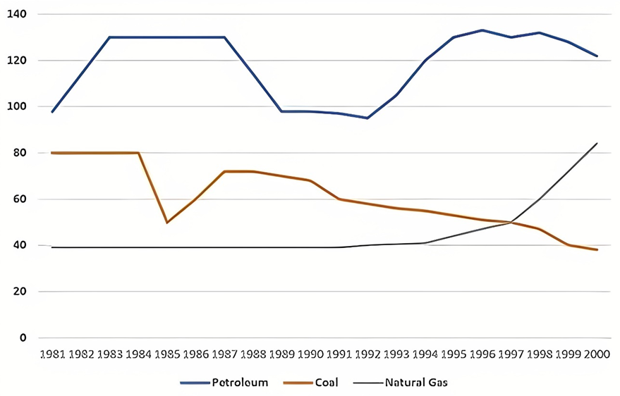
Sample 1:
The line graph illustrates the amount of petroleum, coal and natural gas manufactured in a European country between 1981 and 2000.
Looking at the graph, it is immediately obvious that the amount of petroleum production registered the highest of all three categories examined throughout the given period. It is also evident that while the amount of coal produced witnessed a downward trend, that of natural gas gradually increased.
The amount of petroleum produced in 1981 stood at nearly 100 tonnes. This figure climbed to around 130 tonnes in 1987, before witnessing a fall to approximately 90 tonnes in 1992. At the end of the given period, it went up slowly to 120 tonnes.
Regarding coal production, 80 tonnes was the amount recorded in 1981. After plummeting to 50 tonnes in 1985, this figure experienced a considerable increase of 20 tonnes in 1987, followed by a steady fall to 40 tonnes in 2000.
Natural gas was produced the least at the beginning of the period, at only 40 tonnes. This figure remained relatively unchanged by 1997 and then doubled until 2000.
Sample 2:
The given line graph shows the production levels of three main types of fuel (petroleum, coal, and natural gas) in a particular European country, from 1981 to 2000.
Overall, it can be seen that petroleum was by far the most produced type of fuel, while the amount of natural gas being produced was increasing rapidly.
In 1981, the amount of petroleum being produced was around 100 tonnes. It increased steadily over the next few years to reach around 130 tonnes before dropping back to just under100 tonnes in 1989. It then rose up again to around 130 tonnes in 1995, where it fluctuated slightly until the end of the period.
Coal was the second most produced fuel in 1981, at 80 tonnes. Coal production remained constant until it dropped suddenly down to around 50 tonnes in 1985. It rose back up to just over 70 tonnes in 1987 before slowly declining over the next 13 years to just under 40 tonnes. The production of natural gas remained unchanged at about 40 tonnes until around 1991 when it began to rise exponentially.
Sample 3:
The line graph illustrates the production output of petroleum, coal, and natural gas in the UK over a 20-year period commencing in 1981.
Overall, the UK consistently produced more petroleum compared to the other fuel types during the depicted period. While petroleum and coal production experienced fluctuations, natural gas yield witnessed a negligible increase.
Among the three kinds of fuel, the production level of petroleum consistently led the way. Its figure started at roughly 100 tonnes, rose to about 130 tonnes in the two ensuing years, stayed unchanged till 1987 before dropping back to the initial level in around 1988. After a trivial fall, the amount of petroleum generated in the UK rebounded to its peak of 130 tonnes in 1996 and then marginally descended to approximately 120 tonnes by the conclusion of the period.
In 1981, coal production in the UK was 80 tonnes, double the output of natural gas. Despite fluctuations in the initial six years, coal production decreased to slightly under 40 tonnes by the end of the period. Concurrently, natural gas production remained stable from 1981 to 1994, and then ascended to surpass coal’s figure since 1997, reaching the second rank in 2000 with over 80 tonnes produced.
Sample 4:
The graph illustrates the production levels of petroleum, coal, and natural gas in a European country from 1981 to 2000, measured in tonnes.
Overall, petroleum had the highest and most volatile production levels, coal saw a steady decline, and natural gas experienced substantial growth towards the end of the period.
From 1981 to 1985, petroleum production saw a sharp increase from 100 to 120 tonnes, plateaued for two years, then dropped to around 100 tonnes by 1990. It fluctuated significantly in the following decade, peaking at 125 tonnes in 1995 before decreasing to 110 tonnes by 2000.
Coal production started at 80 tonnes in 1981, declined to 60 tonnes by 1985, and remained relatively stable around 55-60 tonnes until 1995. However, it experienced a steady decrease afterwards, reaching approximately 45 tonnes in 2000. Natural gas production was the lowest initially at 40 tonnes in 1981, stayed constant until 1987, and then gradually increased to about 50 tonnes by 1995. After a brief dip, it surged to 100 tonnes by 2000, marking the most significant growth among the three fuels.
Sample 5:
The line chart illustrates the volume of three kinds of fuel manufactured in a European nation, between 1981 and 2000. Overall, the production of petroleum and natural gas increased over the period, whereas coal witnessed a reverse trend. Additionally, the production level of petroleum was constantly the highest.
Petroleum production began the highest at nearly 100 tonnes and surged to roughly 130 tonnes around 1984, before leveling off for about three years. Subsequently, it dropped significantly to approximately 95 tonnes by 1991, followed by a remarkable rise to peak at about 135 tonnes in 1995, prior to a decline to 120 tonnes by 2000.
As for coal, 80 tonnes of this fuel were produced each year from 1981 to 1984. After the figure plunged to around 50 tonnes in 1985, it recovered to roughly 70 tonnes in 1987. From this point, coal production declined gradually and finished at nearly 40 tonnes by the end.
Lastly, the level of natural gas produced documented a plateau at 40 tonnes over the first ten years of the surveyed period. After this, it ascended moderately and converged with coal production at approximately 50 tonnes in 1997. Finally, a sharp increase saw the production of natural gas surpass that of coal and reach slightly over 85 tonnes by 2000.
Sample 6:
The line graph details the production of three different fossil fuels in an unspecified country between 1981 and 2000.
Looking at the graph from an overall perspective, it is clear that the production of petroleum and coal followed an erratic pattern, whereas natural gas stayed at the same production level for most of the period. Among three types of fuels researched, petroleum always headed the list of production levels.
In 1981, nearly 100 tonnes of petroleum was produced, outstripping the production of coal (80 tonnes) and natural gas (40 tonnes). In 1983, the figure for petroleum grew sharply by 30 tonnes and remained at the same level for 5 years before a pullback to around 95 tonnes in 1989. It thereafter underwent a noticeable recovery, albeit slight fluctuations, to reach 120 tonnes in 2000.
At the same time, coal production plateaued until 1984, which was followed by a precipitous decline to 50 tonnes in 1985. Having jumped back to above 70 tonnes in 1987, the amount of coal produced still steadily dropped, hitting a low of less than 40 tonnes at the end of the period.
Despite staying relatively stable at 40 tonnes until 1994, the figure for natural gas surged to 85 tonnes in 2000.
The graph below shows the three different kinds of emission sources (oil / coal / gas) of greenhouse gas in the UK.
Summarise the information by selecting and reporting the main features, and make comparisons where relevant. Write at least 150 words.
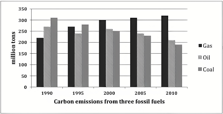
Sample 1:
The given column graph depicts the quantities of emissions of greenhouse gases in million tons from three fossil fuels which are gas, oil and coal over a period of two decades. It can be clearly seen that the emissions from gas showed a downward trend, from coal showed an upward trend, whereas the emissions from oil fluctuated over the period.
In 1990, the greenhouse gas emissions from gas stood at 220 million tons. These emissions increased gradually and reached 320 million tons by 2010. The emissions from coal fell markedly from 310 million tons to 190 million tons over the given period of twenty years. The carbon emissions from oil showed fluctuations till 2000 but after that there was a slow decline in carbon emissions till 2010. In 2010 the emissions became 210 million tons from 270 million tons.
Overall, it is interesting to see that from 1990 to 2010, the emissions from gas went from being the least to the most dominant.
Sample 2:
The bar chart illustrates how much carbon emissions were released from gas, oil, and coal in the UK throughout a 20-year period starting from 1990.
Overall, there was an increase in the amount of greenhouse gas emitted from burning gas, while the oil and coal witnessed a downward trend. In addition, at the beginning of the period examined, coal was burned and released the most carbon emissions, but the reverse was true in the final year.
In 1990, the quantity of carbon emissions from coal started at just over 300 million tons, after which it experienced a slight decline to around 270 million tons but still remained the highest position after 5 years. This figure continued to steadily decrease and reached its bottom at just under 200 million tons in 2010. Similarly, the amount of greenhouse gas produced from oil was roughly 265 million tons in the first year, followed by a gradual drop to just under 200 million tons in 2010, despite an insignificant rise in 2000.
By contrast, approximately 220 million tons of carbon emissions were generated by using gas in the UK, with a subsequent dramatic growth to exactly 300 million tons after a decade. In the last 10 years, this figure then kept rising by 10 million tons every five years and peaked at 320 million tons in 2010.
Sample 3:
The given diagram illustrates the three dissimilar types of emissions sources of greenhouse gas in the United Kingdom in the period 20 years from 1990 to 2010, namely oil, coal and gas. It can be clearly seen that the emissions of gas increased over time, while the coal emissions reduced during the period.
In 1990, the carbon emissions from gas stayed at about 220 million tons, and it still went up then reached at 330 million tons in 2000. These emissions increased to 320 million tons in 2010. While that, the emissions released from oil stood at about 270 at the beginning of the period. Then the emissions fell slightly to 240 million tons in 2000, and they continued to decrease to 210 million tons in 2010.
The emissions from coal stood at 310 million tons in 1990. There was a downward trend of the emissions through the remaining years of the periond. The emissions dropped to 270 million tons in the next five years, then fell to 190 million tons at the end of the period.
The pie charts below show favorite social media channels from 2011 to 2013.
Summarise the information by selecting and reporting the main features, and make comparisons where relevant. Write at least 150 words.
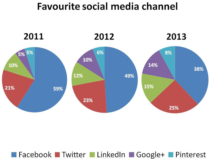
Sample 1:
The pie charts show users’ preference on social media channels throughout the 3-year period, from 2011 until 2013. Overall, Facebook was the most favorable social media channel for three consecutive years despite a gradual fall from one year to another.
Facebook started with the largest number of 59% users in 2011, and the figure began to drop slightly by 10% in the following year. In 2013, only 38% of respondents agreed that they like Facebook better than other social media platforms. Twitter ranked just below Facebook with a huge gap in 2011, which was narrowed from year to year as the percentage of Twitter’s fans consistently increased from 21% to 25%.
A similar pattern can be seen in the rest of social media channels. LinkedIn continued to attract more people and achieved 15% enthusiasts in 2013. Google+ and Pinterest shared the same percentage in 2011 at only 5%; However, while Pinterest showed a minimal change of only 3%, the figure for Google+ nearly tripled to 14%, becoming the social media with the most significant increase among the five.
Sample 2:
The charts depict user preferences across various social media platforms from 2011 to 2013. Throughout this period, Facebook maintained its status as the top choice, despite experiencing a gradual decline in popularity each year. Initially, in 2011, Facebook garnered the highest percentage at 59%, which decreased to 49% in 2012 and further dropped to 38% by 2013.
In contrast, Twitter consistently gained traction over the three-year span, albeit with a noticeable gap behind Facebook. Starting at 21% in 2011, Twitter’s popularity steadily rose to 25% by 2013.
Similar trends were observed with other platforms. LinkedIn witnessed a continuous increase in users, reaching 15% by 2013. Google+ and Pinterest, both starting at 5% in 2011, experienced divergent trajectories. While Pinterest’s popularity saw a slight rise to 8% by 2013, Google+ underwent a significant surge, nearly tripling to 14%, marking the most substantial growth among the platforms analyzed.
Sample 3:
The provided pie charts compare the percentages of 5 different popular social media platforms namely Facebook, Twitter, LinkedIn, Google+ and Pinterest in three consecutive years from 2011 to 2013.
It can be seen that Facebook remained the leading social media platform; however, its user base decreased over the three-year period. Meanwhile, the platforms saw increases in their user percentages, reflecting shifting preferences among social media users
In 2011, Facebook accounted for more than half of the users, followed by Twitter with approximately one-fifth of the total. In the following years, Facebook's percentage dropped slightly by 2% before reaching 38% by the end of the period. In contrast, Twitter saw a rise in popularity, with increases of 2% and 3% in 2012 and 2013, respectively.
On the other hand, other social media platforms were significantly less popular, since all of them collectively accounted for only 20% of the total in 2011, with Linkedin users doubling that of Google+ and Pinterest supporters. However, they experienced an upward trend in the next two years following the decline of Facebook users, with Google+ having the most dramatic surge of 9% in total.
The charts below give information about the price of tickets on one airline between Sydney and Melbourne, Australia, over a two-week period in 2013.
Summarise the information by selecting and reporting the main features, and make comparisons where relevant. Write at least 150 words.
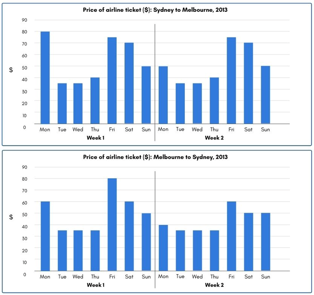
Sample 1:
The given bar charts illustrate how much flight tickets cost between Sydney and Melbourne over a two-week period in 2013.
In general, it is obvious that higher prices were recorded on weekends and Mondays in spite of being almost constant during the weekdays.
Regarding flights from Sydney to Melbourne in week 1, Monday witnessed an all-time high of $80, which then fell below $40 in the next three days before bouncing back to $75, $70 and $50 on Friday, Saturday and Sunday, respectively. Week 2 shared an identical price pattern, with the only exception of Monday’s 50-dollar tickets.
With respect to week 1 reverse flights from Melbourne to Sydney, flyers had to pay $60 per ticket on Monday. The three following days reported an equal price level of $35, which more than doubled itself to reach a peak of $80 on Friday. A downswing to $60 and $50 was experienced on the last two days of the week. Less robust fluctuations can be seen in week 2, when airline flights cost under $40 in the first half of the week and grew to the range of $50-60 from Friday to Sunday.
Sample 2:
The charts compare the cost of flight tickets between Sydney and Melbourne for two weeks in 2013.
Overall, flights from both directions shared a similar pattern with higher prices from Friday through Monday and lower and more stable prices during weekdays.
To begin, in week 1, the ticket cost peaked at $80 on Monday and Friday, departing respectively from Sydney and Melbourne. From Tuesday to Thursday, the fares were steady, fluctuating between $35 to $40 at both ends. A sharp rise in price point was on Friday by a gap of $35 to $45. The rate gradually decreased towards the end of the week from around $80 to $50.
In Week 2, the cost of traveling from both cities experienced the same trend. However, the average ticket price from Melbourne was slightly lower than flying from Sydney, with the lowest remaining $35 and the highest being $75. When taking the ticket price into comparison day by day, it is evident that traveling from Melbourne is cheaper, except on Friday of week 1. Fares on Monday significantly dropped to $50 departing from Sydney and $40 taking off from Melbourne.
Sample 3:
The given bar charts compare airfares of one carrier between Sydney and Melbourne in two separate weeks in 2013.
According to the data, the price of flight tickets between the two destinations experienced the same pattern in both surveyed weeks, with more expensive fares during the four-day weekend and cheaper ones on weekdays. It is also noticeable that the price discrepancy in Week 1 was more significant than that in ant than t Week 2.
In week 1, the best days to fly were Tuesday to Thursday, as fares were the cheapest, averaging $35 for each direction. However, travelers wishing to spend their long weekend in either of the two mentioned cities had to pay virtually double for their flights, ranging from $50-80 per ticket. Particularly, the price hike was on Monday for Melbourne-bound flights while it was on Friday for Sydney ones.
Similar to Week 1, flyers paid the same lowest price ($35) for their airfares on Tuesday through Thursday in Week 2. The long weekend also witnessed substantial price increases, with $50-75 for flights departing from Sydney and $40-60 for ones from Melbourne, both of which peaked on Friday.
Sample 4:
The given charts highlight the differences between the cost of one airline’s tickets between Sydney and Melbourne in two weeks in 2013.
By and large, the price did not differ significantly between the two cities and people generally had to pay more for tickets on the weekends than on weekdays.
From Sydney to Melbourne, the ticket's cost on Monday witnessed a sharp drop from 80 dollars in the first week to 50 dollars in the second week. However, from Tuesday to Sunday, there was no discrepancy. Additionally, except for Mondays, people had to pay the most for air tickets on Fridays, at 75 dollars, and the least on Tuesdays and Wednesdays, at merely 35 dollars.
Regarding flights from Melbourne to Sydney, a mildly similar pattern could be observed. In both weeks, air tickets cost the most on Fridays. However, Fridays’ prices recorded a sharp decrease from 80 dollars to 60 dollars over the period. There was a downward trend on Mondays and Saturdays’ ticket prices, which experienced a fall of 20 dollars and 10 dollars, respectively. In terms of the rest of the week, the cost remained stable.
Sample 5:
The bar charts compare the price of roundtrip airfare between Sydney and Melbourne in two weeks in 2013. Overall, there is a considerable disparity in flight prices between two destinations, as travelling at the weekend is far more expensive than on weekdays.
Regarding flights departing from Sydney to Melbourne, in the first week, flights on Monday incur the highest expenses, at $80 for a one-way journey. In comparison, the cheapest tickets are available on Tuesday, Wednesday, and Thursday, which cost roughly $35 to $40 before a surge to $75, $70, and $50 on Friday, Saturday, and Sunday respectively. A similar pattern can be observed in the second week, except for a slight decline in Monday’s flights to $50.
Concerning journeys from Melbourne to Sydney, in the first week, travellers pay $60 for their flights on Monday, which is nearly double that of midweek, at approximately $35. Friday records the highest ticket price, at $80, while flights at the weekend are also costly, at $60 and $50. In the second week, the price on Monday plunges to $40 and it is also more affordable to travel at the weekend, with figures ranging from $50 to $60.
Sample 6:
The given bar charts illustrate how much an airfare for a round trip from 2 cities in Australia, Sydney and Melbourne, would cost in 2 weeks in 2013.
Overall, there was no considerable difference in the money paid for flights between Sydney and Melbourne over 2 weeks. Noticeably, passengers mostly had to pay a significantly higher price on the weekends than during the weekdays, except for that in week 1 from Sydney to Melbourne.
Regarding the price of week 1 for the above-mentioned route, the cost for a Monday flight was $80, which was by far the highest price over the period, before plummeting for over a half to about $35 in the next 2 days. $40 was the amount of money for flying on Thursday in week 1, followed by a surge to around $75 on Friday before bouncing back to $50 at the end of the week. Similarly, week 2 witnessed nearly identical airfares for all days, with the exception of that for Monday, at only $50.
As for the opposite route, the price of a ticket started at $60 on Monday in week 1, after which it decreased significantly and remained stable in the subsequent 3 days at $35 before hitting the peak of $80 on Friday. After that, the price of week 1 gradually declined to $50 on Sunday. In the following week, passengers paid a relatively lower cost to fly from Melbourne to Sydney, with around $38 for weekdays and approximately $55 for weekends.
Sample 7:
The provided bar charts give data about ticket fares on one airline travelling between Sydney and Melbourne in 2 weeks in 2013.
It is noticeable that the price of tickets was lowest on Tuesdays, Wednesdays, and Thursdays while people had to pay more on Fridays and weekends. Flights between the two cities on Fridays were most expensive except for week 1 from Sydney to Melbourne.
With regard to flights from Sydney, people spent $80 on Monday in the first week whereas the ticket price was significantly lower, at $50 in the second week. The figures for Tuesdays, Wednesdays, and Thursdays were not higher than $40 in both weeks while it cost people almost twice as much on Fridays, at $76. Tickets on Saturdays and Sundays were offered at a remarkably lower rate, at $66 and $50, respectively.
Regarding flights from Melbourne to Sydney, there was a similar pattern as ticket fares stayed lowest at $35 from Tuesdays to Thursdays in both weeks. There was a sharp decline of 20 percentile in ticket prices on Mondays and Fridays between the two weeks while the travelling cost was no more than $60 on Saturdays and Sundays.
Sample 8:
The bar charts display the daily pricing trends for airline tickets on the Sydney to Melbourne route and vice versa, over two weeks in 2013.
Overall, across both weeks and directions, the trend indicated that flying midweek from Tuesday to Thursday would generally be more economical, with prices notably lower than at the beginning and end of the week, while higher fares were consistent. The most expensive days to fly varied but typically fell on a weekend day, and Friday consistently offered the highest prices.
Initially, the first week unfolds with Sydney to Melbourne fares priced at $80 on Monday, dipping to a weekly low from Tuesday to Thursday, averaging just under $40. In contrast, the weekend witnessed a surge, with Friday tickets escalating to a high of almost $80, then gradually decreasing. As can be seen from the chart, flights originating from Melbourne mirrored this midweek economy, with prices maintaining a trough under $40 during the same period, despite Friday's fare peaking at $80. Prices plummeted on Saturday, down to $60, before moderately descending to $50 by Sunday.
When it comes to the second week data, starting the week at a high of roughly $50 on Monday, showed a slight decrease on Tuesday for the Sydney to Melbourne route. The most significant peak occurred on Friday at close to $80, followed by a marked drop on the weekend and Sunday which shared the same price with Monday at $50. Meanwhile, the flight’s airfare Melbourne to Sydney in week two fluctuated less than any week and direction, from Monday to Thursday with minimum fare around or under $40 and Friday still offered the most expensive budget at $60.
Sample 9:
The given bar graphs show data for the cost of airline tickets for flights between Sydney and Melbourne in both directions over two weeks in 2013.
Overall, flights in both directions generally displayed patterns that are similar to one another, with higher prices from Friday through Monday. Week 2 flight prices were either significantly reduced from week 1 or remained identical.
In week 1, airfares from Sydney to Melbourne began at $80 on Monday and remained under $40 for the following three days before rising to $75, $70, and $50, respectively, on Friday, Saturday, and Sunday. The costs remained the same during the second week, with the notable exception of a drop on Monday to $50.
The trend was similar for flights from Melbourne to Sydney, with the most expensive flight being on Friday at $80 (week 1) while the lowest rate was at 35$ on Tuesday, Wednesday, and Thursday (week 1 and 2). Finally, there were declines of 10 to 20$ across Saturday, Sunday, and Monday in the second week.
Sample 10:
The bar charts illustrate the changes in the airfares on one airline between Sydney and Melbourne over two consecutive weeks in 2013.
Overall, passengers paid more for tickets on the weekends than on weekdays. Furthermore, there was a slight decrease in certain fares from the first to the second week in both cities.
For flights from Sydney to Melbourne, the prices on Mondays were lower in the second week, plummeting from 80 dollars to 50 dollars. Meanwhile, there were no differences between the airfares from Tuesday to Sunday in both weeks. Notably, people had to pay the most on tickets at over 70 dollars on Mondays, Fridays and Saturdays, while they only spent around 35 dollars for the remaining days.
For the return flights from Melbourne to Sydney, airfares on Mondays declined from 60 dollars in the first week to 40 dollars in the second week. From Tuesday to Thursday, the price remained the lowest at 35 dollars in both weeks. The highest price was on Friday in the first week at 80 dollars, which dropped to 60 dollars in the following week. The price on Saturdays decreased by 10 dollars, but the figure for Sundays remained unchanged.
Sample 11:
The two provided bar charts illustrate the ticket prices for flights between Sydney and Melbourne, as well as Melbourne and Sydney, during a period of two weeks in 2013.
Overall, airline ticket prices in the second week were generally lower than in the first week for both directions. It is also clear that flights from Sydney to Melbourne were most expensive on Monday, whereas the reverse route charged the highest price on Friday.
The airfare for flights from Sydney to Melbourne on Monday in the first week was much higher than the second week, at $80 and $50, respectively. In contrast, ticket prices towards the end of both weeks were the same, remaining lower than $40 from Tuesday to Friday and recovering to $75, $70, and $50, in that order.
$60 was charged for those taking flights from Melbourne to Sydney on Monday in the first week, compared to $40 in the second week. Flights booked on Tuesday-Thursday during both weeks cost exactly the same at $35, while flights on Friday in the first week charged higher than the second week by $20, with the respective figures being $80 and $60. Lastly, airline ticket prices for Saturday and Sunday hovered around $55.
Sample 12:
The bar charts display information for the price of airline tickets from Sydney to Melbourne and the reverse flight over a two-week period in 2013. Looking from an overall perspective, it is readily apparent that flights in both directions displayed broadly similar patterns with higher prices Friday through Monday. Compared to week 1, week 2 prices were either greatly deflated or identical for nearly all flights.
In week 1, flights from Sydney to Melbourne started at 80$ on Monday, were all under $40 over the next 3 days before a spike to $75, $70, and $50 on Friday, Saturday and Sunday, respectively. During the second week, the prices were unchanged with the notable exception of a decline on Monday to $50 fares.
In terms of flights from Melbourne to Sydney, the trend was comparable with flights on Monday of week 1 elevated to $60, sub-$40 flights on Tuesday, Wednesday, and Thursday and the most expensive flight on Friday at $80. Flights on Saturday and Sunday were also relatively costly at $60 and $50 each day. In week 2, Monday prices displayed a dramatic decline to $40 and there was more variance later in the week. Friday fell to $50 and Saturday to $50. All other tickets remained the same in week 2.
Sample 13:
The given columns graphs compare the price of tickets in an airline between Sydney and Melbourne over a two-week period in 2013. On Monday of the 1st week, the airline ticket prices rise to $80, and on the 2nd week of Monday, it falls down to $50.
As shown above, the prices only fluctuate on Monday, and the rest of the weekdays are rather the same in the airline which travels Sydney to Melbourne in 2013. It can be clearly seen from the graph; the price of airline tickets is highest on Fridays.
In contrast, the highest price date when travelling from Melbourne to Sydney in week 1 was Friday with $80, followed by Monday and Saturday with $60. Moving forward to next week, there were declines in prices but Tuesday, Wednesday, Thursday became stagnant with $35.
In terms of the ticket price in an airline in week two, they showed the similarity when the weekend days ticket price seems to be higher more than those on other days while middle days price did not show any clear price difference which constantly accounted for the lowest cost.
Sample 14:
The two bar charts show the discrepancies in the price of round tickets between Melbourne and Sydney of an undefined airline within a two-week period in 2013.
In general, the flying cost between the two cities did not seem to be distinctively different, and the price of flight tickets was relatively higher on weekends than on weekdays.
Regarding the trip from Sydney to Melbourne, the ticket price of the first-week Monday reached $80, which was by far the highest price to be paid. This experienced a significant fall of $30 in the following week, making it the only difference throughout the period. In other words, almost no changes were recorded in the ticket prices on the remaining days. Whilst passengers could pay a lower price of $35 on Tuesdays and Wednesdays, they were required to spend an extra 5 dollars to fly to Melbourne on Thursdays. The prices were more costly at the weekends as they could go up to $75.
A similar pattern could be seen in the cost of airplane tickets from Melbourne to Sydney. Flight-goers could buy tickets at the most affordable price of around $35 from Tuesday to Thursday, which showed no changes between the bar graphs. The first week’s Friday ticket price ranked first at 80$, followed by 60$ tickets for flights departing on Monday and Saturday. A week later showed a $20 decrease in the price of Monday tickets, but a stable price range at $50 for Saturday and Sunday.
Sample 15:
The chart compares the flyingcost of an airline betweenSydney and Melbourne, Australia in 2 weeks, in 2013.
Overall, flights in both directions generally displayedsimilar patterms, with higher prices from Friday to Monday. In addition, Week 2 flight prices either showed a slightdrop from week 1 or remainedidentical.
Regaring flying from Sydneyto Melbourne, the ticket pricemarked a stating point of 80$on Monday, remained under 40$ for the 3 following days, and eventually rose to 75$,70$, and 50$ on Friday, Saturday, and Sunday. Onweek 2, the flying costremained stable with the exception on Monday with the 30-dollar decrease.
Finally, flying pasengers from Melbourne to Sydney paid most on Friday with 80$, compared with the lowest price recorded - 35$ from Tuesday to Thursday. Week 2 witnessed a decrease in inflying price on Friday, Saturday, and Monday for 10% to 20$, whereas the other days flying feestayed unchanged.
Sample 16:
The two given charts show how much it cost to fly on one particular airline between Sydney and Melbourne, both ways, over a period of two weeks in 2013.
Overall, airfares experienced a price surge on Fridays, and flights from Melbourne to Sydney were cheaper than those in the other direction for most of the period.
In the first week, passengers had to pay a two-week high of $80 on Monday for a one-way flight from Sydney to Melbourne, $20 more than the opposite direction. The next day, the price of the former route halved and then remained in the $35-40 range for two more days, before rising sharply to $75 on Friday and falling gradually back to $50 on Sunday. Similarly, the airfare of the return route also dropped to $35 on Tuesday and maintained this level until Thursday. On Friday, it more than doubled, reaching a peak of $80, before dropping back to $60 on Saturday and $50 on Sunday.
At the beginning of the second week, tickets from Sydney to Melbourne came in at $50 each, $10 higher than the return flight. The Sydney-Melbourne route then repeated exactly the same price pattern as the first week. However, from Tuesday through Thursday, flights in the other direction showed a slightly different trend, bottoming out at $35, then rising to $60 by Friday and leveling off at $50 towards the weekend.
The graph below shows the percentage of Australian exports to four countries from 1990 to 2012.
Summarise the information by selecting and reporting the main features, and make comparisons where relevant. Write at least 150 words.
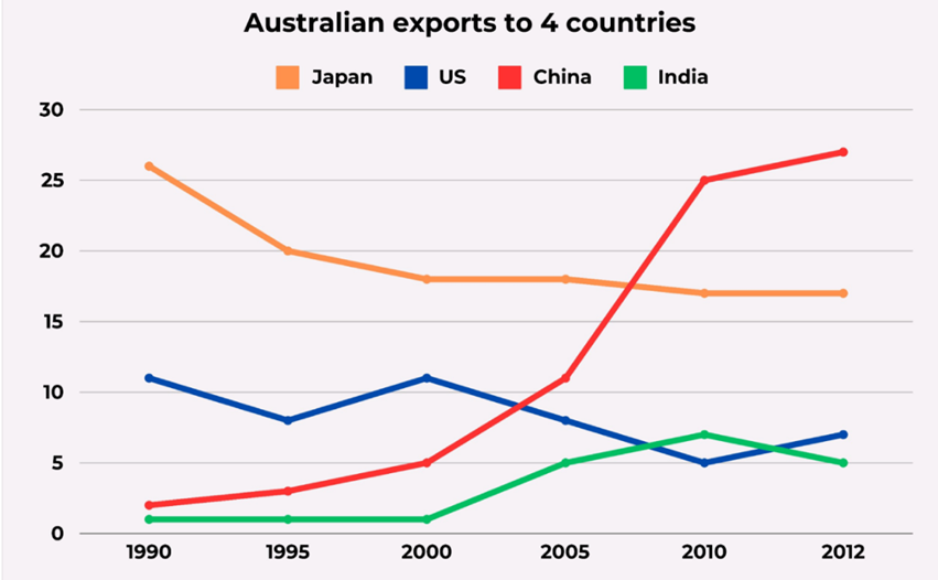
Sample 1:
The given line graph illustrates the proportion of Australian goods exported to four nations between 1990 and 2012.
Overall, there was a gradual decline in the percentage of Australian exports directed to Japan and the US, while the opposite was true for that of China and India. Notably, the figure for China experienced the most dramatic growth, becoming the top destination for Australian exports from 2007 onwards.
The proportion of Australian goods exported to Japan started at just over 25% in 1990, after which it experienced a significant drop to about 17% in 2000, before nearly leveling off towards the end of the period. Similarly, the figure for the US slightly decreased from roughly 11% to 7% between 1990 and 2012, despite some fluctuations.
Only 2% of goods were exported to China from Australia, with a subsequent increase to 5% in 2000 and a final sharp ascent, reaching a peak of 27% in 2012. Meanwhile, the percentage destined for India steadily increased to 6% in 2010 after remaining unchanged at 1% in the first 10 years, but then dropped to 5% in the last year.
Sample 2:
The line chart details exports from Australia to Japan, the United States, China, and India from 1990 to 2012. Looking from an overall perspective, it is readily apparent that total exports to India and particularly China rose, while US and Japanese exports declined. By the end of the period, Chinese exports had become most common, followed by Japanese, American, and finally Indian ones.
The figure for Japan began the period significantly higher than other nations at over 26% before a sharp decline over the next 5 years to around 20% and a more minimal downward trend until 2012 to finish at near 17%. In marked contrast, China in 1990 only received 3% of exports and this figure grew exponentially, especially after the year 2000 and reached a peak of 28% in 2012.
The data for the United States fluctuated around 10% until 2000, then declined and recovered slightly to finish the time surveyed at 6% Similarly, Indian exports stood at around 1% for the first ten years detailed, actually overtook the United States with 7% in 2010 and then ended the period slightly lower than the USA.
Sample 3:
The given line graph represents the proportion of Australian exports to four countries spanning from 1990 to 2012.
Overall, Australian exports to China and India generally witnessed an upward trend, while the opposite was true for Japan and the US. Initially the main importer of Australian products, Japan was subsequently surpassed by China in this regard.
In 1990, Japan was the dominant destination for Australian exports, accounting for around 25% of exports compared to just over 10% for the United States. China and India were significantly smaller markets at the time, receiving less than 5% each.
Afterwards, China’s figure began to surge as the country emerged as the leading importer of Australian goods, peaking at nearly 30% in 2012, having exceeded Japan’s figure since roughly 2007. Japan lost some of its significance as a market for Australian goods, with its export figure dropping to just above 15% in 2012. The US and India, meanwhile, experienced fluctuations throughout the period, both ending in the approximate range of 5%.
Sample 4:
The line graph illustrates how Australia exported its products to four countries, including Japan, the US, China, and India, between 1990 and 2012.
Overall, there was an increase in the proportion of Australian exports to India and China, with the most dramatic rise being seen in the latter, making it the largest export destination for Australia by the end of the period. In contrast, exports to the US and Japan experienced a decrease over the given timeframe.
Looking at the chart in more detail, in 1990, among the four destinations, India and China were the smallest export partners for Australia, with negligible figures of 1% and 2%, respectively. Thereafter, China's importance significantly increased over the period, as the percentage of exports to this country steadily rose to 5% by 2000, before surging more than fivefold to 27% in the final year. Likewise, India maintained a marginal presence in Australia's export market, at just 1% for the first decade, after which its share slightly increased, reaching a peak of 7% in 2010, before falling back to 5% two years later.
With regard to the remaining countries, in the first year, Japan was the leading destination shown for Australian goods, with more than a quarter of total exports going there, twice the figure for the US, at 11%. In the following years, the figures for Japan fell to 17%, and stayed unchanged in the two final years. Similarly, the share of Australian exports to the US underwent a downward fluctuation throughout the period, bottoming out at 5% in 2010 before a modest recovery to 7% by the end of the period.
Sample 5:
The graph shows the proportion of exports from Australia to 4 countries from 1990 to 2012. Overall, the proportion of Australian exports to China and India was on the increase with the export to China experiencing the biggest increase while the exports to Japan and the US went down.
In 1990, over 25% of Australian products were exported to Japan, and this number was much higher than that of other countries. The US imported just over 10% of Australian products, which was ten times higher than the Australian exports to China and India.
From 1990 to 2012, the export to Japan dropped to just above 15%. In contrast, the proportion of exports to China soared, and China had replaced Japan as the leading export market of Australia since 2007, with 30% of Australian products being exported to this country in 2012. During this period, the export to the US flucated and then decreased to above 5% while the figure for India saw a gradual increase to 5% in 2012.
Sample 6:
The given line graph illustrates the proportions of Australian products exported to four countries between 1990 and 2012.
In general, while Australian exports to China and India increased over the period, the US and Japan saw a decline in products imported from Australia. In addition, China experienced the biggest increase in exports over the period, making it the biggest export market of Australia from around 2007 onwards.
In 1990, Japan was the leading export market of Australia, receiving over 25% of all exported goods. China, however, received only a mere 5%. By 2012, the percentage of exports to Japan had dropped to below 20%, while the figures for China saw a dramatic rise to almost 30%.
Meanwhile, Australia exported just over 10% of its goods to the US in 1990, which was around ten times higher than the exports to India. Over the following twenty-two years, the figures for the US fluctuated, and dropped to 5% by 2012. The percentage of exports to India, on the other hand, remained unchanged until 2000, and then increased to about 7% in 2010, before dropping slightly to roughly 5% in 2012.
Sample 7:
The line graph details the figures for Australian exports to four countries between 1990 and 2012.
Overall, what stands out from the graph is that Japan was the country with the highest proportion of exports at the beginning of the period. This top position was challenged by China, whose figure experienced the most dramatic upswing towards the end.
In 1990, Japan topped the list of Australian exports with roughly 26%, far outstripping the figure for the US, at just around 11%. This was followed by China with virtually 3% and India, who imported almost nothing from Australia in this year. Over the time frame, the share of exports to Japan declined steadily to 17% in 2010 and thereafter plateaued until 2012. Meanwhile, there was a boost of 24% in the figure for China, amounting to 27% in 2012.
Regarding the US export figure, it fluctuated over the years in a downward trend, reaching a low of 7% at the end of the period. The rate of exports to India, conversely, remained relatively stable for the first 10 years before rising up to peak at 7% in 2010 and then falling slightly to 5% in 2012.
Sample 8:
The line chart depicts the fluctuations in exports from Australia to Japan, the United States, China, and India between 1990 and 2012. Taking a broader view, it is evident that exports to India and particularly China experienced a significant increase, while exports to the US and Japan declined over time. By the end of the period, Chinese exports became the most dominant, followed by Japanese, American, and finally Indian exports.
Initially, Japan had the highest percentage of exports, standing at over 26% in 1990. However, there was a steep decline over the next five years to around 20%, followed by a minor downward trend until 2012, finishing at nearly 17%. In contrast, China started with only 3% of exports in 1990, but this figure grew rapidly, especially after 2000, reaching a peak of 28% in 2012.
The data for the United States varied around 10% until 2000, after which it declined. It later slightly recovered, ending at 6% by the end of the surveyed period. Similarly, Indian exports remained at approximately 1% during the first decade covered. However, in 2010, Indian exports surpassed those of the United States, reaching 7%. Ultimately, Indian exports finished the period slightly lower than those of the USA.
Sample 9:
The line graph illustrates the exports of Australia to Japan, the United States, China, and India from 1990 to 2012. Overall, it is evident that the total exports to China and India have shown an increasing trend, whereas exports to the United States and Japan have experienced a decline. By the end of the period, China had the highest export values, followed by the remaining countries.
In 1990, Japan’s export figure was considerably higher than the other countries, surpassing $26 billion. However, it witnessed a significant drop to approximately $20 billion in the next five years and continued to decline further to around $17 billion by 2012, exhibiting a continuous downward trend. Conversely, China started with exports worth only $3 billion in 1990 but demonstrated a consistent growth over the years. The numbers changed dramatically after 2000 and reached a peak of $28 billion in 2012.
The export data of the United States fluctuated around $10 billion between 1990 and 2000, subsequently decreased to $5 billion, and experienced a slight recovery, ending the study period at $6 billion. Similarly, India initiated its exports at $1 billion in 1990, remained stagnant for the first decade, and then surpassed the United States with export values of $7 billion in 2010. However, India’s exports concluded slightly lower than that of the United States.
Sample 10:
The graph provides information about the figures for Australian exports to four countries over a period of 22 years. These countries are Japan, the US, China, and India. It can be seen from the graph that the proportion of exports to Japan and the US significantly dropped over the 22-year period, while the proportion of exports to China and India increased significantly. At the end of the period, Japan had the highest percentage of exports among the four countries.
In 1990, the percentage of exports to Japan was 20%, while the percentage of exports to the US was 9%. The proportion of exports to India was 1%, which was lower than the proportion of exports to China, which was 2.5%. However, over the next five years, the proportion of exports to both Japan and the US decreased considerably, to 20% and 9% respectively. Meanwhile, exports to India remained stable at 1%, and the figure for China had a slight increase of 3% in 1995.
In 2012, there was a gradual fluctuation in the percentage of exports to the US, which stood at 7% at the end of the period. At the same time, the figure for Japan steadily decreased to 17%. On the other hand, exports to China rapidly increased by 1% to 6%. However, the most significant change was the percentage of exports to India, which reached a peak of 30% in 2012. Overall, the graph shows that while exports to Japan and the US decreased, exports to China and India increased considerably over the 22-year period.
Sample 11:
The data provided by the line chart depicts the changes in Australia’s exports to Japan, the United States, China, and India from 1990 to 2012. The overall trend reveals an increase in exports to China and India, while exports to the United States and Japan declined. By the end of the 22-year period, China became the primary recipient of Australian exports, followed by Japan, the United States, and India.
In the initial years, exports to Japan began on a high note, exceeding 26%. However, they experienced a significant drop in the subsequent five years, stabilizing at approximately 20%. This declining pattern continued, albeit at a slower pace, until 2012, concluding at nearly 17%.
Conversely, exports to China commenced at a minimal 3% in 1990 but witnessed substantial growth, particularly after 2000, reaching a peak of 28% in 2012. For the United States, approximately 10% of Australian exports were received until 2000, after which there was a decrease, followed by a slight recovery, ultimately reaching 6% by 2012. Similarly, Indian exports began at around 1% and remained relatively stagnant for the first decade. However, in 2010, they surpassed the United States with a percentage of 7% but ended the period slightly lower than the United States.
Sample 12:
The line chart illustrates the proportion of exports from Australia to 4 various countries over a 22-year period.
Overall, while the figures for Australian exports to the US and China followed an upward trend over the period shown, there is an overall decrease in the rate of the other countries. Besides, the share of exports from Australia to China showed the biggest change of all the 4 countries.
In 1990, Australian exports to Japan accounted for around 26%, more than double the figure for the US, at about 12%. Over the next 22 years, the share of Japan imports from Australia experienced a gradual decrease to approximately 18 in 2005, before remaining stable from 2005 to 2012. In the meantime, the percentage of imports into the US from Australia underwent a wild fluctuation, falling to around 6% in 2012.
Turning to the other categories, initiating at about 2% in 1990, the rate of Australian exports to China significantly increased by 26% from 1990 to 2012. The period from 2005 to 2010 marks the point at which China became the major export market. Meanwhile, the period from 1990 to 2012 witnessed an increase in the figure for India imports from Australia to 5% in 2012, after staying constant at 1% between 1990 and 2000.
Sample 13:
The data presented in the form of a line graph illustrates the proportion of Australia’s exports to various countries, including Japan, the U.S, China, and India, between the years 1990 and 2012. The data is expressed as a percentage.
In general, it can be observed from the graph that Japan and the U.S experienced a decline in exports during the later years, while China witnessed a significant increase in exports from 2005 to 2012.
Taking a closer look at the graph, Japan’s proportion of exports started at less than one-third in the initial year and slightly decreased by around 6% in the following five years. Between 2000 and 2012, the proportion fluctuated considerably, ranging from about 80% to less than 20%.
Australia’s exports to the U.S were initially observed at 10% in 1990, gradually decreasing to around 7% between 2000 and 2012, with minor fluctuations throughout the period. The percentage of Australian exports to China had a continuous increase from about 2% to 5% between 1990 and 2000, reaching a peak of 25% in 2010 and 2012. However, the exports to India remained stable at around 1% until 2000, but experienced a dramatic increase from 2005 to 2010, reaching 7%.
Sample 14:
The provided line graph depicts the proportions of Australian products that were exported to four different countries from the year 1990 to 2012. In general, it can be observed that while Australian exports to China and India increased over this period, the United States and Japan experienced a decline in the products imported from Australia. Moreover, China witnessed the most significant rise in exports, becoming Australia’s largest export market from around 2007 onwards.
In 1990, Japan was the primary destination for Australian exports, receiving over 25% of all exported goods. On the other hand, China merely accounted for 5% of the total exports. However, by 2012, the percentage of exports to Japan had dropped to below 20%, while the figures for China experienced a remarkable increase, reaching almost 30%.
In the meantime, around 10% of Australian goods were exported to the United States in 1990, which was roughly ten times higher than the exports to India. Throughout the subsequent twenty-two years, the figures for the United States fluctuated and eventually decreased to 5% by 2012. Conversely, the percentage of exports to India remained constant until 2000, before gradually increasing to approximately 7% in 2010. It then slightly dropped to roughly 5% by 2012.
Sample 15:
The provided graph displays changes in the value of exports from Australia to four distinct nations throughout the years 1990 to 2012. It is evident from the data that, apart from China, Australia experienced relatively poor performance with regards to exports.
In 1990, Japan surpassed the other countries on the list, importing goods valued at over $25 billion from Australia, which was approximately $15 billion more than America’s imports. In contrast, India and China imported goods worth less than $5 billion during the same period. However, after 2000, the value of exports from Australia to both India and China began to grow steadily.
Notably, China exceeded the USA’s imports by 2004 and Japan’s imports by 2007, reaching a peak of approximately $28 billion in 2012. On the other hand, the value of goods imported by India declined from 2010 and settled at $5 billion. Despite some fluctuations, the value of exported goods to Japan and the USA decreased to approximately $16 billion and $6 billion, respectively, in 2012.
Sample 16:
The provided line graph presents data on the proportion of Australian goods exported to four countries (Japan, the US, China, and India) between 1990 and 2012. It is evident that the percentage of Australian products being exported to China and India increased, while the figures for Japan and the US witnessed a contrasting trend. Furthermore, China emerged as the country with the highest imports from Australia throughout the given period.
In 1990, the proportion of Australia’s exports to China stood at approximately 3%, gradually rising to 5% by 2000. Meanwhile, exports to Japan were around nine times higher compared to those going to China. However, the percentage of exports to China experienced a significant growth, peaking at almost 30%. Conversely, Japan witnessed a noticeable decline, reaching around 17% over the remaining 21 years.
For the US, the percentage of Australian exports fluctuated between approximately 12% and 7% within the 22-year period. India, on the other hand, showed no growth at all, with imports from Australia remaining at 0% for the initial ten years since 1990. However, there was a subsequent increase of around 7% in imports, followed by a sharp decline to 5% by 2012.
Sample 17:
The graph below illustrates the percentage changes in Australian exports to four countries: Japan, the US, China and India between 1990 and 2012. Overall, the figure for China and India experienced an upward trend while other countries declined over the period surveyed. Additionally, the percentage of Australian exports to China became the largest by the end.
Looking first at Japan and the US, the proportion of Australian exports to Japan dropped significantly from roughly 26% in the beginning to 20% in the next 5 years. Afterwards, this data declined gradually to end at about 17% in 2012. The figure for the US fluctuated around 10% and reached a peak of around 11% in 2000 before falling considerably to its bottom of 5%. This number then climbed to finish the time span at about 7%.
Turning to China and India, the data of Australian exports to China went up sharply from about 3% in 1990 to 25% in the next 10 years. After that, this figure peaked at approximately 28% in the end of the period shown. The proportion for India remained stable around 2% for 3 years before rising steeply and then soaring to its highest percentage: 7% in 2010. Finally, there was a moderate drop in proportion till it reached exactly 5% at the end of the period surveyed.
Sample 18:
The line graph shows Australia’s exports to Japan, the United States, China and India from 1990 to 2012.
Overall, it is easy to see that total exports to India and China are increasing, while exports from the United States and Japan are declining. At the end of the period, China had the highest exports, followed by other countries.
Japan’s figure was significantly higher than other countries in 1990, exceeding $26 billion, but then plummeted to about $20 billion over the next five years to nearly $17 billion by 2012. It was on a downward trend. In contrast, China’s exports in 1990 were only $3 billion, but that number was steadily increasing. Numbers, which have changed drastically since 2000, was reached $28 billion in 2012.
US data fluctuated around $10 billion between 1990 and 2000, then declined to $5 billion, but recovered slightly and the study period ended at $6 billion. Did. Similarly, India’s exports began at $1 billion in 1990, stagnated for the first decade, and overtook the United States at $7 billion in 2010, then ended slightly lower than the United States.
Sample 19:
The line chart illustrates the exports from Australia to four countries - Japan, the United States, China, and India - over a period of 22 years, from 1990 to 2012. Overall, it is clear that the exports to China and India increased while those to the United States and Japan decreased. By the end of the period, China emerged as the largest recipient of Australian exports, followed by Japan, the United States, and India.
Exports to Japan began at a high of over 26% but experienced a sharp decline over the next five years, settling at around 20%. This trend continued with a more gradual decline until 2012, when it finished at nearly 17%. In contrast, exports to China started at a mere 3% in 1990, but grew exponentially, particularly after the year 2000, reaching a peak of 28% in 2012.
The United States received around 10% of exports until 2000, after which it declined and slightly recovered to finish at 6% by 2012. Similarly, Indian exports stood at around 1% for the first ten years, but overtook the United States in 2010 with 7%, before ending the period slightly lower than the United States.
Sample 20:
The line graph illustrates the distribution of Australian exports to four nations, – Japan, the US, India, and China – between 1990 and 2012.
Overall, while there were declines in the percentage of Australian exports to Japan and the US, the opposite trend was true for China and India. It is also noticeable that China emerged as the leading importer of Australian goods by the end of the period.
Japan started with the highest figure for Australian exports in the whole chart, with roughly 26%, doubling the figure for the US. Thereafter, the share of Australian exports to Japan declined to 20% in 1995, falling steadily to below 20% in the later years. As a result of this fall, Japan fell from the first to the second place in terms of Australian imports. A similar downward trend can be seen in the exports to the US, with the figure fluctuating between 1990 and 2000 before decreasing to just over 5% in the final year.
Moving to China and India, the former initially imported nearly 3% of Australian goods. After that, it witnessed a surge in the percentage of Australian imports, surpassing Japan in three final years and becoming the largest export market of Australia. India began at the lowest point (about 1%), reaching its peak at around 8% in 2010 before going down to slightly above 5% at the end of the period.
Sample 21:
The provided chart demonstrates changes in the number of Australian exports to Japan, the United State, China and India between the year 1990 and 2012.
It is clearly seen that the numbers of Australian exports to Japan and the US experienced a decline while China became Australia’s most significant export market by the end of the period shown.
Looking closer at the graph, it is obvious that at 25%, Japan accounted for the largest proportion of Australian exports in 1990 (over 25%), roughly 13 times higher than the figure of China. However, the percentage of Japan decreased noticeably to around 17% while that of China recorded a sharp rise to reach 28% in the final year of the period, making it the largest importer of Australia that year.
Turning to the remaining markets, the figures of the US and India saw a slight fluctuation around 10% and 1% respectively during the first 10 years of the period. After that, the percentage of Australian exports to the US halved while that of India grew to roughly 7% in 2010. By the end of the period, the former bounced back to the point of 7.5% and the latter went down to become the least significant among the four markets.
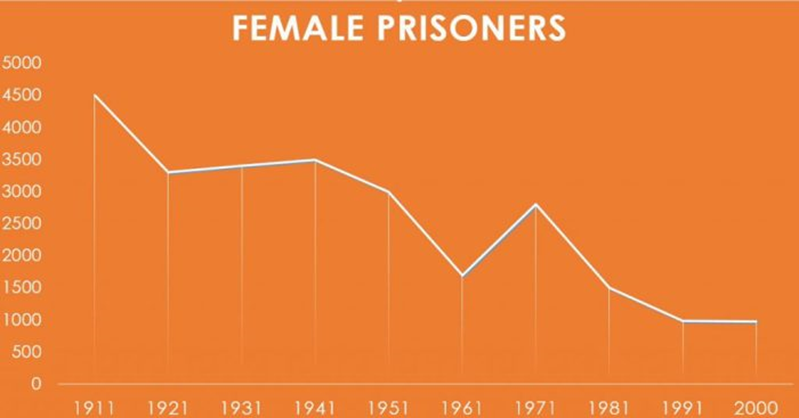
Sample 1:
The two line graphs show the male and female population from 1911 to 2001 of a prison in a European country.
As shown in the first line graph, there were 25,000 male prisoners in 1911. In 1921, the number dropped to approximately 20,000 and leveled out at that point until 1951, after which it rose gradually back to 25,000 after 1981. After that, the number sharply rose before finally peaking at 35,000 in 2001.
Turning to the second line graph, it is apparent that the population of female prisoners was significantly lower, with highest point of 4500 prisoners at the beginning of the period. The general trend can be described as an erratic downward slope. The number dropped to around 3200 in 1921 and further to just over 1500 in 1961, before rising to a little under 3000 in 1971, and finally declining continuously to the lowest point of less than 1500 prisoners in 2001.
In summary, there are more male prisoners than female prisoners. Moreover, the number of male prisoners increased over the period, whereas that of female prisoners decreased.
Sample 2:
The provided charts outline the incarceration rates of male and female individuals in a European nation over the span of 90 years, from 1911 to 2001.
Overall, the male prison population showed a consistent increase over the period, in stark contrast to the fluctuating pattern observed in the female prison population. Notably, throughout the entire timeline, the number of male inmates significantly surpassed that of female inmates.
The analysis of the first graph reveals that the count of male prisoners commenced at 25,000 in 1911, which was substantially higher compared to the 4,500 female inmates present during the same year. This number slightly declined to just over 20,000 in 1921 before gradually climbing back to its initial count by 1981. Subsequently, there was a remarkable surge, peaking at nearly 35,000 in the year 2000.
In contrast, the female prison population started at 4,500 in 1911 and witnessed a sharp decrease to around 1,500 in 1961. However, the subsequent decade exhibited a rising trend in the number of female detainees before plummeting to 1,000 in the final years of the timeline.
The chart and graph below give the information about three categories of workers in Australia and unemployment levels within those categories.
Summarise the information by selecting and reporting the main features, and make comparisons where relevant. Write at least 150 words.
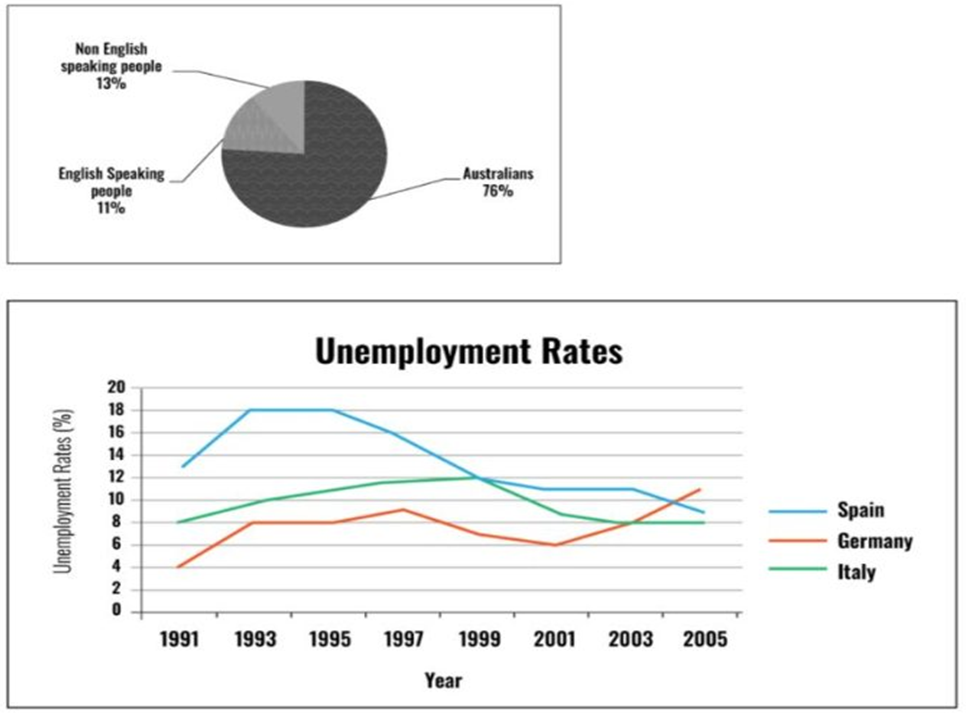
Sample 1:
The pie chart illustrates the proportion of three different groups of workers in Australia in the year of 1991 while the line chart shows the changes in the unemployment rates of 3 countries, namely Spain, Germany and Italy, from 1991 to 2005.
Overall, Australia-born workers represented the largest proportion in the total workforce of Australia. In addition, while Spain and Italy witnessed a downward trend in unemployment level, that of Germany grew and remained the highest at the end of the period.
Regarding workforce composition, in 1991, the vast majority were people who were born in Australia, accounting for 76%. Far fewer were those originating from countries that do not speak English, at 13%, which was slightly higher than the figure for workers from English-speaking nations, at 11%.
Concerning the patterns of unemployment, that of Spain fluctuated with a downward trend, dropping from around 13% in 1991 to 9% in 2005 after reaching a peak of 18% in the years between 1993 and 1995. Meanwhile, the unemployment level of Italy grew steadily from 8% in 1991 to hit the highest point of 12% in 1999 before declining back to 8% in 2003 and ending at this figure in 2005. The unemployment rate in Germany, on the other hand, doubled from 4% in 1991 to 9% in 1997. This number, despite a noticeable decrease to 6% in 2001, saw a steep climb from 6% to 11% in 2005, ending the period as the highest among the other countries.
Sample 2:
The given charts illustrate the distribution of the Australian workforce as well as unemployment rates of various worker types in three countries from 1991 to 2005. Overall, the vast majority of the workforce in Australia was Australian, followed distantly by non-English speaking and English-speaking people. Additionally, the unemployment figure for Spain declined, while the statistics of Germany increased and those of Italy fluctuated despite an increase in the middle of the period.
Concerning the worker categories, Australians made up the by far greatest percentage of workers, at 76%. The figures for non-English speaking and English-speaking workers were mostly comparable, standing at 13% and 11% respectively.
Regarding unemployment, the rate of Spanish people started highest at about 13%, then grew rapidly to 18% in 1993. It stayed constant in the next two years before plummeting to a low of approximately 9% in 2005. By contrast, the unemployment level in Germany increased significantly by almost threefolds from 4% in 1991 to rank first at slightly under 12% at the end of the period. Finally, the proportion for Italy underwent a constant growth of about 4% to 12% in the first 8 years prior to a noticeable dive back to 8% in the final year, moving from second to third position.
Sample 3:
The pie chart and line graph provided illustrate the composition of Australia’s workforce and the unemployment rates in Spain, Germany, and Italy over a 14-year period from 1991 to 2005.
Overall, the majority of the Australian workforce is comprised of English speakers, and over the years, Spain saw a dramatic decline in unemployment, while Italy witnessed a fall followed by a slight increase.
The pie chart demonstrates a workforce predominantly composed of Australians, who constitute 76% of the total. Non-English-speaking people account for 13%, while the remaining 11% of the workforce are English speaking people, presumably representing those who do not fall into the former two categories.
Examining the unemployment trends, Spain had a significant reduction in its unemployment rate, from the highest point of approximately 18% in 1993 to just under 8% in 2005. In contrast, Italy’s unemployment rate remained relatively stable with minor fluctuations around 10%, while Germany experienced an increase from the lowest rate of about 4% in 1991 to peak at around 11% in 1999.
Sample 4:
The pie chart depicts three distinct categories of workers residing in Australia. The line graph, on the other hand, illustrates unemployment trends in three different countries throughout the period from 1991 to 2005.
It is clear that Australian workers accounted for a vast majority of the graph given. Regarding the second graph, the interesting point is that there were 3 distinctive trends in accordance with 3 countries.
As the first chart shows, Australians made up the largest portion of the workforce, occupying a substantial 76% share. Conversely, non-English and English-speaking individuals only constituted 13% and 11%, respectively.
The line graph reveals three unique trends for each country’s unemployment rate. Germany’s rate experienced significant fluctuations, starting at 4% in 1991 before reaching 10% by 2005. In contrast, Spain’s rate went up to its peak of 18% in 1995, but then gradually decreased, eventually stabilizing at around 8%. Finally, Italy’s rate saw a rise to 12% in 1999 but then steadily declined to its starting point.
Sample 5:
The pie chart depicts the composition of the Australian workforce, while the line graph illustrates changes in unemployment across three European nations from 1991 to 2005. It is evident that Australians constitute the majority of the workforce in their own country, whereas unemployment trends vary among the countries featured in the line graph.
In Australia, the overwhelming majority of employees are native Australians, comprising 76%. The remaining quarter of the workforce consists of English-speaking and non-English-speaking individuals. Specifically, those who do not speak English constitute 13% of Australia’s workforce, while 11% are foreign English speakers, representing the smallest group.
Regarding the line graph, Spain had the highest unemployment rate among the three countries, at 13%, followed by Italy and Germany, with rates of 8% and 4%, respectively. Spain's unemployment rate peaked between 1993 and 1995 at 18%, before declining for most of the remaining years, reaching 9% in 2005. Italy's data, on the other hand, initially increased steadily to a peak of 12% in 1999, before decreasing until 2005, when the unemployment rate reverted to its 1991 level. Germany was the only country to experience a rise in unemployment; following a period of uncertainty until 2001, its rate surpassed those of Spain and Italy, reaching a record high of 11% in 2005.
The maps below show the changes in the art gallery ground floor in 2015 and present day.
Summarise the information by selecting and reporting the main features, and make comparisons where relevant. Write at least 150 words.
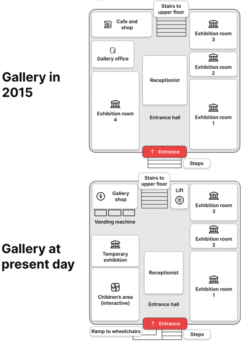
Sample 1:
The maps give information on the transformation the ground floor of an art gallery has undergone between 2015 and the present day. Overall, we can see that there has been a removal of one of the exhibitions, with new amenities in its place. Meanwhile, a few facilities have also been shifted around.
The large exhibition room directly to the left of the entrance hall has been replaced by a temporary exhibition and children’s area. The receptionist table, meanwhile, has also been moved closer to the entrance compared to where it was in 2015, now sitting next to the temporary exhibition. Additionally, the gallery office and cafe have also been dismantled, with a vending machine and gallery shop taking their place. The stairs have been moved slightly leftward, with the space on its right being made available for a lift. Lastly, the three exhibition rooms that occupy the whole right side of the building have remained unchanged from what they were in 2015.
Sample 2:
The maps illustrate the changes that the ground floor of an art gallery has undergone from 2015 to today.
Overall, the art gallery has been modernized to include more facilities to cater for its visitors. The only parts that have remained unchanged are the entrance hall and the three exhibition rooms on the right-hand side.
The entrance is located at the southern side of the layout. Walking past the entrance, visitors should see an entrance hall that leads to a reception desk, which lies at the very centre of the gallery. This reception desk used to be further up north, towards the far end of the gallery. To the north of the reception desk are the stairs, which now have been slightly moved to the left to make room for a new lift on the right. It is interesting to note that the three exhibition rooms to the right of the ground floor remain the same both in size and location.
On the left of the art gallery ground floor, there used to be exhibition room number 4 in 2015. However, this room has been separated into two different rooms now, with one being the children’s area and the other (being) a temporary exhibition. Adjacent to the present-day exhibition was once a gallery office, which has been torn down to free up space for a vending machine, where visitors can pick up snack or a drink. The left-hand corner coffee shop to the end of the gallery has also been converted into a smaller shop for people to buy gallery souvenirs.
Sample 3:
The maps illustrate the layout of an art gallery and how it has changed from 2005 to now.
Overall, the building has undergone several changes internally, with the addition of several new rooms and facilities, and access for the disabled.
In 2005, the gallery contained four exhibition rooms, a gallery office, and a cafe. Exhibition rooms 1, 2, and 3 have remained unchanged, however Exhibition room 4 has now been split into a children’s area, and a temporary exhibition room. The gallery office previously located behind Exhibition room 4 has now been removed and the space opened up to become a part of the entrance hall area.
Previously, a cafe was located to the left of the stairs, but has now been replaced with a gallery shop, however the space is much smaller now. A new vending machine facility has been placed outside the gallery shop where the gallery office used to be. The reception desk has been moved closer to the front of the entrance hall, and new disabled access facilities have been added, including a wheelchair ramp at the front of the building and a lift located next to the stairs.
Sample 4:
The maps depict modifications to the ground floor of an unspecified art gallery from 2015 to the present day. Overall, the ground floor underwent a complete transformation with various facilities being relocated, replaced or added.
Between 2015 and the present day, the reception desk was relocated to a position where it is closer to the entrance. The hall was further expanded to the right-hand side of the ground floor, taking up the space where there once was a gallery office. There is now a lift adjacent to the former stairs, and the café on the top left corner of the ground floor was converted into a gallery shop with a vending machine located just outside.
Another major change to the area was the re-arrangement of the exhibition rooms. The exhibition room 4 on the left-hand side of the room was divided into a temporary one and an area for children, while the three exhibition rooms on the right-hand side remain unchanged. The final change made to the layout of the ground floor is the additional ramp for wheelchairs, which makes the gallery become more accessible to the disabled.
Sample 5:
The maps illustrate the changes that have taken place in an art gallery from 2015 up to the present time.
In general, the main changes have been the use of the west side for other purposes and the addition of some new facilities.
The entrance remains the same at the middle of the southern wall, and there is a new ramp for wheelchairs outside the establishment at present. The lobby has been expanded with the extra space now occupying the site of the initial gallery office. The reception area has been relocated to the central part of the art gallery, and a new elevator now exists to the right of the stairs, which have been moved a little to the west.
The café at the top left corner of the floor plan has been remodelled to become a gallery shop, and a vending machine has appeared alongside its southern wall. In the place of exhibition room 4, which has been removed, are currently a temporary exhibition space and an area for children. The east side of the art gallery remains unchanged with three separate exhibition rooms 1,2,3 aligned in a south-north direction.
Sample 6:
The floor plans give information on the changes made to a gallery between 2005 and the present day. Overall, most of the changes are confined to the left side of the floor while the right side remains the same.
The doorsteps of the entrance witnessed an alteration, where a ramp for wheelchair users was added alongside the steps. In the middle of the room, there is now a reception desk which in 2005 had been placed further northwest of the present position, facing the left corner of the room. The current desk is also an oval one, replacing the old rectangular desk. In the upper left corner of the room, a former cafe and shop is now replaced by a gallery shop, with three vending machines installed in front. Meanwhile, an area for temporary exhibitions, as well as an interactive children’s play area, has been built in place of exhibition 4. Further, the stairs to the upper floor have been made smaller and are now fitted with a lift next to them. Finally, the three exhibition rooms on the right of the room remained unchanged.
Sample 7:
The maps reveal some changes taking place to the layout of an art gallery’s ground floor between 2005 and the present day.
In general, while the eastern part of the gallery has remained more or less intact over time, the opposite side has undergone significant transformations, with the whole area becoming more accessible for the disabled.
Originally, the gallery was designed merely for its exhibition purpose and visitors could enter the hall through the entrance in the south of the building. Inside the hall, there was a reception desk to welcome visitors, which led to a staircase in the north end. The remaining part simply consisted of functional areas with a set of 3 exhibition rooms on the eastern wing, one large exhibition space together with an office taking up the entire southwestern corner, and a café in the northwest.
At present, the location has become modernized and versatile, providing more facilities for visitors, especially with the addition of a wheelchair slope right outside the entrance to the west and a lift next to the stairs. To the west, exhibition room 4 was converted into a children’s indoor playground and one smaller room for temporary display, while a gallery shop and a vending machine were opened in place of the original gallery office and the cafe. The final alteration that happened was the relocation of the reception towards the entrance of the gallery.
Sample 8:
The floor plans illustrate the differences in the layout of an art gallery ground floor between 2015 and the current layout. Overall, it can be seen that there have been a lot of changes to the interior design of the ground floor with the replacement of Exhibition room 4 being the most significant change.
On the left-hand side of the ground floor, there used to be Exhibition Room 4, but it has been removed to make room for the construction of a new temporary exhibition room and children’s play area in the bottom-left corner. A gallery, whose original space is now used for a vending machine, has been relocated to occupy the space of the cafe on the top-left side.
A set of stairs in the middle at the top and three exhibition rooms on the right-hand side of the plan still remain the same, with a new lift being added next to Exhibition Room 3 on the left. There was an entrance hall in the center of the floor and a receptionist in front of the stairs set. While there has been no change ro the entrance hall, the receptionist has been moved beside the temporary exhibition room on the right.
The three charts show the value in Australian dollars of Australian trade with three different countries from 2004 to 2009.
Summarise the information by selecting and reporting the main features, and make comparisons where relevant. Write at least 150 words.
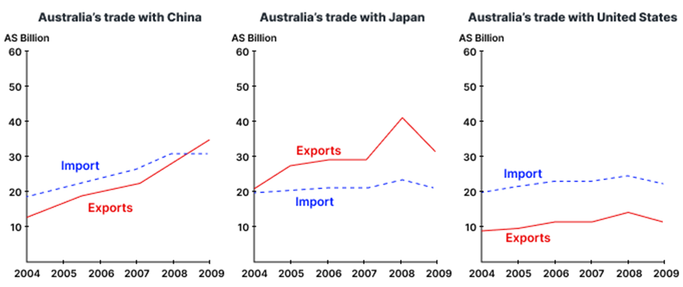
Sample 1:
The provided charts compare three countries namely China, Japan, and the United States in terms of their imports from and exports to Australia between 2004 and 2009.
Overall, there were notable increases in revenue from Australian exports to all surveyed countries, with China experiencing the most pronounced surge. In terms of imports, the most dramatic growth was also demonstrated in the trade with China, while Japan and the US registered only minimal changes. Furthermore, it is evident that the highest value of imports originated from China, whereas the trade with Japan reflected the highest export figures.
Regarding importation, in 2004, the total value of this sector was relatively similar across all three countries, at around 20 billion dollars each. However, over a 5-year period, import values from China surged to nearly 30 billion dollars, establishing the highest point. Meanwhile, imports from other countries experienced a modest growth, with values reaching around 22 billion dollars in 2008, and subsequently reverted to the initial 20 billion dollars at the start of the period.
Concerning exports, the value that Australia reaped from Japan was approximately 20 billion, nearly twice as high as the figures for China and US, at around 10 billion each. From 2005 to 2008, the export values to China and Japan experienced similar changes, with figures all skyrocketing to nearly 30 and 40 billion, respectively, but at the end of the period, while China continued its rising trend and reached its highest point at roughly 35 billion, Japan plummeted to just 30 billion. The US, on the other hand, recorded slight growth to nearly 12 billion before undergoing a slight decline to 10 billion, resulting in the lowest import value among the three countries examined.
Sample 2:
The line graphs portray the fluctuations in the import and export values of Australia concerning three distinct countries from 2004 to 2009.
In general, Australia experienced an upsurge in trade with China and Japan, while its trade figures with the US remained relatively constant during the period under review.
In terms of imports, the total value showed a uniformity among the three nations in 2004, at approximately 20 billion dollars each. However, within the subsequent five-year period, import figures from China surged to nearly 30 billion dollars, marking the highest point. Concurrently, imports from the remaining countries experienced modest growth, with values hovering around 22 billion dollars in 2008, and ultimately returning to the initial 20 billion dollars at the onset of the period.
Regarding exports, Australia’s export revenue from Japan stood at roughly 20 billion, nearly twice as much as the figures from China and the US, both around 10 billion each. Between 2005 and 2008, export values to China and Japan showed parallel growth, with figures soaring to nearly 30 and 40 billion, respectively. However, by the period’s end, while China continued its upward trend and peaked at approximately 35 billion, Japan soared to a zenith of 40 billion in 2008 and then plunged to a mere 30 billion. In contrast, the US saw a slight increase to nearly 12 billion before experiencing a minor downturn to 10 billion, representing the lowest import value among the three countries scrutinized, and was the unique country with exports always inferior to import.
The plans show a school library 5 years ago and the same library now.
Summarise the information by selecting and reporting the main features, and make comparisons where relevant. Write at least 150 words.
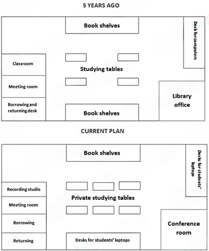
Sample 1:
The two diagrams compare the changes in a school library over a period of five years.
Overall, the layout of the library remains unchanged to a large extent with many facilities changing their names. Although the bookshelves have reduced, the tables for studying have increased a lot.
Five years ago, only four studying tables stood in the centre of the library, but now six private studying tables are equipped to allow students to study simultaneously. The bookshelves in the northern part have remained in the same place, while the ones in the south are converted into desks for students’ laptops. Similarly, the desks for computers in the northeast section are designed to become the desks for students’ laptops.
On the west side, the meeting room stays the same as the one in the past library. The classroom adjacent to the north of the meeting room has been replaced by a recording studio. The borrowing and returning desk next to the south of the meeting room is now divided into two rooms for borrowing and returning respectively. It is also noticeable that the library office, which was the largest room at the bottom right corner, has been transformed into a conference room.
Sample 2:
The two plans illustrate the layout of a school library as it was five years ago and its current configuration.
Overall, the library has undergone significant changes to improve privacy, modernize facilities, and better accommodate students’ needs.
Five years ago, the library had a central area of studying tables, flanked by bookshelves on the northern and southern sides. To the west, there was a classroom, a meeting room, and a borrowing and returning desk. The library office and a computer area were situated on the eastern side.
In the current layout, the classroom has been replaced by a recording studio, while the borrowing and returning desk has been divided into separate areas for borrowing and returning books. The studying tables have been modified to private studying tables, and additional desks for students’ laptops have been introduced. The library office remains in the same location, and the area for computers has been updated to include desks for students’ laptops. Notably, a new conference room has been added in the southeastern corner of the library.
Sample 3:
The diagrams delineate the transformation in the layout of a school library over the past five years.
The overview of the diagrams reveals a significant reorganization within the library’s space, with notable additions and repurposing of areas to better cater to modern needs. Notably, the library has shifted from having expansive bookshelves and designated office space to incorporating more specialized rooms such as a recording studio and conference room, suggesting a modernization in the library’s function and services.
Five years ago, the library layout was more traditional with central bookshelves flanked by a classroom, a meeting room, and a library office. Bookshelves dominated both the northern and southern sides of the library. The east side featured a borrowing and returning desk adjacent to the library office, promoting a straightforward flow for borrowing books.
In contrast, the current layout showcases a more dynamic use of space. The bookshelves remain central on the north side, but the south side has been transformed to include desks for student laptops, indicating a shift towards digital learning resources. The previous classroom has been converted into a recording studio, and the library office has made way for a conference room, reflecting a trend towards multifunctional spaces. The borrowing and returning functions have been separated into distinct areas, streamlining the process and improving user experience.
Sample 4:
The provided diagrams illustrate the configuration of a school library five years ago and its current state.
Overall, the present arrangement incorporates several rooms and some infrastructure in lieu of the classroom and library office that were present in the previous layout.
The present plan includes two additional study tables, in addition to the original four in the central area. The library office located in the southeast corner has been repurposed into a conference room. On the southwest side of the library, there were three separate rooms, with one designated for borrowing and returning materials, and the other two allocated for classes and meetings. The room for borrowing and returning materials has now been split into two separate spaces, with individual areas for borrowing and returning. Furthermore, the classroom has been replaced by a recording studio.
In contrast, five years ago, there were bookshelves occupying the central positions of both the north and south sides of the library. However, the shelves on the south side have now been substituted with a desk designed for students' laptops. Additionally, the computer desk located in the northeast corner is now designated for students' laptops.
Sample 5:
The included diagrams illustrate the layout of a school library five years ago and how it is now.
Overall, a number of rooms and some infrastructures have been added in the present plan in place of the classroom and library office that were in the prior arrangement.
The present arrangement adds two extra study tables to the original four tables in the centre of the space. The library office on the southeast corner has been converted into a conference room. There were three distinct rooms on the left side of the library; one was for borrowing and returning materials, the other two were for classes and meetings, and the borrowing and returning room had been divided into two rooms with separate areas for borrowing and returning materials. In addition, the classroom is removed and replaced with a recording studio.
Five years back, there were bookshelves in the middle points of both north and south sides of the library, while the shelves on the south side have been replaced with a desk for students’ laptops. Additionally, the library office on the southeast corner has been transformed into a conference space, and the north-eastern corner's computer desk is now used for students' laptops.
Sample 6:
The plans illustrate the changes made to a school library over a period of five years.
Overall, the library has been modernized to accommodate students' needs and technological advancements, while retaining its core functions, such as borrowing and returning books and the meeting room.
Five years ago, the library had two large bookshelves located at each end of the room, with four studying tables placed in the center. On the left side, there was a classroom and a meeting room, while the right side housed the library office.
Currently, one bookshelf has been replaced by desks for students' laptops, reflecting the shift from desktop computers to laptops. The study tables have been transformed into private study spaces, with their number increased. Additionally, the borrowing and returning area has been separated into two rooms, with a recording room added. The library office has been converted into a conference room.
Sample 7:
The given maps illustrate the layout of a school library after a course of five years. Overall, the library has undergone numerous changes, in terms of both studying spaces and other functional rooms.
Initially, the studying desks were placed in the middle of the library, in front of the two bookshelves on both ends of the library. On the left and right side of the library were several functional rooms, including a classroom and a meeting room, as well as a book borrowing and returning office to the left. On the other side, there were desks for computers and a library administrative office.
After five years, there have been drastic changes to the school library. Regarding study spaces, there have been more learning desks, which have been turned into private ones. The bottom bookshelf and the computer zone are replaced with lines of desks designated for students’ laptops. Situated amid these portable computer zones is a conference room, which was previously the administrative office. Lastly, the borrow and return office has been separated into two specific rooms.
Sample 8:
The pictures illustrate how the layout of a school library changed over five years.
Overall, significant changes have been made in terms of the library’s interior space design, especially in the area to the Southwest of the library.
A recording studio has been constructed to replace the classroom area. While the meeting room remains in the same place after 5 years, the space for the borrowing and returning desk has been separated into 2 different rooms.
In the center of the library, more private tables have been set up for students to study at the moment than before. Additionally, there were 2 areas for bookshelves to the North and South of the library 5 years ago; however, the one to the South as well as the desk for computers in the Northeast corner has been converted into desks for student’s laptops. Further down the south, it can be seen that the library office has been removed to make way for a new conference room.
The charts below show the percentage of food and goods bought in supermarkets in European countries in 1998 and 2008.
Summarise the information by selecting and reporting the main features, and make comparisons where relevant. Write at least 150 words.
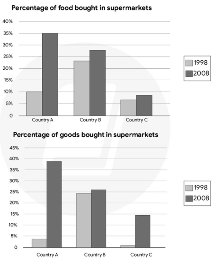
Sample 1:
The bar charts illustrate the proportion of food and other products purchased from supermarkets in three European countries in two separate years, namely 1998 and 2008.
Overall, there was a clear upward trend in supermarket sales across all countries, regardless of the type of products. Notably, although Country B had the highest percentage of food and goods bought from supermarkets in 1998, Country A had surpassed it by 2008.
In terms of food sales, Country B purchased around 23% of its food from supermarkets in the first year, followed by a modest rise of 5% over the next decade. In contrast, Country A experienced a sharper increase, with supermarket food purchases rising from 10% in 1998 to 35% in 2008, exceeding Country B. At the same time, Country C's food sales remained the lowest, making up less than 10% in both years, even though there was a small rise.
Other goods followed a similar trend. In 1998, Country B was at the forefront, with nearly 25% of supermarket sales, which was more than five times the amount for Country A. Yet by 2008, Country A had risen significantly, reaching almost 40%, surpassing the slower growth in Country B to about 27%. Meanwhile, Country C consistently had the lowest figures, growing from just over 2% in 1998 to almost 15% in 2008.
Sample 2:
The bar charts illustrate the percentage of food and other goods purchased from supermarkets in three European countries – A, B and C – in the years 1998 and 2008.
Overall, there was a significant increase in supermarket purchases in all three countries over the 10-year period. However, the extent of this increase varied between the countries, with Country A showing the most notable changes.
In terms of food purchases, Country A, which had the second-highest percentage at 10% in 1998, experienced a dramatic increase to 35% in 2008, making it the highest in that year. Country B, starting with the highest percentage of 23% in 1998, saw a smaller rise to 27% by 2008, ranking second. Meanwhile, Country C exhibited a modest increase from 6% to 8%, maintaining the lowest percentage of food purchases in both years.
Regarding the percentage of goods bought in supermarkets, a similar trend can be observed. In 1998, Country B had the highest proportion at just under 24%, compared to the minor figures in Country A (4%) and Country C (1%). By 2008, Country B increased only slightly by 2%, ranking second. Country A, however, saw the most dramatic rise, soaring to 38%, becoming the highest. Country C also climbed significantly to just under 15%, although it still remained the lowest among the three countries.
Sample 3:
The given bar graphs compare the proportions of groceries and other products purchased from supermarkets across three European nations between 1998 and 2008.
Overall, sales saw an upward trend in all the countries presented, with the most notable increase occurring in Country A. Another noteworthy feature is that in 1998, Country B led in supermarket sales; however, a decade later, Country A surpassed all other nations to take the top position.
Looking first at food purchases, in 1998, the percentage of groceries bought at supermarkets in Country B accounted for 23%, which was 13% higher than that in Country A and four times greater than Country C's figure.
Over the next decade, the figure for Country A experienced a significant surge, reaching 35% and becoming the leader in food sales. In contrast, minimal growth was observed in other nations during the same period, with increases of just under 5%.
Regarding sales of other goods, Country A, initially in second place, saw a sharp rise to 40% in the percentage of goods sold and overcame Country B to be the leader in this category. Likewise, Country C followed a comparable trajectory, increasing sevenfold to reach 14%, though it remained the nation with the lowest sales. Despite having the highest starting point of 24%, the growth in goods sales of Country B was slower, rising modestly to just over a quarter.
Sample 4:
The given bar charts compare three European countries in terms of the percentage of food and other products purchased from supermarkets between 1998 and 2008.
Overall, supermarket sales experienced a marked upward trend in all countries, irrespective of the type of products. It is also evident that while the proportion of both food and goods purchased in supermarkets in Country B was the highest in 1998, by 2008 it had been overtaken by Country A.
Regarding food sales, in 1998, individuals in Country B, on average, bought approximately 23% of their food from supermarkets, after which this figure increased modestly by 5% over the following decade. A similar trend, though more pronounced, was observed in Country A, where supermarket food sales surged from 10% to 35%, surpassing Country B. Meanwhile, food purchases in Country C remained relatively low, accounting for less than 10% in both years, despite a slight increase.
A comparable pattern emerged in the sale of goods. Country B initially led in 1998, with nearly 25% of goods purchased from supermarkets, quintuple the figure for Country A. However, by 2008, Country A saw an eightfold increase, reaching nearly 40%, thus surpassing the more modest rise to around 27% in Country B. Country C consistently registered the lowest proportion of goods bought in supermarkets, with figures increasing from just over 2% to nearly 15%.
Sample 5:
The given bar chart illustrates the rising dominance of supermarkets regarding food and goods purpchases across three European countries between 1998 and 2008.
Overall, it is clear that supermarkets had progressively gained a higher market share in selling food and goods across all 3 examined nations, despite to varying extents. Specifically, supermarkets were most prevalent among consumers in country 1, while country 3 displayed the lowest level of supermarket reliance.
With regards to food, 10% of food bought in country 1 was from supermarkets, which then increased remarkably to a staggering 40% 10 years later, registering as the highest figure across the chart. Country 2 followed a similar pattern, rising moderately from around 25% to over 30% in the same time period. By contrast, country 3 showcased the least interest in buying from supermarkets, witnessing only modest growth from about 5% to over 10% in the examined years.
As for goods, supermarkets once again displayed dominance in country 1, owning about 20% of the market in 1998, before rising to nearly 60% by 2008. Similarly, country 2 recorded a significant climb in its supermarket share, growing from approximately 40% to about 50% after 10 years. Finally, a neligible 3% was seen in the corresponding figure for country C in 1998, which grew to about 10% by 2008, reflecting a minimal shift in consumer preference toward supermarkets.
The table below shows population figures for four countries for 2003 and projected figures for 2025 and 2050.
Summarise the information by selecting and reporting the main features, and make comparisons where relevant. Write at least 150 words.
Population (Millions) | |||
Countries | Year | ||
2003 | 2025 | 2050 | |
Argentina | 34 | 48 | 62 |
Indonesia | 238 | 274 | 312 |
Italy | 54 | 47 | 45 |
Republic of Korea | 48 | 52 | 52 |
Sample 1:
The table provides population data for Argentina, Indonesia, South Korea, and Italy for the year 2003, alongside projections for 2025 and 2050.
Overall, the population numbers for Argentina, Indonesia, and South Korea are projected to increase, while Italy's population is expected to decline. Indonesia had the largest population among the four countries in 2003, and it is forecasted to remain the most populous until 2050.
In 2003, Indonesia had the largest population among the four countries, with 238 million people. This figure is projected to grow significantly, reaching 274 million by 2025 and 312 million by 2050. Argentina also shows a notable increase, starting at 34 million in 2003, and expected to rise to 48 million by 2025, eventually reaching 62 million by 2050. Meanwhile, South Korea's population is predicted to grow modestly from 48 million in 2003 to 52 million by 2025, and then remain stable through to 2050.
In contrast, Italy is expected to experience a population decline. In 2003, Italy had a population of 54 million, which is projected to decrease to 47 million by 2025 and further decline to 45 million by 2050. This represents a significant reduction over the 47-year period.
Sample 2:
The table displays the number of people in four countries in 2003 and their projected figures in 2025 and 2050. Overall, all countries, except Italy, are expected to experience population growth. Indonesia was the most populous country in 2003, and it is predicted to maintain its top ranking in the future years.
In 2003, Indonesia’s population was 238 million, dwarfing the figures for Italy, Korea, and Argentina, which were 54, 48, and 34 million, respectively. According to the table, by 2025, this data will have increased by 36 million to 274 million people. The Argentinian and Korean populations are also predicted to grow to 48 million for the former, and 52 million for the latter. Italy’s figure, meanwhile, is expected to shrink to 47 million, making it the least populous country by 2025.
According to 2050’s projections, Indonesia’s population is likely to reach 312 million, and while that of Argentina will also grow, it amounts to merely one-fifth of Indonesia’s, at 62 million. There seems to be no change after 2025 in Korea’s data, whereas Italy’s population is predicted to continue declining to 45 million. At the end of the period, Italy will have been the country with the fewest people.
Sample 3:
The table indicates the population of four countries in 2003 as well as the predicted information for 2025 and 2050.
Overall, the population figures of three countries are forecast to rise: Argentina, Indonesia and South Korea, but not Italy. Besides, the number of people in Indonesia in 2003 was the highest out of the four, and this country is projected to continue to be the most populous until 2050.
In 2003, Indonesia had the biggest population, reaching 238 million. In contrast, Argentina, which had a population of only 34 million, shows the lowest figure. In the same year, the population of Italy was relatively larger than that of the Republic of Korea, at 54 million and 48 million, respectively.
The projections made for 2025 and 2050 highlight that the population of Indonesia will increase dramatically, with an extra 75 million people in 2050. It is foreseen that Argentina’s population will increase roughly 1.5 times by 2050, whereas that of South Korea is predicted to grow slowly over the course of 22 years from 2003 before levelling out at 52 million. However, Italy’s population in 2050 is expected to be just five-sixths of the initial figure.
Sample 4:
The table provides statistics regarding the populations of four nations in 2003 with forecasts for 2025 and 2050. Overall, the populations of most countries are predicted to rise over the given period, except for Italy. Additionally, it is anticipated that Indonesia's population would remain the highest throughout the years.
Regarding 2003, Indonesia ranked 1st with 238 million residents, followed by Italy and the Republic of Korea at 54 million and 48 million, respectively. At 34 million, Argentina's population was the lowest among the four countries,
As of 2025, changes in the population ranking are expected to occur as the Republic of Korea's population is forecast to rise to 52 million, surpassing Italy which is expected to decrease to 47 million. Both Argentina and Indonesia are predicted to witness moderate population growth, with the former ascending to 48 million and the latter to 274 million.
Turning to 2050, Italy's population is anticipated to decline slightly to 45 million, widening the gap with the Republic of Korea whose population is projected to remain unchanged. Meanwhile, Indonesia's and Argentina's populations are forecast to climb to 62 million and 312 million, correspondingly.
Sample 5:
The provided table offers a demographic overview of population statistics for Argentina, Indonesia, Italy, and the Republic of Korea, in 2003 with projections extending to 2025 and 2050.
Overall, Indonesia stands out as the highest population. While Indonesia and Argentina are on trajectories of significant population increase, Italy faces a declining population, setting it apart from the rest. In contrast, the Republic of Korea's numbers maintain a steady state.
When it comes to the upward trend, Indonesia demonstrated a considerable base population of 238 million in 2003, with a forecasted growth to 274 million by 2025 and an ascending trajectory reaching 312 million by 2050. In parallel, Argentina’s population in 2003 was recorded at 34 million, with prospects of a robust increase to 48 million by 2025, representing a significant upward trend. This momentum is expected to propel the numbers to 62 million by 2050, highlighting a near doubling over the 47-year period. When compared, both countries exhibit substantial population growth, yet Indonesia’s sheer numerical increase dwarfs Argentina’s, despite a smaller relative percentage increase.
Conversely, Italy is projected to witness a demographic downturn from 54 million individuals in 2003 to 47 million by 2025, with a further decline to 45 million anticipated by 2050. The Republic of Korea with its population ascended marginally from 48 million in 2003 to an anticipated 52 million by 2025, a figure that is expected to stabilize through 2050.
Sample 6:
The table delineates demographic statistics in four different nations in 2003 and expected data for 2025 and 2050.
Looking from an overall perspective, it is readily apparent that population figures in all nations in question have experienced upward trajectories throughout the period, with the exception of Italy. Indonesia has recorded by far the most significant figure for citizens in all the years surveyed.
In 2003, the figure for Indonesian residents was greatest at 238 million, while Argentina’s number was least considerable at 34 million. Both countries’ statistics thereafter will see increasing trends, with Indonesia rising substantially to 274 million and Argentina to 48 million in 2025. These patterns are expected to continue as Argentina increases to its peak of (62 million and Indonesia to 312 million in 2050.
In the first year of the period, the figure for Italy’s population was slightly / marginally higher than the Republic of Korea’s, accounting for 54 million and 48 million, respectively. Italy and South Korea’s data are then forecasted to witness opposite patterns, with the former dipping to 47 million and the latter reaching 52 million in 2025. Italy’s number will continue its decline to finish at 45 million in 2025.
The table below shows information about the population of New Zealand from 2011 to 2012 by age group.
Summarise the information by selecting and reporting the main features, and make comparisons where relevant. Write at least 150 words.
Group | 2011 | 2012 | Percentage of change |
All ages | 4,381,269 | 4,410,284 | +0.6% |
Under 15 | 898,160 | 896,364 | -0.2% |
15-39 | 1,577,256 | 1,574,102 | -0.2% |
40-64 | 1,331,907 | 1,339,898 | +0.6% |
65+ | 573,946 | 596,903 | +4.0% |
Sample 1:
The table illustrates the population figures for New Zealand between 2011 and 2012 by different age ranges.
Overall, the New Zealand population rose slightly over the reported years. Moreover, while the figures for those aged under 40 declined, there was a rise in the number of people aged 40 and over.
Firstly, New Zealand's total population increased by 0.6% between 2011 and 2012, from 4,381,269 to 4,410,284 individuals. The 65+ age bracket experienced the largest rise, increasing 4% from 573,946 to 596,903, while the data of 40-64 age group went through a 0.6% increase, from 1,331,907 to 1,339,898.
Meanwhile, despite a decrease of 0.2%, the 15-39 age range made up the biggest portion of New Zealand’s population in both years, at 1,577,256 and 1,574,102 respectively. Additionally, the figure for citizens under 15 years old saw a similar tendency, declining by 0.2%, dropping from 898,160 to 896,364 individuals respectively.
Sample 2:
The table displays how New Zealand's population changed between 2011 and 2012. It can be seen that while there was an increase in this country’s population, the number of people under 39 decreased, whereas the figure for those over 40 rose. Additionally, people between 15 and 39 years of age made up the most populous demographic in both years.
In 2011, there were nearly 1.58 million New Zealanders in the 15-39 age group, and this was closely followed by the 40-64 cohort, with 1.33 million people. These two demographics altogether accounted for two-thirds of New Zealand’s population, and of the remaining third, nearly 900,000 was the figure for children under 15. There were fewest people over 65 years old, with 573,946.
By 2012, the population of this country had grown by 0.6%, from about 4.38 million to over 4.4 million New Zealanders. Seniors older than 65 experienced an increase of 4% to nearly 600,000 people, by far the most significant change shown. The number of people between 40 and 64 years of age, meanwhile, had risen by approximately 8,000. While the remaining demographics shrank by no more than 3,000 for each cohort, the 15-39 age group was still the most populous segment, making up over a third of New Zealand’s 2012 population.
Sample 3:
The table displays population figures for New Zealand between 2011 and 2012.
Overall, the New Zealand population increased slightly over the measured years. Additionally, while the figures for those aged under 40 decreased, there was an increase in figures for those aged 40 and over.
From 2011 to 2012, the total population in New Zealand rose by 0.6%, from 4,381,269 to 4,410,284 people. While the number of people aged 65+ saw the biggest increase, rising 4% from 573,946 to 596,903, the number of people aged 40-64 years old increased by 0.6%, rising from 1,331,907 to 1,339,898,
Meanwhile, though decreasing by 0.2%, those aged 15-39 made up the largest portion of the population in both years, at 1,577,256 and 1,574,102 respectively. Similarly, the figure for people aged under 15 years old also decreased by 0.2%, dropping from 898,160 to 896,364 people respectively.
Sample 4:
The table compares population data by age brackets for New Zealand in the years 2011 and 2012.
Overall, the aggregate population of New Zealand experienced a marginal increase during the surveyed period. It is also clear that while the numbers of individuals under 40 dwindled, there was a concurrent uptick in figures for those aged 40 and above.
Looking first at the groups with increasing rates, between 2011 and 2012, the total population of New Zealand grew by 0.6%, from 4,381,269 to 4,410,284 individuals. The most substantial increase was observed in the population aged 65 and above, which rose by 4% from 573,946 to 596,903. A fairly similar trend was seen in the population aged 40 to 64 years, which increased by 0.6%, from 1,331,907 to 1,339,898.
Turning to the other younger demographics, although there was a decrease of 0.2%, individuals from 15 to 39 years old constituted the largest segment of the total population in both years, numbering 1,577,256 and 1,574,102 respectively. Likewise, the population under 15 years old also dwindled by 0.2%, declining from 898,160 to 896,364 people.
The chart below gives information about car ownership in the UK from 1975 to 2005.
Summarise the information by selecting and reporting the main features, and make comparisons where relevant. Write at least 150 words.
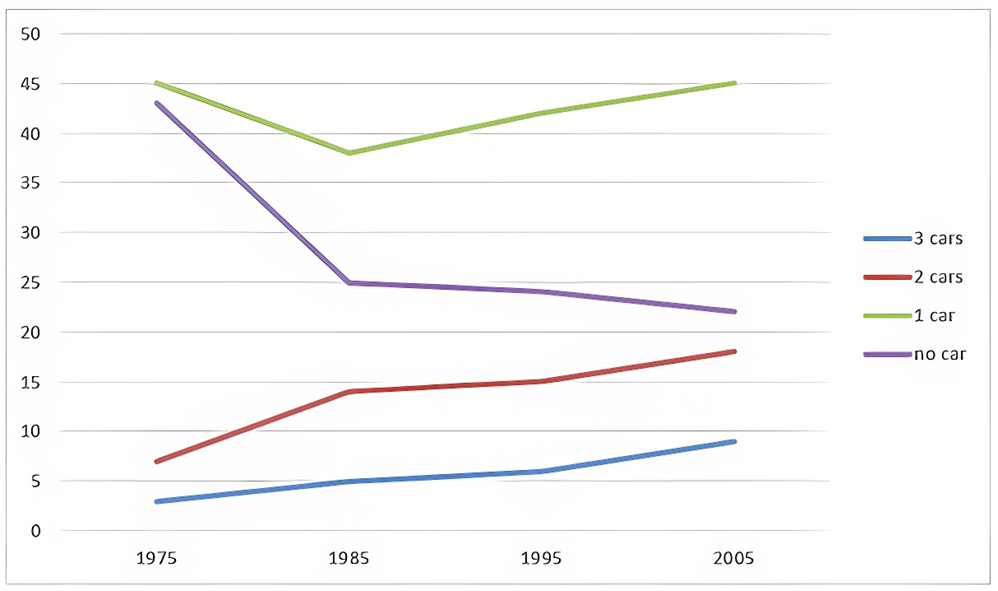
Sample 1:
The provided line graph illustrates the changes in number of cars British people owned from 1995 to 2005.
It is noticeable that more people owned cars over the period shown. Additionally, the figure for people with 1 car was consistently highest while the opposite was true for people with 3 cars.
In 1975, 45% of people in the UK owned a single car while the percentage of those with no car was 2% lower, at 43%. Over the following decade, these figures both decreased, with one-car ownership down to 38% and no-car ownership to 25%. While the proportion for British people owning 1 car steadily increased and reached its exact number in 1975 at 45%, the figure for people with no car gradually went down to only 22%.
The percentage of people with 2 and 3 cars experienced a similar pattern over the given period. The figure for people owning 2 cars stood at 7% in 1975, which was 4% higher compared to that for people owning 3 cars. They both increased steadily and reached their highs of 18% (people with 2 cars) and 4% (people with 3 cars).
Sample 2:
The line graph delineates car ownership trends among UK residents, detailing the percentages of households with no cars up to those owning three cars, over three decades starting from 1975.
Overall, there was a significant rise in car ownership during this period, with the number of households owning one car consistently higher than other categories, while the opposite was true for those owning three cars.
In 1975, 45% of households owned a single car, slightly surpassing 43% of households without any car. Over the next decade, both categories experienced a decrease, with single-car ownership falling to approximately 38% and no-car ownership sharply dropping to one quarter. However, from 1985 onwards, the figures for the former recovered and returned to the initial 1975 level of 45%, while those for the latter continued their decline, reaching roughly 22% by 2005.
The most substantial growth was observed in households owning two cars, which increased steadily from about 7% in 1975 to around 18% in 2005. The proportion of households with three cars also increased, although it remained the smallest group. This category grew from a nearly negligible percentage in 1975 to approximately 7% in 2005.
Sample 3:
The line graph shows how car ownership in the UK changed between 1975 and 2005.
Overall, the proportion of people who owned two or three cars rose while the figure for those who owned no car declined. Additionally, having one car was the most common situation during the period shown.
In 1975, nearly half of the UK population had one car while people with no car took up a smaller percentage, at roughly 43%. These figures both declined over the following ten years, to around 37% for people who have one car and 25% for those with no car. The percentage of those who owned 2 or 3 cars was approximately 7% and 3% respectively in 1975, and both experienced increases over the next 10 years to around 13% and 5% respectively.
Over the next 20 years, the percentage of those with one car gradually rose back up to 45% whereas the percentage of those with no car continued to decline to about 22%.
On the other hand, the proportion of people having 2 or 3 cars continued to rise over the following 20 years to 19% and 9% respectively.
Sample 4:
The line graph illustrates the percentage of car ownership in the UK over a 30-year period, from 1975 to 2005. The data is divided into four categories: people owning 1 car, 2 cars, 3 cars, and no car.
Overall, there was a clear increase in the number of people owning one or three cars, while those without a car or with two cars experienced a decline over the period.
In 1975, the majority of UK citizens owned either one or two cars, with 43% of the population having 1 car and approximately 38% owning 2 cars. Over the next three decades, the figure for 1-car households rose steadily, peaking at about 47% in 2005. Conversely, the percentage of those with two cars fell significantly to around 27% in the same year.
Meanwhile, the proportion of people with no car or three cars started at a lower base. In 1975, roughly 8% of households had no car, and around 4% owned 3 cars. Over the years, the share of non-car owners steadily decreased to about 5%, whereas the percentage of those owning 3 cars saw a moderate rise to 12% by 2005.
Sample 5:
The chart below gives information about car ownership in the UK from 1975 to 2005.
Overall, the trend indicates a shift towards increased car ownership over the 30-year period, with a notable rise in the number of individuals owning at least one car.
In 1975, 45% of individuals in the UK possessed a single car, slightly surpassing the percentage of those with no car, which stood at 43%. In the subsequent decade, both percentages declined, with single-car ownership decreasing to 38% and no-car ownership to 25%. While the percentage of individuals owning one car steadily rose to match its initial 1975 number of 45%, the figure for individuals with no car gradually decreased to 22%.
The proportions of individuals owning two and three cars exhibited a similar trend during the period provided. In 1975, 7% of individuals possessed two cars, which was 4% higher than those owning three cars. Both categories increased steadily, reaching their peaks at 18% (individuals with two cars) and 4% (individuals with three cars).
Sample 6:
The line graph details the changes in car ownership in the UK between 1975 and 2005.
Looking at the graph from an overall perspective, it can be seen that most UK residents had only one car. Also, more and more people possessed 2 or 3 cars over the surveyed period, which resulted in a corresponding drop in the figure for people who owned no car.
In 1975, 43% of the UK population had no car at all, approximately close to that of one-car owner at 45%. These figures far exceeded those of two-car and three car owners with 7% and 3% respectively. 10 years later, both percentages of one-car owners and people who had no car saw a precipitous decline of 7% and a dramatic 18% in turn. From this point, the former started to recover back to 45% in 2005, whilst the latter continued to drop slightly and reach a low of 22% at the end of the period. Both figures for owners of two cars and three cars enjoyed steady growth, amounting to 18% and 9% in 2005.
Sample 7:
The line graph illustrates changes in car ownership in the UK over a 30-year period from 1975 to 2005. The graph indicates a significant shift towards increased car ownership in UK households, with a particular rise in those owning two or more vehicles.
Initially, the most common category in 1975 was households with one car, accounting for approximately 43% of the total. This figure, however, experienced a gradual decline over the 30 years, finishing at just under 40% in 2005. In contrast, the proportion of two-car households saw a steady increase from around 25% to surpass the 35% mark by the end of the period, indicating a significant shift in car ownership patterns.
The percentage of households without a car is not provided, yet there is a notable change in the trends of three and four-car households. In 1975, these were the least common, with three-car households making up around 7% and four-car households negligible at 2%. Over time, both categories saw a marked increase, with the percentage of three-car households rising to approximately 17%, while that of four-car households climbed to about 5% in 2005.
This trend suggests a clear move towards higher car ownership in the UK, with a particularly sharp rise in households owning two or more cars. By 2005, the number of households with two cars was nearly equal to those with one car, a considerable change from the situation in 1975.
Sample 8:
The line graph depicts the evolution of automobile ownership in the UK between 1975 and 2005.
Overall, the percentage of individuals who own two or three automobiles increased, while the percentage of persons who do not own a car decreased.
In 1975, fewer than 5% of households had two automobiles. It grew by around 5% after ten years. From 1995 to 2005, the percentage of households driving their own automobile increased gradually, from roughly 6% to 10%. This was the equivalent of three new automobile owners. Between 1975 and 2005, the numbers increased by around 8% to 14%, 15%, and nearly 20%.
About 45 percent of the population did not own an automobile. However, in 1985 this proportion
dropped substantially, from around 24%. In 2005, 45 percent of automobile owners had only one vehicle.
The diagrams show changes in a student common room.
Summarise the information by selecting and reporting the main features, and make comparisons where relevant. Write at least 150 words.
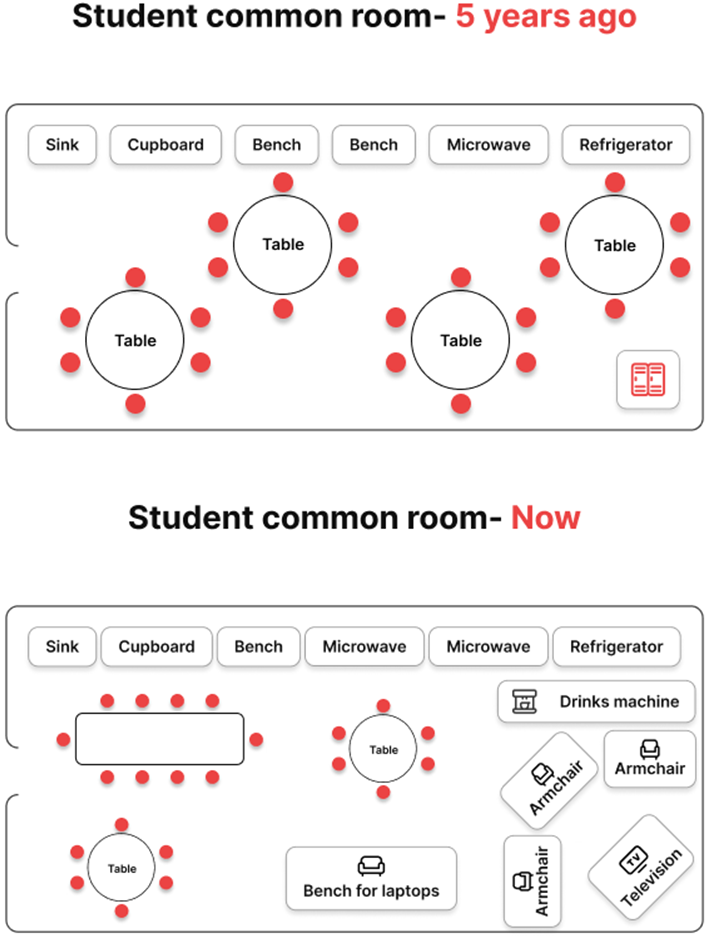
Sample 1:
The plans indicate the adjustments made to a student common room. In general, the present common room contains more benches and new amenities, such as a television and a drinks machine. Further, there has been a rearrangement of tables and chairs as well as kitchen amenities.
The common room 5 years ago compared to its current version could be said to have a much simpler design. There were four sets of identical tables and chairs in the middle of the room, and a bookshelf in one of the corners of the room. The kitchen amenities include a sink, cupboard, two benches, a microwave and refrigerator, lined up from on the left side of the room.
Today, the space next to the table on the immediate right of the entrance has been occupied by a bench used for laptops, displacing another set of tables and chairs. Meanwhile, on the left of the entrance, there is now a long table with eight chairs, in contrast to the other round tables with six chairs. Meanwhile in one corner of the room, the bookshelf has been replaced by three armchairs and a television. Finally, the kitchen facilities remain relatively untouched, except for a bench that was substituted with a microwave.
Sample 2:
The pictures compare the layout and facilities of a student common room five years ago with its current state. Overall, the room now caters to a wider variety of activities, with additional communal amenities.
Five years ago, aligning along the upper wall from left to right, the room was furnished with basic amenities including, a sink, a cupboard, two benches, a microwave, and a refrigerator, respectively. The central area was occupied by four round tables, each surrounded by six chairs, while in the lower right stood a bookshelf. Finally, the entrance was situated on the left wall.
Presently, similar to the unchanged position of the door, the sink, the cupboard and the fridge maintained their original places, yet the number of benches has been reduced to one. An extra microwave has been added, along with a drinks machine below the refrigerator. In the lower right corner, the bookshelf was eradicated, giving space for a television with three armchairs surrounding it. Two old tables were changed to a larger one with ten chairs, whereas a new bench for laptops was introduced by the centre of the lower wall.
Sample 3:
The diagram elaborates on the alterations made to a student common room over a 5-year period. Generally speaking, the room has undergone considerable transformations in terms of seating areas and room amenities with a view to providing a more comfortable experience there for students.
Five years ago, in the middle of the room were four round tables, accompanied by four chairs for students to sit around. Convenience features for students on the upper corner of the room were quite diverse at that time as from left to right respectively were a sink, a cupboard, two benches, a microwave and a refrigerator. Additionally, on the right side of the room was a cabinet.
After the renovation work, the common room’s seating capacity has been increased substantially. There are now only two round tables with the addition of a huge rectangular table for 8 people and a bench for laptops for 4 people to sit. The line of student amenities on the upper side witnesses a slight change as one bench has been replaced by a new microwave. The renewal even goes further to the extent that students now can relish a drinks machine and a television with three armchairs for them to relax, all of which are located on the right side of the room.
Sample 4:
The maps depict modifications made to the layout of an unspecified student common room. Overall, the room has been renovated extensively, seeing great re-arrangements of the tables in the centre and small changes to some of the amenities to the left-hand side of the entrance.
Five years ago, most of the room area was occupied by four sets of 7-piece round tables. However, in the present day, two of them were replaced by a 9-piece rectangular table set, with the other two remaining unchanged. The cabinet to the bottom right corner of the map was replaced by a television, with three additional armchairs placed around it. A new bench for laptops was arranged between one round table set and the television area, and that bench was placed against the wall.
Other major changes include the addition of another microwave which was placed right next to the old one, and a drinks machine adjacent to the refrigerator. The sink, the cupboard and the bench, however, remained at the same location.
Sample 5:
The maps compare the arrangement and amenities of a student common room five years ago with its current version.
Overall, the room has been refurnished for a wider variety of facilities, especially the additional amenities to the communal area.
Regarding the past layout, in the upper area, the room included basic furniture such as a sink, a cupboard, two benches, a microwave and a refrigerator, respectively. The central part was occupied by four round tables with each surrounded by small chairs, while a bookshelf was placed in the lower right corner. Finally, the entrance was located on the left side.
At present, the position of the door remains unchanged. Meanwhile the sink, the cupboard and the fridge reside in their original places, although there is currently only one bench in the upper area. Furthermore, an additional microwave was supplemented along with a drinks machine below the refrigerator. In the lower right corner, the bookshelf has been replaced with a television with three armchairs around it. Two out of the four tables were switched to a big rectangular one with ten chairs. Finally, the center of the lower wall has a new bench for laptops.
Sample 6:
The provided diagrams illustrate the layout of a student common room over a span of five years.
Overall, it is a clear significant transition from a space primarily designed for eating to a multifunctional area that facilitates entertainment and dining needs.
Initially, the design was simplistic, with several essential kitchen appliances with a pair of benches aligned on the left side of the room, which remains almost unchanged, except one bench has been altered by an additional microwave. Central to the space were four round tables, each surrounded by six chairs, however after five years, the number of tables has been reduced to three, and one of which is replaced by a rectangular one with an expanding seating capacity to eight.
When it comes to the most noticeable change, the right corner of the room has been rearranged from reading into a new leisure area for watching television with the introduction of a drinks machine which is situated in front of the refrigerator. Moreover, in the middle of the right wall, a bench for laptops has been presented.
Sample 7:
The two plans illustrate a number of changes which have taken place in a student common room between five years ago and now. Overall, the common room has been refurnished to incorporate more facilities, especially in the open communal area.
According to the plan from 5 years ago, there were a total of 4 round tables in the communal area, laid out in an alternate arrangement with each of which being surrounded by small chairs. From the entrance on the West, one could also spot, in successive order, a sink, a cupboard, 2 benches, a microwave and a refrigerator along the section to the North. Finally, a bookshelf was situated on the bottom right corner.
In the present day, the two round tables in the middle have been removed to free up the space. To compensate for this, a long rectangular table with multiple chairs has been placed near the entrance. To the South of the room, there is a new bench for students’ laptops, adjacent to a new television set with surrounding armchairs, which has taken the place of the old bookshelf. A new drinks vending machine has also been added beside the fridge. Finally, except for the one bench that was replaced by an additional microwave, the row of furniture to the North remained almost the same.
Sample 8:
The given maps illustrate different changes that have taken place in a student common room between 5 years ago and now.
Looking at the pictures, it is obviously evident that while there are certain renovations to the facilities, other equipment has been added for different purposes.
From the entrance to the West of the pictures, there were 4 round tables along with chairs erected in the communal open area of the room 5 years ago. In the North, it can easily be seen that students were provided with a sink, a cupboard and 2 benches. Next to these were a microwave and a refrigerator, so that students could preserve and reheat their meals without the need to go outside. Finally, a bookshelf was located in the bottom right corner of the room.
At present, in the center of the room, two out of four tables have been replaced with a long rectangular ten-seater table to allow more students to use the room. In adjacent to this study area, a bench for laptops has also been added. Apart from the sink, the cupboard and the refrigerator which stay the same, one of the two benches has been altered with a microwave, allowing students to have 2 microwaves for more convenience. In the recreational area to the East of the room, there is a new drinks machine. In the vicinity, 3 armchairs and a television have been situated for the purpose of relaxation.
Summarise the information by selecting and reporting the main features, and make comparisons where relevant. Write at least 150 words.
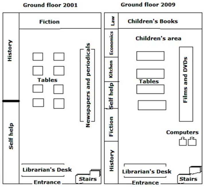
Sample 1:
The maps illustrate significant changes that occurred in the layout of a library’s ground floor between 2001 and 2009. Overall, the library underwent extensive renovations, reflecting a shift towards a more diverse collection, coupled with the inclusion of modern facilities.
In 2001, the library was organized into four main sections: Fiction at the back, History and Self Help to the left, and Newspapers & Periodicals on the right, with tables centrally located for reading and study. The librarian’s desk was situated just behind the entrance, adjacent to the stairs.
By 2009, the Fiction and History sections had been reduced in size and relocated closer to the entrance, on the left side of the librarian's desk. At the backmost part of the library, a Children’s Books area was introduced, featuring a dedicated space for children’s activities. The former History shelf is now used to accommodate Law, Economics and Kitchen books. Notably, the Newspapers & Periodicals section was completely removed and replaced with a Films & DVDs section, situated next to a newly added computer area. Throughout these changes, the original eight tables had been replaced by four longer ones.
Sample 2:
The diagrams show alterations made to the ground level of the library from 2001 to 2009.
In summary, while areas for displaying three original categories of books remained, they were relocated eight years later to accommodate various other types of books. This floor was also updated with interactive media and computer facilities.
Regarding changes in the southern section, upon entering the ground floor in 2001, readers encountered a librarian’s desk directly in front of them, with stairs on the right. Eight years later, redevelopment plans indicate no changes to these features. However, the area for self-help books on the left was moved northward and significantly reduced in size, making room for two cubicles dedicated to history and fiction books.
Regarding redevelopment in the northern part of the library, in the northwest section, previously designated for history books, visitors now had access to books in four categories: law, economics, cooking, and self-help, arranged from north to south. Another noticeable change was the transformation of the area originally for fiction books at the back of the ground floor into a section for children’s books by 2009. The central area also underwent significant changes, with eight square tables being replaced by four longer rectangular tables, and the area for newspapers and magazines converted into a space for movies and DVDs. South of this area were computers, and the open space behind the tables was turned into a children’s area.
Sample 3:
The maps illustrate the plan/layout of a ground floor of a library in 2001 and the changes introduced in it over the next eight years.
Overall, it can be seen that the library underwent four main changes. The principal change was the addition of new sections and their modernization by addition of IT facilities.
In 2001, the entrance of the library was on the south side, with the librarian's desk next to it and stairs to the upper floors to its right. The library had three sections in 2001, self-help and history along with the western wall and the fiction section along the northern wall. Besides these three sections, newspapers and periodicals were present in the east and a few square-shaped tables were there in the centre.
By 2008, the main change that was made was that the newspapers and periodicals were replaced by films and DVDs and a few computers were installed next to them. Another major change was the addition of three more sections, kitchen, economics, law along the western wall. The fiction section was also relocated along the western wall and a children's books section was made in its place. Finally, larger rectangular tables had been placed instead of the squared shaped ones and the area between the tables and children's section was demarcated as a children’s area.
Sample 4:
The map illustrates the development of the library's ground floor in 2001 and 2009.
Overall, albeit intact in size, more sections were built in the latter plan. In addition, the appearance of technology was seen in the library after 8 years.
In 2001, passing through the entrance in the south, the librarian's desk was spotted. In the southeast corner, library users could use the stairs to access more facilities. Eight square tables were provided to learners in the centre. They were surrounded by book sections including self- help, history, fiction and newspaper and periodicals.
After 8 years, the entrance, librarian's desk and stairs' locations remained unchanged. In the middle, the small tables were replaced by four long rectangular ones, which may facilitate group discussions. The west side, which used to accommodate only two book genres, was divided into six zones containing history, fiction, self-help, kitchen, economics and laws from south to north respectively. A new sort called children's books was added, next to the children's area on the northern side. The newspaper and periodicals area was removed, giving way to films and DVDs. The most significant addition to the layout in 2009 was two computers, situated between the Films and DVDs section and the stairs.
Sample 5:
The maps give information about various alterations which occured in the arrangement of a library’s ground floor between 2001 and 2009.
Overall, the library underwent vast renovations, emphasizing a shift towards a more diverse assortment, along with the addition of modern amenities.
In 2001, the books collection was categorized into four main sections: Newspapers & Periodicals to the right, History and Self Help on the opposite side, Fiction in the north of the room with tables centrally situated for reading and study purposes. Additionally, the librarian’s desk was placed in front of the entrance, right next to the stairs.
Eight years later, the Fiction and History sections had been shrinked and repositioned closer to the entrance, adjacent to the librarian's desk. Furthermore, a dedicated area for kids was introduced at the backmost part of the library, featuring books and playground for children. The former slot for history category was utilized to accommodate Kitchen, Economics and Law contents. Remarkably, the new layout completely removed the Newspaper and periodicals section to replace it with a Films & DVDs section, with a newly added computer area on its left side. Finally, there were four long tables instead of eight small ones like in the past.
Sample 6:
The provided maps depict the floor plan of a library in 2001, and the subsequent alterations made over the following eight years.
Overall, changes primarily focus on the introduction of new sections, encompassing kitchen, economics and law, and the integration of IT facilities, indicating a modernization of the library.
In 2001, the library entrance was situated on the south side, accompanied by the librarian’s desk, with stairs leading to upper floors adjacent to it. The library was divided into three sections: self-help and history along the western wall, fiction along the northern wall, and newspapers and periodicals located in the east. Additionally, square-shaped tables occupied the central area.
By 2009, notable transformations had taken place. The newspapers and periodicals section had been replaced with films and DVDs, complemented by the installation of several computers nearby. Furthermore, three new sections - kitchen, economics, and law - were incorporated along the western wall. The fiction section underwent relocation to the same western wall, while a designated children’s books section emerged in its former place. The arrangement of tables was also revised, with larger rectangular tables replacing the previous square-shaped ones. Moreover, an area delineated as the children’s area was established between the tables and the newly designated children’s section.
Sample 7:
The maps illustrate changes that were made to the ground floor of the library between the years 2001 and 2009.
Overall, even though areas for displaying three original categories of books were still retained, these underwent relocation eight years later, making room for the incorporation of various other types of books. This ground floor was also modernized with the introduction of interactive forms of media as well as computer facilities.
Regarding changes in the southern section, upon entering the ground floor in 2001, readers had access to a librarian’s desk directly facing them, and stairs on their right-hand side. Eight years later, redevelopment plans show that no changes were made to these facilities, whereas the area for displaying self-help books to the left was relocated northwards and reduced significantly in terms of size, making way for two cubicles dedicated to showing history and fiction books.
In terms of redevelopments taking place in the northern half of the library, in the northwest area, where there was once a section for the display of books specializing in history, visitors were better catered for as they benefited from being able to read books of four various types, which were law, economics, kitchen and self-help, stretching from north to south. Another noticeable change is that there used to be an area designated for fiction books at the rear of the ground floor, but it had been transformed into that for books read by children by 2009. The central part also saw major alterations, with eight square tables being replaced by four longer and rectangular tables, and a section for newspapers and periodicals being converted into that for films and DVDs, to the south of which were computers. Finally, the open space behind the tables was turned into a children’s area.
Sample 8:
The two maps illustrate how the ground floor of a library had developed between 2001 and 2009. Overall, it can be seen that while the floor's overall size had not changed, it could provide a wider selection of materials for visitors.
In 2001, four categories of texts were located on the ground floor, namely the self-help section to the southwest, the history section to the northwest, the fiction section to the north, and newspapers and magazines to the east, across from the history shelf. Meanwhile, there were eight tables around the center of the floor to provide seating for readers. To the south of the floor was the entrance and the librarian's desk. A stairway was in the southeast, providing access to the first floor.
By 2009, while the entrance, librarian's desk and staircase had experienced no change, virtually every other space had been altered. The self-help, fiction and history shelves had been scaled down and lined up along the east side together with three new selections of kitchen, economics and law texts. Four long tables had replaced the eight tables in the center of the 2001's floor plan, and a new set of tables had occupied the space where the fiction section used to be. To the east, the newspapers and periodicals section had been repurposed into a space reserved for films and DVDs. Next to that section were a few computers for visitors to access electronic reading materials.
Sample 9:
The image illustrates the layout of a library in 2001 and its alterations in 2009. Overall, the most significant changes were the diversification of materials and the introduction of digital facilities.
Regarding 2001, eight small tables were placed in the center of the library. Self help and history materials were on the left, while fiction was on the top of the sketch. The area containing newspapers and periodicals was positioned in the far right. Furthermore, accessibility to the library was by an entrance in the centre bottom and the librarian's desk was the first thing encountered upon entering the library. The stairs were located in the bottom right corner.
As of 2009, the existing tables were replaced by four new longer ones. Children' books were introduced along the top wall, replacing fiction, which was relocated to the left- hand shelves. Moreover, additional subjects were added to this section including kitchen, economics and law. The space between children's books and the tables was dedicated for minors. However, newspapers and periodicals were no longer provided, freeing up the right side for films and DVDs, along with new computers to the bottom of the area. Finally, the entrance, the librarian's desk and the stairs underwent no modifications.
The chart below shows the amount of money given to developing countries from five organizations from 2008 to 2011.
Summarise the information by selecting and reporting the main features, and make comparisons where relevant. Write at least 150 words.
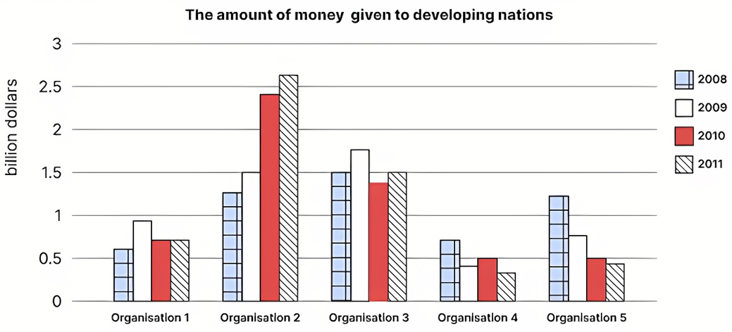
Sample 1:
The bar graph compares how much money was provided by five different organisations to developing countries between 2008 and 2011. Overall, the financial allocations from organisation 2 witnessed the most significant increase while those from organisations 4 and 5 took the opposite direction. Among these, organisation 3 remained the most significant contributor during the first 2 years while this position belonged to organisation 2 in the latter half of the period.
At the start of the period, the largest funding came from organisation 3, amounting to 1.5 billion dollars. This was followed by organisation 2 and 5, with each providing an allocation of around 1.25 billion dollars. The fourth and fifth place went to organisation 4 and organisation 1, with respective figures being approximately 0.7 and 0.6 billion dollars.
Thereafter, the amount of money provided by organisation 2 registered a sharp growth to an unprecedented 2.6 billion dollars, establishing it as the organisation with the largest investment. In contrast, the trend for organisation 5 and 4 was downward, decreasing to 0.4 and 0.3 billion dollars respectively in 2011. Finally, the figure for organisation 3 and 1 witnessed fluctuations, hovering around 1.5 and 0.7 billion dollars in turn.
Sample 2:
The bar graph delineates the financial contributions made by five distinct organizations to developing nations from 2008 to 2011.
Overall, among these entities, organization 3 maintained its status as the most significant contributor during the initial two years, but organization 2 assumed this position during the latter part of the period. The funding provided by organization 2 experienced a surge, while organizations 4 and 5 witnessed a contrasting decline.
At the onset, organization 3 allocated the most substantial financial support, amounting to $1.5 billion. Following closely were organizations 2 and 5, each contributing approximately $1.25 billion. Organization 4 and organization 1 secured the fourth and fifth positions, disbursing around $0.7 and $0.6 billion, respectively.
Subsequently, Organization 2 exhibited an exponential rise in its financial provisions, skyrocketing to an unprecedented $2.6 billion, positioning it as the foremost contributor. Conversely, the financial contributions of organizations 5 and 4 followed a downward trajectory, dwindling to $0.4 and $0.3 billion, respectively, by 2011. Meanwhile, the figures for organizations 3 and 1 fluctuated, oscillating around $1.5 and $0.7 billion, respectively.
Sample 3:
The bar graph details the financial aid from five various organisations to emerging nations between 2008 and 2011. Overall, the sum of monetary resources provided by Organisations 1 and 2 increased whereas
Organisations 4 and 5 saw a downward trend and Organisation 3 remained stable despite some minor fluctuation.
Concerning the categories that rose, in 2008, the amount of funding donated by Organisation 2 was nearly double Organisation 1, at roughly $1.3 $billion, and about $0.6 billion, respectively. While Organisation 2 increased most significantly and consistently to the overall highest point of just over $2.5 billion in the end, Organisation 1 saw a slight rise to approximately $0.9 billion in 2009, followed by a drop of around $0.2 billion a year later and remained the same until the final year.
Moving to the other categories, the donations of Organisation 5 dropped constantly from roughly $1.2 billion to slightly under $0.5 billion between 2008 and 2011. Moreover, Organisation 4 contributed the least, at around $0.7 billion in 2008, dipping to about 0.3 billion in 2009 before falling further to nearly $0.2 billion in 2011. Finally, starting at the highest result of $1.5 billion at the beginning, the amount of Organisation 3 fluctuated at this level until the end, and was surpassed by Organisation 2.
The chart below shows the percentage of a drug company’s total sales, by region, from 2002 to 2006.
Summarise the information by selecting and reporting the main features, and make comparisons where relevant. Write at least 150 words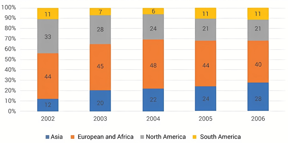
Sample 1:
The given bar graph illustrates the share of a drug company’s sales in four regions in five consecutive years starting in 2002. Overall, the figures for Europe and Africa combined and North America decreased, whereas that of Asia increased significantly and South America stayed relatively unchanged despite some fluctuations. Furthermore, the proportion of revenue in Europe and Africa consistently registered the highest statistics throughout the period.
Regarding European and African along with Asian figures, the former started at 44% then grew slightly by 4% to a peak of about a half in 2004 before declining to a low of 40% at the end of the period. By contrast, the statistics in Asia experienced a rapid growth of 16% from a low point of 12% initially to a high of 28% in 2006.
Concerning sales in the two other areas, North America accounted for approximately a third of total sales in 2002 but subsequently plunged to 21% in 2005, and then remained unchanged to end the surveyed period at 2nd place. Conversely, only 11% of aggregate revenue came from South America in 2002, and then this almost halved to a minor 6% in 2004 before recovering to the starting figure in 2006.
Sample 2:
The provided chart depicts the distribution of a pharmaceutical company’s sales across different regions from 2002 to 2006.
Overall, sales proportion in Asia witnessed a consistent upward trend, managing to surpass that of both Europe and America by 2005. The figure for Europe experienced slight fluctuations, while that of America showed a declining trend.
In 2002, America led the sales with 41%, closely followed by Europe at 34% and Asia at 25%. However, by 2003, Asia’s share increased to 30%, narrowing the gap with the figure for both Europe and America at 35%. The following year, Asia’s sales continued to rise, reaching 35%, surpassing that of Europe at 38%, while America’s share decreased to 27%.
By 2005, Asia further strengthened its position with 37% of the company’s total sales, while Europe and America maintained their percentages at 34% and 29%, respectively. Finally, in 2006, Asia emerged as the leading market with 40% of total sales, while Europe and America both experienced declines, with both regions at 30%.
The graph below shows the percentage of self-employed workers of the total workforce in five countries in 1998 and 2008.
Summarise the information by selecting and reporting the main features, and make comparisons where relevant. Write at least 150 words.
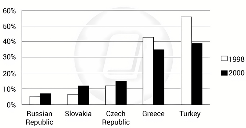
Sample 1:
The given column graph illustrates the percentage of workers who were doing their own work, out of all employed people in five countries, in 1998 and 2008. It is manifest from the graph that the Turks and Greeks were more interested in entrepreneurship than the Russians, Slovakians and the Czechs.
The percentage of self-employed people from the Russian Republic, Slovakia and the Czech Republic was 5%, 7% and 11% respectively, in 1998. However, in just a decade the percentage rose in all three countries and reached 7%, 12% and 14% respectively, by 2008. The people of Greece and Turkey doing own business were 43% and 56% respectively but decreased to 35% and 39% respectively by 2008.
Overall, it is interesting to see that although the percentage of entrepreneurs in the Russian Republic, Slovakia and the Czech Republic were much lesser than those in Greece and Turkey, their interest in doing their own work grew with time. Whereas the people of Greece and Turkey were much more who were running their own business, but their interest in doing their own work dwindled with time.
Sample 2:
The bar chart gives information about the rate of self-employment in the working demographics of five distinct nations in two different years, 1998 and 2008.
Overall, Greece and Turkey boasted the largest self-employed population, far exceeding other countries. It is also noticeable that over the course of a decade, there was positive growth in the segment of people working for themselves in Russia, Slovakia, and the Czech Republic while Greece and Turkey witnessed considerable decreases in their numbers.
Russia, Slovakia, and the Czech Republic were the countries with the lowest levels of self-employment across the chart, with 3%, 5%, and 11% of the workforce working for themselves in 1998. 10 years later, both Russia and the Czech Republic experienced rather minimal increases in their numbers, growing to 5% and 14% respectively. Witnessing a similar trend, albeit at a more pronounced rate, Slovakia saw its self-employed workforce doubling to 12%.
At the beginning of the timescale, over half of the Turkey's working populace was self-employed, 10% higher than that of Greece. However, the level of self-employed workforce in Turkey plummeted by 16% within the next 10 years, marking the most significant change in the chart. A similar pattern was observed in Greece, whose percentage had dwindled to 35% by 2008. It is also worth noting that despite these variations, the pecking order remained the same, with Turkey leading, followed by Greece while the Czech Republic, Slovakia, and Russia lagged behind.
Sample 3:
The bar chart compares five nations in terms of the proportion of people working for themselves in 2 different years, 1998 and 2008.
Overall, both Greece and Turkey witnessed a downward trend over the examined period, while the opposite was true for the 3 remaining countries. Additionally, Turkey recorded the highest figures for self- employment in both years.
Starting with approximately 55 percent at the start of the period, the proportion of workers being self-employed in Turkey dropped considerably to about 38 percent in 2008. In second place on the chart was Greece, with the figures standing at 43 percent in 1998 and 35 percent 10 years later.
Regarding Czech Republic, around 12 percent of the labor workforce was self-employed, followed by a rise of 3 percent to 15 percent in 2008. In a similar way, that of Slovakia experienced a minor rise, from 6 to 12 percent over the 10-year period. 5 was the percentage of self-employment in Russian Republic, which later jumped to about 7% at the end of the period, making it rank last among the 5 nations.
Sample 4:
The bar chart illustrates the percentages of self-employed people in five different countries in 1998 and 2008.
Overall, while the percentage of self-employed people in Russia, Slovakia and the Czech Republic increased over the ten-year period, the figures for Greece and Turkey declined. Furthermore, the percentage of self-employed people in Turkey was highest in both years.
In 1998, the percentage of self-employed people in Russia accounted for 5% of the total labour force, increasing by around 2% by 2008. The Czech Republic saw a similar increase of around 3%, rising from 11% to 14%. Meanwhile, Slovakia’s self-employment figures doubled over the ten-year period from around 6% to 12%.
The percentage of self-employed people in Greece in 1998 was 42%, however it had dropped by around 5% by 2008. Additionally, Turkey had the largest percentage of self-employed people at around 56% of the workforce. However, this figure did decline significantly over the period to around 38% in 2008.
Summarise the information by selecting and reporting the main features, and make comparisons where relevant. Write at least 150 words.
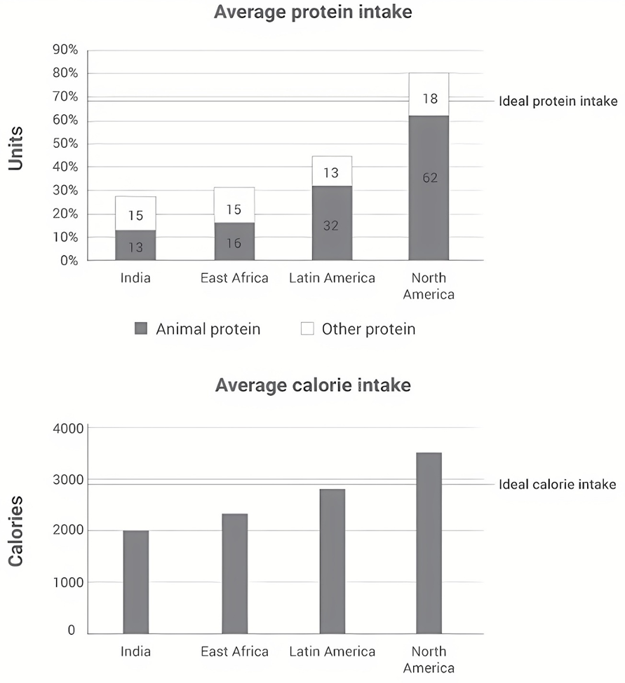
Sample 1:
The given bar graphs illustrate the amount of protein and calories consumed by an average person in 4 regions. Overall, North America registers the highest figures, followed by Latin America, East Africa and lastly India in both charts. In addition, only the consumption statistics in North America exceed the recommended levels, and animals are the main source of protein in most regions.
Regarding average protein intake, the total in North America stands at 80 units, surpassing the advised figure of around 67 units. Out of the total, animal protein accounts for a major 62 units. In comparison, the overall figure in Latin America is significantly lower, at 45 units, of which 32 is from animals. In East Africa and India, other protein sources register 15 units in both areas, while the statistics for animal sources are16 and 13 units respectively.
Concerning the intake of calories, North Americans account for the greatest figure of around 3400 on average, which is about 500 higher than the recommendation. Latin American people, however, consume less than the ideal amount, at approximately 2800 calories. The figures in East Africa and India were even lower, standing at about 2200 and 2000 consecutively.
Sample 2:
The bar charts illustrate the protein and calorie consumption of people in India, East Africa, Latin America, and North America.
Overall, North Americans not only consume more protein and calories than any other region in the chart`but are also the only people whose consumption exceeds the ideal protein and calorie intake levels (nearly 70 units and 3000 calories). This is in stark contrast to India, where the consumption of both protein and calories is the lowest.
In terms of protein intake, North Americans consume an average of 80 units, distantly followed by Latin Americans, who consume approximately 45 units. Notably, the majority of the protein consumed in both regions comes from animals, at 62 and 32 units, respectively. Meanwhile, there is a negligible difference in the protein intake between East Africa and India, both at roughly 30 units, with approximately half of these derived from other unspecified sources.
Regarding caloric intake, North American people again top the list, at 3500 units. In contrast, the figures for Latin America, East Africa, and India are lower, standing at close to 3000, just over 2500, and 2000 calories, in that order.
Sample 3:
The bar charts compare the consumption of protein and calories by individuals from four particular regions around the world.
In both charts, North America has the largest overall numbers, followed distantly by Latin America, East Africa and India. It is also clear that people from North America consume more protein and calories than they are expected to with animal protein being preferred over other protein while the remaining regions do not exceed the recommended intake of these nutrients.
Regarding average protein intake, residents in North America get around 62 units of protein from animals and 18 units of other protein, surpassing the ideal levels of protein consumption. This figure is followed by Latin America with animal protein accounting for 32 units, almost 2 times as many units as other protein. Individuals from East Africa and India consume roughly similar amounts of protein, at around 30 units, with the exception of Indians who ingest more non-meat protein.
Concerning the calorie intake, North America is still the only continent that consumes more than required, at 3500. With 2800 calories ingested compared to 3000, Latin America nearly meets the necessary daily intake of calories. East Africa and India have far lower figures, with about 2400 and 2000 calories, respectively.
Sample 4:
The given bar charts offer a detailed comparison of protein and calorie consumption among individuals in four different regions around the world.
Overall, it is evident that North America and Latin America show higher levels of both protein and calorie intakes, whereas those figures are considerably lower in East Africa and India. Another noteworthy observation is that North America is the only territory exceeding the recommended amount for both categories.
Turning to the details, North America has the highest protein intake, with an average of approximately 80 grams. Latin America follows closely with 45 grams of protein, comprising one-third from animal sources and the remaining from alternative origins. Meanwhile, individuals in East Africa and India consume a similar amount of protein (roughly 30%), with half derived from animals and the other half from other sources.
Regarding the average calorie consumption, North America records the highest intake among four areas, averaging at 3500 calories. Latin America and East Africa have slightly lower figures, around 2700 and 2400 calories respectively. On the contrary, Indians take in an average of 2000 calories, which is the lowest among the four regions.
Sample 5:
The bar chart illustrates a comparison of the average protein and calorie consumption among populations in four distinct regions worldwide.
It is apparent that North American individuals not only consume the highest quantities of protein and calories but also exceed the recommended intake levels.
In terms of protein consumption, citizens in India and East Africa consume approximately 30g of protein each, with nearly equal divisions between two protein sources: animal products and others. In stark contrast, North America leads with an average protein intake of 80g, surpassing the ideal quantity by over 10g and nearly doubling the intake of Latin American individuals, who consume around 45g. Interestingly, the majority, approximately three-quarters, of protein intake in both North America and Latin America is derived from animal sources.
Regarding calorie absorption, the recommended level stands at 3000g, a threshold exceeded by North American consumers by 500g. Latin American people have their calorie intake very close to the ideal level, at roughly 2750g. Conversely, individuals in India and East Africa exhibit notably lower figures, at about 2000g and 2350g on average.
Sample 6:
The two bar charts provide a breakdown of consumption of protein and calories by people from four regions of the world. Generally, the inhabitants of North America have the highest intake of both, and this is also the only region where overconsumption of protein and calories occurs.
The average protein intake of North Americans is 80 units, exceeding the ideal value by 10. There are 62 units of protein derived from animals, while the remaining amount originates from other sources. Latin Americans report the second highest consumption, with 45 units, nearly three-quarters of which is from animals. The figures for East Africans and Indians are 31 and 28 units, respectively. Notably, India is the only region where the share of non-animal protein consumed is over 50%, with 15 units.
With regard to calorie intake, people from North America record a figure of 3500 calories, which is 600 above the recommended value. This is followed by the data of Latin America, where inhabitants' average intake hovers around 2800 calories, 100 short of the ideal threshold. About 2300 and 2000 calories are consumed by East Africans and Indians, correspondingly. Indians display the lowest figure out of all regions, at approximately two-thirds of the recommended consumption.
Sample 7:
The bar charts display the average intake of protein and calories in India, East Africa, Latin America and North America. It is clear that North America people had a much higher value of the average intake of protein or calories than the other countries.
In terms of the average intake of protein, North America had the highest rate of 80%, which includes the maximum percentage protein (62%) that derived from the fats and meats of animals, and other protein (18%). Latin America was the second (45%), which contains animal protein (32%) and other protein (13%). Then, East Africa was listed the third (31%), which involves animal protein (16%) and other protein (15%). finally, India had the minimum proportion of the account of the average intake of calories (28%), which embody animal protein (13%) and other protein (15%).
For the average intake of calories, much more calories intake by North America individuals than the people of Latin American, East Africa and India, the figure was 3500, which was followed by Latin America (2750), East Africa (2250), and India (2000).
Sample 8:
The graphs illustrate how much protein and energy are taken in by people in four different areas of the world, namely India, East Africa, Latin America, and North America.
Overall, animal sources fulfill the majority of the protein needs in all regions except India. In addition, North Americans, with the most protein-rich and high-calorie diets among the groups, are the only population to exceed ideal levels of protein and calories.
Regarding dietary protein, the ideal amount is 68. In North America, 62 out of a total of 80 protein units come from animals, which is almost double the corresponding figure for Latin America, with 32 units derived from animal sources, and other proteins coming to 13 units. Meanwhile, East Africa and India have similar animal protein intakes, at 16 and 13 units respectively, and both places have the exact same consumption of vegan protein, at 15 units each.
In terms of gross energy intake, people from India consume the lowest amount, at 2000 calories, nearly 1000 short of the ideal level, and 300 less than their East African counterparts. The caloric intake of the typical Latin American is the second highest, at approximately 2800 calories, compared to North America’s figure of 3500, which exceeds the recommended quota by over 500.
Sample 9:
The charts illustrate the amount of protein and calories consumed by the average person from four regions around the world.
It is immediately clear that among the people of four areas, North American residents consume the highest amount of protein and calories, while the opposite was true for people from India. Additionally, the former is also the only demographic whose intake is higher than the ideal for both protein and calories.
In terms of protein consumption, the ideal intake stands at about 68 grams. With an average consumption of 62 grams of animal protein and 18 grams of other protein combined, North American people are the only group to exceed the aforementioned threshold. This is followed distantly by the figure for Latin America, whose residents consume 32 grams of animal protein and 13 grams of other proteins on average. People from India and East Africa take in far below the ideal amount of protein, with both groups consuming, on average, 15 grams of other protein and 13 grams and 16 grams of protein, respectively.
Regarding calorie intake, the ideal average amount is 3000 calories. Similarly, North Americans are the only group to consume more than the recommended amount at 3500 calories on average, whereas the figure for Latin America stood at 2800, slightly short of the recommended amount. The average calorie consumption of India and East Africa once again fall far lower than the standard amount at 2000 calories and 2300 calories respectively.
Sample 10:
The bar charts give information about protein and calorie consumption in India, East Africa, Latin America and North America.
Overall, people in all of the countries examined generally did not consume the amounts of protein and calorie considered to be ideal, with North Americans consuming more than both amounts recommended, and an exception being recorded among Latin Americans, who consumed nearly the suggested calorie intake.
In terms of average protein intake, it was advisable that the average amount of protein eaten was a little under 70 units, and North America was the only country that exceeded that amount suggested, with 80 units of protein being consumed in this country. Although people in Latin America ate less protein in comparison to the ideal protein intake, averaging at 45 units, somewhat similar patterns can be observed between Latin America and North America, with the number of other kinds of protein being three times as high as that of animal protein, at 32 and 62 units for the former type, and 13 and 18 units for the latter one. Meanwhile, the consumption levels of protein in India and East Africa were relatively the same, hovering around 30 units and notably, their intake of animal protein and other types of protein were balanced, with each accounting for 15 units.
With regard to average calorie intake, the number of calories one was advised to consume was a little under 3000 calories, and again North Americans did not adhere to this as their dietary choices were high in calories (3500 calories) when compared to the ideal calorie intake. By comparison, the calorie-consuming number among Latin Americans was just minimally lower compared to the level of consumption suggested, whereas far fewer calories were eaten by people from East Africa and India (2200 as opposed to 2000 units).
Sample 11:
The charts illustrate the amount of protein and calories consumed by citizens from India, East Africa, Latin America, and North America. Overall, it can be seen that North America had the highest protein and calorie intakes while the lowest place belonged to India.
In terms of protein consumption, North America consumed 80 units, which was 11 units higher than the ideal intake level, with 62 units sourced from animal protein. In contrast, Latin America’s protein intake was nearly half of North America’s, totaling 45 units, of which 70% were from animal sources. Meanwhile, India recorded the lowest protein intake at 28 units, with animal protein accounting for only 13 units, and other proteins contributing 15 units. East Africa’s protein consumption totaled 31 units, evenly distributed between animal and other protein sources.
Regarding calorie intake, North America led with approximately 3500 calories, exceeding the ideal figure by 600 calories. Latin America followed with 2900 calories, 100 calories below the ideal intake. East Africa consumed 2200 calories, while India had the lowest average intake of 2000 calories, which was 900 calories below the ideal amount.
Sample 12:
Detailed in the shown bar charts is a comparison of average protein and calorie intake in four distinct regions of the world.
Overall, the average absorption rate of animal protein is relatively higher than that of other protein in almost all regions bar India. While the figure for average protein and calorie intake amongst citizens in North America surpasses the recommended levels, that in the remaining regions is recorded with a subpar performance.
North America leads in per capita protein consumption, with animal protein being a far more preferable source than other protein among consumers. More specifically, the consumption rate of animal-based protein (62 units) triples that of other proteins (18 units), and the sum of both is 10 units higher than the recommended protein serving size. Similarly, significantly more units (nearly 20 units) of animal protein are consumed by Latin Americans than those of other protein. In stark contrast, the lowest per capita consumption of animal-based protein and other types of protein can be found in India (15 units) and Latin America (13 units) respectively. The ratio of protein intake from animals to other sources among Indians and East Africans is relatively one to one (both at 15 units). Regarding daily caloric intake, Indians consume far fewer calories each day than is recommended – a mere 2,000, while North Americans consume most calories – in excess of 3,500 calories per diem. Seemingly, the figure for daily calorific consumption among Latin Americans and East Africans is closest to North Americans, standing in the vicinity of 3,000 and around 2,500 calories respectively.
Sample 13:
The given bar charts compare four different regions in terms of their protein and calories intake on average.
Overall, of all countries, citizens in North America consumed the largest amount of protein and calories on average, and it was also the only country that achieved an ideal meal intake for these two essential nutrients. What also stands out from the charts is that protein from animals accounts for a larger share than that from other sources in almost all countries surveyed with the exception of India.
As far as protein intake is considered, in North America, around 62 units of protein is from animals, almost triple that from other sources, the total of which exceeds the ideal amount, at nearly 70 units. This was followed by Latin America as the total amount of protein consumed stood at 45 units, with animal-based protein making up a third of the total. The average intake of Indian and East African citizens was relatively similar, ranging from 28 to 31 units. The ratio of protein from animals to others was almost one to one in these 2 countries.
Regarding calories intake, North America recorded the highest number of calories consumed, at nearly 3500 units, surpassing the ideal amount by nearly 500 units. The total intake of an average person in Latin America almost reaches the ideal level, standing at nearly 3000. The figures for East Africa and India were significantly lower, at 2300 and 2000 respectively.The table shows the number of employees and factories producing silk in England and Wales between 1851 and 1901.
Summarise the information by selecting and reporting the main features, and make comparisons where relevant. Write at least 150 words.
The table describes the number of employees and factories in England and Wales between 1851 and 1901. | ||||
Year | Male | Female | Total employees | Factories |
1851 | 53,964 | 76,786 | 130,750 | 272 |
1861 | 41,936 | 67,933 | 109,869 | 761 |
1871 | 38,102 | 53,310 | 91,412 | 693 |
1881 | 25,766 | 32,138 | 57,904 | 702 |
1891 | 18,689 | 30,336 | 49,025 | 663 |
1901 | 13,375 | 25,567 | 38,942 | 623 |
Sample 1:
The table provides information about the workforce in silk production in two countries, England and Wales, over a period of 50 years starting from 1851.
It is clear that the total number of silk workers in the two countries declined over the period shown, and that significantly more women were employed than men in this industry. Also, the number of silk manufacturing factories increased over the 50-year period, despite fluctuations.
In 1851, the silk workforce was largest with 130,750 people, including 76,786 females and nearly 54,000 males. In contrast, there was the lowest number of silk factories, with only 272 factories, in 1851. However, ten years later, the number of silk manufacturers reached 761, nearly triple that of the first year while the total number of employees experienced a significant fall of over 20,000 people.
Over the following 41 years, the total number of female and male workers decreased gradually throughout the period, to 25,567 and 13,375 respectively, which contributed to the drop in the total number of employees at 38,942 in 1901. Meanwhile, there was a slight decrease in the figure for factories, which was down to 623 by the end of the period.
Sample 2:
The diagram below illustrates how many silk factories there were in England and Wales from 1851 to 1901 and how many people worked in those factories over the same period.
Overall, while there was an upward trend in the number of silk mills over the given period, a reverse trend was observed in the total number of employees. It is also noticeable that there were considerably more females than males employed in this industry.
Looking into the statistics, in 1851, there were 130750 people working in 272 factories producing silk. Ten years later, the figure for factory workers suffered a significant decline of more than 20000 individuals, whereas the number of silk-manufacturing plants peaked at 761, almost triple that of the first year. From 1861 to 1901, while the figure for employees continued to drop until it hit a low of just under 39000 at the end of the period, the number of factories fluctuated in the first two decades before slightly decreasing to 623 in the last year.
With regard to male and female workers, in the first year, there were nearly 54000 men and over 76000 women working in silk mills. Over the next 50 years, a steady fall was witnessed in the figures for both male and female staff members. In the final year, these figures hit a low of over 13000 and above 25000 respectively. It is also worth noting that throughout the period shown, the number of female workers was invariably higher than that of male workers by at least 5000 people.
The charts below show the proportion of holidaymakers using four different types of accommodation in three different years.
Summarise the information by selecting and reporting the main features, and make comparisons where relevant. Write at least 150 words.
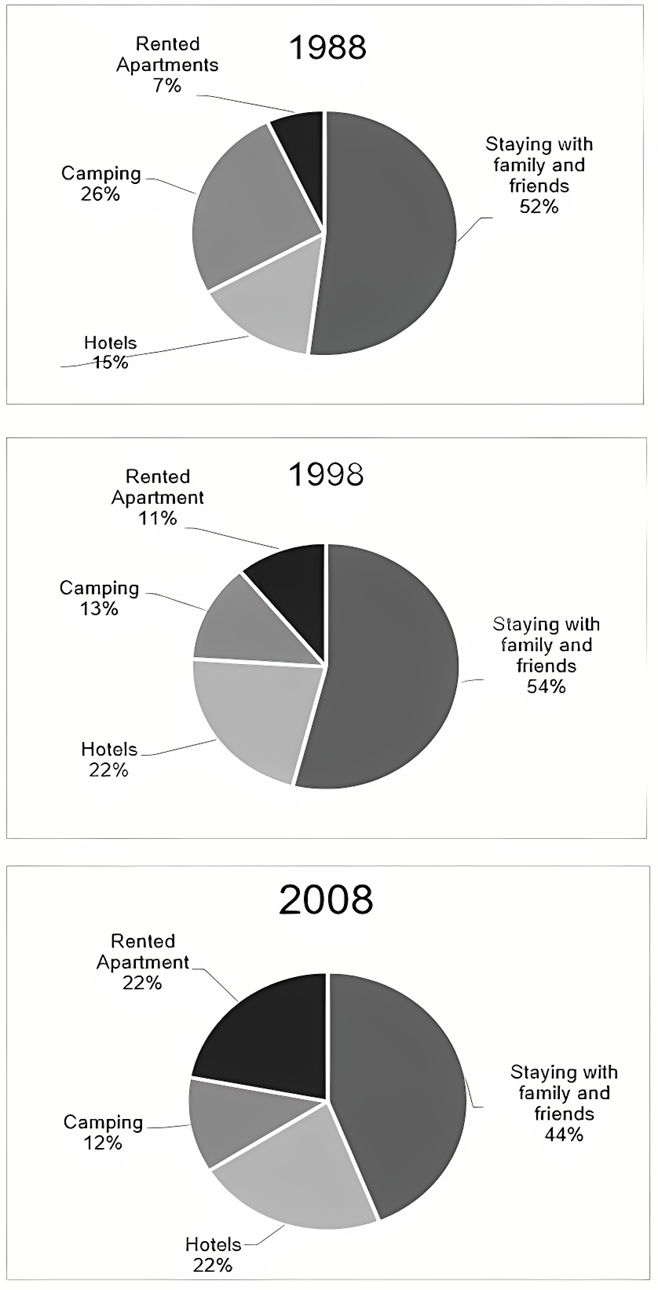
Sample 1:
The pie charts compare the choices of accommodation when people took holidays in three separate years – 1988, 1998 and 2008.
Overall, although a large percentage of travelers still preferred to stay with people they know, the choice of renting an apartment had attracted more holidaymakers over the two decades.
In 1988, more than half (52%) of travelers chose to stay at their friends’ or family’s place, which was twice as many as the proportion of those who decided to camp outside, at 26%. The third preferable choice of accommodation turned out to be hotels which held 15% of tourists in this year. Only a small proportion (7%) of holiday makers tended to rent an apartment.
10 years later, staying with acquaintances remained as the main choice, whereas hotels and rented apartments attracted a higher proportion of travelers than in 1988, at 22% and 11% respectively. The percentage of campers had reduced by half.
This situation had obviously changed in 2008, when 22% of tourists accommodated themselves in a rented apartment, twice as many as the proportion of this group in 1998, while 44% lived with family members and friends, 10% lower than in 1998. Hotels and camping sites did not see any increase in their market share.
Sample 2:
The pie charts compare the proportion of holidaymakers who stayed with family and friends, who stayed at hotels, who stayed at rented apartments and who camped between 1988 and 2008.
Overall, it can be seen that the proportion of holidaymakers who stayed with family and friends was significantly more than those who preferred the other three types of accommodation. Moreover, the figures for those staying with family and friends and those doing camping fell, while the proportion choosing hotels and rented apartments increased.
In 1988, just over half of holidaymakers stayed with friends and family while the proportion camping out was nearly half of that. With time, both these numbers fell and in 2008, 44% stayed with family and friends and only 12% preferred to camp out on holidays.
By contrast, the percentage of holidaymakers renting places during holidays and boarding at hotels rose with time. In 1988, only 7% stayed in rented apartments, while the proportion of staying at hotels accounted for 15% of the holidaymakers. In 2008, the figure stood at 22% for both rented apartments and hotels.
Sample 3:
The pie charts illustrate four common types of accommodation that people chose when on holiday in 1988, 1998, and 2008.
Overall, the most popular choice of accommodation when on holiday was to stay with family, despite a downward trend over the twenty-year period. In contrast, while renting apartments and staying in hotels became more popular over the years, camping became less popular.
In 1988, 52% of people on holiday chose to stay with family. This figure rose to 54% ten years later; however, it dropped to 44% by 2008. Approximately a quarter of all holiday-makers chose to camp when on holiday in 1988, but this became less and less popular reaching 12% by 2008.
Staying in hotels and renting apartments were the least popular accommodation choices among holiday-makers in 1988, at 15% and 7% respectively. These figures gradually increased over the following twenty years, both reaching 22% by 2008.
Sample 4:
The pie charts compare the distribution of travelers using four different types of accommodation from 1988 to 2008, in ten-year intervals. Generally, while there was a dip in popularity, staying with family was the most common choice of accommodation. Both renting apartments and staying in hotels saw an increase throughout the period, while camping and staying with family saw a downward trend.
In 1988, 58% of holiday-goers stayed with their family while on vacation. This figure increased to 54% in 1998, followed by a 10% drop in 2008, making it the most popular choice of accommodation throughout the period. Similarly, campers accounted for 26% of all holidaymakers in 1988, before dropping to 13% in 1998. This figure saw a minor decrease to 12% in 2008.
Conversely, only 7% of travelers chose apartments as the preferred method of accommodation in 1988, which indicated that this was the least common accommodation choice in 1988. In 1998, however, this figure increased to 11%, followed by another increase to 22% in 2008. A similar rise was seen in hotels, where 15% of visitors selected this type of accommodation in 1988. Following this, hotels saw a noticeable increase in popularity, rising to 22% in 1998, and remained stable at this number until 2008.
The graph below shows the information about medical care in three European countries between 1980 and 2000.
Summarise the information by selecting and reporting the main features, and make comparisons where relevant. Write at least 150 words.
|
| 1980 | 1990 | 2000 |
Physicians (per 1000 people) | Austria | 0.8 | 0.9 | 1 |
France | 2.4 | 2.2 | 1.3 | |
Sweden | 3.6 | 3 | 3.8 | |
Hospital beds (per 1000 people) | Austria | 1.4 | 3.1 | 3.7 |
France | 0.2 | 0.8 | 1.6 | |
Sweden | 6.4 | 6.4 | 6.9 | |
Average stay in hospitals | Austria | 18 | 6 | 18 |
France | 9 | 7 | 5 | |
Sweden | 23 | 18 | 21 |
Sample 1:
The table gives information on the ratio of doctors as well as hospital beds to 1000 people and the average length of stay in medical facilities of three countries in Europe namely Austria, France and Sweden in 1980, 1990 and 2000.
It can be seen that the figures fluctuated wildly throughout the period of time. It is also worth noticing that Sweden accounted for the largest numbers in all three aspects.
Regarding the doctors to citizens ratio, the most significant figures were in Sweden, beginning with 3.6 specialists per 1000 people in 1980 then rising moderately to 3.8 by 2000. Following a similar trend, that of Austria went up by 0.2 to 1 physician for every 1000 people by the end of the period. In contrast, the proportion of this sector in France decreased markedly, from 2.4 to 1.3. In terms of hospital beds, all three countries witnessed considerable growth, with Austria having the most noticeable change of 2.4 beds per thousand people.
Considering the average stay in medical facilities, Swedish people spent the longest in such places, with 23 days initially; however, the figure dropped to 21 days later on. This is followed closely by the Austrian, with an average of 18 days hospital stay and more distantly by the French, whose figure changed by 4 days throughout the 20-year period.
Sample 2:
The table compares healthcare systems in Austria, France, and Sweden in 1980, 1990, and 2000.
Overall, it is clear that the figures for Sweden in all aspects were significantly higher than that of France and Austria.
In 1980, Sweden had 3.6 physicians and 6.4 beds per 1000 people, and an average stay in hospitals of 23 days. Austria had the fewest doctors per 1000 people, at 1.4, while the number of hospital beds in France was lowest, at 0.2 beds per 1000 people. Furthermore, the average hospital stay in Austria was twice as long as that of France, at 18 and 9 days respectively.
By 2000, the average number of physicians per 1000 people in Austria and Sweden both saw a modest increase to 1 and 3.8 doctors respectively, while the opposite was true for France’s figure, which decreased to 1.3. All three countries saw an increase in hospital beds per 1000 people, with 6.9 in Sweden, 1.6 in France, and 3.7 in Austria. Average hospital stay times in both France and Sweden saw a significant decrease by 2000, to 5 and 21 days, while the figure for Austria remained unchanged after 20 years.
Summarise the information by selecting and reporting the main features, and make comparisons where relevant. Write at least 150 words.
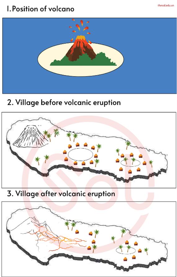
Sample 1:
The series of illustrations describe the geographical layout of a volcano alongside a village prior to and subsequent to a volcanic eruption.
Overall, the eruption has led to significant geographical and societal changes, eradicating a central lake, destroying a substantial portion of the village, and likely forcing the inhabitants to seek safer dwellings elsewhere.
Initially, the volcano is situated on the western flank of the island, with its apex intact, suggesting dormancy, and the village is predominantly established in the central and eastern parts of the island, circumventing two lakes. The larger lake, located centrally, is encircled by numerous houses, indicative of a thriving community, while the smaller lake to the east has fewer dwellings, potentially reflecting a less dense population. Palm trees are interspersed throughout, denoting a tropical climate.
Following the volcanic eruption, the transformation of the landscape is stark. The volcano's peak has been obliterated, leaving a rugged opening from which the eruption likely occurred. The illustration shows signs of lava flow, which has extended to the areas where the village once thrived. The houses closest to the volcano have been completely destroyed, and some palm trees have vanished, presumably incinerated or buried under the volcanic debris. A reduced number of houses suggest either a migration or a loss of population.
Sample 2:
The three illustrations depict the location of a volcano alongside a village before and after the eruption.
Overall, the illustrations show significant changes in the landscape due to the eruption. In the first illustration, there are two main areas: a volcano on the left-hand side and a village on the right. Following the eruption, the devastation caused by lava flow is evident, with many trees and houses near the volcano swept away.
The position of the volcano remains unchanged, but the lava spreads out towards the east, reaching the middle of the island. Additionally, a massive landslide triggers debris avalanches, resulting in a decrease in the volcano's height and the destruction of green spaces to the northeast and southeast.
As for the villages, they are depicted as circular areas with houses and trees. In the second illustration, more than half of the houses in the central area of one village are destroyed, leading to the deformation of the original circle. However, the other village remains unaffected by the eruption.
Sample 3:
The three images display the location of an active volcano and the changes that happened to a nearby village following the volcano’s eruption. Overall, it can be seen that the catastrophic event has damaged the region surrounding the volcano and reduced the habitable area in the village.
The volcano is situated near the western edge of the island it is on and flanked by greenery. The village, meanwhile, occupies the middle and eastern sections of the island, with two clusters of its inhabitants’ accommodation. Prior to the volcanic eruption, the village was densely populated based on the number of buildings, and within each cluster, there was a pathing circle.
After the devastation brought about by the volcano, much has changed in the landscape. Most of the greenery in the volcano’s proximity has disappeared, while lava has spread all the way to the middle section of the island. As a result, over half of the building cluster in the center, and its pathing circle, no longer exists. The other populated section has stayed intact in terms of vegetation, but there are also fewer buildings following the catastrophe. The remaining accommodation in each area could be seen to the east of each respective one.
Sample 4:
The maps demonstrate the location of a volcano, and a village after the volcano erupted.
Overall, the natural disaster made the austere rural area become less green. In particular, the place got thinly populated, and the trees were on a sharp decrease.
Specifically, the volcano constituted one third of the square area of the countryside in the West. After that, it broke out, and its lava spread to the center of the village, which caused many losses. It is striking that plenty of the surrounding trees were burnt due to the eruption. In terms of accommodation, the residential area in the middle was more crowded than the one in the East, and their houses were linked together by footpaths. When the phenonemon happened, the central housing area as well as its ring was demolished up to 60%.
Finally, the way and trees dotted in the second demographic region remained unspoilt whilst it recorded a downturn in the number of huts at 40%.
The table below shows the change in number of people engaged in various physical activities between the years 2001-2009 in Australia (in million people).
Summarise the information by selecting and reporting the main features, and make comparisons where relevant. Write at least 150 words.
People engaged in physical activities in Australia (in million people) | ||||
| 2001 | 2005 | 2009 | % change |
Running | 1.4 | 1.7 | 2.2 | 156% |
Aerobics | 1.5 | 1.6 | 1.7 | 11% |
Tennis | 1 | 1.1 | 1.2 | 15% |
Cycling | 4.5 | 3.1 | 3.6 | -20% |
Swimming | 3.7 | 3.8 | 3.3 | -10% |
Sample 1:
The table compares the number of people participating in five different sports across Australia from 2001 to 2009 and their proportional changes. Overall, while running, aerobics, and tennis gained more popularity over time, fewer people chose swimming and cycling. It is also evident that cycling was most preferred by Australians.
Regarding the activities with increasing participation, running recorded the largest growth of 156% as its figure rose gradually from 1.4 to 2.2 million runners during the surveyed period. Similarly, the number of aerobics participants and tennis players witnessed an increase of 0.1 million players every four years. While the former climbed from 1.5 to 1.7 million people, the latter grew from 1 to 1.2 million, making it the least favorite activity of all time.
Concerning the remaining exercises, there were 4.5 million cyclists in 2001, which then plunged to 3.1 million in 2005 and recovered to 3.6 million, marking a decline of 20%. Swimming observed a less significant decreasing rate of 10% yet overtook cycling to become the most popular activity with 3.8 million people.
Summarise the information by selecting and reporting the main features, and make comparisons where relevant. Write at least 150 words.
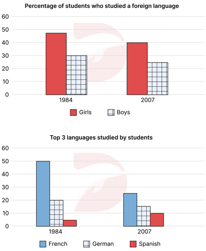
Sample 1:
The bar charts compare the percentages of 14–16-year-old students learning a modern foreign language in an English-speaking country across two different years, 1984 and 2007, and also highlight the popularity of the top three languages studied.
Overall, the general trends indicate a decline in the proportion of students studying foreign languages. There has also been a notable shift in language preferences, with Spanish becoming more common while French and German fell in popularity.
In 1984, there was a marked gender disparity in language study, with approximately 50% of girls learning a modern foreign language compared to only about 30% of boys engaging in this pursuit. The popularity of this activity appeared to have dropped over time for both genders, as the figures for male and female students dropped moderately to 40% and 25% respectively in 2007.
With regard to the most prevalent languages learned, French dominated as the language of choice among students in both years, with a remarkable decrease from 50% in 1984 to 25% in 2007. In the same period, German experienced a minor decline from 20% to 15%, remaining the second most popular language in 2007. Conversely, Spanish registered an increase in popularity, as it was studied by 10% of students in 2007, doubling its initial figure in 1984.
Sample 2:
The bar charts illustrate the percentage of male and female students aged 14-16 who studied a foreign language in an English-speaking nation in the years 1984 and 2007, and the most popular foreign languages that were studied during the same period.
Overall, a significantly larger proportion of girls studied a foreign language than that of boys in both given years, and a lower percentage of students, regardless of their gender, did so in the latter year. Additionally, despite a significant decrease in the study of French and German, both languages remained more popular than Spanish, which saw a rise in its popularity.
In 1984, nearly half of all 14-to 16-year-old female students studied a foreign language, compared to 30% of their male counterparts. By 2007, however, the figures for both sexes had declined slightly to 40% and approximately 25%, respectively.
In terms of the foreign languages that were studied in 1984, French accounted for 50%, followed distantly by German (20%) and Spanish (5%). Thereafter, while the proportion of students learning French and German dropped by 25% and 5% in 2007, in that order, that of Spanish experienced a two-fold increase, reaching 10%.
Sample 3:
The first bar chart details the proportion of 14-16-year-old students learning a foreign language in an English-speaking nation in 1984 and 2007, and the second bar chart illustrates the three most popular languages being studied during the same period. Overall, more females than males studied foreign languages, and the percentages of students of both genders fell over the 23 years in question. Additionally, the proportions for German and French both decreased, though the latter remained by far the most studied language, while the reverse was true for Spanish.
Regarding the first chart, the percentage of girls who studied a foreign language stood at around 50% in 1984, before a considerable fall to 40% by 2007. The data for boys started substantially lower at 30%, and then dropped more moderately to end at approximately 25%.
In terms of the three most chosen languages, in 1984, those who signed up for French courses accounted for a significant 50%, more than double the number for German (20%), and 10 times as high as the figure for Spanish (5%). By the time the 23 years had elapsed, the figure for French had halved to about 25% yet still remained the highest, while the statistic for Spanish had doubled to 10%. Finally, the proportion of those who opted for German fell marginally to 15%, narrowing the difference with French language study.
Sample 4:
The bar chart compares the percentages of male and female students who studied foreign languages, as well as the top three most commonly studied languages between 1984 and 2007. Overall, females showed a higher interest in language learning than males, and the proportions of learners slightly decreased during this period. Additionally, French was the most favored language in both years, followed by German and Spanish.
Regarding both genders’ interest in foreign language learning, in 1984, about 50% of girls were interested in learning a foreign language, which was around 20% higher than their male counterparts at 30% in total. These figures for girls and boys then dropped to 40% and 25%, respectively in 2007.
With regards to students’ choice of languages, in 1984, French was the preferred language for 50% of learners. Although the proportion halved to around 25% in 2007, this language remained as the top choice among language learners. While the perference for German witnessed a moderate drop from 20% in 1984 to 15% in 2007, Spanish was the only language that appealed to more students, with a 200% increase in its learner proportion from 5% to 10% in 2007.
Sample 5:
The given column graphs illustrate the percentage of boys and girls of 14–16-year age group studying foreign languages, and the top three foreign languages opted by those children of an English-speaking country. It is clear that more girls than boys studied foreign languages, and French was the most popular out of the three given languages.
Just under 50% girls and 30% boys studied foreign languages in 1984. This number fell among both genders and in 2007 40% girls and approximately 25% boys were studying foreign languages.
In 1994, French was the most popular language and was studied by 50% students. The percentage of students studying French nearly halved and became about 25% by 2007. German also lost popularity as the proportion of students studying German fell from 20% to 15% over the given period. Spanish was the least popular language in the given two years, but surprisingly it is the only language whose popularity grew over time. In 1984, 5% students studied Spanish but 10% opted for Spanish in 2007.
Overall, there were maximum French learners and the minimum Spanish learners in the given years.
Sample 6:
The two bar charts give information about how many students between the ages of 14 and 16 took courses of a modern foreign language in a country where English was spoken, along with the three most common foreign languages, namely French, German and Spanish from 1984 to 2007.
Overall, both genders saw declining patterns, with the data for girls consistently exceeding that for boys. It is also noticeable that despite experiencing a significant drop, French still remained dominant among the top three languages chosen to study by students.
In 1984, girls far outnumbered boys in terms of the percentage of foreign language learners in an English-speaking country, with a little under 50% of girls compared to 30% of their male counterparts. Over the following 13 years, in 2007, the proportion of young females saw a marginal decrease to 40%, while a similar falling trend was also recorded in that of the opposite gender, falling slightly to around 25% in the same year.
In 1984, French dominated the chart, with half of students in the age group of 14-16 choosing to learn this language. However, there was a subsequent drop to approximately 25% in 2007, but French still retained its top position. Similar changes, but to a far lesser extent, can be seen in students learning German, whose percentage fell from 20% to roughly 15% over the same period. These two declining trends are in contrast to students of the Spanish language, which witnessed a twofold growth from a mere 4% to 10%, significantly narrowing the gap between the three most commonly learned languages.
Sample 7:
One of the given bar charts illustrates the percentage of a section of teenagers learning a modern foreign language in a country where the native language is English. The other bar chart depicts information about the most popular of these languages. The data pertains to 1984 and 2007.
Overall, it is seen that in both years, female students were more interested in studying a foreign language as compared to male students. Moreover, most students chose to learn French while Spanish was the least preferred language.
In 1984, almost 50% of the girl students aged 14 to 16 opted to learn a non-native language whereas, at 30%, the proportion was much lower for male students. However, by 2007, the proportion had dropped to 40% and around 22% for girls and boys respectively.
Half the students who chose to study a foreign language opted for French in 1984. In comparison, only one-fifth of the students chose German whereas it was an insignificant 5% for Spanish. Interestingly, in 2007, there was a sharp reduction of 50% in the ratio of students learning French. The drop was almost similar for German as well. Conversely, Spanish was the only language where the percentage of students studying it doubled to 10%.
Sample 8:
The dual bar charts provide details regarding the number of students aged 14 to 16 who undertook modern foreign language courses in an English-speaking nation, alongside the top three foreign languages, namely French, German, and Spanish, from 1984 to 2007.
In general, both genders witnessed a decline, with girls consistently surpassing boys in terms of statistics. Notably, despite a notable decrease, French maintained its lead among the three most popular languages chosen by students.
In 1984, girls significantly outnumbered boys in terms of the percentage of students learning foreign languages in an English-speaking country, with just under 50% of girls compared to 30% of boys. Over the subsequent 13 years, by 2007, the proportion of female students saw a slight decrease to 40%, while a similar decreasing trend was observed in male students, dropping to approximately 25% in the same year.
In 1984, French held a dominant position in the charts, with half of students aged 14-16 opting to learn this language. However, there was a subsequent decline to around 25% in 2007, yet French retained its top spot. Comparable changes, albeit to a lesser extent, can be observed in students studying German, with their percentage decreasing from 20% to roughly 15% during the same period. These declining trends contrast with students of Spanish, who experienced a doubling in numbers from a mere 4% to 10%, significantly closing the gap among the three most commonly studied languages.
Sample 9:
The bar charts compare the percentages of male and female students who learnt foreign languages in an English-speaking country, as well as the top three most preferred foreign languages in 1984 and 2007.
In general, girls were more interested in studying languages than boys, and the percentage of learners fell slightly throughout this period. Furthermore, the most popular language in both years was French, which was followed by Spanish and German.
Regarding both genders' enthusiasm in foreign language studying, roughly 50% of females expressed interest in 1984, which was about 20% higher than the figure for their male counterparts, at 30% in total. In 2007, these percentages of boys and girls decreased to 25% and 40%, respectively.
In terms of the languages that students chose to study in 1984, 50% of students considered French as their favorite. This language continued to be the top choice among language learners even though the proportion halved to approximately 25% in 2007. While Spanish was the only language that attracted more pupils during the period, with a 200% rise in its learner percentage from 5% to 10% in 2007, the preference for German went through a moderate decline from 20% in 1984 to roughly 15% in 2007.
Sample 10:
The charts delineate the proportion of male and female students in an English-speaking country who studied a foreign language between the ages of 14 and 16, and the three most popular languages they learned in 1984 and 2007.
It is evident that a higher percentage of females showed an inclination towards learning new languages compared to males in both years. Furthermore, French emerged as the predominant choice of language among students.
In 1984, approximately 50% of female students engaged in foreign language acquisition, in contrast to only 30% of males. By 2007, these figures saw a notable decline, with approximately 40% of female students continuing to study new languages, while only about 25% of male students pursued language learning.
Regarding language preferences, in 1984, French stood out as the top choice among second language learners. However, over the following years, its dominance dwindled, settling at approximately 25%, but French remained the preferred language for learners aged 14-16. Initially selected by 20% of learners, German followed a similar declining trajectory, albeit less steep than French, dropping to less than 15%. Conversely, Spanish gained popularity, experiencing a negligible rise from around 5% to 10% and remaining consistently the least favored option.
Sample 11:
The given bar charts illustrate the percentage of boys and girls of 14–16-year age group studying foreign languages, and the top three foreign languages opted by those children of an English speaking country.
In 1984 only 50% of girls and 30% of boys studied foreign languages. This number fell between both genders and in 2007, 40% of girls and approximately 25% of boys were studying foreign languages.
In 1984, French was the most popular language with 50% of students learning it. The percentage of students learning French has almost halved to about 25% by 2007. The German language also lost popularity as the proportion of students learning German dropped from 20% to 15% during the given period. Spanish has been the least popular language over the given two years, but surprisingly it is the only language that has grown in popularity over time. In 1984, 5% of students studied Spanish, but 10% chose Spanish in 2007.
Overall, it is clear that more girls studied foreign languages than boys. In addition, while the number of students choosing French and German decreased, those studying Spanish increased in the given tenure.
The charts below show the percentage of workers in three sectors across four countries in 1980 and 2010.
Summarise the information by selecting and reporting the main features, and make comparisons where relevant. Write at least 150 words.
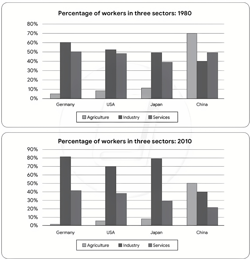
Sample 1:
The bar charts illustrate the distribution of the labour force in four different countries across agricultural, industrial, and service industries in two separate years.
Overall, Germany, the USA, and Japan had very similar workforce distribution trends, compared with China. In addition, the industrial sector accounted for the highest proportion of jobs in all countries besides China, in both years.
In 1980, 60% of the German workforce were employed in the industrial sector, compared to around 50% in Japan and the USA, and 40% in China. Meanwhile, approximately half of the German, US, and Chinese workforce worked in service industries, followed by Japan, with a figure of nearly 40%. Agricultural jobs, on the other hand, dominated the Chinese labour market, accounting for 70% of the workforce, while figures for the other three countries ranged between 5 and 10%.
By 2010, the German and Japanese industrial sectors had witnessed increases, making up 80% of their workforces, which was about 10% more than the figure for the USA, and double that of China. In contrast, a downward trend could be seen in the percentage of the workforce in the service industry, with Germany and the USA sitting at 40%, and Japan and China at 30% and 20% respectively. Jobs in the agricultural sector also saw a significant decline in all countries, with China dropping to 50%, and Germany declining to almost 1%.
Sample 2:
The bar charts depict the proportion of individuals employed in three different sectors across four countries in two years, 1980 and 2010.
Overall, there was a decline in the percentage of employment in agriculture and services, while industry in all countries generally experienced an upward trend except for China. In both years, agriculture held the highest percentage of employment in China, while industry dominated in the other nations.
In 1980, the workforce distribution in Germany showed that 60% of individuals were employed in industry, with services and agriculture accounting for 50% and 5% respectively. Similarly, the USA and India had comparable distribution patterns, with roughly half of the workforce employed in industry and a small minority in agriculture. Conversely, China had a predominant agricultural workforce, at 70%, surpassing services and industry by 20% and 30% respectively.
Thirty years later, there was a notable increase in industry in Germany, the US, and Japan, ranging from 70% to 80%, while China's industry sector remained relatively stable at 40%. There was a significant decrease of 30% in services in China, compared to a less significant drop of approximately 10% in the other countries. This trend also applied to agriculture, with China experiencing a decline of 20%, while the figures for the other three countries remained negligible, accounting for less than 10%.
Sample 3:
The bar charts illustrate the employment distribution across sectors in four nations between 1980 and 2010.
Overall, there was a downturn in agricultural and service employment, while industrial employment generally surged across all countries except China. In China, agriculture maintained the highest employment share in both years, while industry dominated in the other countries.
In 1980, Germany exhibited a predominant industrial workforce at 60%, with services and agriculture at 50% and 5% respectively. Similarly, the USA and India had comparable patterns, with roughly half in industry and nearly another half in services and a small minority in agriculture. In contrast, China’s workforce was primarily agricultural, at 70%, exceeding services and industry by 20% and 30% respectively.
By 2010, there was a surge in industrial employment in Germany, the US, and Japan, reaching 70% to 80%, while China’s industrial sector remained stable at 40%. China experienced a notable 30% decline in services, compared to around 10% in the other countries. Agricultural employment in China also dropped by 20%, contrasting with negligible changes in the other nations, each accounting for less than 10%.
Sample 4:
The bar charts illustrate the percentage of workers in three sectors - agriculture, industry, and services - across four countries (Germany, USA, Japan, and China) in 1980 and 2010.
Overall, the period saw a shift towards services, with agriculture and industry declining across all four countries.
In 1980, agriculture had the highest workforce in China, accounting for around 70%, while the USA, Japan, and Germany had significantly lower percentages at about 3%, 4%, and 6% respectively. Industry was prominent in Germany with 40%, followed by Japan and the USA with roughly 30%. Services dominated the USA at 50%, and were also significant in Japan and Germany, with 45% and 40% respectively.
By 2010, the workforce distribution changed notably. In China, agriculture's share fell to about 35%, while services rose to 45%. Germany saw a rise in services to 70%, with industry dropping to 25% and agriculture remaining low. Similarly, the services sector in the USA and Japan increased to approximately 70% and 60%, respectively, with declines in agriculture and industry in both countries.
Sample 5:
The bar charts depict the proportion of workers employed in agriculture, industry, and services in Germany, the USA, Japan, and China in 1980 and 2010.
Overall, industry and services were the primary sectors attracting workers in most countries, except for China, where agriculture employed the largest workforce. While the proportion of agricultural workers decreased in all four countries between 1980 and 2010, the number of workers in the industrial sector increased in all countries excluding China.
In 1980, Germany had over 50% of its workforce engaged in industry, with services closely following at 50%. By 2010, the industrial sector in Germany continued to grow, reaching 80%, an increase of 20% from the initial data. A similar pattern was observed in the USA, where industry and services remained dominant, with minimal representation in agriculture.
Japan, in 1980, had half of its workforce in the industrial sector, which increased to nearly 80% by 2010. The percentage of individuals in services decreased from 40% to around 30%, while agriculture had a negligible presence. China stood out as the only country where agriculture accounted for the majority of its workforce at 70% in 1980. Over the next three decades, the proportion of Chinese individuals in industry remained stable, while agriculture and services experienced significant declines to 50% and 20%, respectively.
Sample 6:
The bar charts give information about the proportion of individuals who got a job in three different sectors across four countries in two separate years, namely 1980 and 2010.
Overall, declining trends were seen in the percentage of workers in agriculture and services, while industry in all countries generally experienced rising trends, with the exception of China. It is also noticeable that in both years, agriculture accounted for the highest proportion of employment in China, while industry dominated in the other nations.
In 1980, 60% of the workforce in Germany was made up of industrial workers, while the figures for services were marginally lower, at 50%, and only 5% worked in the agricultural sector. Similar distribution patterns can be seen in the USA and India, where roughly half of the workforce were employed in industry and agricultural workers made up a small proportion. By contrast, China was the leading country in terms of employees holding agricultural jobs, at a striking 70%, in contrast to slightly under 50% and 40% for services and industry respectively.
Over the following 30 years, there was a marked increase in the percentage of people working in the industrial field in Germany, the US, and Japan, with figures ranging from 70% to 80%, while China’s industry sector remained relatively constant at 40%. The most significant decrease of 30% in services was recorded in China, whereas the corresponding figures for the remaining countries dropped by a lesser amount (around 10%). Finally, the agricultural sector experienced a similar pattern to that of services, with China again experiencing the most noticeable decline of 20%, while the figures for the other three countries remained relatively low, making up less than 10%.
Sample 7:
The bar charts give information about the proportion of individuals who got a job in three different sectors across four countries in two separate years, namely 1980 and 2010.
Overall, there were decreasing trends in the proportion of workers in agriculture and services, while industry generally saw an upward trend across all countries except China. It is noteworthy that agriculture constituted the largest share of employment in China in both years, whereas industry dominated in other nations.
In 1980, Germany had 60% of its workforce in industry, slightly lower figures for services at 50%, and only 5% in agriculture. Similar distribution patterns were observed in the USA and India, where around half of the workforce was in industry, and agriculture had a smaller share. In contrast, China stood out with 70% of its workforce in agriculture, compared to just under 50% in services and 40% in industry.
Over the next three decades, there was a significant rise in the proportion of industrial workers in Germany, the US, and Japan, ranging from 70% to 80%, while China's industrial sector remained relatively stable at 40%. China also saw the most substantial decrease of 30% in the services sector, whereas the other countries experienced smaller declines (around 10%). The agricultural sector followed a similar pattern to services, with China again showing the largest decline of 20%, while the other countries remained below 10%.
The diagrams show the structure of the solar panel and its use.
Summarise the information by selecting and reporting the main features, and make comparisons where relevant. Write at least 150 words.
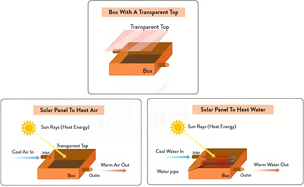
Sample 1:
The charts illustrate the characteristics of solar panels and two possible uses. Firstly, the basic structure of a solar panel is shown, then how the warming process of air or water works.
Regarding the structure, it can be seen that a solar panel is formed by approximately a box, which has an inlet on one side and an outlet on the other side. This box has on it a transparent glass that seals it and that is the part through which sun rays will pass.
Under the image describing the physical feats, some functions are explained. In particular, the first possible use of a solar panel is to generate warm air. This function is possible by letting air enter the box from the inlet and once it is in, letting it heat up thanks to the sun rays that get refracted by the glass, thus creating warmer air that will be let flow from the outlet. On the other hand, an additional step is required to heat up water. More specifically, a tube that connects the inlet and the outlet is needed to let the water flow through it. Given this, the principle is the same, with solar energy heating up the water inside the tube, which will enter from one side and exit from the other.
In conclusion, it can be stated that this simple model can explain the basic principles of a solar panel, even if it is not an accurate representation.
Sample 2:
The diagrams provide an overview of the structure and functionality of a solar panel. They depict the key components of a solar panel, as well as how it harnesses solar energy to generate warm air or water.
Starting with the first diagram, it showcases the structural elements of a basic solar panel. The panel consists of a transparent glass sheet placed on top, along with an inlet pipe and an outlet pipe located on opposite sides.
Moving on to the second diagram, positioned on the left, it illustrates the process of solar energy absorption. Sunlight penetrates the transparent glass, heating the air that enters the panel through the inlet pipe. Consequently, the warmed air flows out of the panel through the outlet pipe, providing a source of warm air.
The final diagram demonstrates the solar panel's capability to produce warm water. Water enters the panel through an inlet pipe, which then circulates in an 'S'-shaped pipe within the panel. As the sun's rays shine on the panel, the water within the pipe absorbs the heat and exits the panel through the outlet pipe, delivering warm water for various purposes.
Sample 3:
The charts outline the characteristics of sun-based boards and two conceivable employments. Firstly, the fundamental structure of a sun-based board is appeared, at that point how the warming handle of discuss or water works.
With respect to the structure, it can be seen that a sun-oriented board is shaped by roughly a box, which has a gulf on one side and an outlet on the other side. This box has on it a straightforward glass, that seals it which is the portion through which sun beams will pass. Beneath the picture depicting the physical accomplishments, a few capacities are clarified. In specific, the primary conceivable utilization of a sun-based board is to produce warm discuss. This work is conceivable by letting discussion enter the box from the gulf and once it is in, letting it warm up much obliged to the sunbeams that get refracted by the glass, in this way making hotter discussion that will be let stream from the outlet.
On the other hand, an extra step is required to warm up the water. More particularly, a tube that interfaces the gulf and the outlet is required to let the water stream through it. Given this, the rule is the same, with sun-oriented vitality warming up the water interior the tube, which is able to enter from one side and exit from the other.
In conclusion, it can be stated that this basic demonstration can clarify the fundamental standards of a sun-oriented board, indeed in case it isn't an exact representation.
Sample 4:
The given pictures illustrate how a basic sun-oriented board is developed and its applications. In general, this sun-oriented board can be partitioned into two major parts: a square cover and a holder. It is additionally famous that this framework is utilized to warm the discuss or water with the bolster of sun-powered control.
With respect to the plan of the sun-powered board, there's a holder which has two tubes for the input and yield on either side. At the same time, on the beat of the holder, a rectangular straightforward glass is utilized as a cover that retains the sunbeams and after that changes over to vitality.
In terms of the applications, for warming discussion purposes, this sun-based panel gets the crude discussion through the cleared outside tube. After that, it'll be warmed beneath the sunbeams interior the holder some time recently going through the proper side tube as warm discuss. Be that as it may, for the warming water reason, the holder too has an extra bent pipeline. So also, to the air, water is channeled through the entrance on the cleared outside to the crisscross pipe within the holder and after that is bubbled by the daylight. At last, the conducted water gets away by the proper side.
Sample 5:
The given graph shows the structure of a sun-oriented board to warm water and wind. In general, there are two diverse graphs including an arrangement of steps starting from the channel of cool air/water in and ending with the outlet of warm air/water out. To start with, the beat of the box is secured by transparent glass, so it'll get coordinate daylight.
There are two parts: sun-based boards to hot wind and sun-based boards to hot fluid. Firstly, cold air is collected in a box with the assistance of gulf and due to coordinate sun beams cold wind is exchanged to hot discuss and it gets out through the outlet.
Secondly, the same concept is taken after for hot liqued but there's one alter, in a box water pipe is found from which cold water is transferred to hot water with the assistance of coordinated warm vitality which is hitting within the straightforward best of the box.
Sample 6:
The diagrams illustrate the design of a simple solar panel and the process by which it generates energy.
Overall, the structure of the panel is not complex, consisting of only a few details. This structure enables the panel to utilize sunshine, which heats up either air or water
To begin with, the layout of the panel is relatively simple. It is a rectangular container, with the surface layer made of transparent glass. In addition, there is an inlet and outlet on either side of the container, allowing water and air to flow through the system.
The energy generation process works by using solar power. Firstly, sun rays are absorbed by the transparent glass, thereby capturing the heat of these rays of sunlight inside the panel. This captured energy then turns air flowing through the system into warm air. Likewise, if the system contains water inside, it is also heated in a similar manner to air.
Sample 7:
The given diagram gives information on how a simple solar panel is constructed and how it can be used to heat up air and water.
By and large, the structure of the solar panel can be described as minimal since it only consists of four components: a transparent glass, a square dark box, an inlet, and an outlet.
First, lying on top of the solar panel is a see-through square piece of glass. This glass allows sun rays to pass through to be converted into thermal energy. Next, a container can be found underneath the glass. On its left-hand side, there is an inlet that acts as an entrance for air and water. At the same time, on the right side, an outlet is located and serves as an exit for transformed contents.
When air travels through the container, its temperature is raised by the generated energy. Likewise, when water is channeled through the inlet, it travels through a zigzag pipe, inside which it will be heated to cater to the domestic water use of households.
Sample 8:
The illustrations depict the design of a solar panel and its application.
Overall, the solar panel displays a relatively straightforward structure, comprising only four components. This solar panel is capable of heating up air or water by harnessing sunshine.
As for the design of this solar panel, its body is made of a hollow rectangular box topped with a piece of transparent glass. In addition, there is an inlet attached to one side that allows water or air to enter and then exit through an outlet on the opposite side. In order for water to travel within the system, additional tubing needs to be installed inside, which is not required for air.
By utilizing solar power, this device can be used to warm either air or water. Initially, energy from the sun, in the form of sun rays, is absorbed by the transparent glass surface, heating up the enclosed space inside the panel. This heated space subsequently transforms the air or water circulating through it into a warmer state, eventually escaping the system through the outlet.
Sample 9:
The picture illustrates the composition and function of an environmentally friendly system that utilizes sunlight to generate hot air and water. Overall, the system is relatively basic in terms of structure and mechanism except that the water heater includes a metal zigzag pipe to conduct heat.
The design consisted of a square-shaped metal compartment with an open top, where a sheet of transparent glass can be placed. Moreover, two holes are drilled on opposite sides, acting as an inlet and outlet.
Regarding the working principle, the panel can be used for generating either warm water or air. Firstly, air or water enters the compartment through the inlet, in which the sun’s radiation is absorbed and subsequently converted into usable energy. Heat collected from the solar conductors then heats up water or air, before being pumped out of the outlet for domestic use.
Sample 10:
The provided diagrams illustrate how a solar panel is constructed and used. It is noticeable that the structure of the system is relatively simple, and its function is to heat up air or water by using solar power.
Regarding the design of the solar panel, there is a container with an inlet and an outlet on either side. The inlet serves as an entrance for air and water while the outlet is where the warm air or water escapes. A sheet of transparent glass is placed above the compartment to capture the sun rays.
At the beginning of the process, the sun rays onto the transparent glass are absorbed and converted into energy. When the air is channeled through the inlet, it is heated by the generated energy and turned into warm air. Similarly, water is conducted through a zigzag pipe inside the container and heated to produce warm water.
Sample 11:
The diagrams illustrate how a solar panel is structured and how it is used.
Overall, the diagrams show the basic parts of a solar panel, through to the lower diagrams which illustrate how this panel functions to produce warm air or water.
Firstly, the top diagram illustrates the structural component parts of a simple solar panel. These parts are a sheet of transparent glass, which fits over the panel, an inlet pipe and an outlet pipe on the opposite side.
The second diagram, on the left, shows how the sun’s rays pass through the transparent glass, warming the air which enters the panel through the inlet pipe. The heated air then passes out of the panel through the outlet pipe. The final diagram shows how this same system functions to produce warm water. Water enters the solar panel through an inlet pipe, which then forms an ‘S’- shaped pipe in the panel itself. The water in this pipe is heated by the sun’s rays and exits the panel through the outlet.
Sample 12:
The diagrams depict the structure of a solar panel and its energy generation process.
Overall, the design of the solar panel is not complicated, comprising minimal details. This structure allows the panel to harness sunlight, heating either air or water.
In terms of its structure, the layout of the panel is straightforward, presenting a rectangular container featuring a transparent glass surface. Additionally, there are inlet and outlet openings situated on both sides of the container, which facilitates the flow of water and air through the system.
In terms of its function, energy generation operates through solar power utilization. Initially, sunlight is absorbed by the transparent glass, capturing its heat within the panel. This captured energy then transforms the flowing air within the system into warm air. Similarly, water contained within the system undergoes heating akin to the process involving air.
Sample 13:
The diagrams that are supplied show how a solar panel is built and utilized.
Overall, the system’s structure is quite simple, and its purpose is to use solar energy to heat either air or water.
In terms of the solar panel’s design, there is a container on either side with an input and an outlet. The inlet allows air and water to enter, while the outlet allows warm air or water to exit. To collect the sun’s rays, a sheet of transparent glass is put above the compartment.
Subsequently, the operation of a solar power system is depicted in the second two diagrams. The sun’s rays on the clear glass are absorbed and turned into energy at the start of the process. The created energy heats the air as it passes through the intake, converting it to warm air. Water is also heated and circulated via a patterned pipe inside the container to make warm water.
The charts below show the water levels of 6 cities in Australia in October 2009 and 2010.
Summarise the information by selecting and reporting the main features, and make comparisons where relevant. Write at least 150 words.
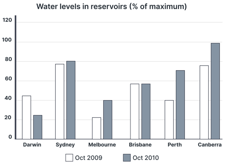
Sample 1:
The presented bar chart illustrates the variations in water levels across six Australian cities during October 2009 and 2010.
Overall, the majority of the surveyed cities witnessed an upward trend in the water levels in the reservoirs in October 2010 compared to the preceding year. The only two exceptions were Darwin, where the water level decreased, and Brisbane which recorded no change. In addition, Canberra was the city with the highest percentage of water stored in its reservoirs in both years.
In October 2009, Sydney and Canberra had the most abundant water reserves, with approximately 75% water capacity each. Brisbane, Darwin, and Perth followed, registering figures ranging from 40% to approximately 55%. In contrast, Melbourne recorded the lowest water percentage in its reservoirs, hovering around 25%.
One year later, Perth witnessed the largest increase in water levels, hitting a high of just above 70%. Having a similar trend, the figure for Canberra reached a peak of nearly 100%, making it the city with the highest level of water. Although Sydney and Melbourne also experienced upward trends, their growth was less pronounced, with respective figures in 2010 of 80% and 40%. Conversely, Darwin encountered a notable decline in its reservoir water, decreasing to just under 30% of its capacity in October 2010. Finally, the figure for Brisbane remained unchanged compared to the previous year.
Sample 2:
The bar chart illustrates the changes in the levels of water in reservoirs across six Australian urban areas between October 2009 and the same month in 2010.
Overall, the water level in Darwin decreased over the period in question, whereas the opposite was true in the case of the other cities, except for Brisbane, where no changes were recorded. Additionally, Canberra had replaced Sydney to become the city with the highest percentage of water stored in its reservoir by the end of the period.
In October 2009, Sydney and Canberra had more water at their disposal than any other city listed, as around 75% of their reservoir levels were filled. These metropolises were followed by Brisbane, Darwin, and Perth, with their figures ranging from 40% to nearly 60%. In the last position was Melbourne, whose water reservoir was just over a fifth full.
After one year, the capital city took the lead, with its water level increasing to a high of close to 100% of the total storage capacity. Sydney and Melbourne followed similar trends, albeit at lower rates, rising to 80% and 40%, respectively. The largest rise was seen in the proportion of water stored in Perth’s reservoir, reaching approximately 70%. This contrasts starkly with the data for Darwin, where a fall to roughly 25% was reported, and lastly, the figure for Brisbane stayed the same.
Sample 3:
The bar chart delineates the fluctuations in water levels within reservoirs across six urban regions in Australia from October 2009 to the corresponding month in 2010.
Across the period, Darwin experienced a decline in water reserves, while the other cities observed an increase, except Brisbane, where no alterations were evident. Notably, Canberra surpassed Sydney to secure the position of the city with the highest water storage percentage in its reservoirs by the end of the period.
In October 2009, Sydney and Canberra boasted the highest water storage among the listed cities, with both locations holding approximately 75% of their reservoir capacities. Following them were Brisbane, Darwin, and Perth, maintaining levels varying from 40% to nearly 60%. Melbourne recorded the lowest water reserves, barely exceeding a fifth of its storage capacity.
Over the course of the year, Canberra ascended to the forefront, with its reservoirs reaching nearly 100% capacity. Meanwhile, Sydney and Melbourne exhibited growth, albeit at slower rates, achieving 80% and 40%, respectively. Perth demonstrated the most substantial rise, with its water reserves escalating to around 70%. In contrast, Darwin experienced a sharp drop to approximately 25%. Brisbane’s water storage level remained constant throughout the duration.
Sample 4:
The bar chart delineates the percentages of water in reservoirs in various cities in Australia in October 2009 and 2010.
Looking from an overall perspective, it is readily apparent that reservoirs in all cities witnessed rising water levels, except Darwin and Brisbane. Sydney and Canberra’s water levels were generally more notable, though Perth demonstrated the strongest growth.
The percentage of water in reservoirs in Sydney in October 2009 was most prominent at around 78%, followed by Canberra, Perth, and Melbourne at 76%, precisely 40%, and slightly over 20%, respectively. The figure for water levels in these cities all experienced rises over one year, with Sydney growing most marginally to roughly 81%, Canberra more substantially to 99%, Perth most dramatically to 70%, and Melbourne nearly doubling to 40%.
In October 2009, Brisbane’s water levels stood at approximately 56%, with Darwin’s data trailing slightly at 45%. Over the following year, Brisbane’s figure thereafter remained unaltered, while Darwin’s dipped considerably to about 23%.
Sample 5:
The bar chart illustrates how the water levels in reservoirs across six Australian cities - Darwin, Sydney, Melbourne, Brisbane, Perth, and Canberra - changed between October 2009 and October 2010.
Overall, water levels in most cities increased over the one-year period, with the exceptions of Darwin, which saw a decrease, and Brisbane, which remained constant. In 2009, Sydney and Canberra had the highest water levels, while in 2010, Canberra took the lead.
In October 2009, Sydney and Canberra had the highest water levels, with their reservoirs at around 75% of capacity. Brisbane followed closely with about 55%. Darwin and Perth were next, with water levels at roughly 45% and 40% respectively. Melbourne recorded the lowest levels, with just over 20% of its reservoirs filled.
By October 2010, Canberra experienced a dramatic increase, with water levels soaring to nearly 100%, the highest among all the cities. Perth and Melbourne both also saw a significant rise to around 70% and 40% respectively. Sydney’s levels, on the other hand, gained minimally to reach 80%. Conversely, the amount of water stored in Darwin dropped significantly after a year, decreasing to just under 30% of its capacity in October 2010. Finally, the number in Brisbane remained the same.
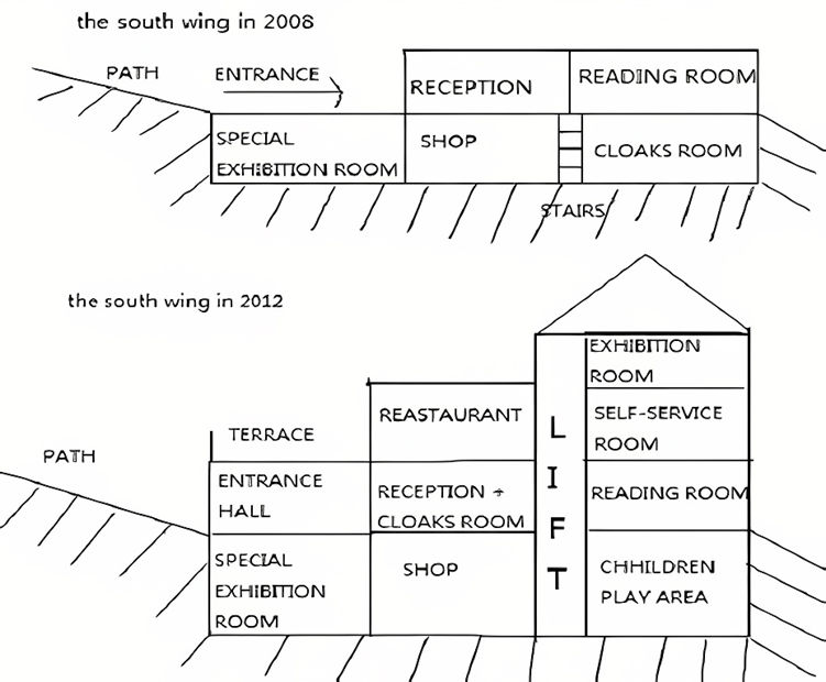
Sample 1:
The given maps depict the development of Walton Museum between 2008 and 2012. It is clear that massive changes took place in just four years.
In 2008, the South wing had two storeys with a path on the west of it. On the first floor there was a special exhibition room, a shop and a cloak room. The entrance and reception were on the second floor. Stairs were there between the shop and the cloak room. Next to the reception was a reading room.
By the year 2012, this building had four storeys with a lift from the first floor to the top floor. Children’s play area was there in place of the cloak room, which was moved to the reception. On the second floor a self-service café was opened towards the eastern side of the lift above the reading room. On the west of the lift, above the reception and cloak room, a restaurant was constructed. Another exhibition room was built on the topmost floor above the café. Above the special exhibition room an entrance hall was made, which had a terrace above it.
Overall, except for the special exhibition room and the shop, the rest of the South Wing saw a major transformation.
Sample 2:
The two maps illustrate the changes in the layout of Walton Museum between 2008 and 2012 following its redevelopment.
Overall, significant transformations were made in the South Wing over the four years, with major modifications throughout, except for the specialized exhibition area and the shop.
In 2008, the South Wing consisted of two levels, with a pathway on its western side. The first floor housed a specialized exhibition area, a shop, and a cloakroom, while the entrance and reception were located on the second floor. Stairs connected the shop and cloakroom, and a reading area was adjacent to the reception.
By 2012, the structure had expanded to four floors, including a lift that connected all levels. The entrance hall was constructed above the specialized exhibition room and topped with a terrace. The cloakroom was relocated to the reception area, replaced by a children's play zone, and a restaurant was added on the western side above the reception. Additionally, a self-service café was introduced on the second floor, and a new exhibition space was built on the top floor above the café.
Sample 3:
The maps reveal the change of the South Wing of Walton Museum in the period of 2008 to 2012.
In 2008, the South Wing was a two-storey building with a path on the west. On the ground floor, there was a special exhibition room, a shop and a cloaks room. The reception was on the first floor, and there was also a reading room next to the reception. Visitors can take the stairs between the shop and the cloakroom to the ground floor.
By the year 2012, the building had four floors with a life from the ground floor to the top floor. Children play area had replaced the cloaks room and the cloaks room had been moved to the reception. On the eastern side of the lift, there was a new cafe where visitors can serve themselves and on the top floor was another exhibition room. Opposite the cafe was a newly built restaurant. In the west of the building, an entrance hall was constructed on the first floor, and it should be noted that on the second floor there was a terrace.
The chart below shows the amount of energy generated from wind in four countries from 1985 to 2000.
Summarise the information by selecting and reporting the main features, and make comparisons where relevant. Write at least 150 words.
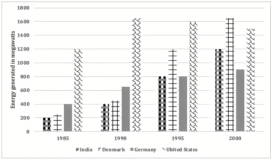
Sample 1:
The bar graph compares the wind energy production in four countries, India, Denmark, Germany and the US between 1985 and 2000.
Overall, initially the US was the leader in wind energy production, but with time all the countries except the US showed considerable growth in wind energy production. Also, Denmark experienced the most significant expansion among all the given countries.
In 1985, the US produced approximately 1200 megawatts of energy from wind. Wind energy production in India and Denmark was nearly the same at 200 megawatts and about double this amount was produced from wind in Germany. In India and Denmark, there was a substantial increase over the 15-year period and in 2000, nearly 1200 megawatts were produced from wind in India, while about 1600 odd megawatts were generated from wind in Denmark.
Germany also witnessed a growth but not as significant as India and Denmark and in 2000, its wind energy production stood at about 900 megawatts. The US was an exception as its energy production increased to 1650 megawatts till 1990, but afterwards its production fell slightly by about 100 megawatts in the last five years.
Sample 2:
This bar chart compares wind energy production in four countries: India, Denmark, Germany, and the United States between 1985 and 2000.
In 1985, the United States generated about 1200 megawatts of power from wind. Wind power production in India and Denmark was similar at about 200 megawatts and almost twice that from wind in Germany. In India and Denmark, there was a substantial increase over a period of 15 years, and in 2000, India generated approximately 1200 megawatts from wind, while Denmark generated about 1600 megawatts from wind.
Germany also saw growth, but not as much as India and Denmark, and had about 900 megawatts of wind energy production in 2000. The United States was an exception as its energy production increased to 1,650 megawatts before 1990, but its production has since fallen slightly by about 100 megawatts over the last five years.
Overall, initially the USA was the leader in the production of wind energy, but over time, all countries except the USA have shown a significant increase in wind energy production. In addition, Denmark experienced the most significant expansion of any of the countries listed.
The chart below shows the percentage of the population in the UK who consumed the recommended daily amount of fruit and vegetables in 2002, 2006 and 2010.
Summarise the information by selecting and reporting the main features, and make comparisons where relevant. Write at least 150 words.
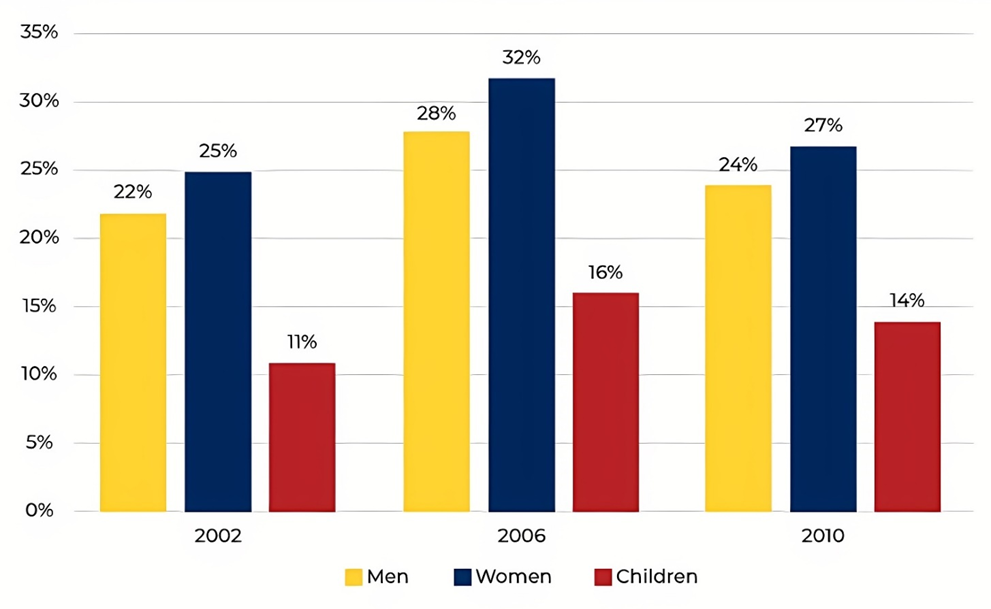
Sample 1:
The given bar chart illustrates the proportion of British people who consumed the suggested amount of fruit and vegetables on a daily basis in three years: 2002, 2006 and 2010.
Overall, it can be seen that British women’s consumption of fruit and vegetables was far higher than the two remaining groups.
The initial impression from the graph is that the percentage of the recommended amount of fruit and vegetables every day that the British of both genders, namely male and female, consumed was nearly similar. Regarding men, their consumption shared the same pattern in 2002 and 2010 with roughly 23%. In 2010, both figures for men's and women’s consumption of fruit and vegetables reached the highest point at 27% and 32%, respectively. The recommended daily amount of fruit and vegetables consumed by women living in the UK was 25% in 2002 and rose slightly by 2% at the end of the period.
In 2002, children’s daily consumption of fruit and vegetables was much lower than the other groups with approximately one-tenth, which was half of the women’s and men’s consumption in the same year. In the next 4 years, the figure rose to 16% before dropping by 2% in 2010.
Sample 2:
The bar chart illustrates the proportion of men, women, and children in the UK who followed the recommended daily amount of fruit and vegetables in three different years.
From an overall perspective, upward trends were witnessed in all three groups of population. In addition, the percentage for women was consistently the highest, followed by that of men and children respectively. It is readily apparent that all of the figures reached their peaks in 2006.
25% of women in the UK followed the recommended amount in 2002, which was about 3% and 11% higher than men and children. Four years later, there was a significant increase in all three groups. While the percentage of women peaked at 32%, that of men and children grew to 28% and 16%.
However, all three groups experienced downward trends in 2010. In particular, a moderate decline of 5% was witnessed in the figure for women. Meanwhile, the proportion of men went down to 24%, which was 10% higher compared to that of children in the last year surveyed.
Sample 3:
The chart illustrates the percentage of men, women and children who consumed the recommended amount of fruit and vegetables on a daily basis in three different years.
Overall, women came out first in term of fruit and vegetable consumption while the opposite was true for children.
In all three years, there was a small difference in the percentage of males and females who consumed enough fruit and vegetables every day. The highest figure for women was 32% in 2006 compared to 28% of men. 2010 witnessed the second highest rank for both women and men’s figures. While 27% of women consumed fruit and vegetables, the percentage of men was 24%. And the smallest figure for both women and men, which was nearly the same as the 2010 figures, was recorded in 2002.
The smallest percentage of people consuming the daily recommended amount of fruit and vegetables was children with only 11% in 2002, half as much as that of men and women in the same year. Following that, the figure for children slightly increased to 16% in 2006 before falling marginally to 14% in the last.
Sample 4:
The bar chart illustrates the percentages of males, females and children in the UK consuming the recommended daily amount of fruit and vegetables, in three separate years (2002, 2006 and 2010).
Overall, the proportion of all groups eating fruit and vegetables increased over the period shown. Also, while women had a tendency to consume these foods the most, the opposite was true for children.
As can be seen from the chart, in 2002, approximately a quarter of females in the UK ate the recommended amount of fruit and vegetables. This was followed by nearly 22% of males consuming these foods daily, which was two times higher than that of children.
Over the following eight years, the figures for all groups increased to reach peaks in 2006 in which the figure for women was highest at just over 30%. By 2010, however, the percentage of females, males and children eating fruit and vegetables had decreased slightly to 27%, 24% and 14% respectively.
Sample 5:
The chart indicates the proportion of the British population who consumed the recommended daily amount of fruit and vegetables in 2002, 2006 and 2010.
As a general trend, the proportion of women is higher compared to the percentages for men and children across the three years, while the percentage for children is usually the lowest across this time period.
Between 2002 and 2006, it can be seen that the percentage of the UK population who consumed the recommended amount of fruit and vegetables increased uniformly across the three different groups before falling across the board between 2006 and 2010. This percentage for women experienced the greatest growth at 7 percent, rising from 25% in 2002 to 32% in 2006.
At the same time, the rate of growth for men and children were comparatively lower, at 6 percent for men and 5 for children between the same four years. Nonetheless, this percentage also dropped the furthest for women between 2006 and 2010, falling by 5 percent, compared to men and children, which fell by 4 and 2 percent respectively.
Sample 6:
The given chart compares the percentages of British people who consumed the recommended daily amount of fruit and vegetables in three years: 2002, 2006, 2010.
What is apparent from the chart is that British women’s consumption was the highest figure while the proportion of fruit and vegetables consumed by children was the lowest throughout the years. It can also be clearly seen that the percentage of all categories shared the same pattern over the period.
To go into specific detail, the percentages of fruit and vegetables that both male and female British consumed were 22% and 25% respectively in 2002. Over the next 8 years, the percentages of their consumption fluctuated and had an increase of 2% at the end of the period.
Regarding the children’s consumption, this number started at 11% before reaching a peak to 16% in 2006. This figure then witnessed a slight decrease, to 14% in 2010.
Sample 7:
The bar chart depicts the percentages of males, females, and children in the United Kingdom who consumed the recommended daily quantity of fruit and vegetables in three different years (2002, 2006 and 2010).
Overall, the proportion of people consuming fruits and vegetables followed an upward trend throughout the time period shown. Furthermore, whereas women consumed the most of these foods, the opposite was true for children.
According to the data, around one-quarter of females in the United Kingdom consumed the recommended quantity of fruits and vegetables in 2002. This was followed by over 22% of males consuming these items on a daily basis, which was twice as high as that of youngsters.
Over the next eight years, the statistics for all categories rose to a peak in 2006, with women accounting for little more than 30% of the total. However, by 2010, the percentage of ladies, males, and children consuming fruit and vegetables had fallen somewhat to 27 percent, 24 percent, and 14 percent, respectively.
The table and pie chart give information about the population in Australia according to different nationalities and areas.
Summarise the information by selecting and reporting the main features, and make comparisons where relevant. Write at least 150 words.
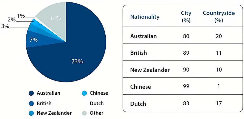
Sample 1:
The pie chart gives information on the percentages of people from different countries who live in Australia while the table illustrates the proportions of inhabitants in rural and urban areas.
Looking from an overall perspective, the most striking feature of the pie chart is the predominance of native Australians living in this country. Regarding the table, it is apparent that the vast majority of people, regardless of their nationality, choose to live in cities.
In terms of the pie chart, Australians account for nearly three-quarters of the population in this country, which is almost ten times as large as the segment of people from Britain residing in Australia. New Zealand ranks third, at 3 percent, followed by China and the Netherlands, at 2 percent and 1 percent respectively while 14 percent of the Australian population is made up of residents from other countries.
Regarding their living areas, although the percentage of Australians living in rural areas is the highest among all demographics, at 20 percent, the majority of them still live in cities. A similar pattern can be observed in the figures for the Dutch, the British and New Zealanders with 83 per cent, 89 per cent and 90 percent of them opting for urban areas. Almost all Chinese residents live in these parts of the country (99 percent).
Sample 2:
The given pie chart illustrates the percentage of people of different nationalities residing in Australia, whereas the table shows demographical figures which are classified according to urban and rural areas. The initial impression from the pie chart is that the vast majority of Australian people claim their ancestry to be of Australian origin. It is also noticeable that most Australian people, regardless of their ethnicity, are city dwellers.
According to the pie chart, Australian ethnicity makes up nearly three fourths of the total population. This is followed by the figure for people coming from the UK (7%) and New Zealand (3%). People of Chinese and Dutch ethnicity, on the other hand, made up a negligible 1-2%.
As is seen from the table, roughly 80% of people from Australia and New Zealand live in cities, whereas only around 20% lived in the countryside. A similar picture is evident in the figures for people from China and New Zealand, with their urban population amounting to a high of 90-99%.
Sample 3:
The given pie chart illustrates the percentages of different nationalities that make up the Australian population, while the table gives information about whether they live in urban or rural areas.
In general, it is evident that the vast majority of Australia’s population is of Australian nationality. Furthermore, most people in this country, irrespective of their nationality, opt to live in cities.
The percentage of the Australian population that are of Australian nationality is 73%, whereas the figures for people of British or other nationalities are significantly lower, at 7% and 14% respectively. Meanwhile, 3% of the population come from New Zealand, while 2% are of Chinese nationality. 1% of Australia’s population comes from the Netherlands.
From the table it can be seen that 80% of Australians choose to reside in cities, along with 89% of the British and 90% of the New Zealanders. SImilarly, 99% of Chinese live in the city, as do 83% of the Dutch.
Sample 4:
The pie chart depicts the constitution of those residing in Australia with respect to their nationalities, whereas the table details where these people live in an unspecified year.
Overall, what stands out from the graph is that Australian demographics hold the lion’s share in the population of this nation. Another interesting point is that most residents opt for the city regardless of ethnicity.
With regards to the pie chart, local Australian people represent nearly three fourths (73%) of the total population. Next came other countries with 14%, whilst 7% come from the UK. Those whose home countries are in Dutch, China and New Zealand hold a negligible 1-3% of total people residing in Australia.
In terms of the table, the vast majority of surveyed Australian demographics favour living in the city with 8 out of 10. A similar pattern can be seen in the figures for Dutch, British and New Zealander residents, amounting to 83%, 89% and 90% respectively. This trend is particularly evident in Chinese people with 99% choosing to live in the city.
Sample 5:
The pie chart and table detail population figures in Australia and if residents tended to live in rural or urban areas. Looking from an overall perspective, it is readily apparent that the vast majority of the population is Australian, followed by sizeable numbers for other and British nationals, and more marginal figures for New Zealanders, Chinese, and the Dutch. All demographics live overwhelmingly in cities, especially individuals from China.
The pie chart indicates that 73% of the Australian population is made up of Australians themselves. This figure is followed distantly by other at 14%, residents from Great Britain at 7%, New Zealanders at 3%, Chinese at 2%, and people from the Netherlands at just 1%.
In terms of livings areas, Australians are most likely to live outside cities, though 80% still live in urban environments. Similarly, 83% of the Dutch live in cities and 17% in the countryside. British and New Zealand residents display nearly identical proportions with around 90% in cities. Finally, the Chinese live predominately in the cities (99%).
Sample 6:
The pie chart illustrates a demographic breakdown of the Australian population by nationality, and the table shows the proportions of these nationalities living in urban and rural areas.
Overall, Australian nationals are the predominant group in the entire country. In addition, the vast majority of the population gravitates towards city life regardless of their nationalities, with nearly the entire Chinese immigrant community doing so.
Looking first at the different nationalities, nearly three quarters (73%) of the population are Australian, which is more than ten times higher than the figure for British people, at 7%. Meanwhile, New Zealanders, Chinese, and Dutch nationals are also smaller minorities, with their respective figures being 3%,2% and 1%, and all other unnamed nationalities account for 14%.
Regarding the locations of these communities, almost all Chinese people reside in cities, specifically 99%. Similarly, the majority of people from the UK and New Zealand live in urban areas, at 89% and 90% respectively. Finally, 83% of people originating from the Netherlands have settled and remained in cities, which is only 3% more than that of Australians.
Sample 7:
The pie chart depicts the percentage of people of various nationalities living in Australia, whereas the table displays demographic data divided into urban and rural areas.
Overall, the pie chart gives the impression that the vast majority of Australians claim to have ancestors of Australian origin. It is also notable from the table that most Australians, regardless of ethnicity, are urban dwellers.
According to the pie chart, ethnicity accounts for nearly three-quarters of the total population in Australia. This is followed by figures for people from the United Kingdom (7%), and New Zealand (3%). People of Chinese and Dutch origin, on the other hand, made up a negligible 1-2% of the population.
Looking at the table, roughly 80% of Australians and New Zealanders live in cities, with only about 20% living in the countryside. A similar picture can be seen in the figures for people from China and New Zealand, where the urban population is 90-99%.
Sample 8:
The given pie chart shows the percentage of people of different nationalities residing in Australia, while the table shows demographic figures which are classified according to urban and rural areas.
Overall, Australians are the largest nationalities, residents, almost three-quarters of the major population, and they tend to live in the urban area. This figure is followed distantly by other citizens who are almost twice the residents from Great Britain (7%), New Zealanders at 3%, Chinese at 2%, and people from the Netherlands at just 1%.
It is readily apparent that Chinese live predominantly in the cities up to 99%, whereas only 1% live in the countryside. The other vast majority of city dwellers is New Zealanders and British, which display nearly identical proportions around 90%. In terms of living areas, Australians are few likely to live outside the cities, nearly 20%, while the rest still live in urban environments. Similarly, 83% of the Dutch live in cities and 17% in the countryside.
Sample 9:
The pie chart illustrates the proportion of people of different nationalities in Australia while the table shows their whereabouts.
Overall, the majority of the population has Australian nationality. It is also apparent that people mostly reside in urban areas.
According to the pie chart, a hefty 73% of people living in Australia are Australians. This is followed by the figure for those who hold other nationalities (14%), which is twice as much as that for people of British origin (7%). The remaining groups only account for a minority of the population, with New Zealanders comprising 3%, the Chinese occupying 2% and the Dutch making up 1%.
Regarding the table, it is evident that an overwhelming proportion of residents in Australia are city dwellers regardless of their nationality. Almost all Chinese people, New Zealanders and British people live in cities, at 99%, 90% and 89%, respectively. Likewise, the figures for people of Australian and Dutch descent also show a preference for urban areas, with a ratio of around 8 urbanites to 2 country dwellers.
Sample 10:
Given is the table illustrating how many people residing in Australia based on different nationalities, and the pie chartdelinates the demograph in this country in rural and urban areas.
Overall, the percentage of Australians who dwell in this country dominates the pie chart. By contrast, when it comes to thetable, city dwellers accounts for a vast majority of australia’s population.
According to the pie chart, the proportion of Australiansstand at the top position, at 73%, followed by that of the Britishwith 7%. Simultaneously, the next position belongs to the figure for New zealanders, at 3%. At the same time, around 2%was recorded for the figure of Chinese and Dutch, compared to 14% that of other nationalities.
As seen from the table, regarding the cosmopolitan area, the share of Chinese people ranks first at 99%, which wasapproximately 9% higher than that of NewZealander and British. In the meantime, a mere 82% of Dutch and Australianschoose to live in this area. In terms of the countryside, while the proportion of Australian residents is highest, at 20%, the figures for British, NewZealander and Dutch were comparable, at around 15%. However, Chinese people only have 1% oits population living there, which also occupies the lowest share in the table.
Sample 11:
The provided pie chart illustrates the percentage of people from various nationalities residing in Australia, while the table presents demographic data categorized by urban and rural areas. At first glance at the pie chart, it is evident that the majority of Australians identify their ancestry as Australian. Moreover, a notable observation is that the majority of Australians, regardless of their ethnic background, live in urban areas.
According to the pie chart, individuals of Australian descent constitute nearly three-quarters of the total population. This is followed by individuals from the UK (7%) and New Zealand (3%). Conversely, people of Chinese and Dutch descent account for a marginal 1-2%.
According to the table, approximately 80% of Australians and New Zealanders reside in urban areas, whereas only about 20% live in rural regions. A similar trend is observed among Chinese and New Zealand residents, where the urban population ranges from 90% to 99%.
Sample 12:
The pie chart illustrates the percentage of individuals from various nationalities residing in Australia, while the table presents demographic data categorized into urban and rural areas.
In summary, the pie chart suggests that the majority of Australians claim ancestry of Australian origin. The table also indicates that a significant proportion of Australians, irrespective of ethnicity, reside in urban areas.
According to the pie chart, ethnicity constitutes almost three-quarters of the total Australian population. This is followed by percentages for individuals from the United Kingdom (7%) and New Zealand (3%). Conversely, people of Chinese and Dutch descent account for a negligible 1-2% of the population.
Analyzing the table, approximately 80% of Australians and New Zealanders live in urban areas, with only around 20% residing in rural regions. A similar trend is observed for individuals from China and New Zealand, where the urban population ranges from 90% to 99%.
The table and pie charts below show the number of research students in Australian universities in 2001 and 2010.
Summarise the information by selecting and reporting the main features, and make comparisons where relevant. Write at least 150 words.
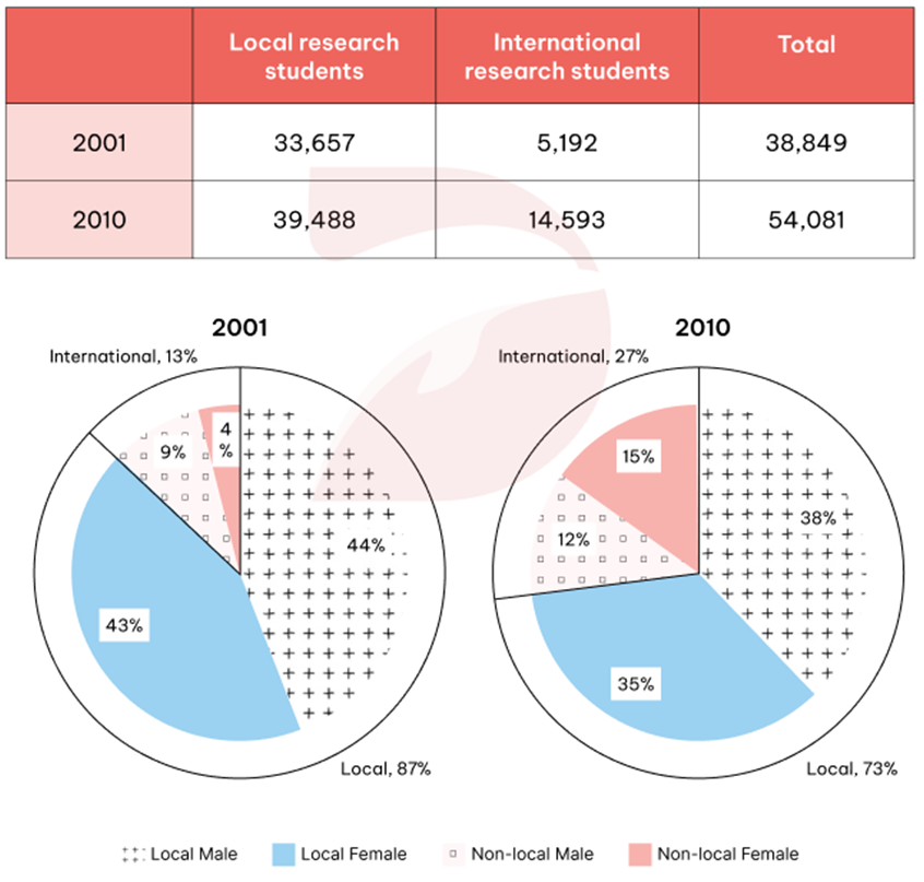
Sample 1:
The provided charts illustrate the participation of local and international students in research fields at Australian universities in 2001 and 2010, along with a breakdown of research students by gender over the same period.
Overall, there was a notable increase in the number of students pursuing research between 2001 and 2010. What also stands out from the chart is that local students showed a particularly strong interest in research, outnumbering their international counterparts in both years. Additionally, local male students dominated the major in both periods.
In 2001, approximately 34,000 Australian students engaged in research, nearly seven times the figure for their international counterparts. For the following 10 years, the number of local students grew modestly to roughly 40,000 students. Even though a threefold increase to around 15000 international students was recorded in the participation in research majors, this figure was far lower than that of local students in 2010.
Turning to gender distribution, the proportion of male and female local students in research fields was relatively balanced in 2001, at 44% and 43% respectively. Among international students, however, there was a notable gender disparity, with only 9% male and 4% female. By 2010, the gender gap among local students had widened slightly, with males accounting for 38% compared to 35% of females. A similar gap of 3% could also be seen in the percentage of international students choosing research fields. However, among these students, the proportion of females, at 15%, surpassed that of males, standing at 13%, indicating a shifting trend over a decade.
Sample 2:
The table illustrates how many local and foreign research students studied at universities in Australia in the years 2001 and 2010, while the pie charts show the proportions of gender among those same students.
Overall, there was an increase in the total number of research students in Australian universities, with local students far outnumbering their non-local counterparts in both years. Despite this, the former’s share decreased as international enrollments rose. Additionally, the gender distribution remained relatively balanced.
In 2001, Australian colleges had 33,657 domestic and 5,192 international students engaged in research, totaling 38,849. By 2010, local student numbers had risen slightly to 39,488, while that of international students had almost tripled to 14,593, bringing the total number to 54,081.
In terms of gender distribution, in 2001, local research students made up 87% of the total, with almost equal percentages across both sexes. Their international counterparts, split between 9% male and 4% female, accounted for the remaining 13%. By 2010, the proportion of domestic research students had declined to 73%, yet the gender gap widened slightly, with males and females representing 38% and 35% respectively. This fall corresponded with a two-fold rise in the percentage of foreign research students, reaching 27%, where females (15%) surpassed males (12%).
Sample 3:
The table and pie graphs depict the number of domestic and foreign students involved in research, with a further breakdown of the proportion of genders, in Australian colleges in two separate years: 2001 and 2010. Overall, the total number of students increased, which was mirrored by both nationality categories. Additionally, local students consistently accounted for the larger share, and gender distribution was fairly even across all students throughout.
Regarding student counts, 2001 recorded 33,657 domestic students and 5,192 foreign ones, totaling 38,849. A decade later, local students increased to 39,488, whereas their international counterparts nearly tripled to 14,593 individuals. Accordingly, the total number of university research students in Australia rose to 54,081.
Concerning the composition, in 2001, local undergraduates accounted for 87% of the total number, with gender distribution being almost identical. Meanwhile, international male and female students constituted 4% and 9%, respectively, making up 13% of the total. By 2010, the percentage of local students dropped to 73%, which resulted from decreases in males to 38% and females to 35%. Finally, the increases in the rate of overseas males to 12% and females to 15% ultimately led to an overall 27% representation.
Sample 4:
The table and pie chart illustrate data on the number of students doing research degrees in Australian universities in 2001 and 2010.
Overall, there was a strong growth in the total number of research students while significantly more local students enrolled in research courses compared to international students.
The number of local research students rose slightly from 33,577 to 39,488 during the 9-year period. Yet there was an almost threefold increase in that of international students, jumping from over 5,000 in 2001 to nearly 14,600 students in 2010. This resulted in an increase of around 15,000 in the total amount of research students in Australian universities, though by 2010, there still had been a huge difference of roughly 25,000 between the number of international and local students pursuing research programs.
In 2001, the proportion of international research students who were male, which accounted for 9% of the total, was more than double that of females (4%). However, 9 years later, the figures for female international students increased and overtook that of males, reaching 15% and 12% of the total respectively. By contrast, the percentages of male and female local research students stayed either equal or similar to each other in the two years surveyed.
Sample 5:
The table and pie charts give information about how many research students studied at universities in Australia in the years 2001 and 2010.
Overall, the number of research students saw a significant rise over the period given, with local research students far exceeding international ones. It is also noticeable that the figures for males and females, regardless of local and international students, were relatively the same in both years, except for those for local males in 2001, which were almost twice as high as their female counterparts.
In 2001, Australian universities recorded a total of 38,849 research students, of which a striking 33,657 students came from Australia, whereas the rest (5,192) were from other countries. Over the following nine years, considerable growth was seen in the total number, increasing to 54,081. Notably, such a growth primarily resulted from international research students, whose numbers almost tripled to 14,593, compared to a marginal increase of around 6,000 among local research students, although they still clearly dominated the table.
Regarding local students doing research in Australian universities, the percentage of males and females made up a combined 87%, with each gender accounting for around 44%. However, in 2010, both of these proportions underwent a declining pattern, falling to 38% and 35% respectively. As for foreign research students, initially 9% of them were males, as opposed to only 4% of their female counterparts, after which their enrollment rates rose noticeably, with a more significant rise seen in the number of female international research students (15% in 2010).
Sample 6:
The provided charts give information about the figures for local and international students going to Australian universities to participate in research fields in 2001 and 2010, along with a breakdown of research students by gender over the same period shown.
Overall, there was a significant increase in the number of both local and international research students between 2001 and 2010. It can also be seen that Australian students showed an intense interest in research, outnumbering their international counterparts; moreover, local males dominated the major in both years.
In 2001, the figure for Australian students specializing in research was approximately 34,000, which was tremendously higher than that of international students, with over 5,000. In the following 10 years, although the number of international research students saw a threefold increase to around 15,000 people, it was still far lower compared to the modest rise of local students, with about 40,000 people.
Looking at gender distribution, the percentage of male and female local students pursuing research was relatively balanced in 2001, at 44% and 43% respectively; however, the opposite was true for international students, with only 9% male and 4% female. 10 years later, there was a slightly wider gender gap among local students, with 38% male and 35% female. Likewise, a similar gap of 3% was witnessed in the proportion of international students choosing research fields. Nevertheless, a shifting trend could be seen when the proportion of females, at 15%, surpassed that of males, standing at 13% over ten years.
Sample 7:
The table and the pie charts show the local and international research students in Australian universities between 2001 to 2010.
In general, the strength of local research students in Australian universities remained higher than the international research students in both the years and with time the strength of both local and international students increased in universities.
According to the table, the strength of local research students in 2001 was 33,657 whereas the strength of international research students was only 5,192. On the other hand, the strength of both international and local research students increased to 39,488 and 14,593 in 2010. Overall, by 2010, 15,232 research students took admission in colleges.
The given pie charts provide an estimate of local students and international research students. The ratio of local students was 87% and international students was 13% in 2001. Whereas this ratio changed by 2010 as the strength of international students increased to 27% and local students’ strength reduced to 73%. Moreover, the pie charts are further divided into male and female categories and provide information about the amount of local and international research students based on gender. The percentage of international research students increased from 9% male and 4% female to 12% male and 15% female respectively.
Sample 8:
The given diagrams compare the quantity of research students in Australian universities in two years.
It is obvious that Australian universities experienced a significant growth in the number of research students, and this growth was mainly contributed by the rise of international ones.
In 2001, about 39,000 was the total number of research students, in which the figure for local students (about 34,000) was almost six times higher than that of foreign ones. Regarding local students, the percentages of males and females were the same, accounting for 43% of the total number of students; however, within the foreign group, the proportion of males was over twice as high as that of females.
In 2010, there were just over 54,000 research students, and the percentage of local students declined to 73% as a result of the twofold increase of international students. Among international groups, the most noticeable growth was seen in the proportion of females with a fourfold increase while the figure for males slightly went up to 12%. In contrast, both the percentages of local male and female research students dropped slightly to 39% and 35% respectively.
The table details the international tourist arrivals (in millions) in 8 countries in 2009 and 2010 and the changes (in percentages).
Summarise the information by selecting and reporting the main features, and make comparisons where relevant. Write at least 150 words.
The international tourist arrivals in millions in 8 countries in 2009 and 2010 and the changes | |||
Country | In 2009 (millions) | In 2010 (millions) | Change |
France | 76 | 76 | +0% |
US | 66 | 67 | +1.5% |
Spain | 55 | 56 | +1.8% |
UK | 55 | 57 | +3.6% |
Italy | 44 | 45 | +2.3% |
Turkey | 33 | 45 | +33% |
China | 22 | 34 | +55% |
Germany | 11 | 23 | +109% |
Hong Kong | 10 | 9 | -11% |
Sample 1:
The table illustrates the changes in the arrivals of tourists in nine countries in 2009 and 2010.
Overall, France remained the most popular tourist destination among 9 countries in both years, while the opposite was true for Hong Kong. In addition, all countries, except for Turkey, China and Germany, witnessed no significant changes in their figures after one year.
The numbers of visitors to Italy, Spain and the US were 44 million, 55 million, and 66 million respectively in 2009, after which these figures all increased by 1 million. Starting with the same figure as Spain, the UK experienced a growth rate of 1.8%, resulting in 57 million tourists in the second year. Meanwhile, the figure for travellers to France remained unchanged, at 76 million, in both years.
While Turkey and China recorded considerable growth rates of 33% and 55% respectively after one year, Germany's figure saw a dramatic increase, with the initial number of 11 million significantly rising to 23 million in 2010, indicating a growth rate of 109%. By contrast, Hong Kong attracted less tourists in the second year, with 9 million compared to 10 million in 2009.
Sample 2:
The table illustrates the changes in visitor numbers from overseas to 9 countries, in both absolute and relative terms, in two consecutive years, namely 2009 and 2010.
Overall, with the exception of France and Hong Kong, all the countries listed welcomed more tourists in 2010. In addition, France was the most popular destination, while the most significant growth was seen in Germany.
Regarding the most visited nations, in 2009, France topped the list at 76 million visitors, which remained unchanged in the following year. While 66 million people traveled to the US, Spain and the UK both attracted 55 million tourists, which was 11 million higher than Italy. An increase from 1 to 2 million was subsequently witnessed in these four countries, equivalent to 1.5% to 3.6% growth.
With regard to the remaining countries, the number of foreign visitors to Turkey was 33 million, 11 million higher than that of China, which in turn outnumbered the next country, Germany, by the same margin. There was a rise of 12 million in the figures for all the three nations, with their relative growth being 33%, 55% and 109%, respectively.
Hong Kong was the least appealing tourist destination, with its numbers declining from 10 to 9 million in 2010, representing a drop of 11%.
Sample 3:
The table outlines the shifts in tourist arrivals in nine different countries during 2009 and 2010.
Overall, France consistently ranked as the top tourist attraction among the nine countries in both years, while Hong Kong occupied the least preferred position. Aside from Turkey, China, and Germany, the other countries did not see any substantial changes in their figures over the year.
In 2009, the number of visitors to Italy, Spain, and the United States were 44 million, 55 million, and 66 million, respectively. These numbers each rose by 1 million in the following year. The UK, starting with the same figure as Spain, showed a growth rate of 1.8%, resulting in 57 million tourists in 2010. Interestingly, the count of travellers to France remained stable at 76 million in both years.
Turkey and China reported significant growth rates of 33% and 55% respectively over the year.
Germany's figures saw a remarkable increase from 11 million to 23 million in 2010, marking a growth rate of 109%. Conversely, Hong Kong saw a dip in tourists in the second year, from 10 million to 9 million.
Sample 4:
The table enumerates eight countries with their data on foreign visitors (in millions) as well as changes (in percentages) between 2009 and 2010.
Overall, France had the highest number of international tourist arrivals. However, the most rapid rate of change is displayed by another country - Germany - while Hong Kong was the only nation with a negative growth rate.
Specifically, France tops the list with 76 million foreign visitors in both 2009 and 2010, followed by the United States with 66–67 million. Next are three other European countries, including Spain, the UK, and Italy, with figures ranging between 44 million and 57 million. All of these nations, however, recorded small growth rates (below 4%), particularly 0% for France.
Turkey, China, and Germany received modest numbers of international tourists in 2009, at 33 million, 22 million, and 11 million, respectively. Nevertheless, the figure for Germany dramatically increased by 109%, followed by China (55%), and Turkey (33%).
Finally, Hong Kong received the smallest number of foreign visitors (10–9 million) in addition to a negative rate of change (-11%).
Sample 5:
The table describes the changes in the number of foreign tourist visits to eight different nations in two consecutive years, 2009 and 2010. Overall, except for France and Hong Kong, an upward trend was registered in the number of international tourist arrivals in most surveyed countries, with Germany recording the largest growth. Moreover, France was the most attractive tourist destination in both studied years.
Regarding countries in mainland Europe, France topped the chart with 76 million overseas tourists in 2009, closely followed by the UK and Spain, at equally 55 million. Meanwhile, 44 million was the number of international tourists to Italy, quadruple that for Germany. After one year, while the dominant figure of France remained unaltered, an increase to 57 million, a 3.6% growth, was seen in the UK, overtaking Spain with a margin of 1 million tourists despite its 1.8% rise. Noticeably, foreign arrivals in Italy stood at 45 million in 2010 after a rise of 2.3%, whereas that in Germany soared by 109% to 23 million tourists.
Concerning other countries, in 2009, the US recorded 66 million international tourists, which was double the figure for Turkey. The number of foreign visits to Hong Kong was exceptionally lower, at 10 million, which was merely a half compared to China. A year later, tourist arrivals in the US rose marginally by 1.5%, far exceeding Turkey with 45 million tourists of a 33% growth. As for Asia, a significant 55% rise was observed in foreign arrivals in China while Hong Kong ranked last after undergoing a plunge of 11% in its figure.
Sample 6:
The table compares the number of international visitors who came to nine nations and their percentage change over a two-year period.
Overall, most nations saw an increase in foreign visitor arrivals, with Germany having the most significant proportion. In the meanwhile, there were two exceptions: France, which remained steady, and Hong Kong, where the numbers showed an 11 percent drop over the two years.
In 2009 and 2010, 76,000 foreign tourists visited France, compared to 66,000 visitors to the United States in 2009 and 67,000 in 2010. In comparison, tourist arrivals in Spain and the United Kingdom were much lower. In 2009, both of these nations welcomed 55,000 international tourists, increasing to 56,000 and 57,000 visitors the following year.
The estimates for Italy also increased moderately, from 44,000 in 2009 to 45,000 in 2010. Despite the inferior numbers, foreign visitor arrivals in Turkey, China, and Germany all escalated significantly during this time, with Germany seeing the most dramatic exacerbation at 109 percent. The numbers for Hong Kong, on the other hand, dropped by 1,000 to 9,000 between these years.
The graphs below show the percentage of math graduates and all graduates who got full-time jobs after graduating from a university in Australia and also show the average salary of both these types of grads, from 2004 to 2012.
Summarise the information by selecting and reporting the main features, and make comparisons where relevant. Write at least 150 words.
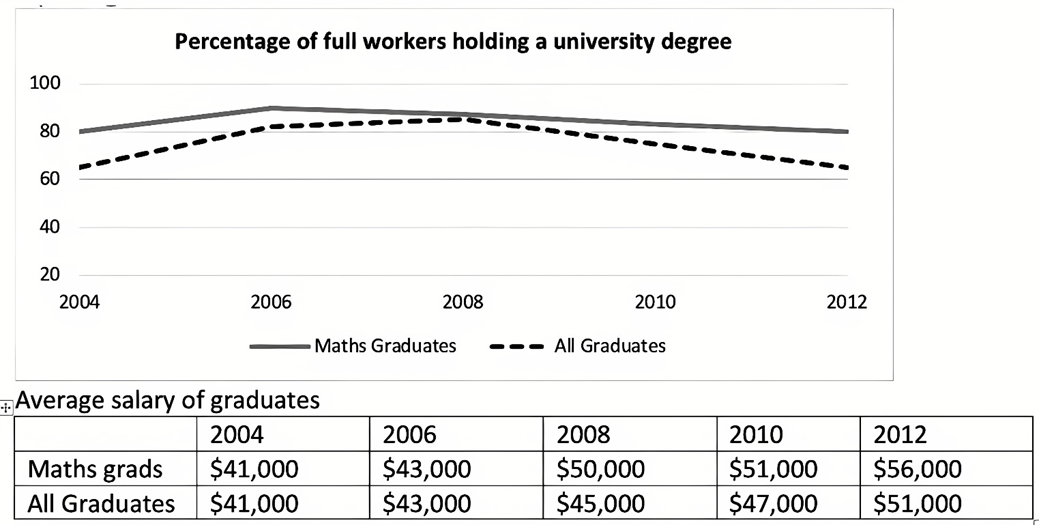
Sample 1:
The provided line and table chart show a comparison between the statistics of full-time employment and average annual salary for graduates in mathematics and all majors in Australian universities between 2004 and 2012.
In general, math graduates performed better than graduates in terms of both average salary and full-time employment. Although the percentage of math graduates securing full-time employment remained stable, salaries increased over time for both math and general graduates.
To elaborate, approximately 60% of all graduates obtained full-time employment in 2004, while around 80% of mathematics graduates found a full-time job. These percentages rose by roughly 10% in the following two to three years. Nevertheless, the proportion decreased for both groups thereafter, and by 2012, the figures were nearly identical to those of 2004.
Regarding the average annual income, in 2004 the average annual salary for all graduates was approximately $41,000, which was also the same figure for math graduates. Over the following eight years, salaries increased for both groups, but the salaries for math graduates increased more than those for all graduates. Eventually, in 2012, math graduates earned a yearly salary of $56,000, while general graduates received around $51,000.
Sample 2:
The line graph illustrates the proportion of full-time workers with a university degree, divided into Maths graduates and all graduates while the table provides a breakdown of their income over an eight-year period. Overall, Maths graduates tended to have a higher employment rate and salary than their counterparts. While the percentage of full-time employees fluctuated wildly, the average income observed an upward trend over time.
Regarding the proportion of graduates with a full-time job, in 2004, roughly 65% of the total workforce were fully employed, being moderately lower than their Maths counterparts, at 80%. Three years later, both groups experienced a similar increasing trend to over 80% and 90% respectively. However, while the percentage of all graduates climbed slightly to 83% in 2008 before a plunge to roughly 65%, that of Maths graduates decreased gradually to 80% till the end of the period.
Concerning the average earnings, in 2004, both groups had the same starting salary at $41.000. Over the following eight years, Maths graduates recorded a more significant growth rate, with figures rocketing to $56.000 compared to a $10.000 rise to $51.000 of all graduates.
Sample 3:
The graphs provide information on the percentage of math and all graduates securing full-time jobs after graduating from Australian universities, along with the average salaries of these graduates from 2004 to 2012.
Overall, the percentage of math and all graduates obtaining full-time employment showed a declining trend from 2004 to 2012. In terms of average salaries, both math and all graduates experienced an increase over the same period.
Regarding the graph, the employment rate for both math graduates and all graduates fluctuated during the period under review. Initially, in 2004, math graduates had a higher percentage of full-time employment at roughly 80% compared to all graduates at nearly 60%. The percentages for both categories increased steadily over the next 2 years. However, the proportion decreased for both groups thereafter, with math graduates consistently surpassing all graduates, and by 2012, the figures were nearly identical to those of 2004.
Concerning the table, both math graduates and all graduates experienced salary increases from 2004 to 2012. In 2004, the average salary for math graduates stood at $41,000, whereas all graduates earned the same amount. Over the following eight years, salaries increased for both groups, but the salaries for math graduates increased more than those for all graduates. Conversely, in 2012, the average salary for math graduates had increased to $56,000, while all graduates’ average salary was $51,000.
Sample 4:
The given line and table graph compare the full-time employment and average yearly salary statistics for maths and all university Australian graduates from 2004 to 2012.
Overall, it can be seen that maths graduates outdid graduates in general both for average salary and full-time employment. Also, while the proportion securing full-time employment remained relatively stable, the salaries rose with time for both maths and all graduates.
In detail, in 2004, about 60% of all graduates got full time employment, whereas about 80% of maths graduates secured a full-time job. Both the figures increased slightly by approximately 10% in the next two or three years. However, after that the proportion fell for both and in 2012, figures stood at nearly the same value as in 2004.
Coming to the average yearly salary, in 2004 the average yearly salary for all graduates was about $41,000 and the figure was the same for maths graduates as well. In the next 8 years, the salaries went up for both, but the salaries rose more for maths graduates as compared to the figures for general salaries for all graduates. Finally, in 2012, maths graduates secured a yearly pay of $56000, whereas graduates, in general, got about $51000.
Sample 5:
The provided line graph compares the proportion of graduates from math and other majors who could have a full-time job after their graduation from 2004 and 2012 while the table shows how their salary changed throughout that period of time.
Overall, it is readily apparent that the percentage of full-time employees graduating from the math department was always higher than that of others. Moreover, although all graduates experienced an upward trend in their salary, it was the ones from Math who got the higher amount of money.
As regards the line graph, around 80% of full-time employees in 2004 graduated from the Math faculty, which was 15% higher than the figure of one from other departments. Two years later, both data experienced a slight increase of 10%. After that, while the percentage of math graduates declined marginally to end at 80% in the last year, that of other graduates grew slightly to hit a peak of 85% in 2008 before dropping gradually to under 70% in 2012.
With regard to the table, both the salaries of math and other graduates started at 41000 dollars in 2004 and grew 2000 more dollars two years later. After that, however, that of math graduates was higher than others. In particular, a significant increase of 13000 dollars was witnessed in the former whereas there was a slow rise of 8000 dollars in the latter in the last year surveyed.
Sample 6:
The graphs illustrate the percentage of math graduates and all graduates who obtained full-time employment after graduating from universities in Australia, as well as their average salaries, from 2004 to 2012.
Overall, math graduates surpassed general graduates in both average salary and full-time employment rates. While the proportion of graduates securing full-time employment remained relatively stable, salaries for both groups increased over time.
In 2004, approximately 62% of all graduates found full-time employment, compared to about 80% of math graduates. Over the next three years, both percentages rose by around 10%. However, the proportions declined for both groups afterward, returning to levels similar to those in 2004 by 2012.
Regarding salaries, the average annual income for all graduates in 2004 was roughly $41,000, which was also the starting figure for math graduates. Over the following eight years, salaries increased for both groups, with math graduates experiencing a more pronounced rise. By 2012, math graduates earned an average annual salary of $56,000, while all graduates earned approximately $51,000.
The bar chart shows the percentage of people who ate five portions of fruits and vegetables per day in the UK from 2001 to 2008.
Summarise the information by selecting and reporting the main features, and make comparisons where relevant. Write at least 150 words.
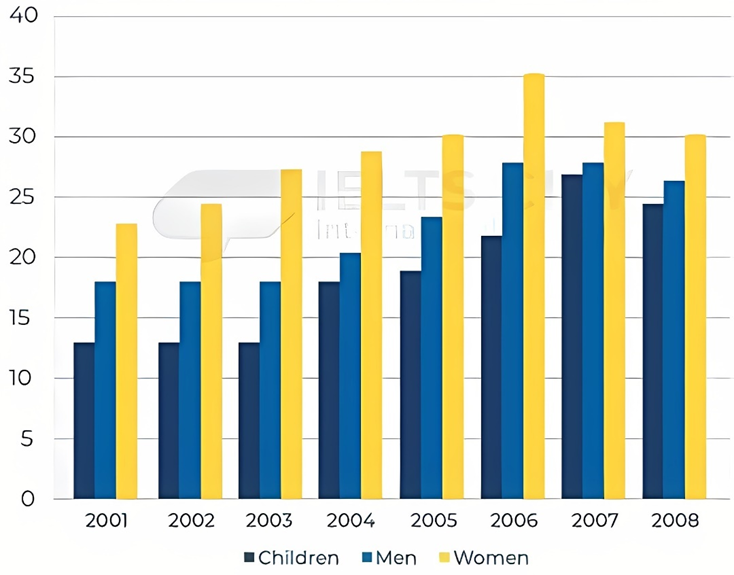
Sample 1:
The provided bar chart depicts the percentage of individuals in the UK who included five portions of fruits and veggies in their daily diet from 2001 to 2008. The data is divided into three categories: children, men, and women.
Overall, all groups showed an upward trend in their consumption. Women consistently had the highest proportion, followed by men and children, throughout the surveyed period.
At the start of the course, less than a quarter of UK women ingested five servings of fresh produce in one day. However, this figure steadily grew over the years and hit a peak at 35% in 2006 before dropping to exactly 30% in 2008.
Regarding children, their percentage remained relatively stable in the first three years at approximately 12.5% and a similar pattern was observed in the men bracket during the same period, with their proportion remaining around 17.5%. Over the following three years, men witnessed a significant growth of nearly 10% and peaked at 27.5% in 2006, whereas, in the same years, the children group slightly increased and did not reach its highest point until 2007 at about 26.5%. Towards the end of the inspected duration, both men and children groups underwent a minor decline and ended at 26% and 24%, respectively.
Sample 2:
The bar chart depicts the changes in the proportion of people in the UK having five rations of fruits and vegetables daily between 2001 and 2008. In general, an upward trend was registered in the percentage of all three surveyed categories. Furthermore, women consistently boasted the highest rate of consumption throughout the period shown.
A closer look at the chart reveals that in 2001, nearly one quarter of females in the UK ate five portions of fruits and vegetables each day, distantly followed by males and children, with data recorded at around 17% and 13% respectively. Over the following three years, despite all undergoing increases in their consumption rates, women still topped the chart with about 28%, as opposed to merely 20% and below among the two remaining groups.
During subsequent years, the intake gap among these three categories was further narrowed. Specifically, after rising substantially and reaching its peak of 35% in 2006, the proportion of women consuming five portions of fruits and vegetables declined moderately to 30%, maintaining its first rank. Meanwhile, a considerable increase to over 25% was witnessed in the figure for male consumers, which was only roughly 2% higher compared to the youngest cohort.
Sample 3:
The graph illustrates the share of the UK population who ate fruit and vegetables five times per day between 2001 and 2008. Overall, there was an uptrend over the entire period for all categories; the figures for children and men increased sharply, while the share of women went up moderately.
The figure for children remained the lowest all over the time frame; it started at roughly 12% in 2001, remained constant until 2003 and then grew with a steady rate to about 25% in 2007. The share of men had a similar trend, but in 2001 it was around 17%, had no changes over next 2 years and then it started to increment rapidly to nearly 27% in 2007. Both segments of population suffered from a slight decline over last year in the graph.
In contrast, the percentage of women who ate five portions of fruit and vegetables in 2001 was the highest, among other categories. Over time, it incremented gradually between 2001 and 2006, from roughly 21% to about 34%, while in the last two years it declined by almost 3%, remaining the highest figure in 2008.
Sample 4:
The chart illustrates the percentage of people in the UK consuming five portions of fruit and vegetables daily from 2001 to 2008, categorized by children, men, and women.
Overall, there was a general upward trend in the consumption of fruits and vegetables across all groups from 2001 to 2008, with women consistently having the highest rates and children the lowest, despite a decline observed in 2007 and 2008.
In 2001, the percentage of women consuming five portions daily was the highest at approximately 22%. Men followed, with a rate close to 17%, and children had the lowest rate at around 12%. The figures for men and children remained relatively stable over the next two years, maintaining around 17.5% and 12.5%, respectively. In contrast, the percentage for women increased steadily, reaching over 27% by 2003.
From 2004 to 2006, there was a consistent rise in the percentages for men and children. Men’s consumption increased from 20% to nearly 27%, while children’s consumption grew from 17.5% to 23%. However, both groups saw a slight decline in 2007 and 2008. Men’s consumption peaked at 27% in 2006 and 2007 before dropping to about 26% in 2008. Similarly, children’s consumption peaked at 25% in 2007, then fell to approximately 24% in the final year.
Women’s consumption peaked at nearly 35% in 2006, followed by a decline to around 30% by 2008, a figure similar to that of 2005.
Sample 5:
The bar chart illustrates the proportion of women, men and children consuming five servingsof fruit and vegetables each day in 8 years from 2001 to 2008 in the UK.
Overall, it can be seen that the highest percentage of all people consuming fruit andvegetables was women, while children consistently accounted for the lowest proportion. Furthermore, a significant increase in the proportion of people eating these food items can be seen over the period given.
The percentage of women who ate fruit and vegetables started at just over 20% in 2001. This figure then rose steadily to reach a peak of almost 35% in 2006, before falling slightly to30% in the final year.
In terms of men and children eating fruit and vegetables, the rate remained relatively stable inthe first three years (about 17% and 12% respectively). From this point, the proportion ofmen climbed gradually to peak at about 27% in both 2006 and 2007, after which it dropped to about 26%. A similar growth in the figure for children was evident reaching 25% in 2007and around 24% in the final year.
Summarise the information by selecting and reporting the main features, and make comparisons where relevant. Write at least 150 words.
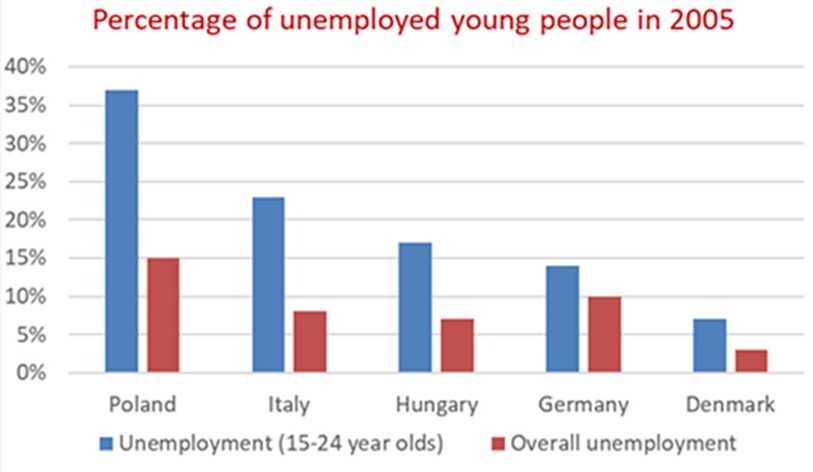
Sample 1:
The provided bar graph illustrates data from five European nations in 2005. It is about the rate of total unemployment as compared to the unemployment of a specific younger age group.
Overall, it is obvious that the rate is substantially greater among the younger generation when compared to global figures.
According to the graph, Poland had the highest total unemployment rate in 2005. 37% of its 15% overall unemployed were between the ages of 15 and 24. Germany was the second most struck by the crisis, but the impact on the younger generation was less severe than in Poland. When compared to the national unemployment rate of 10%, the proportion of the 15-24 age group who were unemployed was little under 15.
When the general unemployment rate in Italy and Hungary was between 6 and 8, the proportion of jobless youngsters aged 15 to 24 years. It was approximately 24 and 17%, respectively, which was higher than in Germany. Denmark was the least hit by the crisis. The proportion of young people unemployed there was over 8%, compared to only 3% in the total unemployment data.
Sample 2:
The bar chart depicts the unemployment rates of young individuals aged 15-24 as well as the entire workforce in five European nations in 2005.
In terms of the proportion of unemployed young adults, Denmark had the lowest result (just over 5%). Germany and Hungary had around three times the rate of young unemployment as Denmark. Italy and Poland had the highest unemployment rates, at around 23% and 37%, respectively.
In terms of total unemployment rates, Poland also had the highest result in this category. In Poland, 15% of the workforce was unemployed, but in Germany, 5% fewer individuals were unemployed. Italy and Hungary followed, both with approximately 6-7% total unemployment. In Denmark, the unemployment rate was only about 3%.
In general, the data shows that young unemployment rates were much higher than overall estimates in all of the nations included. Poland was top in both categories, while Denmark was last. Italy and Germany were in the middle, with Hungary representing the overall average.
Sample 3:
The given bar chart compares five different countries in terms of the proportion of jobless individuals aged 15 to 24 and the overall unemployment rate in 2005.
Overall, it is notable from the chart that Poland recorded the highest unemployment rates, while Denmark experienced the lowest. Another key observation is that the unemployment rate among the 15-24 age group was higher than that of the total population in all the countries surveyed.
In Poland, over 35% of individuals in the 15-24 age bracket were jobless, more than double the figure for the total population, both of which were by far the highest among the five countries. Italy and Hungary displayed similar trends, albeit with smaller disparities between the two rates. The unemployment rate among 15-24-year-olds in these countries ranged from approximately 18% to 24%, while the overall unemployment rate was around 8%.
Germany showed that just under 15% of those aged 15-24 were unemployed, which exceeded the overall rate by about 5%. Meanwhile, Denmark had the lowest figures, with only 3% of the total population facing unemployment and around 7% of young individuals aged 15-24 being jobless.
Sample 4:
The bar graph compares the unemployment rates between the 15 to 24 age group and the total population, in five different nations in Europe in 2005. Overall, the unemployment rate of the young cohort was higher than the overall percentage for all given countries. Additionally, Poland recorded the highest proportion for both categories, whereas Denmark experienced the lowest.
In terms of individuals aged 15 to 24, approximately 36% of Polish youths were jobless, which was significantly higher than Italy and Hungary at roughly 23% and around 16%, respectively. Moreover, the unemployment rate of youngsters in Germany was nearly 15%, while that of Denmark was the lowest result at about 7%.
Turning to the overall unemployment rate, Poland documented a national rate of precisely 15%, followed by Germany at one-tenth. Furthermore, Italy and Hungary exhibited comparable percentage points of around 7%, which was about double that of Denmark.
Sample 5:
The graph compares the unemployment rates of individuals aged 15-24 with the overall unemployment rates in five European countries in 2005.
It is evident that the unemployment rate among the 15-24 age group consistently exceeded the overall unemployment rate across all five countries. Notably, Poland recorded the highest figures in both categories.
Specifically, Poland had the highest overall unemployment rate, at around 15%, with a significantly higher youth unemployment rate of 37%. Italy and Hungary had relatively similar overall unemployment rates, at 7% and 8% respectively, but differed in youth unemployment. Italy’s youth unemployment rate was notably higher at 23%, compared to Hungary’s 17%.
Germany and Denmark presented more balanced employment figures between age groups. Germany, with the second-highest overall unemployment rate of 10%, had a youth unemployment rate of 14%, only 4% higher than the general rate. Denmark, however, had the lowest overall unemployment at 3% and the smallest youth unemployment rate at 7%, reflecting the least disparity between the two categories.
Sample 6:
The bar chart illustrates the percentage of unemployed people aged between 15 and 24 in five European countries in 2005, compared with the overall unemployment rate in those countries.
Overall, young people aged 15 to 24 faced higher unemployment rates compared to the overall population in all five European countries. Poland had the highest youth unemployment rate, while Denmark had the lowest rates for both youth and overall unemployment.
A closer examination of the chart reveals that Poland had the highest youth unemployment rate, at 38%, while the overall unemployment rate was significantly lower, at 15%. Italy followed, with a youth unemployment rate of 24%, and an overall unemployment rate of 8%. Hungary also exhibited a notable disparity between the youth and overall unemployment rates, with youth unemployment at 17% and overall unemployment at 7%.
In contrast, Germany showed a smaller gap between youth and overall unemployment rates, with 14% youth unemployment and 10% overall unemployment. Denmark had the lowest rates among the five countries, with youth unemployment at 7% and overall unemployment at 4%. Notably, Denmark was the only country where youth unemployment was lower than the European average.
Sample 7:
The bar chart provides information about the unemployment rates of young adults aged 15-24 and that of the total workforce in five European countries in the year 2005.
Looking at the proportion of jobless young adults, the lowest figure was recorded in Denmark (just over 5%). Germany and Hungary had approximately three times higher youth unemployment rates compared to Denmark. The highest unemployment rates were observed in Italy and Poland, about 23% and 37% respectively.
As regards the overall unemployment rates, Poland witnessed the highest figure in this category as well. Fifteen percent of the Polish workforce was jobless while 5% fewer people were idle in Germany. Italy and Hungary came next with similar levels of overall unemployment, nearly 6-7%. In comparison, Denmark had only around 3% unemployed people.
In general, what stands out from the chart is that the youth unemployment rates were significantly higher than the overall figures in all the listed countries. Poland ranked the first in both the categories while Denmark came last. Italy and Germany were in the halfway marks with Hungary representing the overall mean.
Sample 8:
The provided bar chart compares and contrasts the unemployment rates of young people aged 15 to 24 with the overall unemployment rates in five European countries in 2005. Overall, the data reveals that youth unemployment consistently exceeded the general unemployment rate across all five countries. Poland experienced the highest rates in both categories, while the opposite was true for Denmark.
As illustrated, Poland's youth unemployment rate reached approximately one-third (33%), significantly surpassing its overall unemployment rate of 15%. No other country surveyed had such a substantial gap between youth and general unemployment. In contrast, the rate of Danish young people who did not have a job remained relatively low at just over 5%, with an overall rate of jobless personnel around 2-3%.
Italy, Hungary, and Germany exhibited youth unemployment rates ranking second, third, and fourth, respectively. While Italy and Hungary showed a noticeable difference between the two groups of unemployment, similar to Poland, Germany's rates were more comparable, with the overall proportion of those in between jobs at 10%, only slightly lower than its youth unemployment rate.
Sample 9:
The bar chart depicts the percentage of unemployed individuals aged 15 to 24 in five European countries in 2005, compared with the overall unemployment rate in those countries.
Overall, young people aged 15 to 24 encountered higher unemployment rates compared to the overall population across all five European countries. Poland reported the highest youth unemployment rate, while Denmark recorded the lowest rates for both youth and overall unemployment.
A closer examination of the chart reveals that Poland had the highest youth unemployment rate, at 38%, while the overall unemployment rate was significantly lower, at 15%. Italy followed, with a youth unemployment rate of 24%, and an overall unemployment rate of 8%. Hungary also exhibited a notable disparity between the youth and overall unemployment rates, with youth unemployment at 17% and overall unemployment at 7%.
In contrast, Germany showed a smaller gap between youth and overall unemployment rates, with 14% youth unemployment and 10% overall unemployment. Denmark had the lowest rates among the five countries, with youth unemployment at 7% and overall unemployment at 4%. Notably, Denmark was the only country where youth unemployment was lower than the European average.
The diagrams give information about changes in a student accommodation.
Summarise the information by selecting and reporting the main features, and make comparisons where relevant. Write at least 150 words.
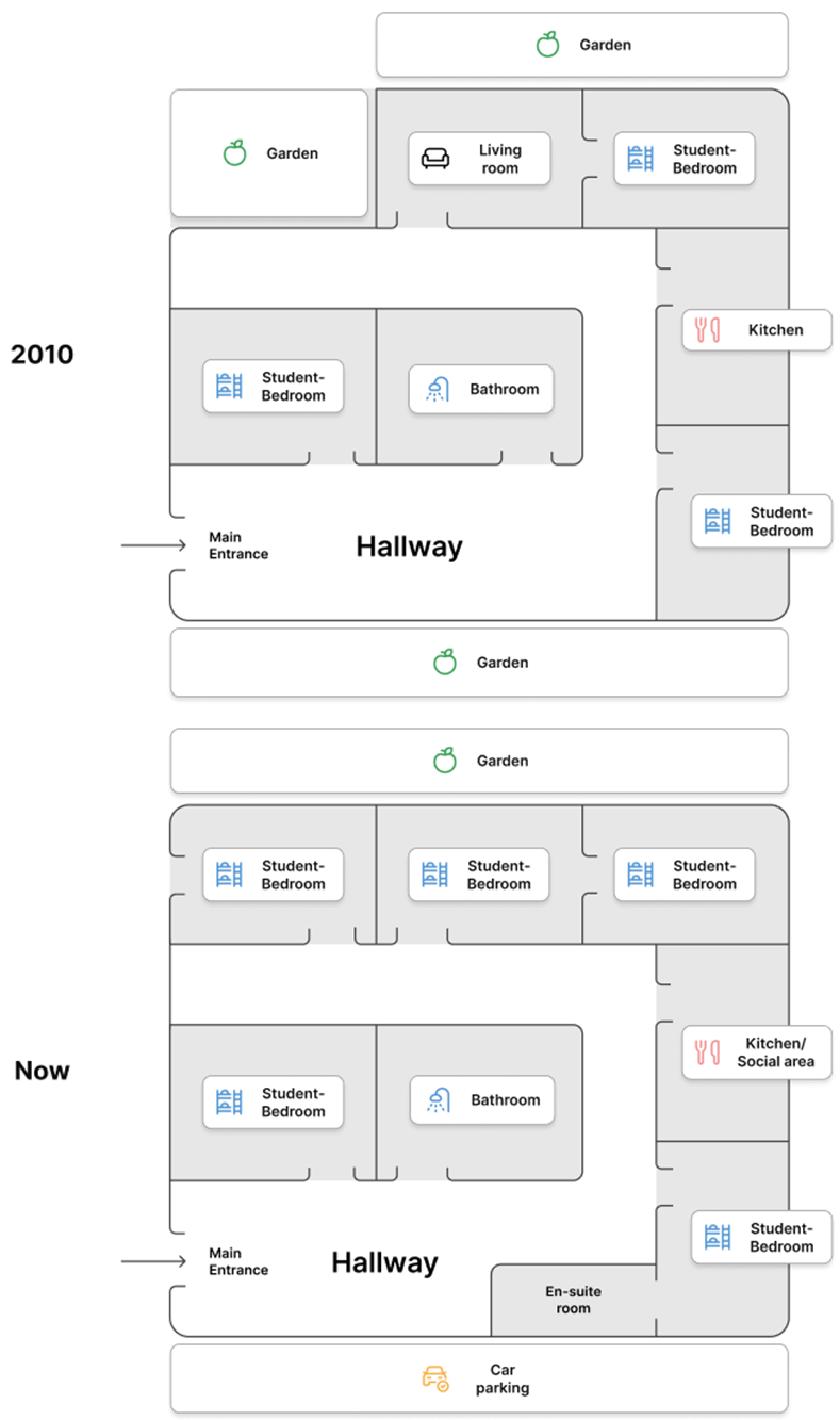
Sample 1:
The map illustrates certain alterations that have been made in student accommodation in 2010 and now.
Overall, it can be seen that the most noticeable change was the expansion of student bedrooms. Also, the garden in the south was transformed into a parking site.
In 2010, there was a spacious hallway accessed by the entrance along which a student bedroom and a bathroom were located. However, in the present day, this area was narrowed down to make room for an en-suite room which was connected to another student bedroom in the southeast. Although the kitchen remained in its original position, its function was integrated with socializing.
To the north of the site, a part of the garden and the living room in the north of the accommodation was replaced by newly-built student bedrooms. And the green area of this place was reduced in size as a new car parking lot was constructed to the south of the accommodation.
Sample 2:
The maps depict modifications to a student accommodation building from 2010 to the present day. Overall, the building has been renovated extensively, seeing fundamental changes to the student-bedrooms and the gardens. In addition, more entrances are added as a result of the remodeling.
In 2010, the building was a relatively green area with three gardens to the northwest, the north and the south of the map. However, in the present day, only the northern one remains; the other two were replaced by a new student bedroom and a car park. The number of student bedrooms was greatly expanded from the original three to five, replacing the former living room.
The current building is also more accessible with more doors added, connecting the rooms to each other and to the exterior. Other major changes include the introduction of an en-suite room and the addition of a new social area in the kitchen. The big bathroom sited at the heart of the map, however, remained unchanged over the given period.
Sample 3:
The maps illustrate data regarding alterations in a student’s housing from 2010 up until the present time.
Overall, there has been an increase in the number of students’ accommodations, along with the replacement of green spaces to provide new outdoor amenities. However, certain facilities have remained unchanged.
In 2010, there was a student bedroom and a bathroom to the right of the hallway, accessible from the main entrance. Another bedroom for students was situated in the southwest corner of the building, adjacent to the kitchen. At the top of the map, a living room was located to the west of the third student’s bedroom.
The recent modifications to the building are evident in the second picture. The most notable change is the conversion of the garden in the south into a vehicle parking area. Additionally, an en-suite room has been erected to the left of the bedroom in the north-west. Underneath the garden in the north of the diagram, two more bedrooms have been added, with one of them being converted from the living room back in 2010.
Sample 4:
The given maps illustrate how the layout of a student accommodation has altered from 2010 to the present day.
Overall, it is evident that this area has undergone significant changes, the most noticeable being the increase in the number of students' bedrooms, the construction of a new car park and entrances as well as the disappearance of the living room and gardens.
In 2010, at the top of the design, there was a garden next to the living room, but in the present day, these areas are replaced by two new student bedrooms. The three old student bedrooms still remain as they did in 2010. In addition, the garden to the south of the map has been cleared to make way for a new car park.
Compared to 2010, the current building is also more accessible with more doors added, connecting the rooms to each other and to the exterior. Further developments are the appearance of an en-suite room and the introduction of a new social area in the kitchen. Finally, there has been no change to the big bathroom situated in the centre of the accommodation over the period shown.
Sample 5:
The changes illustrated in the maps depict alterations to a student residence from 2010 to the present time.
In summary, the building has undergone extensive renovations, particularly to the student bedrooms and gardens. Moreover, additional entrances have been included as part of the redesign.
In 2010, the building was surrounded by three gardens: northwest, north, and south of the map. Presently, only the northern garden remains, while the other two have been replaced by a new student bedroom and a parking lot. The number of student bedrooms has also increased from three to five, replacing the former living room.
The current structure is more accessible, with additional doors linking the rooms internally and externally. Other notable changes include the addition of an en-suite room and a new social area in the kitchen. The large bathroom in the center of the map has remained unchanged over time.
Sample 6:
The map illustrates the transformation of a student accommodation between 2010 andnow. In general, the most significant transformation is the appearance of additional student bedrooms and the relocation of the garderns. It is also clear that the bathroom in the middle and the other student bedrooms of the accommodation remained unchanged.
To be more specific, in 2010, the student bedroom and the bathroom are located in the centre of the premises and recorded no alternations. However, at present, the U-shaped hallway decreased in size and a new en-suite room was added next to the bedroom in the southeast corner, which remained intact. A new car park was built right on the site where part of the garden in the south of the student accommodation used to be. Although the kitchen beside the bedroom in the east was unaltered, it now also fuctions as a social area for students.
There was a student bedroom, a living room and a part of the garden located in a row in the north of the accommodation. By now, this part of the garden and the living room have been knocked down and replaced by two new student bedrooms. The other part of the garden in the north was extended, the student bedrooms in the northeast and in the west experienced no change.
Sample 7:
The maps depict changes to a student housing building from 2010 to the present.
Overall, the building has been extensively renovated, with significant changes to the student bedrooms and gardens. Furthermore, as a result of the remodelling, more entrances are added.
In 2010, the building was surrounded by three gardens to the northwest, north, and south of the map. However, only the northern one remains today since the other two have been replaced by a new student bedroom and a parking lot. The number of student bedrooms also increased from three to five, replacing the former living room.
The current structure is also more accessible, with more doors connecting the rooms to one another and to the outside. Other significant changes include the addition of an en-suite room and a new social area in the kitchen. The large bathroom in the centre of the map, on the other hand, remained unchanged over the period.
Sample 8:
The maps illustrate how a dormitory has changed from 2010 to the present.
Overall, the buildings have undergone a number of dramatic changes, the most noticeable of which are the expansion of the students' living quarters and the introduction of a social and a parking area.
In 2010, the building was surrounded by green areas, especially in the north and the south, offering ample outdoor space for relaxation and recreation. However, in the current layout, the garden to the south has been replaced by a parking lot in order to provide parking facilities for students with vehicles. The garden on the other side of the building has remained unchanged.
Internally, there used to be a living room in the north of the hostel, but it has been repurposed into an additional student bedroom. The same thing has happened to the garden on its left, increasing the total number of bedrooms from three to five and adding another access to the building apart from the main entrance. The kitchen in the west, the bathroom in the center, and the student bedrooms are still connected by a central hallway. The kitchen now also serves as a communal space for students, making up for the loss of the living room. Additionally, a new en-suite room has been added near the main entrance, offering more convenience and privacy for one of the bedrooms.
The map below shows the development of the village of Ryemouth between 1995 and present.
Summarise the information by selecting and reporting the main features, and make comparisons where relevant. Write at least 150 words.
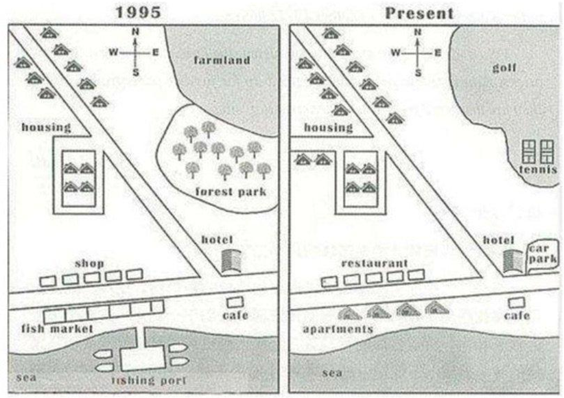
Sample 1:
The map shows how a village called Ryemouth has developed over the last twenty-five years.
Overall, there have been several changes, the most noticeable being the increases in accommodation, the elimination of the fishing industry, and the introduction of sports facilities.
In 1995, to the south of the village where the sea is there was previously a fishing industry, with a fishing port and quite a large fish market as well. Next to this was a small cafe. On the other side of the road running by the sea stood a line of five shops and a hotel, while situated in the northeast part of the village was farmland and a park with trees. The main housing of the village was located in the northwest around a main road that runs from the coastal road, with twelve houses, four of them encircled by a smaller side-street.
Turning to the present-day map, it can be seen that the fishing facilities have all gone, being replaced by four apartments, and the shops have become restaurants. The cafe remains, as does the hotel, albeit with parking facilities which it did not have before. Having been converted into a golf course, the farmland has now gone, while the forest park has been removed to make way for tennis courts. Although the old houses remain, new ones have been built, along with a new road with two new houses beside it.
Sample 2:
The two maps shown below display a seaside village and how it has changed from 1995 to the present day.
Overall, the village represents a small-scale community and is situated to the North of the sea. There is a main road running along the sea from West to East, and another running from South-East to North-West. In both maps, there is a housing district located in the North-West corner of the village.
The most notable changes to the village from 1995 to the present day are the addition of a golf course and tennis courts where there used to be farmland and a forested area. Other changes include a new road which is running West and is roughly parallel to the seaside road.
In addition, the old shops and fish market in the South end have been transformed into seaside restaurants and apartments. The fishing port has also been removed, which opens up the beachfront.
Sample 3:
The map distinctly delineates the transformative development of the village of Ryemouth from the year 1995 to the present.
An overarching view of the maps highlights significant urban expansion and restructuring, particularly with the addition of residential areas and recreational facilities. The landscape has shifted from rural to a more suburban setup with enhanced amenities.
From 1995 to now, Ryemouth has seen the replacement of its fishing port and surrounding establishments with modern infrastructure. The erstwhile fish market and a row of shops have been superseded by contemporary apartment buildings and restaurants, enhancing the southern waterfront's appeal. This part of the village now serves as a bustling residential and commercial hub compared to its previous commercial focus on fishing.
In the northern section, where a forest park and farmland once prevailed, now lie a golf course and tennis courts, marking a shift towards recreational development. The presence of additional housing along the roads confirms an increase in the local population. Meanwhile, the central facilities like the hotel and cafe have remained, with the addition of a nearby car park to accommodate the growing influx of visitors and residents alike. This evolution reflects Ryemouth's transition from a primarily agrarian community to a more diversified suburban area.
Sample 4:
The maps provide an extensive illustration of the village's remarkable modifications between 1995 and the present day.
In general, the village map has undergone substantial changes with the significant increase in the number of houses and shops, and the conversion of farmland and woodlands into sports facilities. These new sporting facilities and the overall expansion of the village have brought about a significant transformation to the area's economic, social and physical landscape.
In the northeast of the village, a forest park now stands where there was once farmland. There are still several roads that run from north to south and east to west, with homes on both sides of the north-eastern road concentrated in the northwest corner of the village. On the east-west road, the same hotel and café established in 1995 continue to thrive. However, the southern side of the hamlet shows the most striking alterations.
In the present-day map, the fishing port has disappeared into the water, and a range of apartments and restaurants have taken the place of the former fish market and row of small shops. On the village's north-western side, four more houses have been built beside the roads. Moreover, a parking lot has been established by the hotel, and the former farmland and forest park have been transformed into a golf course and two tennis courts, offering residents new recreational opportunities.
Sample 5:
The illustrations reveal the extensive transformations that the Village of Ryemouth has undergone from 1995 to the present day.
Overall, the once fertile agrarian area in the north-eastern section of the village has now been transformed into a sporting ground, while the southern side of the village has seen the most significant changes, with the disappearance of the fishing port and the replacement of the former fish market and row of shops with apartment buildings and dining establishments.
The once-fertile agrarian area in the northeast of the village has been transformed into a golf course and two tennis courts. Despite this change, several roads still traverse the area, with homes on the north-eastern road maintaining their position in the northwest corner of the village. The east-west road is home to a hotel and café that have withstood the test of time.
However, the southern side of the hamlet has undergone the most significant changes, with the fishing port now vanished and replaced by apartments and dining establishments. The former fish market and row of small shops have made way for these modern developments. To the northwest of the village, four new homes have been added and a parking lot established by the hotel. In addition, the former agrarian land and forest park have been transformed into a golf course and two tennis courts, offering residents new recreational opportunities.
Sample 6:
The maps depict the major adjustments that a village has undergone between 1995 and the present.
In general, in addition to the substantial increase in the number of houses and shops, farmland and woodlands’ conversion to sporting grounds reveals the significant changes in the village map over the time.
A forest park was close to what used to be a farmland in the north-eastern portion. There used to be a few highways that went from north to south and from east to west. The homes constructed on each side of the north-east road were and continue to be centred on the village's northwest corner. On the east-west road, there is still the same hotel and café that were established next to one another in 1995. The south side of the hamlet, where there used to be a row of stores opposite a fish market that was close to the fishing port, is where the big alterations are most obvious.
In the current map, the fishing port has vanished into the water, while a number of apartments and restaurants have taken the place of the fish market and the row of small shops, respectively. Four more homes have been built to the residential facilities beside the roadways on the village's north-western side. In addition to the parking lot’s opening by the hotel, a golf course and two tennis courts have been built over the former farmland and the forest park.
Sample 7:
The maps illustrate the main changes which have taken place in a village from 1995 to the present day. Overall, the increased number of houses and apartments over the period indicates a significant rise to the village population.
In the past, there was a farmland in the northeast corner, and a forest park was next to it. A couple of roads crossed from north to south and from east to west which are still there. The houses built on both sides of the north-east route were and have always been centred to the northwest corner of the village. A hotel and a café built opposite each other on the east-west route are there the same as they were in 1995. However, the major changes are visible most in the south side of the village where there was a row of shops opposite a fish market which was near the fishing port.
Turning to the present scenario, four more houses have been added to the array of houses by the roads on the north-western side of the village. The farmland and forest park have been converted into a golf course and a couple of tennis courts. Fishing port is disappeared in the sea, while the the fish market and the line of shops are replaced with a number of apartments and restaurants, respectively. Also, a car park has been opened up by the hotel.
Sample 8:
The village of Ryemouth has witnessed significant changes since 1995, with many green spaces disappearing and new infrastructure emerging to meet the demands of a growing population and increased tourism.
In 1995, the village was located to the north of the sea, with a main road running from west to east along the coast, and another road intersecting it from southeast to northwest. In the northeast, there was a forest park and farmland, which have now been replaced by a golf course and tennis courts. Additionally, the northwest has seen the expansion of a road and the construction of new houses, although the main road remains unchanged.
Presently, several shops and fish markets in the southwest have been demolished to make way for restaurants and apartments near the beach, and the fishing port has disappeared. Despite these changes, the hotel and café in the northeast still stand, with a new car park added beside the hotel. Overall, Ryemouth has transformed from a primarily green area to one with more service-oriented facilities.
Sample 9:
The two maps show the layout of the same village in 1995 and at present. It is visible that there is a new infrastructure for housing and reconstruction that has been done at the cost of destroying the agricultural land and demolishing commercial fishing.
The most important changes that can be seen are the disappearance of the fishing port and the nearby fish market, as well as the creation of a golf course and tennis courts in the northeast, where farmland and a forest park were located in 1995. Moreover, a new housing development containing apartments is now found on the waterfront where the old fish market was located, and several restaurants have been built on the opposite side of these apartments, on the road where previously shops were located.
There is also an increase in the total number of houses, from 12 in 1995 to 16 at present. Also, the road towards a small housing development west of the main road has been extended further. The hotel and cafe in the south-east have remained the same. A new car parking area has been constructed next to the hotel.
Sample 10:
The given maps highlight alterations to the layout of the Tynemouth village from 1995 to the present time. Overall, the village has undergone drastic changes, in terms of the housing area and utilities buildings. In return, certain infrastructure has been demolished.
A closer look at the map reveals that the residential area situated to the West of the village has been extended further to construct more dwellings for citizens, and the number of houses has also increased to 16. In 1995, there used to be an agricultural land and a forest park in the northeast, but now it has been converted into a sports complex, which comprises a vast golf course and a tennis court.
Regarding the lower half of the village, new apartment blocks have taken place of the previous fish market, which was simultaneously removed with the commercial fishing port. In front of these condominiums lies a shopping center, which is now repurposed as an eatery. Noteworthily, the cafe and the hotel remained unchanged for over two decades, except for the fact that a new parking lot has been constructed adjacent to the latter.
Sample 11:
The two maps depict the changes that have taken place in Ryemouth village from 1995 to the current time.
It is evident that commercial structures like a golf course and tennis courts have been set up at the cost of the green cover of the village. Additionally, the structures that supported fishing have completely disappeared.
The most significant changes that have happened are the demolition of the fishing port and the fish market located on the south coast of Ryemouth. Apartments have been built in place of the fish market on the south side of the road which runs parallel to the sea. Additionally, several restaurants have replaced the shops on the north side of the road.
Further, a golf course and tennis courts have been constructed in the northeast of Ryemouth, in place of the farmland and forest park which existed in 1995. There is also an increase in the total number of houses, from 12 in 1995 to 16 at present. The hotel and cafe in the southeast part of Ryemouth have not changed in any way except for a new car parking area that has been constructed next to the hotel.
Sample 12:
The given map illustrates the transformations of a village from 1995 to the present.
Overall, the village has undergone notable changes with a significant reduction in green areas and an increase in housing and service-related facilities. Specifically, while features like the forest park have disappeared, new amenities such as housing and recreational areas have emerged.
In 1995, the village was located to the north of the sea. A main road ran parallel to the sea from west to east, intersected by another road extending from the southeast to the northwest. In the northeast, there was a forest park and farmland, which have since been replaced by golf and tennis courts. The main road has remained unchanged, but the northwest has seen the expansion of roads and the construction of new houses.
Currently, a series of shops and fish markets in the southwest have been demolished to make way for restaurants and apartments. The fishing port near the ocean has also disappeared. In the northeast, the hotel and café still stand opposite each other, with the addition of a car park adjacent to the hotel. These changes reflect the village's shift towards accommodating a growing population and increased tourism.
Sample 13:
The given map illustrates how Ryemouth village has developed from the year 1995 to the present. Among many changes, the most noticeable one is the increase in accommodation, as well as the replacement of the fishing facilities and farmland by other residential areas.
In the year 1995, there was a fishing port and a fish market in the South of Ryemouth village. On the other side of the street were several shops and a hotel. Located in the Northeast of the village were a farmland and a forest park. In addition, the housing was situated on the Northwest side.
According to the current map, it can be seen that the fish market and fishing port were replaced by some apartments. The shops became restaurants, whereas the hotel and café still remain the same. Furthermore, a new car park is built next to the hotel. Another replacement also occurs in the Northeast, with a golf and tennis court added. Additionally, new houses and roads have been built in the Northwest.
Sample 14:
The maps illustrate the changes that occurred in the village near the seashore between 1995 to the present time.
Starting from the western side sea which had fishing port in the year 1995, this disappeared later. Parallel to the sea, there is a road running East to West. The fish market on the south of this road was replaced by sea facing apartments while the cafe on the South-East side is intact. Shops which were on the opposite side of the fish market are converted into restaurants. A car parking is seen adjacent to the hotels in the present time.
In the year 1995, the North-east side was occupied by farmland and forest park. These later disappeared as golf course and tennis courts take the place. Road from North-West to the South-east had houses on both the side in the former direction. The count in later period hiked and the road encircling a small housing development west of the main road has been extended further westward.
Overall, remarkable development in the village occurred but at the expense of farming land and fishing.
Sample 15:
The map illustrates the development of Ryemouth village over the past twenty-five years. It showcases significant changes in accommodation, the decline of the fishing industry, and the addition of sports facilities.
In 1995, to the south of the village, there was a thriving fishing industry with a port and fish market, accompanied by a small cafe. Across the road were five shops and a hotel, while farmland and a park were in the northeast. The main housing area was in the northwest, with twelve houses, including four accessed via a side street.
In the present-day map, the fishing facilities have been replaced by four apartments, and the shops have been transformed into restaurants. The cafe and hotel remain, with the addition of parking facilities for the hotel. A golf course has replaced the farmland, and tennis courts have replaced the forest park.
Some old houses have survived the massive development, and new ones have been built along with a new road, with two adjacent houses.
Sample 16:
The maps demonstrated the evolution of Ryemouth, a village, from 1995 to the present.
It was obvious that the village has changed dramatically since 1995. From themaps, it appeared as though the fishing port and a sizable amount of green space have vanished. The infrastructure of the hamlet has also been updated with the installation of some new lodging, entertainment, and dining options.
According to the map from 1995, the farmland was to the north-east of shop and aforest park was directly opposite the farmland. But now they were completely chopped down to make way for a golf and two tennis courts. Despite the additionof a new parking lot on the hotel's right side, we can still make out a hotel and acafe that haven't altered much since 1995.
More houses were constructed in the northeast. Two homes blocks next to the main highway have grown as a result of the arrival of two more blocks. Two homes were erected on a new road that was added and traveled through the housingsquare. The shop was at right angles to the fishing port, which were replaced by restaurant and apartments.
The pie charts show the reasons for immigrants to and from a European country in 2009.
Summarise the information by selecting and reporting the main features, and make comparisons where relevant. Write at least 150 words.
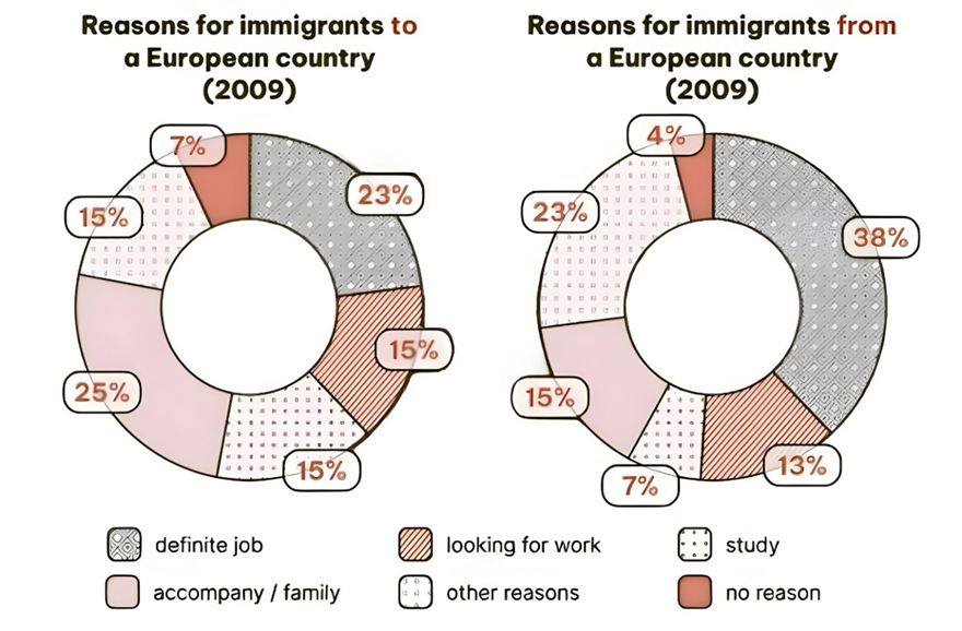
Sample 1:
The given pie charts state different justifications for migrating to and out of a European country within the year of 2009. Overall, most of the newly arrived immigrants came to live with their relatives and friends, while those who left the country were mainly for job security.
A closer look at the chart revealed that in 2009, migrants entered the European country primarily for fixed occupational roles and co-living with menage, with 25% and 23%, respectively. Meanwhile, those who settled in the country to seek jobs and pursue education share an equal share of 15%. Lastly, only 7% of citizens relocated to the country without a specific reason.
Regarding the emigrant group, a large proportion of citizens leaving the European country were those having secured a permanent job, with 38%. This figure was doubling the group reporting that they entered another country to stay with relatives or participate in the job market here. Whereas less than 10% of settlers were said to migrate out of their country in order to commence an educational course.
Sample 2:
The two pie charts illustrate the reasons why people immigrated to and from a European country in 2009.
Overall, the primary reasons for both immigration to and emigration from the country in 2009 were family and job-related factors.
Regarding immigration to this European country, the largest share of people (25%) relocated to accompany or join family members. Close behind, 23% moved for a definite job. Similarly, 15% immigrated in search of work, while an equal percentage (15%) came for educational purposes. Another 15% cited other reasons for their move, and the smallest group, at 7%, indicated no specific reason for their immigration.
As for those leaving the country, the majority (38%) did so to secure a definite job. Similar to immigration, 23% emigrated to accompany or join family members. Another 15% left for educational reasons, while 13% sought work opportunities abroad. Other reasons accounted for 7%, and a minority (4%) left without giving any particular reason.
Sample 3:
The pie graphs illustrate the purposes for migration to and from a particular nation in Europe in 2009. Overall, individuals joining their families accounted for the largest share of immigrants to this country, while secured employment was the most popular cause for emigrants.
Regarding immigration, a quarter of people entering this nation came for family unions, followed by those who had obtained definite work at 23%. Furthermore, the figures for job seeking, academic pursuit and other objectives were identical at 15%, whereas the lowest proportion was from people who did not specify a reason at 7%.
Concerning emigration, the two most common motivations for leaving this country were confirmed career opportunities and other reasons at 38% and 23%, respectively. Moreover, fairly similar percentages were witnessed for accompaniment of relatives and job finding at around 14%, which was approximately double that of study. Similarly to immigration, the lowest result was exhibited from the 4% of individuals who left without a reason stated.
Sample 4:
The pie charts illustrate the reasons for immigration to and from a European country in 2009.
Overall, accompanying family or loved ones was the primary reason for immigrating to the country, whereas definite employment was the main factor driving people to leave. Notably, very few individuals cited no specific reason for their migration in either direction.
To begin, 25% of those immigrating to the European country did so to join family or loved ones, making it the leading reason, followed closely by definite employment at 23%. The pursuit of a new job, education, and other miscellaneous reasons each accounted for 15%. Meanwhile, only 7% of individuals moved without a clear motive.
In contrast, the most significant reason for leaving the country was definite employment, which made up 38%. Other miscellaneous reasons were next at 23%, followed by accompanying family or loved ones (15%) and job-seeking (13%). Education and lack of a specific motive were the least common reasons, at 7% and 4%, respectively.
Sample 5:
The given pie charts provide information on the percentage of people immigrating to and from a European country in 2009, categorized by different purposes.
Overall, employment and family-related reasons were the predominant factors influencing immigration. Meanwhile, the majority of emigrants left the country to pursue job opportunities.
In terms of immigration, a significant portion, at 25%, moved to the country for family reasons. This was closely followed by those who migrated for work, accounting for 23% of the total. An equal share of 15% was observed among individuals immigrating to seek employment and those arriving for educational purposes. Meanwhile, 15% of immigrants cited other reasons for their move, and a minor 7% did not disclose their reasons by choosing not to participate in the survey.
When it comes to emigration, work was the most compelling factor, with 40% of individuals leaving the country for employment purposes. Family reasons and job hunting accounted for 15% and 13%, respectively, indicating a slight variation. These figures were approximately double the 8% of emigrants who left the country to pursue their studies abroad. Additionally, 23% of people emigrated due to various other reasons, while a mere 4% did not respond to the survey.
Sample 6:
The pie chart illustrates information about the reasons for immigration to a European country in 2009 and the reasons for immigration from a European country in 2009.
Overall, we see the reasons for leaving the country of immigrants. Besides, work is essential for migrants. In contrast, the reasons play the least important role for both purposes.
The pie chart shows that autonomy and family are the main reasons for immigration, with 25% of immigrants. Next to that is 23% with a definite job as the reason. A total of 45% divided equally between 3 reasons: other reasons, study, and looking for a job. Finally, 7% have no reason.
However, the remaining chart shows a rather contrasting picture when a definite job accounts for the largest proportion with 38% of individuals considering it as the reason for their departure. This is followed by 23% with the remaining reasons. While only 15% are because of autonomy and family.
Following that is 13% with the reason being looking for a job. The reason for studying drops to only 7% and rounding up to 4% with no reason.
The plans below show a bookstore in 2000 and the bookstore now.
Summarise the information by selecting and reporting the main features, and make comparisons where relevant. Write at least 150 words.
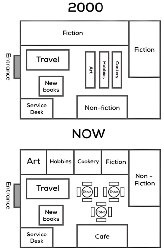
Sample 1:
The maps show changes in the layout of a bookstore between 2000 and the present.
In general, the layout of the bookstore has been significantly changed, especially on the left-hand side of the room. A number of features have been moved and modified, while other facilities have been added.
In 2000, there was a large section dedicated to fiction books on the left-hand side of the store. However, that section has been divided into four new sections, in which books on art, hobbies, cookery, and fiction are now displayed.
The area for fiction books in the rear left corner of the store is now used for non-fiction books, while the old non-fiction section has been transformed into a new cafe. The central area of the room, which used to be for art, cookery, and hobby books, is now occupied by tables and chairs. Meanwhile, the space for travel books, new books, and the service desk, has remained unchanged over the years.
Sample 2:
The maps depict the layout changes of a bookstore from 2000 to the present. Overall, the bookstore has undergone significant modifications, including the relocation of several book sections, the introduction of a seating area, and the addition of a café.
In 2000, the bookstore’s central area was occupied by the art, hobbies, and cookery sections. These sections have now been moved to the top left corner, next to the fiction area. As a result, the fiction section, which previously spanned across two large areas, has been reduced in size. The central space, once home to art, hobbies, and cookery, now accommodates three tables for customers to sit and read.
Additionally, the non-fiction section, originally located at the bottom of the store, has been relocated to the top right corner, where the larger fiction area once stood. The space formerly used for non-fiction has been transformed into a café, providing customers with refreshments. Despite these transformations, some areas have remained unchanged. The travel section, new books, service desk, and entrance have all stayed in their original positions throughout the period.
Sample 3:
The two maps depict the transformation of a bookshop over the course of two decades, from the year 2000 to the present.
Overall, the layout of the store has undergone significant changes over time, particularly with regard to the arrangement of the different sections. While the centre of the store is now fully occupied, the relocation of the cooking, hobbies, and art units to the north has resulted in a more balanced distribution of content throughout the store. The addition of a café has also enhanced the shopping experience for customers, offering a comfortable space for reading, relaxing, and enjoying a cup of coffee.
In the year 2000, the central area of the bookshop was primarily occupied by cooking, hobbies, and art units, while the northeast and north edges were dominated by large fiction units. The west and east west corners housed travel, new books, and a service desk, and a non-fiction section was situated on the east side of the store.
Fast forward to the present, and the bookshop has undergone a significant transformation. The central tables are now completely occupied, forcing the cooking, hobbies, and art units to be relocated to the north. The previous large fiction unit in the northeast corner has been replaced by a non-fiction section, and a café now occupies the south side of the store, where the non-fiction department once stood.
Sample 4:
The two maps show the evolution of a bookshop from the year 2000 to the present. Overall, the tables in the centre have been totally occupied, pushing the units for hobbies, literature, and cooking to the north. Also, a café has replaced a non-fiction section in the present bookstore.
The centre of the bookshop included cooking, hobbies, and art areas in 2000. Large fiction units were occupying the northeast and north edges. After the entry area, on the west and east west corners were travel, new books, and a service desk. A non-fiction section was also located on the east side of the bookstore.
The present bookshop has three attached circular tables with four chairs surrounding each one in the centre, displacing the cooking, hobbies, and art units to the north side where there used to be a huge fiction arrangement. Additionally, a non-fiction section has taken the place of the other fiction unit that was in the northeast corner. In fact, the south side of the bookshop, which is currently home to a café, used to house the nonfiction department.
Sample 5:
The two maps depict the changes that have taken place in a bookstore from 2000 to the present day. Overall, the central area has been completely packed with tables, pushing cookery, hobbies, and fiction units on the north side. Meanwhile, at the expense of a non-fiction unit, a café has appeared in the current bookstore.
In 2000, there were cookery, hobbies, and art sections at the centre of the bookstore. Both the north and the northeast sides were occupied by large fiction units. Travel, new books, and service desk were on the west and east west corner right after the entrance area. Moreover, there was a non-fiction unit on the east side of the bookstore.
In the current bookstore, pushing cookery, hobbies, and art units to the north side, where previously there was a large fiction setup, the central space is packed with three round tables attached with four seats around each one. Furthermore, the other fiction unit, which was located at the northeast corner, is now replaced with a non-fiction area. In fact, the nonfiction section was previously on the south side of the bookstore, which is now occupied by a café.
Sample 6:
The maps below show a bookstore in 2000 and now.
Overall, several scattering book sections have been consolidated to make space for the introduction of some new services.
In 2000, fiction was the most dominating genre, occupying the largest L-shaped shelves running along the top wall and half of the right-side one. Hobbies, cookery, and art took up a modest space in the middle of the bookstore.
Currently, the area right after the entrance has been kept intact with space dedicated to the travel and new book sections. The L-shaped area has been divided into four nearly equal sections to accommodate art, cookery, and fiction at the top, and non-fiction on the right, which has allowed the removal of the four separate display areas. The non-fiction section from 2000 has been removed to establish a café, enhancing customers' experience.
Sample 7:
The maps illustrate the reorganization of a bookstore at present in comparison to its arrangement in 2000.
According to the floor plan of the store, the area right at the entrance has been kept intact with space dedicated to the travel and new books sections. Also, in the near right-hand corner after the front entrance, still stands the service desk.
However, after reshuffling, the fiction section stretching along the left wall in 2000 has been reduced to only a quarter of its original size in the back corner of the store. This leaves room for the art, hobbies, and cookery sections which have been removed from the middle of the store to make way for three sets of tables and chairs. At the back of the store, people now keep non-fiction books where there used to be fictions. Meanwhile the non-fiction section in 2000 has been removed to establish a café which customers can reach when they walk past the service desk on the right of the store.
Overall, the maps demonstrate the resizing and relocation of the same sections of books in the store to accommodate a new in-house café.
Sample 8:
The map illustrates the evolution of a bookstore's layout from the year 2000 to the present day. A comparative analysis reveals a significant reconfiguration of various sections, notably a reduction in the area allocated to fiction, which has been supplanted by new facilities and sections.
Commencing with the left side of the entrance, the original fiction area has undergone a notable transformation, segmenting into four distinct categories: Art, Hobbies, Cookery, and Fiction. This diversification enhances the variety available to customers. Furthermore, the upper right section, which initially housed a dedicated fiction area, has now been occupied by a Non-Fiction section. In contrast, the Travel section, located directly opposite the entrance, has remained unchanged over the years, indicating a stable demand for this genre.
On the right side of the entrance, the sections for New Books and the Service Desk have retained their original positions. However, a Non-Fiction area that existed in 2000 has been converted into a café, reflecting a shift towards a more leisure-oriented experience for patrons. Additionally, the middle section, which previously included Cookery, Hobbies, and Art areas, has transitioned into a cluster of tables, providing customers with spaces to sit, relax, or read while enjoying their visit to the bookstore.
Sample 9:
The changes which occurred to the physical layout of a bookstore since 2000 are portrayed in the given maps. Overall, it is clear that there have been done significant alterations in the store for the introduction of a Cafe and a reading area.
In 2000, the bookstore was a square-shaped building with its entrance at the West. The service desk was there towards its extreme right, crossing the sections for travel and new books. Most area of the store was occupied by books on fiction: at the North and towards the North-east. Non-fiction books were arranged to the South, towards the East of the service desk. At the centre, there were books on cookery, hobbies and art.
The first major change as a part of re-arrangement is seen at the centre, when the area is seen cleared up for reading. The area for fiction at North is seen shrunken by a quarter of its previous size. Books on art, cookery and hobbies occupied the other three portions. The area in the North-east, where fiction books were there in 2000, is seen occupied by non-fiction books now. At the place where the non-fiction books were seen, a café came to existence.
Sample 10:
The two maps illustrate the layout of a bookstore in 2000 and the present day.
Overall, while the core structure of the bookstore remains the same, there have been some noteworthy changes in the arrangement of bookshelves and the addition of a café and tables.
In 2000, the largest section in the bookstore was allocated to fiction books, located on both sides of the store. Non-fiction books occupied the space at the bottom right corner, while genres such as travel, art, hobbies, and cookery were arranged in the middle part of the store. A section labeled “new books” was placed near the entrance, along with a service desk on the left-hand side.
In contrast, the current layout has undergone several modifications. The fiction section has been reduced in size, and the space previously occupied by non-fiction books is now a café. The non-fiction section has been moved to the top right corner, replacing part of the old fiction area. In the center of the store, three tables have been introduced, creating a more communal space. Additionally, the sections for travel, art, hobbies, and cookery books have remained in the same area, but their positions have been slightly adjusted.
The table below gives information about the average annual distance traveled by adults and the types of travel in 1977 and 2007.
Summarise the information by selecting and reporting the main features, and make comparisons where relevant. Write at least 150 words.
Average annual distance (in miles) travelled by adults, by mode of travel | ||
| 1997 | 2007 |
Walking | 400 | 300 |
Bicycle | 100 | 80 |
Car | 3500 | 7100 |
Motorcycle | 100 | 90 |
Bus | 800 | 500 |
Train | 900 | 1000 |
Taxi | 200 | 800 |
Sample 1:
The table compares the average annual distances, measured in miles, that adults traveled using various modes of transport in 1997 and 2007.
Overall, car travel saw a dramatic increase, while walking, bicycle, motorcycle, and bus travel generally declined over the period. Among these means of transport, the average annual distance traveled by car led in both years.
In 1997, adults traveled an average of 3,500 miles by car, which more than doubled to 7,100 miles by 2007, making car travel the most preferred mode of transportation in both years. Another striking increase occurred in taxi usage, with the distance covered rising fourfold, from 200 miles in 1997 to 800 miles in 2007. Train travel saw a modest increase, from 900 miles to 1,000 miles, indicating a slight rise in usage.
Walking and cycling, however, became less popular over time, with walking decreasing from 400 miles in 1997 to 300 miles in 2007, and cycling declining slightly from 100 to 80 miles. Similarly, bus travel saw a significant drop from 800 miles to 500 miles over the decade, indicating a reduced reliance on public transport. Motorcycle travel remained relatively stable, dropping just 10 miles, from 100 miles in 1997 to 90 miles in 2007.
Sample 2:
The table illustrates the average number of miles adults travelled per year in 1977 and 2007, in terms of seven different modes of transport.
Overall, there were increases in the use of cars, trains and taxis by adults in both years, whereas the opposite was true in the cases of the other forms of transport listed. Additionally, while cars remained by far the most popular type of travel, bicycles and motorcycles were the least common throughout.
In 1977, adults predominantly traveled by car, with an average distance of 3500 miles. This was significantly more than trains and buses, recording 900 and 800 miles respectively. At the same time, adults walked an average of 400 miles, twice the distance covered by taxis, while bicycles and motorbikes were used in equal measure, at an average of 100 miles for the year.
By 2007, the average distance covered by car had more than doubled, reaching 7100 miles and remaining the highest figure. Taxis and trains followed similar increasing trends, with the use of the former rising fourfold, whereas the latter grew by only 100 miles. In contrast, travel by bus and foot experienced declines of 300 and 100 miles, in that order, while minimal changes were observed in the distances traveled by bicycles and motorbikes, both just under 100 miles.
Sample 3:
The table illustrates the average distance that adults commuted by seven different means of transport annually within 30 years, from 1977 to 2007. Overall, cars travelled the farthest distance, and this figure continued to dominate after 30 years. Meanwhile, the other modes of transportation did not commute over 1000 miles yearly in both studied years.
A closer look at the table reveals that commuters by car drove around 3,500 miles on average, marking it as the largest figure in terms of travelled distance in a year. This number was higher than the sum of the other six vehicles. Sharing the second place was bus and train goers, who took turns to travel 800 and 900 miles in 1977. Noteworthily, none of the other commuting methods was able to exceed 500 miles when it came to the average total mileage per year.
Regarding the changes in travel patterns in 2007, car travellers continued to intensify their driven miles annually, which doubled to 7,100 miles. Taxis have overtaken buses since they witnessed a fourfold increase to 800 miles a year and shared the second place with trains. Meanwhile, those who chose to travel by two-wheeled vehicles and buses, or on foot observed a decline in their average travel distance, with the smallest belonging to cyclists and motorcyclists.
Sample 4:
The table presents a comparative analysis of the average annual distances traveled by adults across various modes of transportation in the years 1977 and 2007.
Overall, there was a significant disparity in the distances covered by different modes of transport over the two decades, with notable increases in the utilization of cars, trains, and taxis, while other forms of travel experienced a decline.
In terms of walking and cycling, both activities witnessed a reduction in average distance traveled. Specifically, walking decreased from 400 miles in 1977 to 300 miles in 2007, marking a decline of 100 miles. Similarly, bicycle travel saw a drop from 100 miles to 80 miles during the same period, reflecting a decrease of 20 miles. Conversely, motorcycling exhibited a marginal decrease, with average distances traveled falling from 100 miles to 90 miles.
In stark contrast, car travel surged dramatically, with adults covering an average of 3,500 miles in 1977, which more than doubled to 7,100 miles by 2007, indicating an increase of 3,600 miles. Taxi usage also showed remarkable growth, rising from 200 miles in 1977 to 800 miles in 2007, a notable increment of 600 miles. The use of buses saw a decline from 800 miles to 500 miles, while train travel experienced a slight increase, from 900 miles to 1,000 miles, signifying a change of 100 miles.
Sample 5:
The table illustrates the mean travel distance per annum by adults, categorized by transport methods, in 1977 and 2007. Overall, only cars, trains and taxis witnessed an increase between the two years. Additionally, the average distance traveled by cars was the highest for both years.
Regarding the increasing categories, surveyed individuals traveled 3500 miles by automobiles in 1977, which then more than doubled to 7100 miles by 2007. Moreover, trains accounted for a distance of around 1000 miles for both years, while the figure for taxis quadrupled from 200 miles to 800 miles for the selected period.
Concerning the remaining categories, adults reduced their walking distance from 400 miles in 1977 to 300 miles in 2007. Cyclists and motorcyclists shared the lowest results of 100 miles in 1977; subsequently, their respective figures declined to 80 miles and 90 miles in the following forty years. Finally, buses contributed to 800 miles of adults' travel distance in 1977, followed by a plunge to 500 miles by 2007.
Sample 6:
The given table compares different means of transportation in terms of the annual distance traveled by adults in two separate years, 1977 and 2007. Units are measured in miles.
Overall, cars were by far the most popular means of transport during the entire 40-year period, witnessing the most dramatic rise. In contrast, bicycles and motorcycles were the least common modes of transportation. Regarding changes in commuting patterns, there was an upward trend in the use of cars, trains, and taxis, while the remaining methods of transport recorded a decline.
In 1977, cars occupied the position as the most prevalent vehicle, with 3,500 miles traveled, nearly quadruple the distance of the second and third most popular methods, buses and trains, which ranged from 800 to 900 miles. Meanwhile, the distance traveled on foot was 400 miles on average, twice as high as that of taxis. Bicycles were as common as motorbikes, with the average distance for each vehicle standing at 100 miles.
By 2007, the distance traveled by car had increased twofold to 7,100 miles, solidifying its position as the most preferred mode of transportation. Similar changes were seen in the figures for trains and taxis, with the former witnessing a slight growth to 1,000 miles and the latter recording a fourfold rise to 800 miles. In contrast, the other transport methods underwent a descending trend, with the most dramatic drop recorded in buses, falling by 300 miles to reach 500 miles in 2007. The distances traveled by walking, motorbikes, and bicycles dropped to 300, 90, and 80 miles, respectively.
Summarise the information by selecting and reporting the main features, and make comparisons where relevant. Write at least 150 words.
Country | Health expenditure (US dollars) |
Australia | 5,187 |
Germany | 6,646 |
United Stated | 11,073 |
Japan | 4,823 |
United Kingdom | 4,652 |
Sample 1:
The table provides data on the total health expenditure per capita in five different countries in 2019, namely Australia, Germany, the United States, Japan, and the United Kingdom.
Overall, the United States had the highest health expenditure per capita, significantly surpassing the other countries, while the United Kingdom had the lowest expenditure.
To begin with, the United States’ health expenditure per capita was $11,073, making it the highest among the five countries. This figure is notably higher than the others, indicating a substantial investment in healthcare per individual. Germany followed as the second-highest spender with $6,646 per capita, which is almost half of the expenditure of the United States but still considerable.
In contrast, the other three countries had relatively lower expenditures. Australia’s health expenditure per capita was $5,187, placing it in the middle range among the five countries. Japan’s expenditure was slightly lower at $4,823 per capita, and the United Kingdom had the lowest expenditure at $4,652 per capita. This data shows that while there are differences in health expenditure per capita, they are less pronounced among these three countries compared to the significant gap between the United States and the others.
Sample 2:
The table compares and contrasts data on the health expenses of people living in 5 different countries in the year 2019, measured in US dollars.
In general, citizens of the United States allocated the largest budget to healthcare, while people in the United Kingdom spent the least.
More specifically, the United States made the top place with about 11,073 US dollars. Except for Germany, which was the second place at 6,646 US dollars, the remaining three countries (Australia, Japan, and United Kingdom) could not even reach half of the United States in terms of health-related outgoings. Among the three aforementioned countries, the record of Australia was the median of the whole researched data, accounting for 5,187 US dollars. Investment in healthcare in the United Kingdom was 4,652 dollars, staying at the bottom of the list. With the difference of about 200 US dollars from the United Kingdom, Japan held the fourth position with 4,823 US dollars.
Sample 3:
The table gives information on how spending in the health sector is allocated per capita across five countries: Australia, Germany, United States, Japan, and the United Kingdom in 2019.
Overall, the United States has the highest health expenditure while the United Kingdom has the lowest spending on health in 2019.
To start with, the United States allocated a total of 11,073 US dollars per capita on healthcare services, which is almost twice the expenditure of the second highest-spending country - Germany - at 6,646 US dollars. Next in ranking was Australia with an average of 5,187 US dollars used on health per capita, merely 1,500 US dollars less than Germany and significantly 6,000 dollars less than the United States. Meanwhile, Japan and the United Kingdom tied at the bottom with relatively similar amounts of money spent of 4,823 and 4,652 US dollars, respectively. Moreover, these figures were approximately a third of that of America and two-thirds of that of Germany.
The table below gives information about the situation of marriage and age from 1960 to 2000 in Australia.
Summarise the information by selecting and reporting the main features, and make comparisons where relevant. Write at least 150 words.
Year | Religious marriage | Civil marriage | The average age of bride | The average age of bridegroom |
1960 | 25,000 | 8,000 | 21 | 24 |
1970 | 28,000 | 12,000 | 23 | 25 |
1980 | 50,000 | 16,000 | 25 | 27 |
1990 | 32,000 | 23,000 | 27 | 30 |
2000 | 34,000 | 40,000 | 30 | 32 |
Sample 1:
The table illustrates changes in the average age at the time of marriage for Australian men and women, as well as the changes in popularity between religious and civil marriages.
Overall, partners of both genders are choosing to get married at a later age over the 4 decades shown. Civil marriages have gained in popularity, while the numbers for religious marriages peaked and then declined.
Considering first the numbers of each type of marriage, in 1960 there were 25,000 religious marriages in Australia, more than triple the number of civil ones, which stood at only 8,000. Thereafter, religious marriage numbers surged, reaching a peak of 50,000 in 1980, before plunging to 32,000 and recovering slightly to 34,000 at the end of the period. On the other hand, a consistent upward trend was observed in civil marriages, with the annual total gradually rising to 23,000 in 1990, before rising more sharply to 40,000 in the final year, surpassing religious marriages for the first time.
Regarding the average age at the time of marriage, in 1960, Australian men typically got married when they were 24, three years older than their female counterparts. An increase of one to three years per decade was subsequently observed in the average age when getting married of both sexes, with men and women doing so at 32 and 30, respectively, in the final year.
Sample 2:
The given table elucidates the data pertaining to the number of marriages solemnised as religious and court marriages in Australia over the four-decade period from 1960 to 2000. The data also points to the average age of the bride and groom at the time of their weddings.
On the whole, the maximum number of religion-based marriages took place in 1980 while the highest number of civil matrimonies were registered in 2000. Interestingly, the wedding age of both the girls and boys increased steadily over the 40 years under consideration.
Weddings as per religion in 1980 were the most at 50000 with less than 30000 in 1960 and 1970 and more than that in 1990 and 2000. However, the number of civil weddings increased gradually with passage of time; they were the least in 1960 at 8000 and the most in 2000 at 40000 weddings.
Regarding the age at marriage for females, it was just 21 years in 1960 and kept rising by 2 or 3 years for each decade and was finally at 30 years in 2000. The figures for bridegrooms also showed a similar trend and increased from 24 years in 1960 to 32 years in 2000. Although the age difference between boys and girls in 1960 and 1990 was 3 years, it was 2 years in 1970, 1980 and 2000.
Sample 3:
The table provides data on marriage status and age in Australia from 1960 to 2000.
Overall, religion-based marriages peaked in 1980, whereas civil marriages reached their highest point in 2000. Additionally, the age at which both women and men entered into marriage showed a consistent upward trend over the 40-year period.
In 1980, religion-based weddings recorded their highest number at 50,000, surpassing the figures of less than 30,000 in both 1960 and 1970 and exceeding those in 1990 and 2000. Conversely, civil weddings exhibited a gradual increase over time, with the lowest count in 1960 at 8,000 and the highest in 2000 at 40,000.
Regarding the average age at the time of marriage, in Australia, during the 1960s, men typically married around 24 years old, three years earlier than women who married at 21. Over the following decades, the average marriage age for both genders went up by one to three years every ten years. By the end of this period, men were getting married at 32 and women at 30.
Sample 4:
The given table illustrate the number of religion and civil marriages along with the average age of Bride and groom from 1960 to 2000 in Australia. It is clearly seen that the number of religion marriages fluctuated, whereas the number of civil marriages grew over the period of four decade.
In 1960, the number of religion marriages was 25000. Which increased slightly to 28000 in 1970, after which the number rose dramatically to an all-time high of 50000 by 1980. However, religion marriages show a drastic fall and reached 32000 in 1990, after which the number picked up slightly to 34000 by 2000. The number of civil marriages grew 5 times from 8000 in 1960, to 40000 in 2000.
The average age of the bride was 21 in 1960 but increased steadily to 30 years by 2000. The average age of the groom escalated from 24 to 32 over the given period of time.
Overall, it can be seen that civil marriages grew in popularity over the years, and in both genders the average age of marriage increased.
Sample 5:
The given table shows the number of religious and civil marriages, as well as the average age of the bride and groom from 1960 to 2000 in Australia. It can be clearly seen that the number of religious marriages has fluctuated, while the number of civil marriages has increased in the given period of four decades.
In 1960, the number of religious marriages was 25,000, in 1970 it slightly increased to 28,000, after which by 1980 this number rose sharply to a record level of 50,000. However, religious marriages fell sharply and reached 32,000 in 1990, after which by 2000 they increased slightly to 34,000. The number of civil marriages increased 5 times, from 8,000 in 1960 to 40,000 in 2000.
The average age of brides was 21 in 1960, but steadily increased to 30 years by 2000. The average age of the groom increased from 24 to 32 in the given period of years.
Overall, it can be seen that civil marriages have become more popular over the years, and the average age of marriage has increased among both genders.
Sample 6:
The given table highlights the total number of religious and civil marriages, along with the average age of brides and grooms from 1960 to 2000 in Australia. Overall, it is apparent that civil marriages gained popularity over the years, accompanied by a rise in the average age of marriage for both genders.
First off, in 1960, religious marriages were around 25,000, rising slightly to 28,000 in 1970, then dramatically increasing to 50,000 by the year 1980. However, religious marriages experienced a sharp decline, hitting 32,000 in 1990, before slightly increasing to 34,000 by 2000.
To mention, civil marriages faced a drastic increase in their numbers from 8,000 in the year 1960 to 40,000 in 2000. Regarding the average age of brides, it was 21 in 1960, steadily climbing to 30 by 2000. Similarly, the groom’s average age increased from 24 to 32 during the same period.
Sample 7:
The table shows the marital status in Australia categorized by approval from religion and civil, along with the number of brides and bridegrooms by age from 1960 to 2000. Overall, religious marriages were the most common ones, but the numbers went down as the years passed by, whereas civil marriages were constantly facing an increase in their count.
From 1960 to 1980, the number of religious marriages in Australia was three times higher than civil marriages. Although this trend declined to 32,000 by the year 1990, the religious marriages anyway remained popular.
In contrast, in the year 2000, civil marriages surpassed religious ones by around 6,000 individuals. Regarding age distribution, both the number of brides and bridegrooms increased steadily over the given period of time. However, there was a consistent dominance of bridegrooms, with a slight gap between ages 2 and 3 years between 1960 and 1980.
Sample 8:
The given table presents very clear data based on the marital trends in the country of Australia between the years 1960 and 2000. Overall, religious marriages decreased steadily over the period, while civil marriages showed the opposite trend, increasing over time.
Firstly, it is evident that in 1960, religious marriages and civil marriages were both quite common, with 42,000 and 8,000 respectively. Over the next decade, these figures increased by 4,000 each, reaching 50,000 for religious marriages and 12,000 for civil marriages. However, there was a significant decline of around 12,000 in both categories.
Regarding the year 2000, the numbers stood at 36,000 for religious marriages and 40,000 for civil marriages. Furthermore, the typical age for women to marry was 21, which was two years younger than men. Over the following two decades, the average age increased by 2 years for both genders.
The two charts below show the proportion of qualified graduates in a particular country.
Summarise the information by selecting and reporting the main features, and make comparisons where relevant. Write at least 150 words.
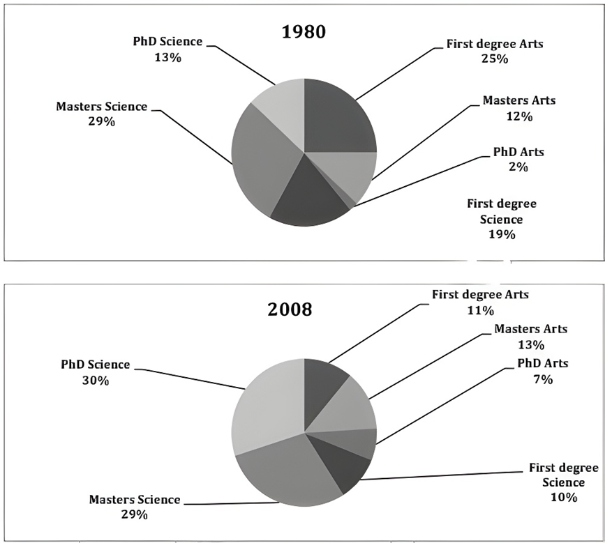
Sample 1:
The two pie charts illustrate the educational qualifications of employees at an engineering enterprise in 1998 and 2008.
Overall, over the course of a decade, the company hired a greater number of specialists, primarily those with a PhD degree.
In 1998, the majority of employees held a bachelor’s degree, with 19% in science and 25% in arts, accounting for nearly half of the total workforce. While 29% of the employees had a master’s degree in science, only 12% held a master’s degree in arts. However, only a small percentage of employees had a PhD degree, with 13% in science and a mere 2% in arts.
In contrast, there was a considerable shift in the qualifications of the staff at the same company in 2008. The most noteworthy difference was the substantial increase in the percentage of PhD scientists, which rose to 30% and constituted the majority of the workforce. Similarly, there was also an increase in the number of people majoring in arts with a doctorate, rising from 2% to 7%. The proportion of employees with a first degree in either of these two majors, on the other hand, decreased to 10% (science) and 11% (arts). The figure for employees with a master’s degree saw a little change, though.
Sample 2:
The given pie charts depict the proportion of graduates who held various degrees in a given country in 1980 and 2008. It is clear from the charts that the First degrees in Arts and Sciences lost popularity whereas the Masters and Doctoral courses gained popularity after a period of nearly three decades.
In 1980, a quarter of the graduates held a first degree in Arts, whereas only 12% went for Master’s in Arts and a very small minority (2%) went for a PhD in Arts. First degree Science graduates were a little under a fifth whereas the Master’s in Science graduates were nearly a third of the total. Only 13% held PhD degrees.
In 2008, Graduates holding Master’s in Arts and Sciences were 11% and 10% respectively. This percentage was considerably less as compared to that of 1958. The proportion of Master’s in Arts and Science graduates was almost similar to that of 1958. PhD degree holders in Arts grew significantly from 2% to 7% and the PhD in Science was held by 30%, which was also much higher than the figures of 1958.
Overall, it is interesting to see that undergraduate or the first-degree courses became less popular over time, but the graduate courses were pursued by more people.
The maps indicate how Huntingdon has changed throughout time, both in terms of present changes and anticipated future changes.
Summarise the information by selecting and reporting the main features, and make comparisons where relevant. Write at least 150 words.
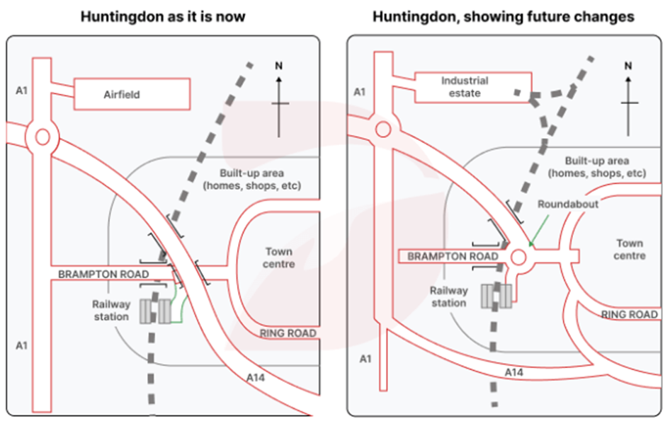
Sample 1:
The given maps demonstrate the layout of Huntingdon town as it is now and the proposed future urban planning.
Overall, the town is set to undergo significant changes, with the most notable developments being the enhancement of traffic infrastructure and the construction of new industrial zones.
In terms of the road systems, Huntingdon currently has an intersection between the A14 and A1 roads, forming a roundabout in the northwest corner on the outskirts of the town. The A14 travels across the town from the northwest to the southeast, while the A1 runs from north to south. The northern section of A1 links with a small road leading to Airfield, which is set to be demolished to make room for a new industrial estate. Meanwhile, the southern section connects to Brampton Road, forming a T-junction. This southern portion of A1 currently serves as the main access route to the town center, which is located in the eastern section and encircled by the Ring Road. To improve accessibility to this central area, a new roundabout will be constructed, linking the A14 with Brampton Road and the Ring Road. Additionally, a new road will be built at the end of the A1, providing further access to the central area.
Surrounding the town center is a built-up area with houses and shops that cater to local residents. The town also has a railway line running north to south, with a station located to the west of the center. In the future, the proposed extension of the rail line will connect the existing system to the newly developed industrial zones, enhancing transport links within the town.
Sample 2:
The maps below illustrate the current layout of Huntingdon and the proposed changes for the future.
Overall, the town is planned to experience a host of significant alterations, the most prominent of which will be the development of traffic infrastructure and the construction of an industrial zone.
At present, Huntingdon town centre is encircled by a ring road that separates it from the surrounding built-up area, comprising homes, shops, and other facilities. The ring road is currently connected to the A1 highway via Brampton Road, which runs in an east-west direction. Meanwhile, the A14 highway can only be accessed via a roundabout on the A1, located near the airfield to the north. There is also a railway line located to the west of the ring road, running from the south, through the built up area, and out in a north-easterly direction. Finally, a railway station is located just south of the Brampton Road underpass.
In the future, the town center and surrounding built-up area will remain unchanged. However, the most notable development will be the addition of a roundabout at the junction of Brampton Road and the A14, enhancing access to the railway station. The southeastern segment of the A14 is also set to be rerouted to directly link with both the ring road and the A1, though this will reduce access to the newly constructed roundabout. Lastly, a major change will occur in the northwest, where the airfield will be replaced by an industrial zone, with two additional railway lines linking to the existing main railway line.
Sample 3:
The provided maps illustrate the current layout of Huntingdon town and the future urban development plans.
Overall, the town is poised for major changes, focusing primarily on transportation upgrades and expanding industrial areas.
Currently, the town center is surrounded by both residential and commercial zones that cater to the local population. A railway line runs north to south through the town, with a station situated to the west of the town center. According to the proposed development plan, this railway line will be extended to reach the newly constructed industrial zones, enhancing transportation links within the town between different areas.
At present, the A14 and A1 roads are the primary arteries of Huntingdon’s Road network. The A14 cuts diagonally from the northwest to the southeast of the town, while the A1 runs vertically from north to south. A key intersection between these two roads is marked by a roundabout in the town’s northwest outskirts. The southern section of the A1 meets Brampton Road at a T-junction, and this route currently serves as the primary access to the town center, which is encircled by the Ring Road in the eastern part of town. In the future, a new roundabout will be built at the junction of the A14, Brampton Road, and the Ring Road to facilitate smoother traffic flow to the center. Additionally, the northern portion of the A1 connects to a minor road leading to the Airfield, an area set to be demolished to make room for a new industrial estate. An extension of the A1 is also planned, improving connectivity to the central area.
The table and the chart below provide a breakdown of the total expenditure and the average amount of money spent by students per week while studying abroad in 4 countries.
Summarise the information by selecting and reporting the main features, and make comparisons where relevant. Write at least 150 words.
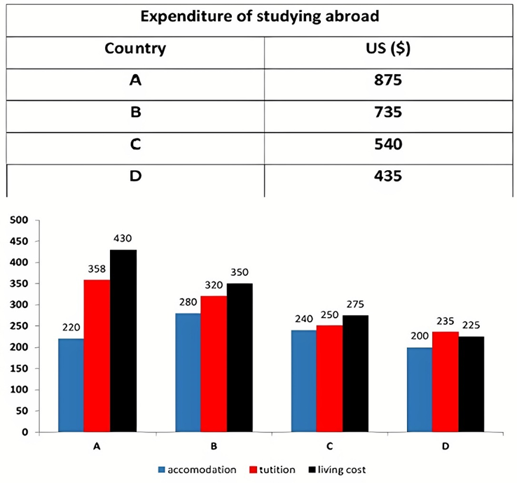
Sample 1:
The bar graph illustrates the overseas students' spending on accommodation, tuition, and living expenses, while the table depicts information about the average weekly expenses by international students in four countries: A, B, C, and D.
Overall, foreign students need to spend the highest in country A and the lowest in D. In nearly every nation, the international students’ weekly average living expenses are the greatest, while their housing cost registers the lowest.
The costliest country for studying is A, with a weekly average expense of 875 dollars. This is followed by B, C, and D, which have weekly expenses of 735, 540, and 435 dollars, respectively. However, foreign students always pay the least for accommodation, which incurs on average weekly 220, 280, 240, and 200 dollars in the nations A, B, C, and D, respectively.
On the other hand, living expenditures account for the highest portion of average weekly costs for international students in countries A, B, and C, with 430, 350, and 275 dollars, correspondingly. Tuition fees in the same countries (A, B and C) come in second with the weekly averages of 358, 320, and 250 dollars in order. However, D is the only nation where education accounts for the highest average spending area, coming in at USD 235, followed by the cost of living (USD 225) and housing (USD 200).
Sample 2:
The table illustrates information regarding the weekly spendings by overseas students in four countries, A, B, C and D, while the bar graph depicts the students’ expenditure on the sectors, housing, education fees and living expenses.
Overall, the cost of studying abroad is the highest in country A and the lowest in D. Apart from country D, living costs account for the most part of the weekly spendings in all countries, while accommodation registers the least.
Regarding the total cost of studying, A is the most expensive country with weekly average 875 dollars, followed by B, C and D with 735, 540 and 435 dollars, respectively. On the other hand, the overseas students always spend the least on accommodation, which are on average weekly 220, 280, 240 and 200 dollars in the corresponding countries A, B, C and D.
Considering the living cost, it takes the largest share of foreign students’ average weekly expenses in countries A, B, and C with 430, 350 and 275 dollars, respectively, while tuition fees in the same countries hold the second place with weekly average 358, 320 and 250 dollars, sequentially. However, D is the only country where tuition fee occupies the highest expenditure with average weekly 235 dollars, followed by living cost (USD 225) and accommodation (USD 200.)
Sample 3:
The table and bar graph depict information regarding the weekly spendings by overseas students in countries A, B C and D.
Overall, there are three elements, housing, school fees and living costs that contribute to the total weekly spendings. The total expenditure in country A is the highest while it is the lowest in country D. Living costs account for the most part of the weekly spendings in all countries except D.
The total mean weekly cost for pupils to study in country A is US$875, next by country B at US$735, and then by country C at US$540, and finally by country D at US$435. The living costs are always the biggest component of the expenditure except for country D, with about US$10 less than the major spending which is the school fees.
Accommodation accounts for the least among all spendings in all countries. The most expensive housing is found in country B, at US$280, and the cheapest in country D at US$200. The middle range can be seen in country A at US$220 and country C at US$240, respectively. Costs of the tuition fee range between US$ 358 and US$235 in country A and D, in order.
The map below shows a school in 1985 and the school now.
Summarise the information by selecting and reporting the main features, and make comparisons where relevant. Write at least 150 words.
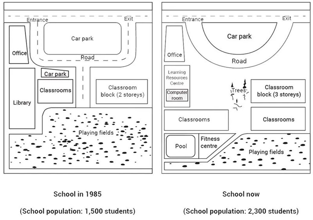
Sample 1:
The two maps illustrate the degree to which a school campus has changed since 1985.
Overall, the school has experienced significant alterations to accommodate the growing number of students, the most prominent of which are additional classrooms and the construction of various sports and educational amenities. Further changes have also been made to the school’s access and parking facilities.
In 1985, the school had an enrollment of 1500 students. In the west of the campus, there was a cluster of facilities, including classrooms, a small parking lot, a library, and an office, while on the east side stood a block of classrooms with two storeys. The students accessed the campus through the entrance and exit points positioned on both sides of a large car park in the north, with a road branching off in the middle of the map, leading to spacious playing fields in the south.
At present, the student population has risen significantly to 2300. Whilst the office remains intact, the library has been reduced in size and become a new learning resources center housing a computer room, making way for the relocation of the now expanded classroom building. Just south of this is a newly built gymnasium with an indoor swimming pool, overtaking approximately half of the playing fields. Meanwhile, a third floor has been added to the classroom block, accompanied by more classrooms being built to its south. In the north, the small car park has been completely removed, and the rectangular one has been reshaped into a semicircle. Finally, a group of trees has been planted, replacing the road in the center of the campus.
Sample 2:
The map displays the different distribution of a school in 1985 and now. It is clear that the school changed dramatically during the period.
In 1985, there were 1500 people in this school, and it had a square car park and a road, which is located on the northern of the school. On the east part of the school, there was a classroom block which had 2 storeys. A large field was located in the south part of the school, and in the west part of the school, there are some of the buildings laid in here, which include office, library and car park.
At present, the population of this school increased to 2300. The north car park remains but its size is smaller. On the west part of the school, the new classrooms are constructed, and the classroom block adds the storeys by 3. The south field was cleared to make a way for pool and fitness centre. On the west part of the school, the car park was demolished, new classrooms were built in here, and the library change to a resource centre which has a computer room.
Overall, it is obvious that more and more facilities have been constructed in this school and many more students studying in this school.
Sample 3:
The maps illustrate the extent to which a school campus has transformed since 1985.
Overall, the school has witnessed significant changes, which include the incorporation of classrooms and other sports and educational facilities. Moreover, the parking lot has also seen significant changes.
In 1985, to accommodate 1500 students, there was an office, a library, and classrooms next to a small parking area in the west of the schools as opposed to only a 2-storey block of classrooms in the east. There was a huge car park in the north, which was surrounded by a road that connected the school’s entrance and exit in the northwest and northeast respectively. This road was access for students to reach huge playgrounds in the south of the school.
Considerable alterations have been witnessed to accommodate 2300 students now. In the west of the school, the library now becomes a new learning resources center where there is a computer room. The old classrooms have been relocated next to the new learning resources center. The playing fields have been reduced in size and roughly half of it has been the construction of a new sports area, which is also located to the south of the new classrooms, including a swimming pool and a fitness center. A third floor has been added to the 2-storey classroom block, next to more classrooms being built to the south of it. The small car park in the north of the school has been enlarged and the road connecting the entrance and exit has been reshaped into a more curved one. Moreover, many trees have been planted and replaced the road that led to the playing fields.
Sample 4:
The given diagrams compare the layout of a school in 1985 with its present-day one. Overall, the school has undergone many changes to accommodate the growing number of students over the given period of three decades.
After more than 30 years, the student population has grown from 1500 to 2300. In 1985, the entrance and exit were in the north, on the two sides of a rectangular car park. There was a playing field occupying a substantial area in the south, and a road running along the periphery of the car park connecting the entry and the exit. This road extended along the center to the playing area. An office was in the northwest of the road. To the south of the office, there was a library, which extended into the play area. Another smaller car park and some classrooms were there on the east of the office and library. A two-story classroom block was located towards the east of the road.
In the present layout, the rectangular car park has been replaced by a bigger, semi-circular car park. The road connecting the car park to the playing fields, and the smaller car park have been removed, while the entrance, exit, and office have remained unchanged. A learning resource center and a computer room have taken the place of the old library. The area of the playing fields has been cut down to make room for a pool and fitness center. Another story has been added to the two-story classroom block with some trees planted in the place of the road. Some more classrooms have been constructed to the south of the three-story classroom block.
Sample 5:
The two diagrams depict the extent of transformations a school campus has undergone since 1985.
Overall, the modifications to the school campus since 1985 have been extensive to accommodate the increase in the number of students, involving the expansion of classrooms, the establishment of new sports and educational facilities, adjustments to the parking facilities, and alterations to the campus's layout.
In the year 1985, the school's student population amounted to 1500. Students accessed the campus through entrance and exit points situated on both sides of a spacious and rectangular parking lot in the northern region. From here, a road led to expansive playing fields in the southern portion, west of which was a cluster of facilities including classrooms, a small parking lot, a library, and an administrative office. On the eastern side, there existed a two-story block of classrooms.
At present, there has been a substantial rise in the school’s enrollment, reaching a total of 2300 students. While the office remains unaltered, the small car park was demolished and the library has been transformed into a new learning resources center, encompassing a computer room. Additionally, the expanded classroom building has been relocated further south. Adjacent to this, a newly constructed gymnasium, featuring an indoor swimming pool, occupies approximately half of the previous playing fields. Regarding the eastern campus, the classroom block has been extended with the addition of a third floor, accompanied by the construction of more classrooms towards its southern end. In the northern area, the rectangular parking area has been reshaped into a semicircular configuration. Lastly, a cluster of trees has been planted, replacing the road that previously ran through the center of the campus.
Sample 6:
The maps illustrate the layout of a school in 1985 and how it looks currently. Overall, most changes involved the school's access and amenities, with some newly added and some resized. Notably, the number of students had increased quite significantly.
In the past, there were only a few facilities mainly for academic purposes, accommodating 1500 students. To the left, a large rectangular library, a small car park and several classrooms were grouped, with an office just above the library. Opposite these was a 2-storey block of classrooms. In terms of access, a vehicle road, which circulated another car park in the centre near the entrance and exit at the top, led to huge playing fields at the far bottom.
Today, the school has more facilities as the student figure has increased to 2300. The road now only surrounds the central car park, which was reduced in size. The office has remained the same; however, the smaller car park and nearby classrooms were demolished, while the old library was transformed into a resource learning centre with a computer room. However, the classroom building opposite has stayed in the same place, but it now has 3 floors. In contrast, the playing fields were made smaller, making room for 2 groups of new classrooms and a fitness centre with an indoor swimming pool in the lower left corner.
Sample 7:
The maps depict the transformation of a school campus from 1985 to the present, primarily driven by an increased student body.
Notable changes include expanded classroom spaces, updated sports and academic facilities, and modifications in access and parking arrangements.
In 1985, the campus accommodated 1500 students. Westward, facilities clustered, featuring classrooms, a small parking area, a library, and an office. Conversely, the east housed a two-story classroom block. Entrances were positioned on both sides of a large northern car park, with a road branching towards spacious southern playing fields.
By the present day, student enrollment has surged to 2300. The library has been downscaled to create a learning resources center, now hosting a computer room. Classrooms have expanded, a new gymnasium with a pool has replaced half the fields, and the classroom block now spans three floors. The smaller parking area is gone, the larger one reshaped, and a tree cluster replaces the central road. Overall, the campus transformation reflects a significant adaptation to accommodate increased student numbers and upgraded facilities.
Sample 8:
The map illustrates the layout of a school in 1985 and the present day.
Overall, the school has undergone significant changes to accommodate a larger number of students (from 1,500 to 2,300 students), with the most notable changes being the reduction in the size of the road and playing fields to make room for additional learning and sports facilities.
Looking first at the southern part of the campus, in 1985, it was mainly occupied by the playing fields. They are now half the size they used to be, with a new pool and a fitness centre built in the west and new classrooms constructed in the northeast corner. Just north of the new sports facilities now stand a new, larger classroom building, replacing the one that once lay next to the old library. The library itself has been repurposed into a new learning resources centre with a dedicated computer room.
Upon entering the school, in 1985, there were roads around the main rectangular car park and going south to the playing fields. The main car park has been redesigned into a semicircle, with corresponding changes to the road around it. The smaller car park located just south of this driveway, along with the road that led to the playing fields, has been removed. Another major change has taken place in the east of the campus, where the classroom block now has 3 storeys instead of 2, and a new green area has been introduced in place of the road.
Sample 9:
The accompanying diagrams delineate the transformation of a school from its original layout in 1985 to its current setup. It is evident from the illustrations that the campus has undergone substantial modifications, resulting in an enhanced, capacious environment.
Directing our attention to the northern half of the maps, one can observe the original rectangular car park has evolved into a semi-circular form, instigating a consequent metamorphosis of the surrounding thoroughfare. The office retains its initial position on the western flank, while the erstwhile library has been supplanted by a technologically equipped learning resources centre. Adjacent to the old library, the smaller car park and classrooms have been demolished, making way for expansion.
On the eastern periphery, the classroom block has been expanded vertically, with an additional storey augmenting the total to three levels. The heart of the campus is now adorned with a number of newly planted trees, infusing the area with greenery.
Shifting focus to the southern half, the playing fields have been curtailed to half their original size. On the western side, a new aquatic centre and a fitness facility complement the additional classrooms. Analogously, on the east, the diminished playing fields are flanked by fresh classrooms. Overall, the renovations and additions symbolize a transformative shift from the traditional school layout of 1985 to a more multifaceted and resourceful campus.
Sample 10:
The provided diagrams offer a comparative study of a school's infrastructure, contrasting its 1985 configuration with the present layout. An evaluation of the illustrations underscores significant evolution, transforming the school into an expansive and amenity-rich environment.
Scrutinizing the top half of the maps, one witnesses the transformation of the originally rectangular car park into a semi-circular layout, thereby altering the adjacent roadway. The administrative block remains constant on the western side, while the antiquated library gives way to a state-of-the-art learning resources center, replete with a computer room. The erstwhile smaller car park and adjacent classrooms, located next to the traditional library, have been razed to provide room for enhancements.
To the east, the school building has seen vertical expansion with the construction of an extra floor, resulting in a three-storey edifice. The heart of the campus is now adorned with freshly planted foliage, providing a lush green aesthetic to the area.
Observing the lower half, the playing fields have undergone a significant downsizing to half of their original expanse. The west side welcomes the addition of a swimming facility and a fitness center, supplementing the newly erected classrooms. Similarly, the east is home to newly built classrooms, abutting the shrunken playing fields. Overall, the transformation from a basic 1985 layout to a contemporary, amenity-rich environment embodies the school's progressive shift.
Sample 11:
The provided maps compare the layout of the school between 1985 and the present day.
Overall, the school has undergone significant transformations to accommodate the expansion in student capacity.
Notably, while the school has preserved the original locations of its entrance, exit, and administrative office, major infrastructural modifications have been implemented. The bigger car park, previously rectangular, has been reconfigured into a curved design. Additionally, the road leading to the playing fields has been eliminated, giving way to a landscaped green area enriched with trees.
Due to the substantial growth in the student population, which has risen by 800, the classroom block has been expanded vertically by adding an additional story. This expansion in the number of students has caused a reduction in the play area, with parts of this space now repurposed to house more classrooms and other essential facilities. In response to evolving educational priorities, the school has also introduced new amenities, including a swimming pool and a fitness center. Moreover, the traditional library has been transformed into a Learning Resources Centre and a Computer room, indicating a shift towards digital learning platforms and resources.
Sample 12:
The given map illustrates the changes in a school’s structure from 1985 to the present day. Overall, the school saw substantial development, with new constructions and adjustments to existing buildings and the student population rose evidently throughout the mentioned years.
To begin with, in 1985, the school comprised a square car park and a road situated to the north. Additionally, a two-storey classroom block occupied the eastern section of the campus. Meanwhile, the southern area featured a spacious field, while various buildings, including offices and a library, were positioned to the west.
In contrast, the present-day configuration of the school showcases significant modifications. Additionally, the northern car park has undergone a reduction in size, while new classrooms have been erected on the western side. Furthermore, the classroom block has expanded to three storeys, accommodating the increased student population. Additionally, the former field has been replaced with a pool and fitness centre, and the former western car park has been made into additional classrooms and a computer-equipped resource centre.
Sample 13:
The provided map compares the layout of a school in 1985 with its current structure and the changes over this time span have been significant. Overall, the school has undergone considerable development, with more facilities added and a steady increase in the student count.
Back in 1985, the school accommodated around 1500 students and had a square car park and a road leading to the playing fields, located on the north side. Moreover, a two-story classroom block was situated in the east, while various buildings, including classrooms, a library, and an office, were present on the west side.
Today, with a population of 2300, the school has seen significant alterations. While the northern car park remains, it has shrunk in size. The road connecting to the playing fields has disappeared, though the entrances and exits remain unchanged. New classrooms have been built in the east, and the classroom block has been extended to three floors. Additionally, the playing fields have been reduced in size to accommodate a fitness centre and a pool.
The table below shows the percentage of working men and women in different areas of employment in one country in 1986, 1996 and 2006.
Summarise the information by selecting and reporting the main features, and make comparisons where relevant. Write at least 150 words.
| Men (%) | Women (%) | ||||
Area of employment | 1986 | 1996 | 2006 | 1986 | 1996 | 2006 |
Catering | 16 | 22 | 22 | 26 | 26 | 26 |
Banking | 11 | 20 | 21 | 12 | 16 | 19 |
Manufacturing industry | 32 | 21 | 17 | 18 | 12 | 6 |
Education | 13 | 14 | 15 | 33 | 35 | 38 |
Sample 1:
The table illustrates the percentages of male and female employment across four sectors: catering, banking, manufacturing industry, and education, during the years 1986, 1996, and 2006.
Overall, manufacturing industry saw the greatest decline in employment rates, while women dominated education sector.
Within the manufacturing industry, male employment started at a relatively high level of 32% in 1986 but declined to 21% in 1996 and further dropped to 17% in 2006. Women’s participation in this field was consistently lower than men, with a continuous fall from 18% to 6% during the same period. By contrast, in the education sector, female employment was reported to be significantly higher than male, with figures of 33%, 35%, and 38% for the respective years. Male employment remained relatively low in this area, ranging from 13% to 15% across the three years.
In the catering sector, women consistently represented a slightly higher proportion, maintaining a steady 26% throughout the years, while male employment started at 16% in 1986 and rose marginally to 22% in both 1996 and 2006. For the banking industry, both male and female employment experienced substantial growth. The proportion of men employed in this field rose from 11% in 1986 to 20% in 1996, reaching 21% in 2006. Women’s participation increased by 7% throughout the two decades.
Sample 2:
The table illustrates the percentage of men and women employed in various sectors—catering, banking, manufacturing, and education—across the years 1986, 1996, and 2006 in a certain country.
Overall, education consistently employed the highest percentage of women, while the manufacturing industry saw a significant decrease in male employment over the years. In addition, both genders showed stable employment rates in the catering sector.
In 1986, the majority of men were employed in manufacturing (32%), followed by catering (16%), education (13%), and banking (11%). By 2006, there was a notable shift: the manufacturing sector's male employment dropped to 17%, while banking and education saw modest increases to 21% and 15%, respectively. Catering remained stable at 22%.
For women, education was the dominant employment sector, starting at 33% in 1986 and rising steadily to 38% by 2006. The catering sector remained constant at 26% throughout the period. Banking saw a gradual increase from 12% in 1986 to 19% in 2006, whereas the manufacturing sector experienced a decline from 18% to 6%.
The line graph shows the number of people who used different communication services in the world.
Summarise the information by selecting and reporting the main features, and make comparisons where relevant. Write at least 150 words.
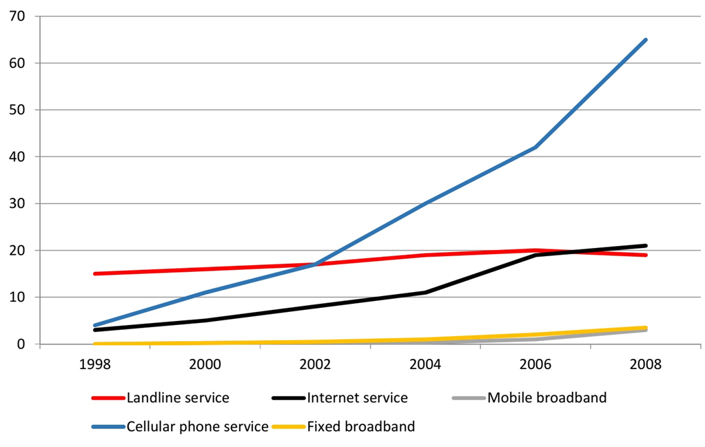
Sample 1:
The line graph gives data about the number of users of five different communication services worldwide from 1998 to 2008.
Overall, all services experienced some growth over the 10-year period, with cell phone and Internet services experiencing the most growth and becoming the most popular forms of communication.
In 1998, the figures for cell phone and Internet users started at around 5% of the population. They both increased over the remaining years, with cell phone service gaining the highest position in 2008, with more than 60% percent of the population using this type of service. This number was approximately three times as much as that of Internet service in the same year.
Meanwhile, throughout the 10-year period, little change was seen in the use of landline services, at about 15% of the population. Also, the use of mobile and fixed broadband services was minimal before 2002. The figures for these two services rose slightly to roughly 5% of the population by the last year.
Sample 2:
The line graph gives data about the number of users of 5 different communication services worldwide from 1998 to 2008.
Overall, cell phone and Internet services became more and more popular, and others similarly experienced minimal growth over the years.
In 1998, the figures for cell phone and Internet users started at around 5 per 100 inhabitants. They both increased over the remaining years, with cell phone service gaining the higher position in 2008, at more than 60 users per 100 in habitants. This number was approximately three times as much as that of Internet service in the same year.
Meanwhile, throughout this 10-year period, little change was seen in the use of the landline service, with about 15 users per 100 inhabitants. Also, mobile and fixed broadband had yet to be introduced by 2002. The figures for these two services rose slightly to roughly 5 users per 100 inhabitants in the last year.
Sample 3:
The line graph illustrates the number of people in the world who used five categories of communication services at two-year intervals from 1998 to 2008.
Overall, although all kinds of communication services tended to grow during the entire time period, only the increase in popularity in cellular phone service was significantly higher than the rise in that of other means of communication.
In 1998, the figure for cellular phone service was round about 500 people, as same as Internet service’s. From 1998, the number of individuals using cellular phone services increased dramatically to exactly 6000 people and became the most common means of communication in the year 2008. Additionally, the figure for Internet service was about five times higher than during the period of 10 years.
With 1500 people used, the figure for landline service was the highest number in 1998. However, that figure had a minor increase to 2000 people in 2006 before it dropped slightly to approximately 1800 people in 2008. The figure for mobile broadband and fixed broadband remained nearly 0 throughout the first six-year period. They were also the least popular kinds of communication services despite rising up to 500 people in 2008.
The charts show the percentage of volunteers by organizations in 2008-2014.
Summarise the information by selecting and reporting the main features, and make comparisons where relevant. Write at least 150 words.
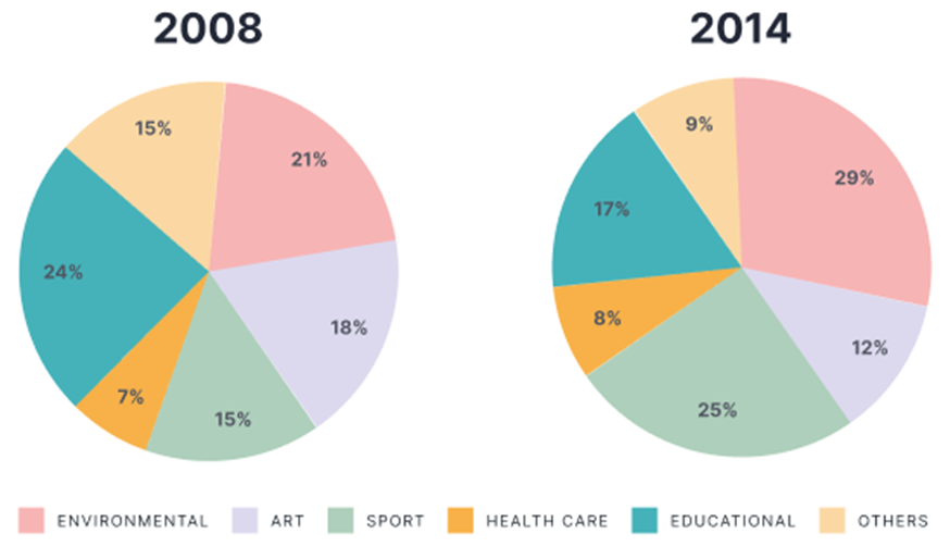
Sample 1:
The pie charts illustrate the proportion of participants who work without getting paid in different sectors from 2008 to 2014.
Overall, it can be seen that while the percentage of volunteers in education, art and other fields decreased, that in environment, sport and healthcare saw an upward trend during the same period. Another highlight is that, although in 2008, the educational sector was the most attractive organization for volunteers, in the next 7 years, this dominance was challenged by environment.
In 2008, while education and environment were the two sectors that attracted the most volunteers (24% and 21%), the proportion of participants doing voluntary work in healthcare accounted for only 7%. The figure was only half of the percentage of volunteers in the remaining area, namely sport and others which shared the same pattern of 15%.
In the next 7 years, 17% of volunteers in education made its leading position beaten by environment with 29% of contributors. At the same time, there were 25% of volunteers in sport, which was roughly double the figure in art and triple that in healthcare.
Sample 2:
The pie charts depict the percentage of participants who worked unpaid in multiple sectors from 2008 to 2014.
Overall, there was a decline in the proportion of volunteers in education, art, and other sectors, while there was a surge in that in the environment, sports, and healthcare sectors throughout the same time frame. Furthermore, it is noteworthy that while the educational sector held the highest appeal for volunteers in 2008, its dominance was subsequently challenged by the environment over the following 7 years.
In 2008, the sectors of education and environment were the most popular among volunteers, with 24% and 21% of participants respectively. However, only 7% of volunteers were involved in healthcare. The statistics represented just 50% of the total number of volunteers in the remaining region, specifically in the fields of sports and other activities, which also had a similar distribution of 15%.
In the next seven years, the percentage of volunteers in the education sector who held the leadership position was surpassed by the environment sector, which had a higher percentage of contributors at 29%. Simultaneously, the percentage of volunteers in sport was 25%, approximately twice the proportion in art and three times that in healthcare.
Sample 3:
The bar charts depict the constitution of volunteers, categorized in various social sectors, in an unspecified country between 2008 and 2014.
As can be seen from the graphs, most volunteers opted for educational organizations in 2008, whilst 2014 witnessed a rise in the rate of environmental volunteers. Healthcare was the least favoured sector among volunteers in the two surveyed years.
In 2008, 24% of volunteers worked for educational organizations, compared to 21% and 18% of those who volunteered in the environmental and arts categories respectively. Next came the share of volunteers who chose to work for sports and other organizations with 15% in each sector. Bottom of the list was healthcare with only 7% of people volunteering.
In 2014, ranked in first place was no longer the educational sector as environment took the place with 29% of volunteers registered, a dramatic 8% increase. This was followed by sports with 25% of total volunteers, whereas the figure for educational volunteers saw a corresponding decline to 17%. Arts and other organizations also recorded a drop in the rate of volunteers, accounting for 12% and 9% of total people volunteering. The percentage of healthcare volunteers remained relatively the same with only 8%.
Sample 4:
The given pie charts compare the proportion of people who did voluntary work in different organizations in 2008 and 2014.
Overall, while the percentage of people volunteering for the environment, healthcare services and sports activities followed an upward trend, the reverse pattern was seen in the figure for the remaining groups. Besides, healthcare organizations were staffed with the least volunteers in both years.
In the year 2008, volunteers working in educational organizations accounted for the largest proportion, at 24%, in comparison with 21% and 18% of people volunteering in environmental and art projects respectively. Meanwhile, 15% of volunteers worked in sports organizations, which was the same as the figure for others. Voluntary work related to healthcare, however, was the least common choice among people, with a mere 7% participants.
After 6 years, the percentage of volunteers in educational organizations decreased to 17%. Likewise, the figure for people working in art and other volunteering activities witnessed a fall of 6%. In contrast, there were many more volunteers working in environmental and sports organizations compared to other groups, with 29% and 25% respectively. Activities in the healthcare sector, despite a slight rise of 1% in its figure, remained the least preferred option among volunteers.
Sample 5:
The pie charts compare the percentage of volunteers who worked for different types of organizations in 2008 and 2014. The categories include environmental, sport, education, healthcare, art, and others.
Overall, there was a notable increase in the percentage of volunteers working for environmental and healthcare organizations, while the proportion of volunteers in educational and art organizations saw a decline. The share of volunteers in other categories remained relatively stable over the six-year period.
In 2008, educational organizations had the highest share of volunteers, accounting for 24%, followed by healthcare and environmental organizations with 21% and 18%, respectively. Art and sport organizations made up a smaller portion, at 15% each, while the “other” category had the lowest percentage at 7%.
By 2014, environmental organizations had become the most popular choice for volunteers, with their share increasing significantly to 29%. Healthcare organizations also saw a rise to 25%, while the proportion of volunteers in educational organizations dropped to 17%. The percentage of volunteers in sport organizations remained stable at 15%, but art organizations experienced a noticeable decrease, falling to just 12%. The “other” category saw a slight increase, rising to 9%.
Sample 6:
The provided pie charts illustrate the percentage of people doing voluntary work in various organizations in 2008 and 2014.
It is noticeable that the figures for volunteers in Educational, sport and health care organizations decreased while those in Environmental, art, and other ones declined over the 6-year-period. Also, Heath care remained the least attractive area to volunteers.
In 2008, almost a quarter of total volunteers worked for Environmental organizations, followed by Education, at 21%. The percentage for Environmental dropped by 7% to 17% in 2014 whereas Education witnessed a dramatic jump to 29%. Sport sector, which attracted 15% of voluntary personnel, experienced a remarkable increase to 25%., making it the second most favorite sector after Education in 2014.
The voluntary participation in art organizations went down from 18% in 2008 to 12% in 2014. Similarly, the figure for volunteers working in other organizations stood at 15% in 2008 and then fell to 9% in the following 6 years. The percentage for health care remained lowest in both 2008 and 2014, at 7% and 8%, respectively.
Sample 7:
The pie charts show the proportions of people volunteering in various kinds of organisations in 2008 and 2014.
It is clear that while volunteers’ participation in environmental, sport, and health care organisations increased, the opposite was true for other types of organisations. Additionally, the percentages of health care volunteers were by far the lowest during the two years.
In 2008, volunteering in educational organisations was the most common choice, accounting for nearly a quarter of all volunteers, while 21% and 18% of volunteers took part in environmental and art projects respectively. 15% of volunteers worked in sport organisations, and another 15% in other organisations, while only 6% volunteered in health care.
In 2014, significantly more volunteers worked in environmental and sport organizations compared with the other fields, at 29% and 25% respectively. Meanwhile, the figures for art and other volunteers both fell by 6%. There was also a slight fall in volunteers in educational organizations, at 17%, while volunteering in health care was still the least preferred option, at only 8%.
Sample 8:
The table gives information about the participation in 6 categories of activities such as (environment, Arts, Sports, Health care, Educational, and others). The organization is estimated in percentage in the years 2008 and 2014.
Overall, at the beginning of the period, participants were the least, especially in sports and health. At the same time, education was the most significant in the band. In comparison, at the end of the year environment became the largest segment. However, the arts and others had slight changes in both years.
The number of volunteers in sports and health are lower in 2008. The groups are around 15% and 7%. They experience more than a fifth in 2014. In contrast, education is threefold higher at starting but dramatically fell to about 17% in the last year.
In 2008, the environment club was approximately 21%. That exceeded up to a one-half quarter in the last period. Whereas the Arts and others are slightly (18% and 15% respectively) and both are less than one-tenth and end up in 2014.
Summarise the information by selecting and reporting the main features, and make comparisons where relevant. Write at least 150 words.
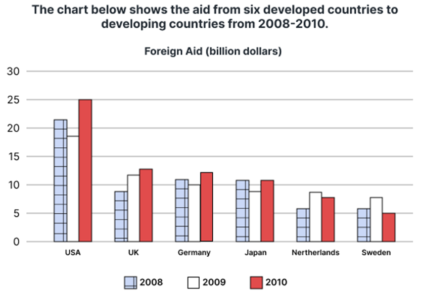
Sample 1:
The bar chart shows the amount of financial aid sent to developing countries by six developed nations between 2008 and 2010.
Overall, Sweden was the only country experiencing a downward trend while the opposite was true for the remaining countries except for Japan whose end figure was the same as its initial amount. Among these countries, the US established itself as the nation that provided the largest aid package during the entire period.
In 2008, the United States led with a substantial allocation of approximately 22 billion dollars directed towards developing nations. This was followed by Japan, Germany and the UK, as their figures ranged from 12 billion to 8 billion dollars. At the bottom of the list were Sweden and the Netherlands, each extending around 6 billion dollars in aid.
Thereafter, the amount of money sent from the US dropped to a low of 18 billion dollars before increasing sharply to 25 billion, still ranking first. Germany and Japan mirrored this pattern with less pronounced fluctuations, ending the period with 12.5 and 11 billion dollars in turn. Having an opposite trajectory, the figures for the Netherlands and Sweden rose to a high in 2009 but later dropped to 8 billion and 5 billion dollars respectively in 2010. Finally, the amount of financial support from the UK surged, reaching a peak of 13 billion dollars at the end.
Sample 2:
The chart illustrates the total amount of financial support that six wealthy countries in Asia, Europe, and America allocated to assist developing ones within three years, from 2008 to 2010. Overall, the USA outnumbered other countries in terms of support for developing countries, and the amount of financial aid tended to increase after three years in all countries, except for the Netherlands, and Sweden.
As observed in the chart, the USA had already ranked first regarding international support in 2008, as there were more than 20 billion USD designated to aid developing countries. This figure was around 4 times higher than that of the Netherlands and Sweden when these two European nations did not spend more than 8 billion USD. In the subsequent two years, there was a contrast in the spending pattern for charity work between these two countries and their American counterpart. To be specific, the former both decreased mildly their budget to aid developing countries, while the latter significantly boosted its amount to 25 billion USD in 2010, marking the highest sum of money dedicated to charity.
On the other hand, the UK, Germany, and Japan barely witnessed any substantial change in their national budget allocated for aiding developing countries. After a period of three years, the first two nations gradually raised their overall spending for international aid, both of which were around 12 billion USD. Japan stood as an exception, as the country maintained its initial amount concerning financial support after an insignificant fall, at slightly over 10 billion USD in 2010.
The diagram below shows how a modern landfill for household waste is designed.
Summarise the information by selecting and reporting the main features, and make comparisons where relevant. Write at least 150 words.
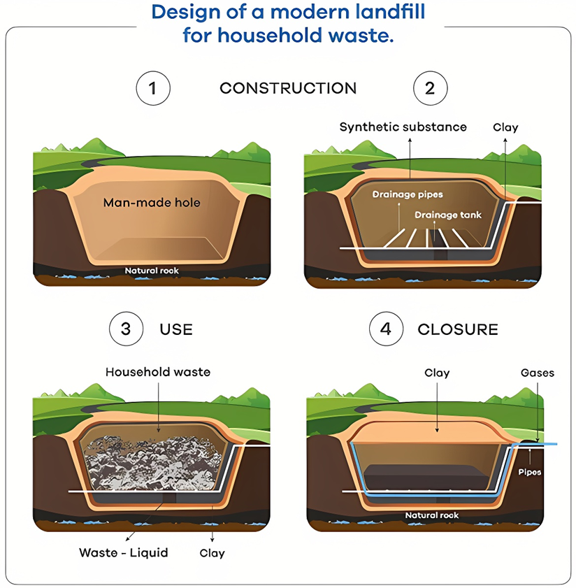
Sample 1:
The diagram illustrates the design of a contemporary landfill intended for household waste disposal.
Overall, the construction of such a landfill encompasses four primary elements: an excavated area, drainage infrastructure, a composite layer involving clay and an unspecified material, and a clay cap.
The construction process commences with the excavation of the ground in a trapezoidal prism shape, situated above a foundation of natural rock. Subsequently, an unspecified synthetic substance is positioned over a layer of clay. Concurrently, a drainage tank is excavated, taking on the form of a cuboid, traversing through the aforementioned layers, while a network of drainage pipes is also incorporated.
Upon readiness for operation, the landfill is filled with household waste, with the resultant leachate being filtered and directed away from the excavation through the installed pipes. Once the waste has disintegrated into a mud-like amalgam, a clay cover is applied to the top surface, and any emitted gases from the site are channeled away.
Sample 2:
The diagram illustrates the design and operation of a modern landfill for domestic wastedisposal.
Overall, the process involves four stages, beginning with the excavation and construction of the landfill and concluding with its closure after waste deposition.
Initially, a rectangular man-made cavity is excavated into the ground until it reaches the underneath layer of natural rock. This cavity is then lined with synthetic material and clay. forming a barrier to ensure effective waste containment. At the base, a drainage system comprising of multiple pipes and a tank is installed to facilitate the waste processing phase by managing the liquid waste produced as waste decomposes.
Following construction, the landfill is utilized for household waste disposal. Over time, liquid by-products accumulate at the bottom and are handled by the drainage system. In the final stage, once the landfill reaches capacity, it is sealed with a thick layer of clay. Gas venting pipes are installed to safely release gases produced during the decomposition of waste materials.
Sample 3:
The diagram shows the life cycle of a modern landfill used for the disposal of household waste. There are three main stages in the life of a landfill: the construction, the use of, and the closure.
Firstly, a giant hole is dug in the earth above a bed of natural rock. Once the hole has been dug, it is then lined with a thick layer of clay, followed by a layer of synthetic material which helps to stop toxic waste substances from leaching into the surrounding earth. Drainage pipes and a drainage tank are also installed in order to remove the toxic waste liquids from the bottom of the landfill.
Once the landfill has been built, it is ready to be filled with household waste. During the usage stage of the landfill, waste liquids will sink to the bottom where they will be held in the drainage tank and removed via the drainage pipes in order to minimise a build-up of gas. Once the landfill is full, it is covered with a thick layer of clay. As the waste degrades over time, waste gases are emitted from the landfill.
Sample 4:
The given diagrams provide an illustration of a modern landfill for household waste. Overall, a typical landfill is a man-made hole dug on a solid, two-layer base in which household refuse is kept and toxic liquids are removed from the landfill by the use of a system of pipes.
The construction of a landfill commences when a large hole is dug out of a site with natural rock underneath. The bottom of the hole is thereafter covered with a layer of clay and another layer of unspecified synthetic substance. A drainage tank which is a box-shaped compartment dug through the two aforementioned layers and a set of drainage pipes are also installed.
When used, the landfill is filled up with household waste, with the leachate being extracted and eventually flowing out of the site in liners. Once the rubbish has been converted into a mud-like compound, the landfill is sealed with clay, and gases that are emitted as a result of the conversion is eventually pumped out to an unspecified zone.
Sample 5:
Given in the process is how a contemporary household landfill is contructed and operated.
Four stages are involved, starting from creating a space underground and ending at pit covering.
The first two stages aim at constructing the landfill. Firstly, an artificial open rectangle hole is dug until reaching the natural rock layer of the earth core. Several layers including clay and synthetic substances are then used to cover the pit wall. Drainage pipes are placed on the surface of the base except for the minor space spared at the bottom of the pit for a drainage tank.
Once the pit construction is finished, household waste could be stored inside. Users are advised to close it by a clay lid in the final step. While the waste is fermented, the gas produced along the way could pass through the installed pipes and is potentially reused as a form of energy.
Sample 6:
The images illustrate the construction and operation of a method for household waste disposal, also known as a landfill. It could be deduced from the cross-section of this apparatus that its life cycle includes three sequential phases of construction, use and termination.
To create a landfill, a deep hole is first dug into the ground and goes as far as the natural rocks beneath the soil. It is then layered with clay and padded with another layer of synthetic material to prevent waste from leaking and contaminating the earth. Inside the hole, there are a set of drain pipes and a tank to ensure that waste does not cause clogging.
During operation, liquid from the garbage that occupies the landfill sinks to the bottom of the hole so as to escape through the drainage pipes. This minimizes the generation of toxic gases inside the landfill, and also leaves more space for solid waste. Once the hole is full, workers seal it off with clay. Following the end stage, garbage inside the landfill decomposes, and gases are produced.
Sample 7:
The diagram depicts how to build and operate a landfill for residential waste.
Overall, the landfill's lifecycle is segmented into four principal stages, beginning with two steps construction, one utilization step for waste disposal, and final closure.
Initially, the process begins with the excavation of a man-made hole, which forms the base of the landfill. Subsequently, the second stage involves the placement of a synthetic substance inside the clay layer surrounding the hole, ensuring a secure and leak-proof foundation. In conjunction, drainage pipes and a tank are installed, designed to handle and store liquid by-products. The third stage is marked by the active use of the landfill for the disposal of household waste, which is deposited and allowed to accumulate within the prepared space. Upon reaching its full capacity, the landfill enters the closure stage, where a layer of clay is applied over the accumulated waste. This stage also includes the installation of pipes which function to vent gases generated within the landfill.
Sample 8:
The diagram illustrates how a modern landfill for household waste is made and used.
Overall, there are three main stages involved in the process, starting with digging the hole, then using it and and when it is full, it is closed by means of a clay sheet.
The construction begins with a hole being dug in the ground, which is just above the natural rock layer. Then, protective linings, consisting of an outer clay layer and an inner one made of artificial materials, are applied to the bottom and the sides of the hole to prevent waste leakage into the environment. At the same time, a drainage system is installed, including a drainage tank and pipes, to allow wastewater to exit the site.
Once the installation is complete, the landfill is ready for use, as household waste is dumped into the hole over time. During this stage, waste-liquid from the refuse sinks to the bottom, where it builds up in the tank and is rerouted via drainage pipes to avoid the accumulation of toxic liquids. After reaching its full capacity, the hole is covered by clay, then the trash is left to decompose, producing waste gases, which are finally collected through a gas-collecting system.
Sample 9:
The diagram illustrates the process involved in the lifecycle of a modern landfill, specifically designed for household waste disposal.
Overall, there are 3 significant phases commencing with the construction and ending with closing the landfill.
The process begins with excavating a substantial hole in the ground, positioned on a bed of natural rock. After excavation, the pit is lined with a thick clay layer, followed by a synthetic liner to prevent harmful substances from seeping into the soil. Additionally, drainage pipes and a tank are installed at the base to manage and remove toxic liquid waste.
Upon completion of the landfill's construction, it becomes operational, receiving household waste. During this phase, liquid waste accumulates at the bottom and is collected in the drainage tank, with pipes facilitating its removal to mitigate gas buildup. When the landfill reaches its capacity, it is sealed with another layer of clay. Over time, as the waste decomposes, gases are produced and emitted from the site.
Sample 10:
The diagram outlines the structure of a modern landfill designed for household waste disposal.
Overall, the diagram shows that the landfill construction involves four key elements: excavation, lining with protective materials, installation of a drainage system, and a sealing process. The use of the landfill focuses on waste disposal and leachate management, while the closure phase aims to secure the site and handle gas emissions.
The construction process begins with digging a trapezoidal prism-shaped hole, located above a base of natural rock. Following this, a synthetic material is laid over a layer of clay. At the same time, a drainage tank is excavated in the shape of a cuboid, cutting through the layers, and a network of drainage pipes is installed.
Once operational, the landfill is filled with household waste. Leachate, a liquid produced from waste, is filtered and diverted away from the excavation through the drainage pipes. After the waste decomposes into a sludge-like mixture, a clay cover is applied to the top surface, and any gases generated from the site are vented out.
Sample 11:
The diagrams illustrate the process involved in constructing a modern landfill designed for household waste management. Overall, the process encompasses three primary stages including construction, waste deposition, and waste management with several key components, including a pit, drainage pipes, and a tank.
In the initial construction stage, a large, deep rectangular pit is excavated in natural rock. This pit is first lined with a thick layer of clay, followed by a synthetic liner to prevent leakage. At the bottom of the pit, a drainage tank is installed, while several drainage pipes are positioned on top of the liner. These components are crucial for the subsequent management of liquid waste.
Once the landfill is prepared, it is filled with household waste. As waste accumulates, excess liquid drains through the pipes into the tank at the base, preventing contamination of the surrounding soil.
In the final stage, gas generated from the decomposing waste is collected via a gas vent, which is connected to the drainage pipes. This gas is then safely emitted and can be utilized domestically. In order to effectively contain the waste and minimize environmental impact, the landfill is sealed with another layer of clay.
This comprehensive setup ensures efficient waste management by preventing leakage, managing waste liquids, and safely utilizing generated gases.
Sample 12:
The diagram showcases the blueprint for a modern landfill for household waste. Overall, the construction of a landfill involves four components: a man-made hole, drainage pipes, a layer of clay and another unspecified substance, as well as a clay cover.
The building is initiated by emptying the ground in the shape of a trapezoidal prism above a foundation of natural rock. Then, a layer of an unspecified synthetic substance is placed on top of a layer of clay. A drainage tank is dug out through the two aforementioned layers in the shape of a cuboid, while a system of drainage pipes is also installed.
When it is ready to be used, the landfill is filled with household waste, with the leachate being filtered out and pumped through the pipes, away from the hole itself. Once the waste has been pulverized into a layer of mud-like amalgamation, the top is covered with a clay lid, and gases emitting from the site are funneled away.
Sample 13:
The process details a modern landfill designed for the storage of household waste. Looking from an overall perspective, it is readily apparent that it is a largely man-made process taking place in the natural environment that involves drainage and disposal of various liquids and gases as well as basic storage of the waste itself.
The landfill is a rectangular hole cut into a large piece of natural rock. To finish the construction, there are synthetic pipes, and a clay layer placed against the rock as well as drainage pipes and a drainage tank at the bottom of the landfill.
When in use, the household waste is stored in the main compartment and liquid waste is held in the tank. The landfill is then closed and paved over with a single clay layer with the synthetic pipes still in place that can transport gases in or out of the storage area.
Sample 14:
The diagram illustrates the design and process of a modern landfill for the disposal of household waste.
Overall, the picture shows its construction, use, and closure stages to dispose of waste in a controlled and environmentally responsible manner.
In the construction stage, a large man-made hole is excavated/ dug into natural rock. The hole is then lined with a layer of clay and synthetic material to prevent contamination of the surrounding soil. At the bottom of the landfill, drainage pipes and a drainage tank are installed to collect liquid waste.
During the use stage, household waste is dumped into / deposited into the landfill. As waste builds up, liquid waste seeps to the bottom, where it is collected by the drainage pipes and tank, preventing it from leaking into / escaping into the environment. In the closure stage, once the landfill is full/ reaches capacity, it is sealed with a layer of clay to block off any additional entry of waste or environmental exposure. A pipe is also installed / added to release gases produced by / generated by decomposing waste, ensuring proper ventilation and maintaining environmental safety.
Sample 15:
The diagram illustrates the design of the modern landfill site for waste from households.
Overall, the design shows three phases. Firstly, it shows the construction, then the use and finally the closure of the landfill site.
The design begins with making a hole in the natural rock. Then the hole is lined with clay and a synthetic lining is placed on top of the clay. Next, a drainage tank is placed at the bottom of the hole and the waste liquid is designed to be fed to this tank by drainage pipes.
The second phase is the use of the landfill site. Trucks empty household waste into the hole. The drainage tank enables waste liquid to empty into the surrounding natural rock.
Finally, the site is closed when the hole is filled completely with household waste. A pipe is put into the hole in order to enable gases to escape into the air outside. In the last stage, the top is sealed with clay and the design process is completed.
Sample 16:
The diagram depicts the design and operation of a modern landfill for household waste.
Overall, the process involves careful construction, usage, and closure phases to manage waste efficiently and minimize environmental impact.
Initially, a man-made hole is excavated in a natural rock base. This hole is lined with a layer of clay and a synthetic substance to create a barrier that prevents contamination. Drainage pipes and a drainage tank are then installed to manage the liquid waste, known as leachate, that results from waste decomposition.
During the usage phase, household waste is deposited into the landfill. Over time, this waste compresses, and any leachate produced is collected and directed away through the drainage system, ensuring that the surrounding environment remains protected.
In the final stage, the landfill is sealed once it reaches capacity. A thick layer of clay is added on top of the waste, followed by a layer of soil to support vegetation growth, typically grass. This seal prevents further leachate production and reduces the impact on the environment. Additionally, gas pipes are installed to safely vent gases generated during waste decomposition.
Sample 17:
The design of a landfill for residential waste, including details about the construction and usage is illustrated in the diagram.
Significantly, it is noticeable that the whole process takes place in the natural environment. Specifically, to construct the landfill, a deep rectangular hole needs to be dug, which is cut into a large piece of natural rock. After that, a clay layer and a synthetic lining are placed against the rock. Meanwhile, at the bottom of the landfill are some drainage pipes and a drainage tank.
Once the construction is done, trucks carrying household waste can dump household waste into the landfill for storage and the waste liquid is held in the drainage tank. Finally, the tank is sealed with a clay cover, leaving a vent connecting the outside to allow the gases inside to discharge.
To sum up, it is a relatively simple way to build and use a landfill to dispose of residential waste, which does not involve a complicated process or various materials and equipment.
Sample 18:
The shown picture describes the construction of a modern landfill for household waste and how it works.
As can be clearly seen from the diagram, this landfill is made by digging in the ground and the waste is dissolved with the help of both artificial and natural substances.
In terms of its structure, firstly, a spacious rectangular-shaped man-made hole is dug up from the ground which has a layer of natural rock underneath. Next, a thin layer of clay is laid on before being covered by a special synthetic substance. A drainage tank is then put down, with a number of drainage pipes placed on top of it.
Moving to its operating principle, abandoned waste from households is discarded into the hole and then buried by a thick surface of clay. After a while, the liquid waste drops to the bottom of the drainage tank and gradually changes from liquid form to gas form to escape out through the pipes.
Sample 19:
The diagram illustrates the process of constructing and using a modern landfill for household waste.
Overall, the process involves careful construction and management in three main steps - construction, use, and closure - to ensure that waste is stored safely, and any harmful by-products are properly handled.
During the construction phase, a large hole is dug into the natural rock. This hole is then lined with a thick layer of clay and a synthetic material to prevent pollutants from seeping into the surrounding soil. Drainage pipes and a drainage tank are installed at the bottom to manage liquid waste.
In the use phase, household waste is deposited into the landfill. Liquid waste is collected at the bottom and removed through the drainage system to minimize gas buildup.
Finally, in the closure phase, once the landfill is full, it is covered with a thick layer of clay. This acts as a barrier to prevent waste from escaping into the environment. Over time, as the waste decomposes, gases are released and are directed through pipes to a treatment facility.
The bar chart below shows the proportion of the population aged 65 and over of three countries in 1980 and 2000 and prediction in 2030.
Summarise the information by selecting and reporting the main features, and make comparisons where relevant. Write at least 150 words.
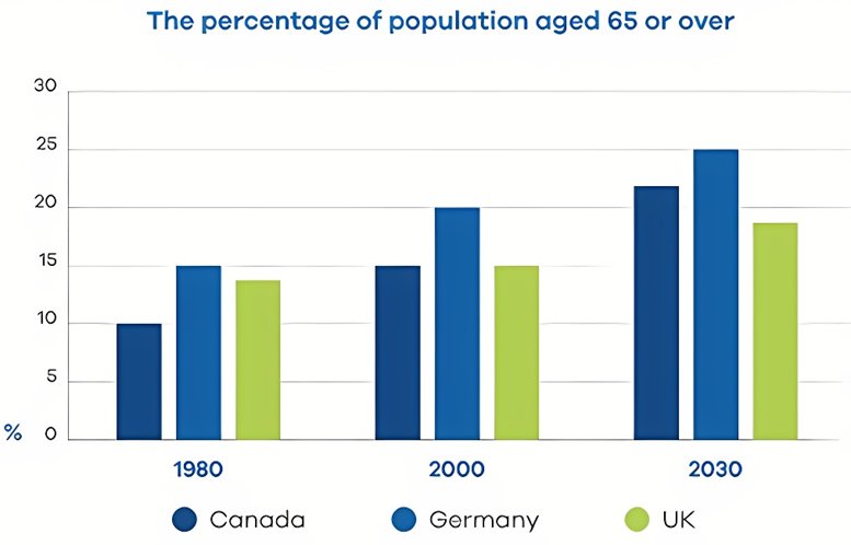
Sample 1:
The chart shows the percentages of the population aged 65 and over in Canada, Germany, and the UK, in 1980, 2000, and projected figures for 2030.
Overall, Germany’s population had the largest percentage of people aged 65 and over. In addition, the predicted figures for 2030 show that Canada will see the biggest growth in the elderly population.
In 1980, 15% of the German population was aged 65 and over. This figure had risen to 20% by the year 2000. Meanwhile, the figures for the UK and Canada were approximately 14% and 10% respectively in 1980, with both countries rising to 15% by 2000.
Projected figures for 2030 show a further 5% increase in Germany’s elderly population, reaching 25%. Canada will see an even larger increase of 7% by 2030, which will make around 22% of their population aged 65 and over. Meanwhile, around 18% of the UK population is predicted to be aged 65 and over by the year 2030.
Sample 2:
The bar chart delineates the proportion of individuals aged 65 and older in three nations - Canada, Germany, and the UK - across three distinct years: 1980, 2000, and a projection for 2030. Each country’s data is represented in percentages.
An overview of the data reveals that Germany consistently exhibits the most substantial growth in its senior population, with projections indicating a continuation of this trend. Conversely, the UK demonstrates a slower and fluctuating growth pattern, although it is expected to see an appreciable increase by 2030.
In more detail, Germany's senior demographic experienced a significant upsurge from 1980 to 2000 and is anticipated to reach 25 percent by 2030. This rising trend underscores Germany's increasing older population, which notably surpasses that of the other two countries. Canada, while showing less dramatic increases than Germany, still follows a clear upward trajectory. From holding 10 percent of its population within the senior age bracket in 1980, it rose to 15 percent in 2000, with a forecast of approaching 23 percent by 2030.
The UK, however, presents a more nuanced scenario. In 1980, the percentage of the population aged 65 or over was slightly higher than in Canada but decreased by the year 2000. Nevertheless, projections suggest a recovery to around 18 percent by 2030. This illustrates a more gradual and less consistent growth in the elderly population compared to Canada and Germany, reflecting different demographic dynamics.
Sample 3:
The bar chart illustrates the percentage of the population aged 65 and above in three countries - Canada, Germany, and the UK - over three specific years: 1980, 2000, and a projection for 2030. The figures are presented as percentages, highlighting trends in aging demographics.
A general examination of the chart shows that Germany has the most pronounced increase in its elderly population, with continued growth anticipated through to 2030. In contrast, the UK's aging population growth is slower and exhibits some fluctuations, though a notable rise is forecasted for 2030.
Delving into specifics, Germany’s older population surged markedly between 1980 and 2000, with the projection indicating a rise to 25 percent by 2030. This trend emphasizes a significant aging population in Germany, far exceeding that observed in the other two nations. In Canada, the increase in the senior age group has been less dramatic but nonetheless steady. The data show an ascent from 10 percent in 1980 to 15 percent in 2000, with expectations of reaching approximately 23 percent by 2030.
Meanwhile, the UK's situation is somewhat more complex. Initially, in 1980, the share of the population aged 65 and over was marginally above Canada’s but saw a decrease by 2000. Projected figures suggest a rebound to around 18 percent by 2030, indicating a more moderate and uneven progression of the aging population in comparison to the steady and robust growth observed in Canada and Germany.
Sample 4:
The chart shows changes in the number of people in 65-year-old and over in three nations in the years 1980 and 2000 and predicts the share of this population group in 2030. The units are measured in percentage.
Overall, Germany and Canada show the most significant and consistent increase in the population rate of over-65 age group during 50-year period. However, the UK experiences a slow rise over the period of 50 years, despite a decline in 2000.
Germany saw the biggest rise in people aged over 65 in the first 20 years, and this percentage is likely to increase to 25 percent in 2030. Similarly, Canada also had an upward trend of population growth over-65 age bracket at 15 percent in the year 2000, and this percentage rate is predicted to remain rise to around 23 percent in 2030.
On the other hand, the 65 and above age group’s percentage share of population in the UK in 1980 was nearly 13 percent, which increased to 15 percent in 2000. However, the figure for the UK is expected to rise to 18 percent in 2030, which the growth of people aged above 65 still slower than that of Canada and US.
Sample 5:
The bar chart indicates the growth of population aged 65 and above in three countries between 1980 and 2000, with the projections towards 2030.
Overall, what stands out from the graph is that the percentage of senior demographics aged 65 and older has been on the rise since 1980 and is predicted to continue in 2030. It is also clear that Germany always heads the list over the surveyed period.
In 1980, 15% of the population was the elderly 65 or above in Germany, as opposed to 14% in the UK and only 10% in Canada. Twenty years later, these figures grew steadily by 5% in Germany and Canada, whilst the UK only saw a slight increase of 1%.
In 2030, both Germany and Canada expect a respectable rise in the rate of senior people 65 and over to reach a peak of 25% and 22% respectively. Meanwhile, it is anticipated that there will be around 19% of people aged 65 and older in the UK in 2030.
Sample 6:
The vertical bar graph illustrates the proportion of the population aged 65 and over in Canada, Germany, and the UK, in 1980, 2000, and projected figures for 2030.
In 1980, 15% of the German population was aged 65 or over. By 2000, this figure had risen to 20%. Meanwhile, rates for the United Kingdom and Canada were roughly 14% and 10% respectively in 1980, and by 2000 both countries had risen to 15%.
Projected figures for 2030 show a further 5% increase in the elderly population in Germany, reaching 25%. By 2030, Canada will experience an even bigger growth of 7%, which will account for about 22% of their population aged 65 and over. Meanwhile, around 18% of the United Kingdom population is predicted to be aged 65 and over by the year 2030.
Overall, the German population had the largest percentage of people aged 65 and over. In addition, projected figures for 2030 show that Canada will see the largest increase in the elderly population.
Sample 7:
The graph details the percentages of elderly people in the past with an outlook for the future in Canada, Germany, and the UK.
From an overall perspective, there is no doubt that the elderly population has risen and is predicted to continue to grow steadily.
If we look at the countries separately, Germany has and will continue to have the highest proportion, while Canada will likely overtake the UK. In 1980, Germany had the greatest percentage of elderly at 15%, slightly above the UK and 5% higher than Canada.
By 2000, percentages for Germany and Canada both surged by 5% (to 20% and 15%, respectively), compared to the UK, which rose marginally to equal with Canada. By 2030, Germany is expected to rise by another 5% to 25%, with Canada surpassing the United Kingdom and finishing at 22% and the latter’s figures lagging behind slightly at just under 20%.
Sample 8:
The graph given puts forward a series of data for the elderly people in Canada, Germany, and the UK in the past with projections for the future, looking from an overall perspective. It provides an apparatus to understand that the Elderly population have risen and are predicted to continue to grow steadily in the mentioned countries. While the trend of the rising elderly population is evident, Germany has indicated to have the highest proportion, and that Canada will likely overtake the UK.
At 15%, Germany had the greatest percentage of elderly in 1980, this is slightly above the UK and Canada. By 2000, percentages for Germany and Canada both surged by 5% (to 20% and 15%, respectively), compared to the UK which rose marginally to equal with Canada. By 2030, Germany is expected to rise by another 5% to 25%, with Canada surpassing the United Kingdom and finishing at 22% and the latter’s figures lagging behind slightly at just under 20%.
Sample 9:
The chart illustrates the proportions of the elderly population in Canada, Germany, and the UK in 1980, 2000, and projected figures for 2030.
Overall, Germany’s population had the largest percentage of people aged 65 and over. In addition, the predicted figures for 2030 show that Canada will see the biggest growth in the elderly population.
In 1980, 15% of the German population was aged 65 and over. This percentage had increased to 20% by the year 2000. Meanwhile, the percentages for the UK and Canada were approximately 14% and 10% respectively in 1980, both rising to 15% by 2000.
Projected figures for 2030 indicate a further 5% increase in Germany’s elderly population, reaching 25%. Canada is expected to experience an even larger increase of 7% by 2030, making up around 22% of their population aged 65 and over. Meanwhile, around 18% of the UK population is forecasted to be aged 65 and over by the year 2030.
Sample 10:
The graph details the percentages of elderly people in Canada, Germany, and the UK in the past with projections for the future. Looking from an overall perspective, it is readily apparent that Elderly populations have risen and are predicted to continue to grow steadily in all countries. Germany has and will continue to have the highest proportion, while Canada will likely overtake the UK.
In 1980, Germany had the greatest percentage of elderly at 15%, slightly above the UK and 5% higher than Canada. By 2000, percentages for Germany and Canada both surged by 5% (to 20% and 15%, respectively), compared to the UK which rose marginally to equal with Canada.
By 2030, Germany is expected to rise by another 5% to 25%, with Canada surpassing the United Kingdom and finishing at 22% and the latter’s figures lagging behind slightly at just under 20%.